Vivian Maier
Formal Elements
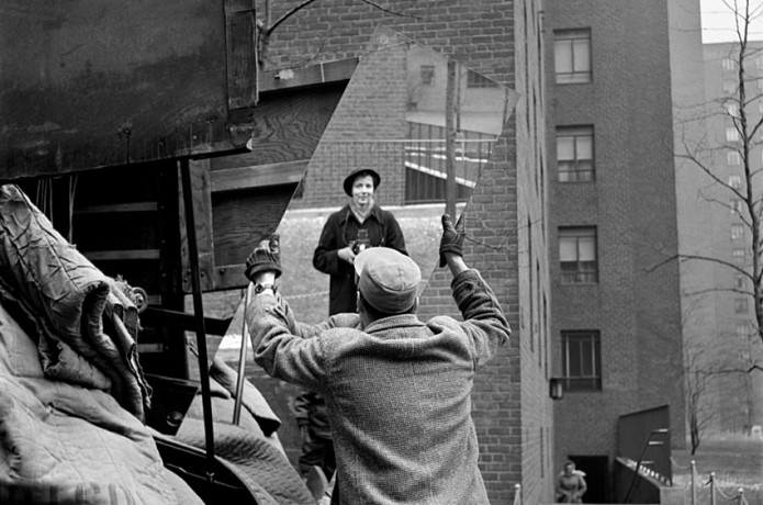
LIGHT
All the light from this picture is natural, the scene, outside is all the light in the world.
As the light is natural, which means that the light is everywhere.
The light is very soft and natural, this means that the light in the shot is very calm. The left hand side of the shot is darker than the right, created by shadows.
TEXTURE
The mirror is the clearest object, the texture of the mirror is smooth, as smooth as it can be.
The man's jacket is creased and shows his difference with the mirror. This creates a kind of juxtaposition.
There is a rug on the left hand which is old and torn, this is the lowest wealth in the picture and is shown against the cleanness of the mirror.
FOCUS
The sharpest focus in the picture is the man. The ripples on the back of his jacket are very clearly defined.
The rest of the image is a faint blur.
This makes the image feel very calm, as there are no harsh lines.
ANGLE OF VIEW
The camera is slightly above the subject, this creates the kind of look that the photographer is above the subject.
The camera is just above eye level, but can probably pass for eye level.
The view of the camera makes the shot look like chance, the photographer was waiting for the subject to arrive.
FRAMING/COMPOSITION
The man in the picture is centred so that he is the clear focus.
The rest of the shot feels like its very backgrounded, as if its only there because thats where the mirror is.
The left third is set by the rubbish, with hints at the fate of the mirror.
The right third is a bit less crowded, it shows the scenery, setting the scene for where the picture is taken.
The mirror is framed by its surroundings but I think that it was chance that got the mirror in its surroundings
COLOUR
I think that the clarity of the subject creates the 'realness' of the picture. The use of colour in this picture would have added something else, not necessarily wanted.
I think that colour can create a different sense of depth that that black and white has to create with shades of grey.
I think that the scene would differ a lot if it were in colour, maybe it will have added something to the subject, maybe the viewer would feel like they knew him more?
Francesca Woodman
Visual Elements of Photography
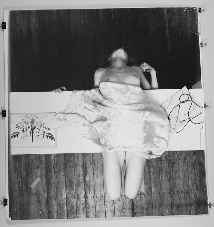
LIGHT
The light source is natural, as are most of her pictures.
The light is pointing onto the subject straight on. So the light source is following the view of the camera.
The light in this picture is soft, illuminating the subject.
The top of the picture is darker, with the table the subject is sitting on casting a shadow onto the floor.
TEXTURE
The main texture is the cloth that is covering the subject, the texture of the cloth is soft. The softness is interrupted by creases and folds,
The cloth is draped over her.
The cloth is noticed right away, as it's the focus of the picture, it's in the centre and it's the lightest point of the picture.
FOCUS
The only thing in sharp focus are the objects on the table. There is one cable on the right hand side. The contours on her legs are very defined.
The other thing in focus is her left hand. The detail on it is very sharp.
The softness of the light and focus make the image feel welcoming. The image is very free, her position draws the viewer in, she's laying back, showing herself.
THE ANGLE OF VIEW
The photographer is straight above the photographer.
The photographer is looking down at the flooring, the are about a person's height but they are above the subject.
The fact that the photographer is looking down on the subject shows her vulnerability.
FRAMING/COMPOSITION
The subject is just off centre taking up almost all of the centre third.
The table she is on takes up all of the centre third horizontally.
This draws the viewer into the subject, into the picture. The rest of the image is flooring.
The lines of the flooring help centre the subject and the table makes a '+' with the cloth covering the woman in the centre of it.
COLOUR
This photo is in black and white. Saying that colour is more 'real' looking is more surface level, of course when you see, you normally see in colour, but the existence of black and white make the photo look more focused. The colour in an image like this would be a distraction.
In black and white the different colours that you would see in colour are turned into shades, of grey.
This scene would be very different if it were in colour, the focus might not be on the subject but on the colours.
My formal element pictures
|
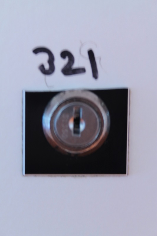
The Camerless Picture
The picture I can see is a wall of white, encased in the centre is the number '321' hand drawn with marker. Under the number is a lock. Evaluation of Someone else taking your picture.
The task was quite hard, as we had to find the exact place where the other person had envisaged their image. The description was in detail enough that I managed to find the exact place that he was standing. The composition and focus was also a hard task. I have learnt about the details that need to be in a picture, and that its not just about the final outcome, its about the thinking about the image first. My picture is quite different from the one that he imagined. His picture is further away and from a few steps to the right. |
|
|
Evaluating your photo that someone else has taken.
The photo that he took was very similar to the one that I imagined. I explained the image, i think, clearly enough that the image was the same. There was no other alternative for it to be. I dont think that theres anything to add, maybe I could explain the shutter speed or the aperture i imagined. I think that this task helps you look at the way a photograph is constructed. That the description of the image is so clear that you can visualise the picture before you take it. |
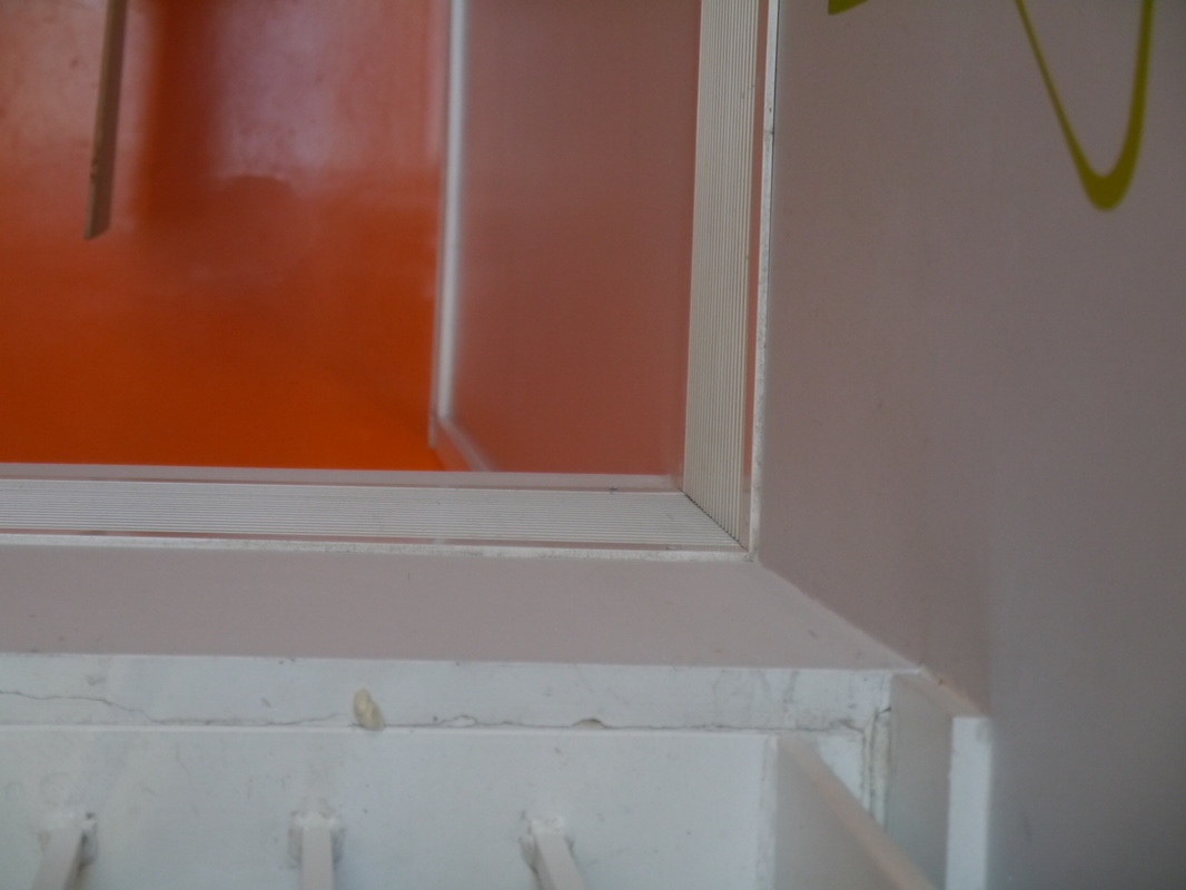
Texture/Light Photos
|
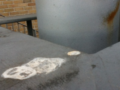
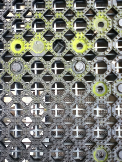
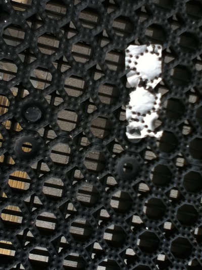
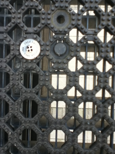
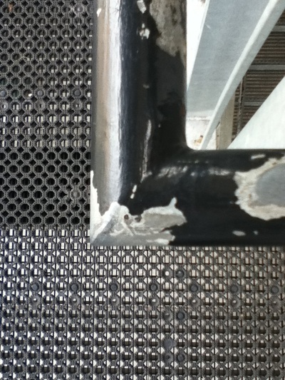
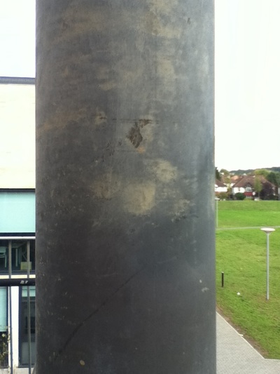
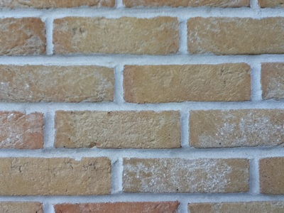
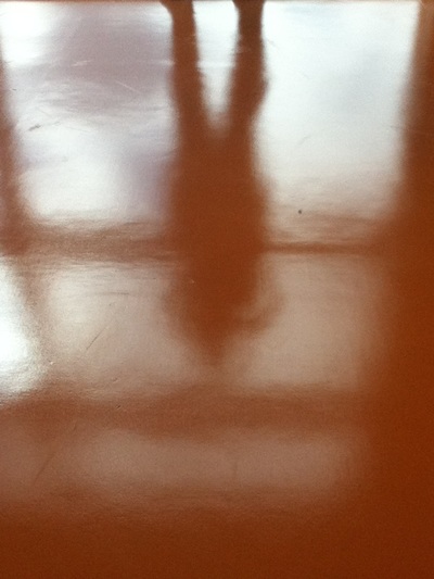
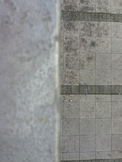
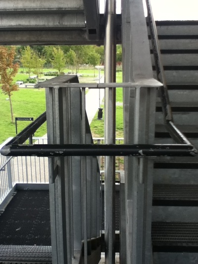
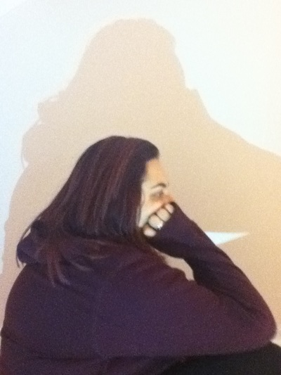
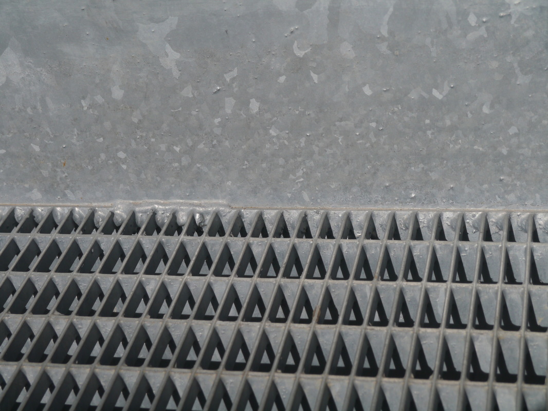
For these set of images I looked at two of the formal elements: texture and light. I looked at how light was affecting objects. The first image focuses mostly on texture. The different textures in the image all together. The second image is the floor on the walkways at school. These interested me as several things were pushed into the small circles. The second image has a green tinge as the circles has become discoloured. The texture of the circles The third and fourth images are different objects having been pressed into the circles. The fifth image is the railings alongside stairs. The railing has worn away. The sixth image is a pole that has been discoloured over time, from being handled and worn down by the weather. The next is a sticker that has been almost rubbed off. The eighth picture is of a brick wall and how the light has affected each brick. The ninth picture is the reflection of the floor of a person. The tenth is two different textures, the floor and railing. The eleventh is of a railing and staircase. The last is of a person and their reflection against a white wall.
|
|
LIGHT/LINE PHOTOS
|
|
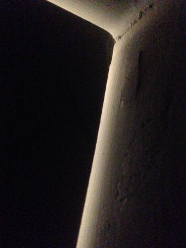
These pictures focus on the two formal elements: Light and Line. The first image is the corner of a door as the light comes through it. The light is only on the right hand side which contrasts the darkness of the left hand side.
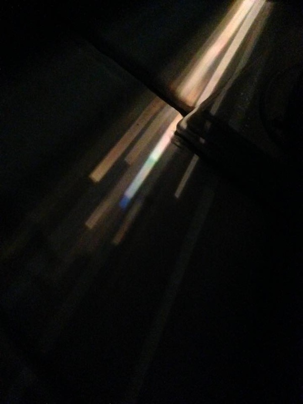
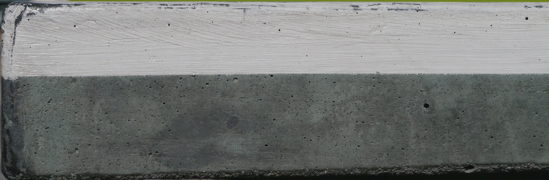
The second picture is another corner of a door. This time the light has bounced in a different way. The light has separated out and has different colours. The third image is a table tennis table. The painted top half contrasts with the unpainted bottom half. There is also a straight line down the middle where the two halves meet. The final image is of the stairs, the light creates the lines underneath the stairs. The ways that the light falls on each section differently. |
|
|
