“A photograph is a moral decision taken in one eighth of a second” - Salmon Rushdie
My personal investigation
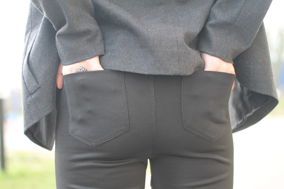
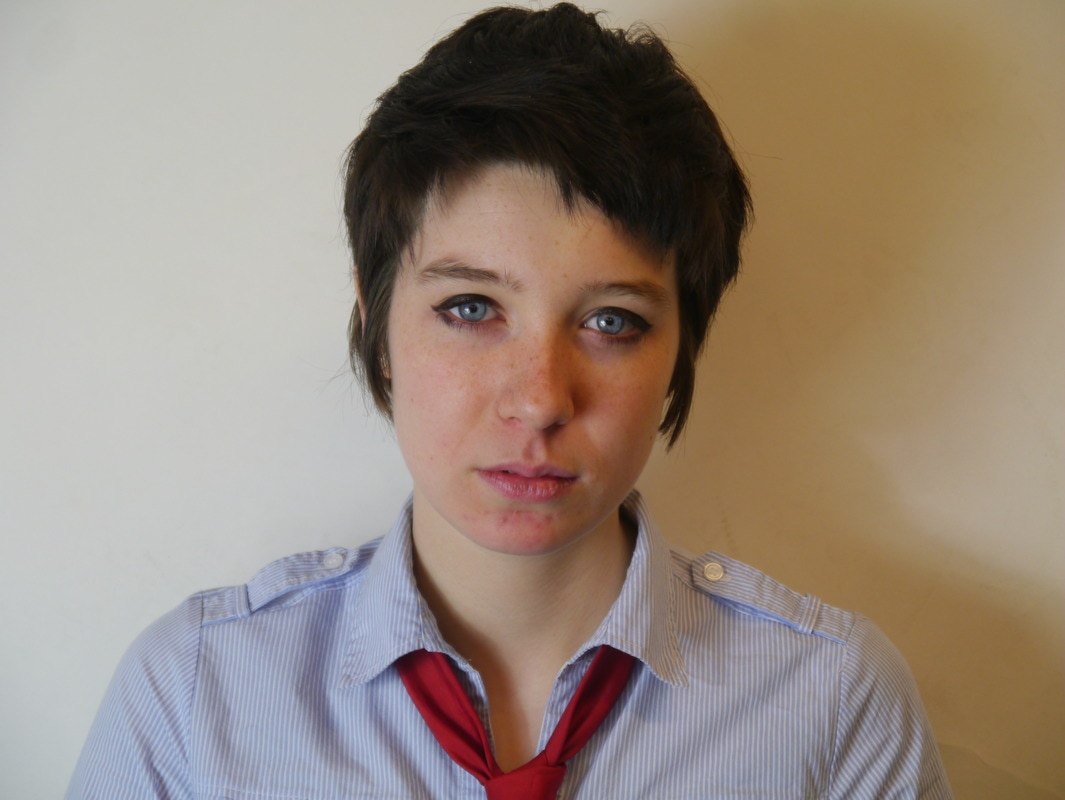
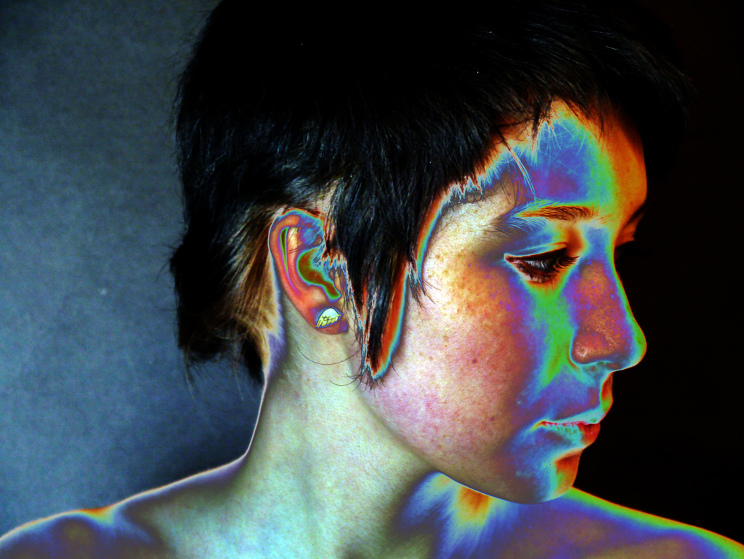
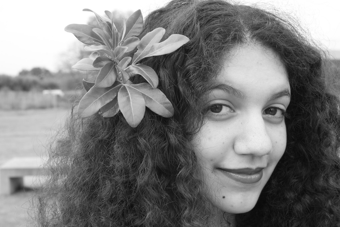
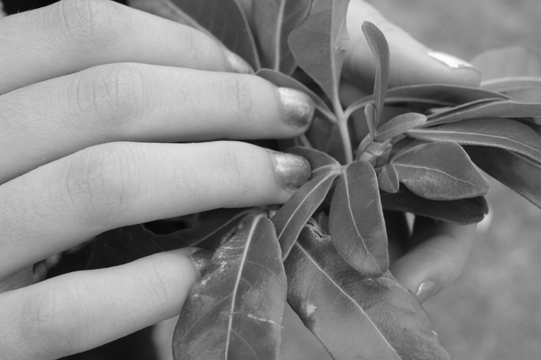
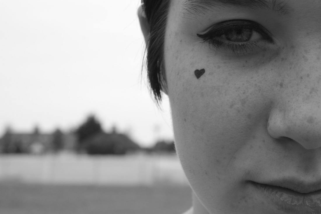
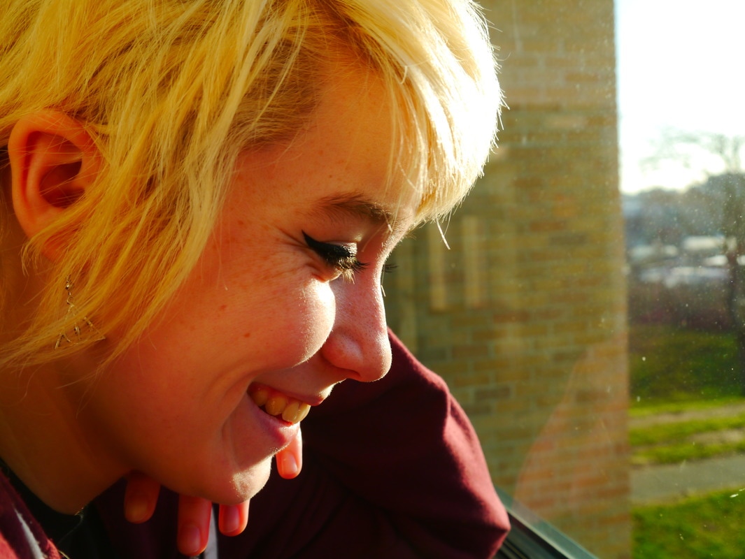
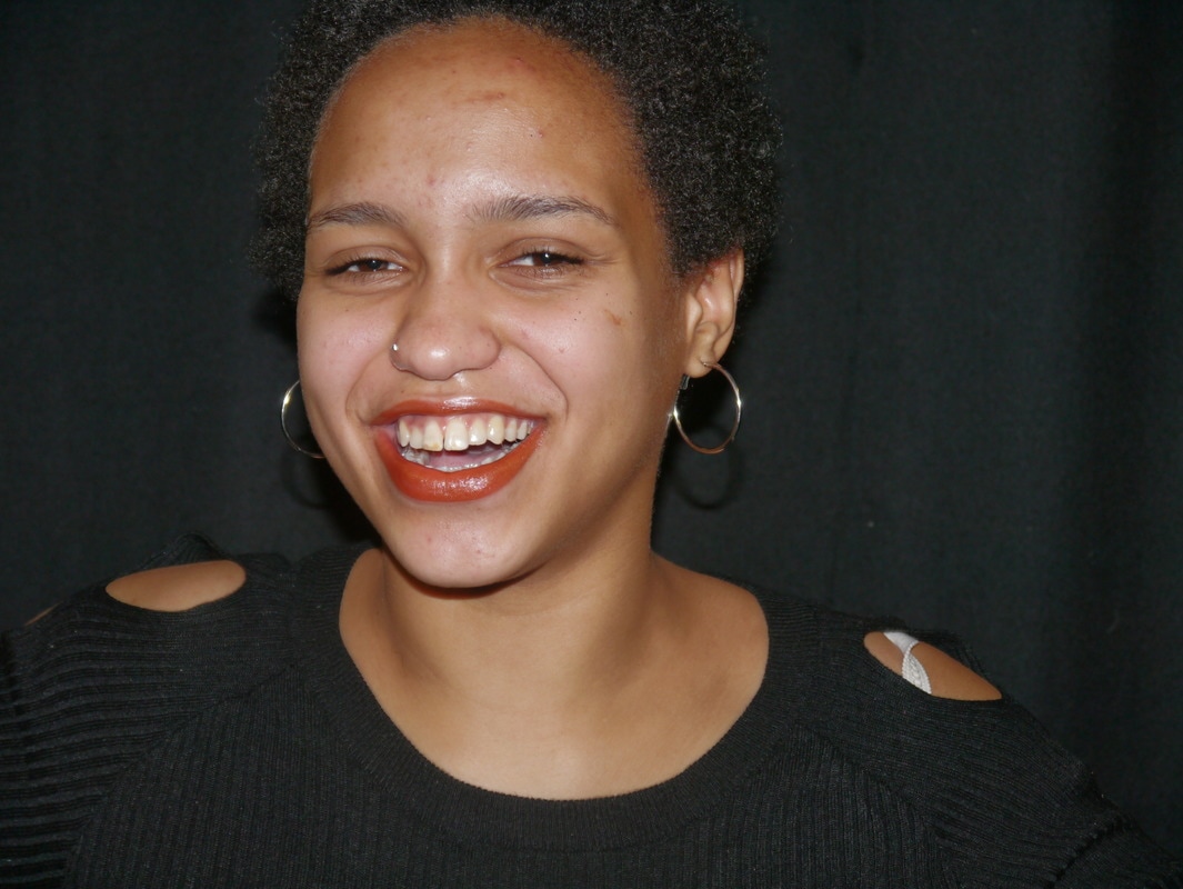
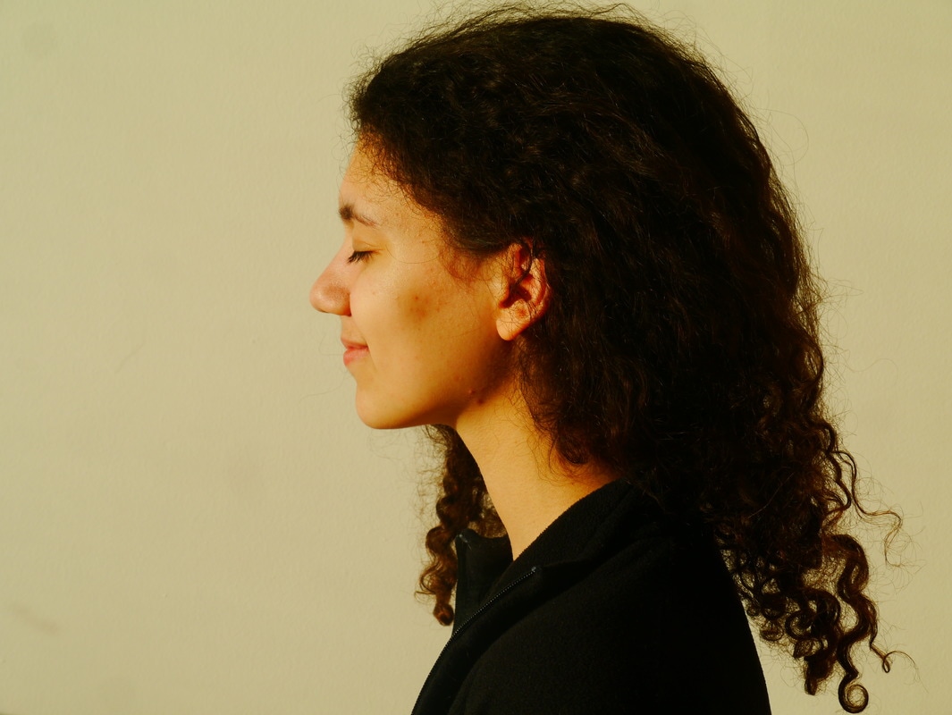
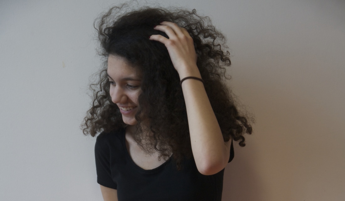
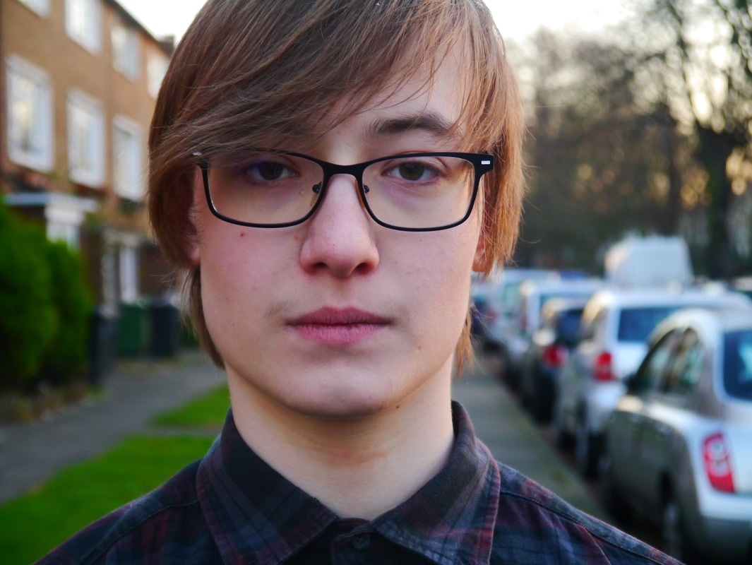
My personal investigation started off with my love of portraits and how people's faces were so expressive even when they didn't think they were being. This begins with my photobook, stemming from my interest in psychology and the different reactions people have to events in their life. My first series of portraits were headshots taken with the intention of actually using them, thus committing me to a different level of quality. From there I looked into Staged Photography, with artists such as Roger Ballen and Gregory Crewdson. I made this leap because I was feeling that pure portraiture wasn't really expressing all that I wanted to, I found staged photography after having the idea that I wanted to create film stills. This is from my love of film and my intention of going into the film industry. I really like to experiment with different forms, like film and digital, moving and still, panoramas and landscapes.
The photobook
Photobooks were first used as a tool of cataloguing artists works. Most though of the first photobook is that it is 'Photographs of British Algae: Cyanotype Impressions(1943-1953) which was created by Anna Atkins. The book was released to assist the scientific community when identifying marine specimens. In the beginning, photobooks had photographs put onto the pages rather than printed directly onto the paper stock. These were printed in a lot lower quantities and only able to be purchased by the privileged.
edges
|
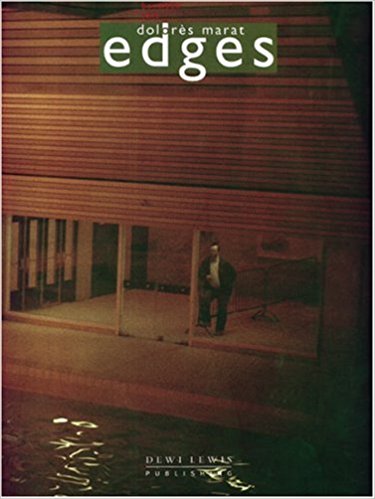
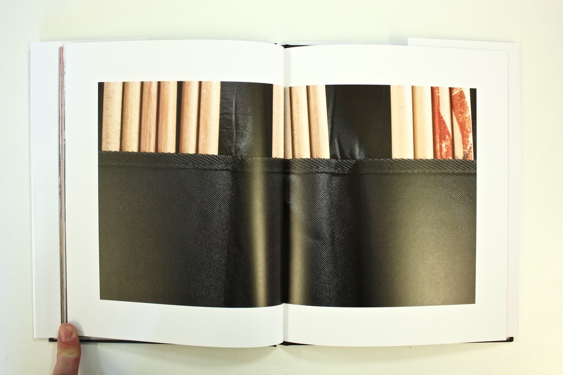
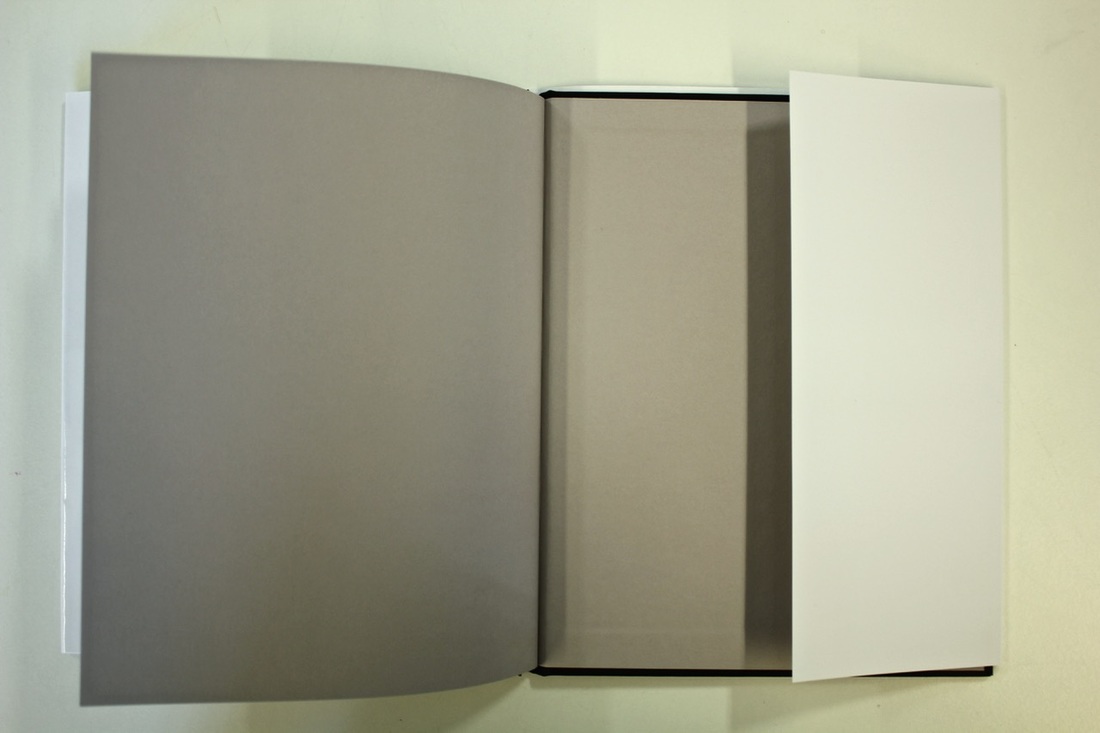
The book edges is about life in (mostly) Paris. Dolorès Marat takes pictures from a decade of her life, first published in 1996.
If I summarised the subject in one sentence it would be; a hidden view of Paris. The cover is a man standing facing a glass wall. On the back cover, it is the other half of the image, it is the surrounding building that the man is inside. The picture is a full bleed across the two pages. The title is at the top of the page. The collection of photographs are really important, as they show what isn't usually shown. They were taken at a time when the subject wasn't expecting them, they are realistic and reflective of real life. I think that's what makes these photographs stand out and the reason why I made it to the end of the book. |
|
|
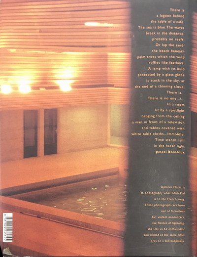
I'm not fully sure of the photographer's intentions with this book, but I think that the message is so clear that it definitely transmits a message. The pictures throughout the book are thought out, you can tell this as they all have the same layout. The pictures have coherent meaning between them.
I think that after viewing the book I remember the theme more than the individual pictures. I remember the flow of the pictures and the technique that the photographer used, like that the pictures were partially out of focus or blurred. This shows that they were more focused on the moment rather than the crispness of the photos.
I think that after viewing the book I remember the theme more than the individual pictures. I remember the flow of the pictures and the technique that the photographer used, like that the pictures were partially out of focus or blurred. This shows that they were more focused on the moment rather than the crispness of the photos.
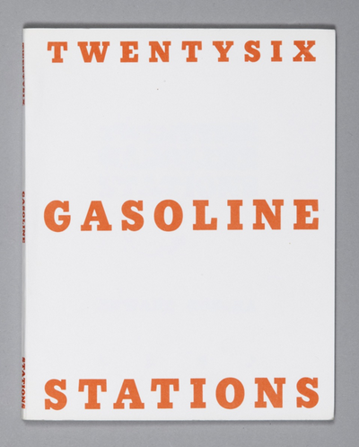
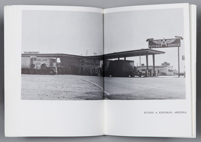
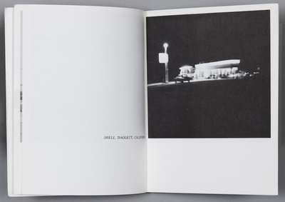
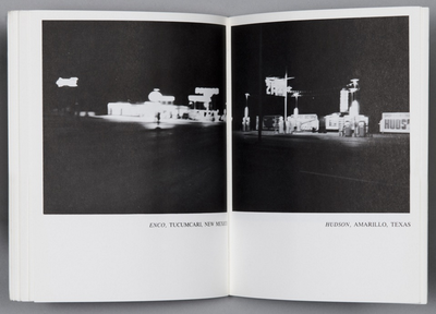
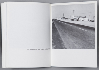
Twentysix Gasoline Stations
|
|
Edward Ruscha made a lot of typological books, he would photograph phenomena such as gas stations and car parks. He was one of the first people to do this, many people since have followed in his footsteps.
I’d always wanted to make a book of some kind. When I was in Oklahoma I got a brainstorm in the middle of the night to do this little book calledTwentysix Gasoline Stations. The book is twenty-six gas stations. The simple design and execution of the book allow the reader to focus solely on the pictures.
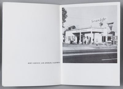
On the cover, the words 'TWENTYSIX GASOLINE STATIONS" are printed in bold orange font. I think that this is significant because it is plain where other books are not and the orange is a colour not often used as it a title font, this makes it bolder and more individual. Again, like the inside of the book, the cover is very simple. I think that the thing that makes his photographs stand out is that they are all of the same thing/ideas. This makes his book feel like a typology as there are clear relationships between all the images. The pictures are all of the same sizes but some have the place name underneath them allowing there to be two per double page, and some have the name place on the opposite page giving priority to that one image on both place, the pictures are definitely thought out how they'll be presented. |
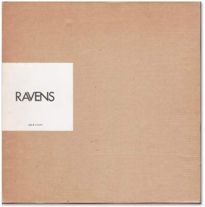
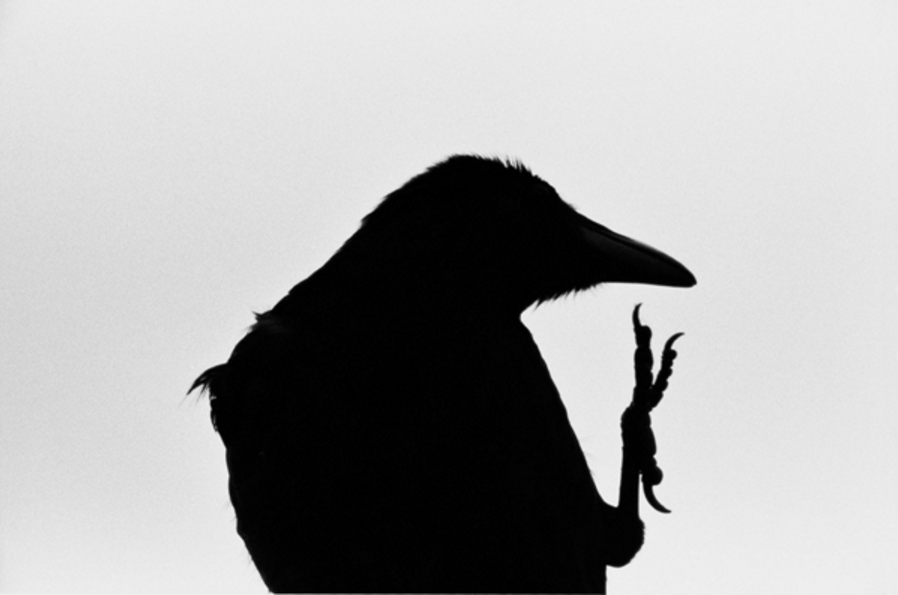
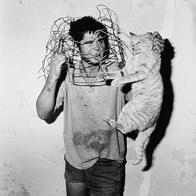
Ravens or The Solitude of Ravens
|
ワタリガラス published in Japan these pictures were taken over a 10 year period. He was inspired by the loneliness that he felt after his wife left him
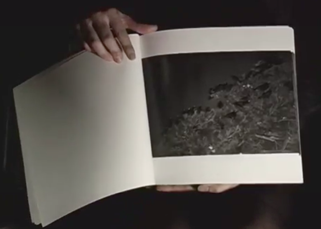
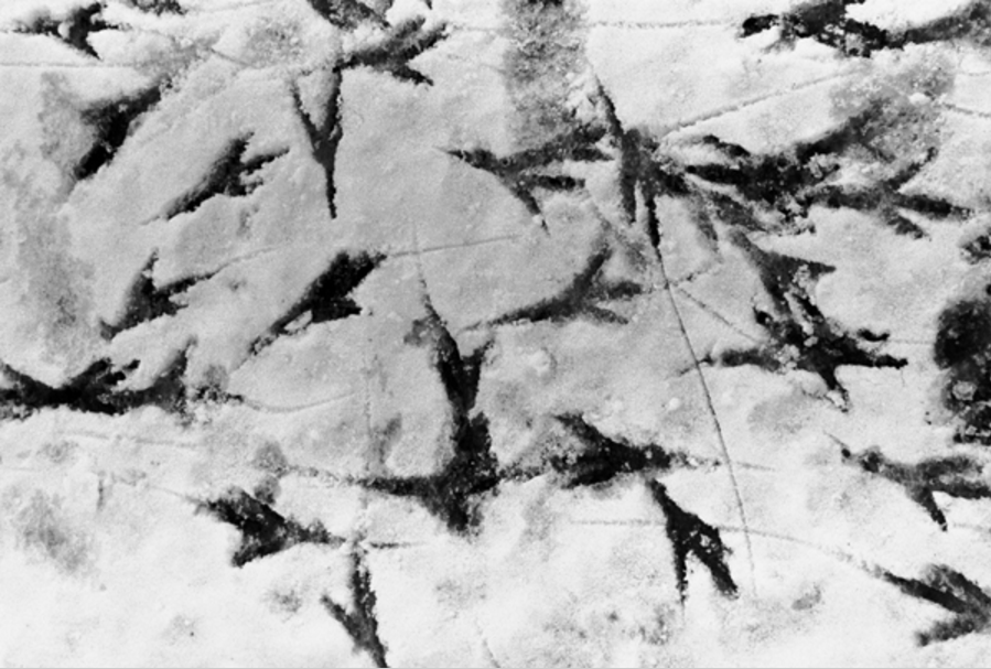
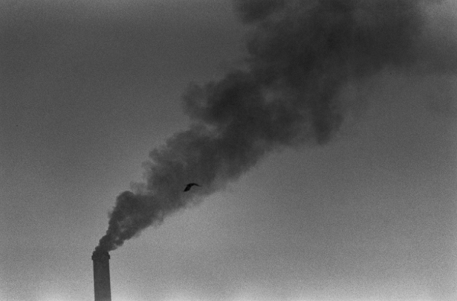
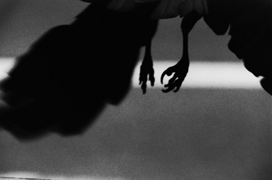
They are captured in flight, blurred and ominous, and at rest, perching on telegraph wires, trees, fences and chimneys. Fusake photographs them alive and dead, and maps their shadows in harsh sunlight and their tracks in the snow. In an article by the Guardian, they publish that the BJP asked a panel of experts to choose what they thought was the best photobook of the last 25 years. They choose this, the second was The Ballad of Sexual Dependency by Nan Goldin, the BJP said that it was "an obscure masterpiece". Although he photographs mostly ravens there are other subjects in his book, such as: "a nude, fleshy masseuse, a malevolent-looking cat, windswept girls peering over a boat rail, a homeless man drinking in what looks like a municipal rubbish tip"
|
|
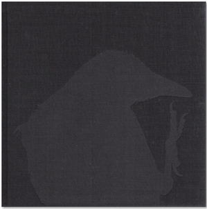
I think that this book is about loneliness, about how he connects with the ravens on this. The dust cover is almost plain with the title printed onto a white square. Under the dust cover there is a black cover, with a grey raven printed on, it is one of the pictures that is in the book. I think that what stands out is the continuity between the pictures, the theme of ravens is so clear throughout. I think that the style of the photographs have similar patterns throughout also, such as there is a clear focus on the centre of the pictures. The work feels very sophisticated and concise.
|
|
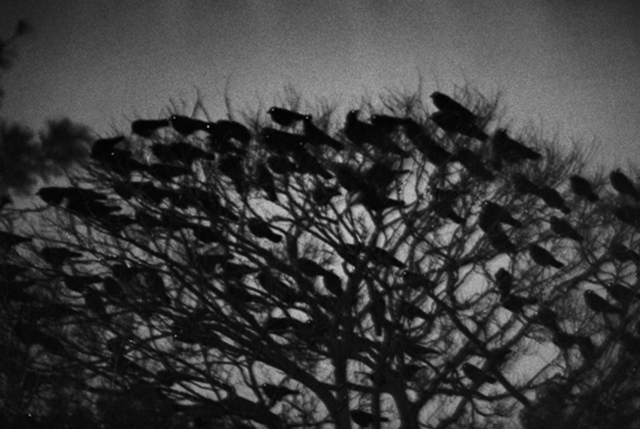
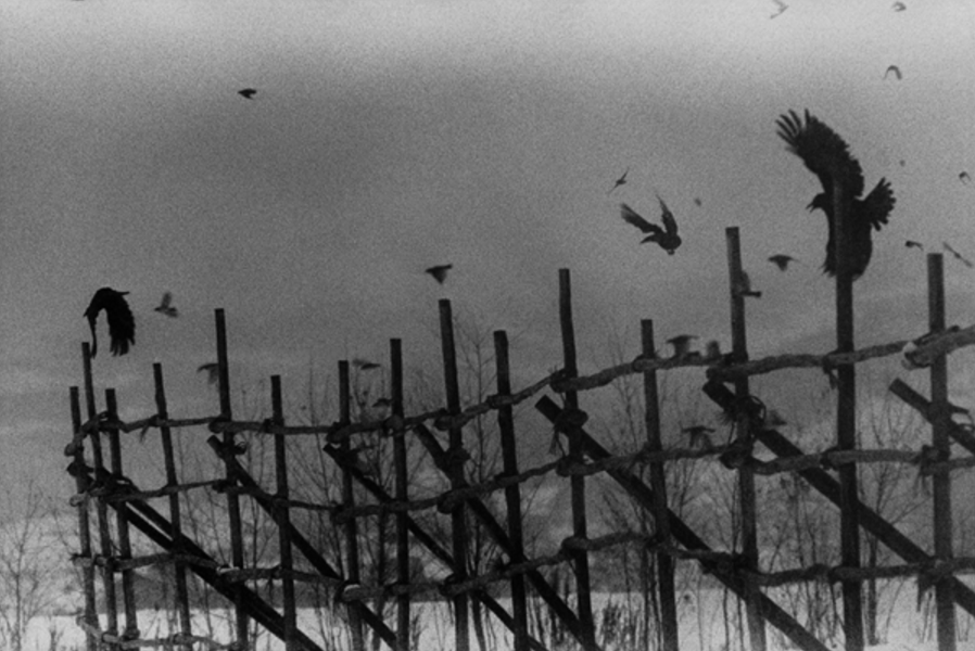
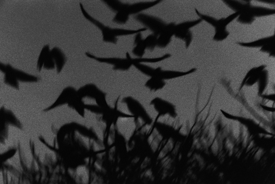
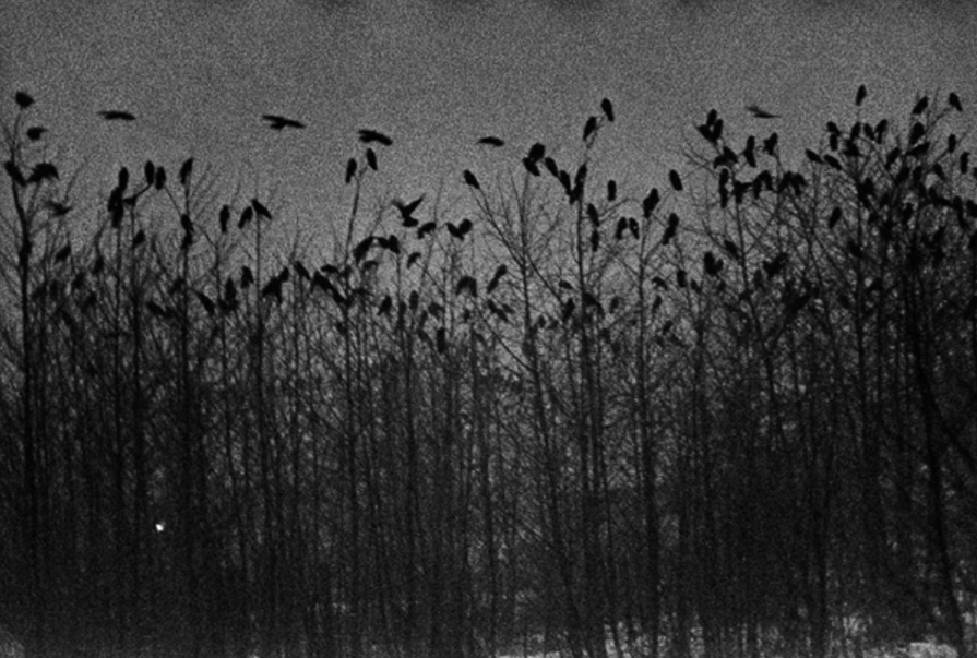
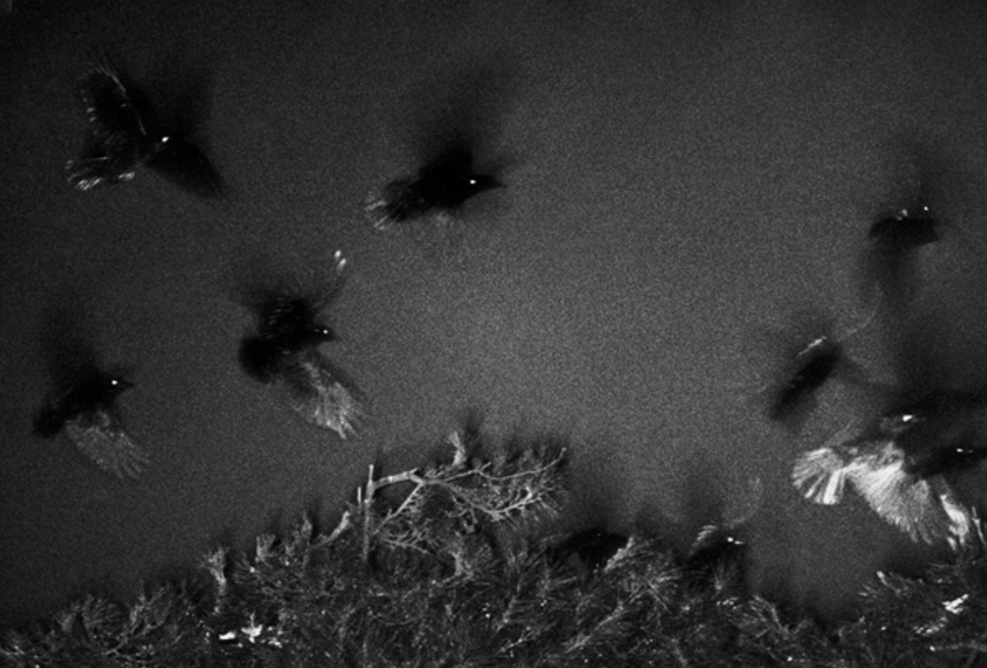
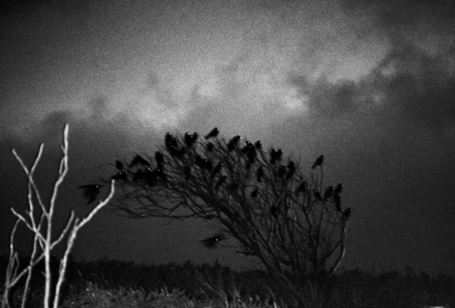
All of the pages are laid out the same giving the book a very formal and professional look. The fact that there is only one picture per double page gives that picture a focus and makes it look framed. Unlike most photobook, there are no words throughout the pictures, giving no explanation to the pictures letting the viewer interpret them how they wish.
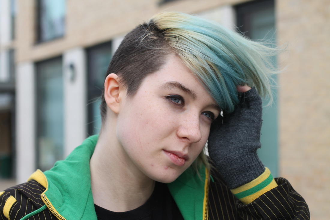
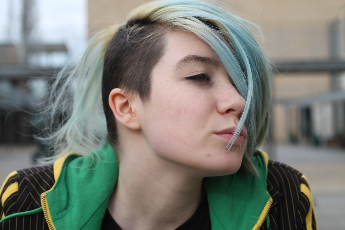
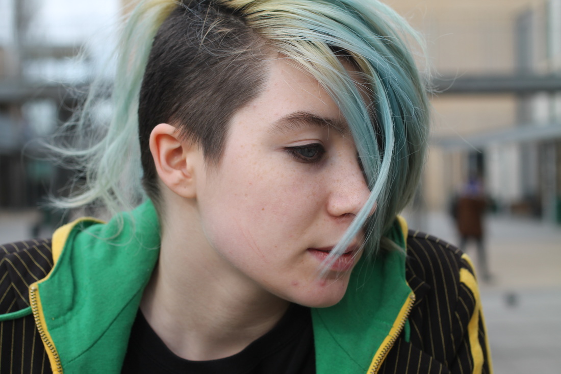
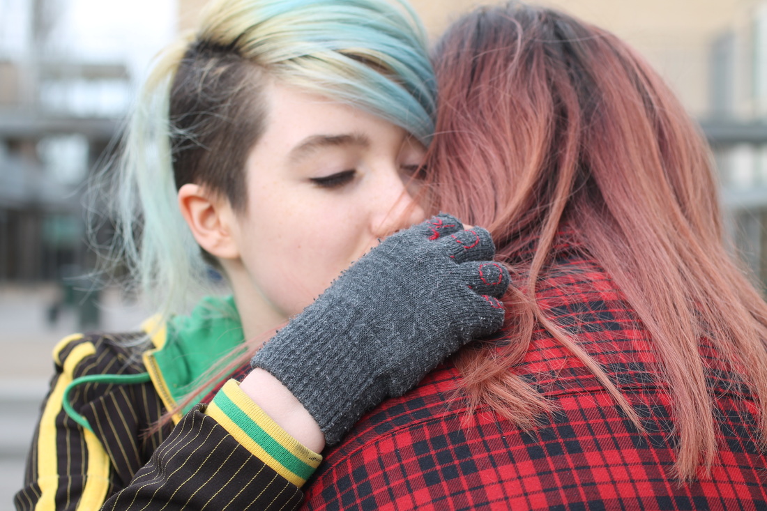
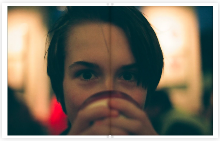
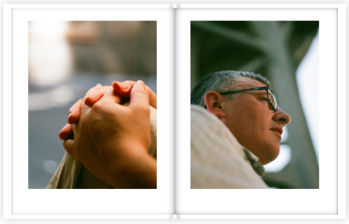
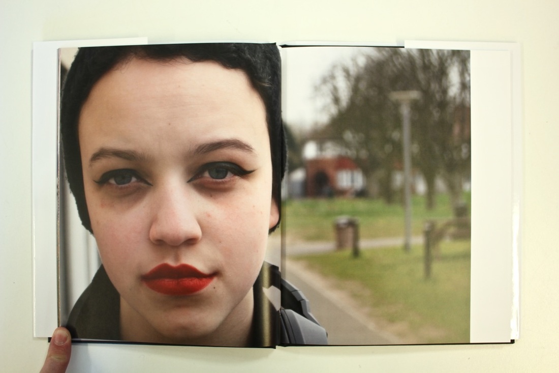
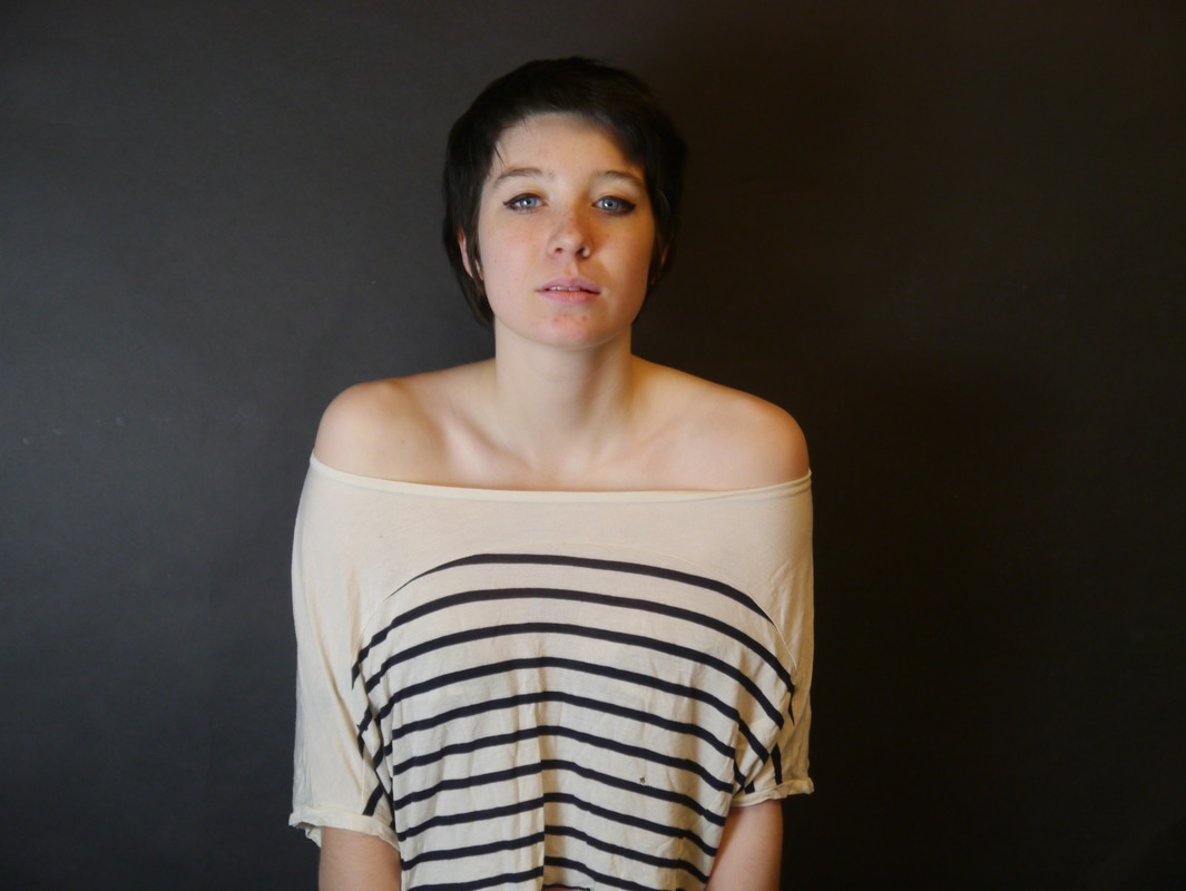
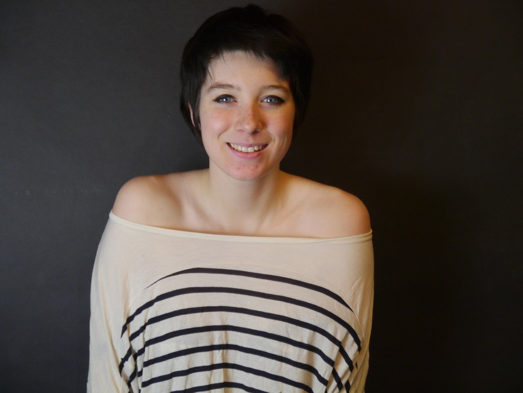
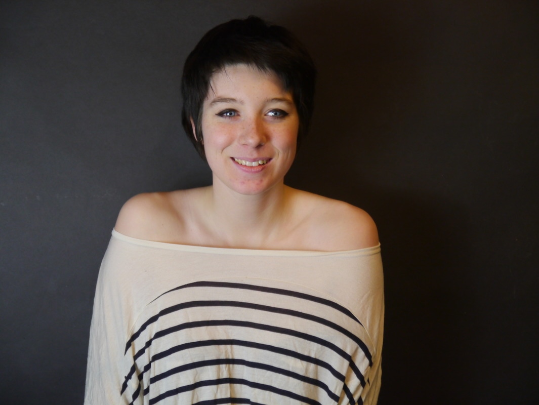
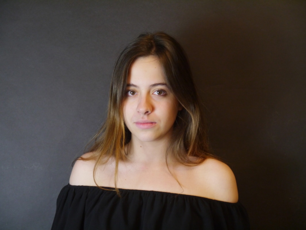
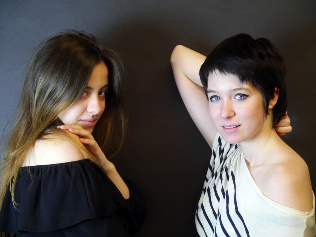
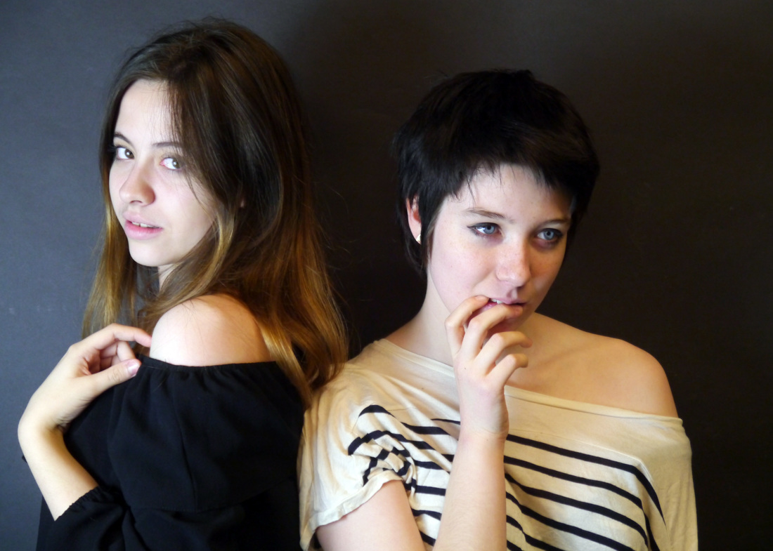
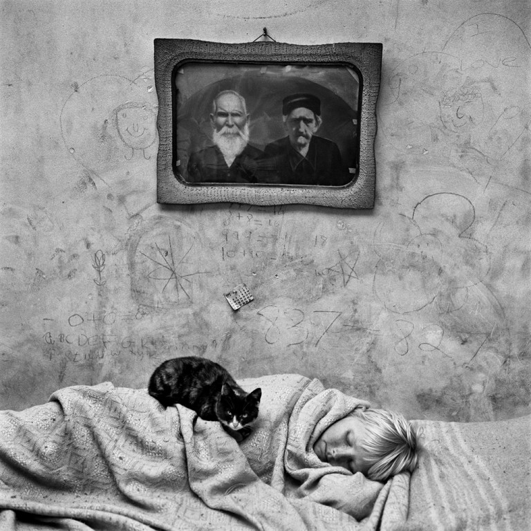
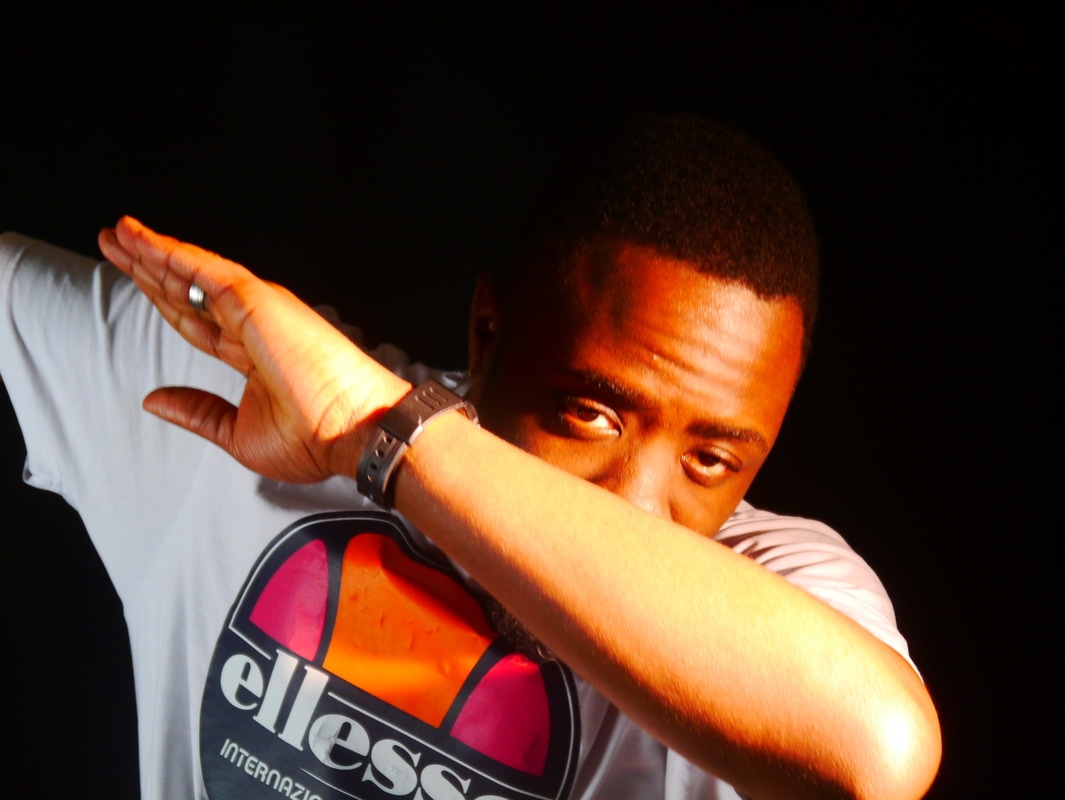
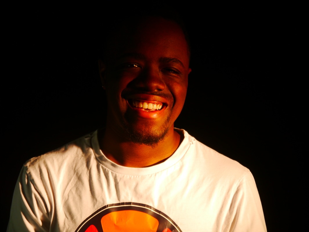
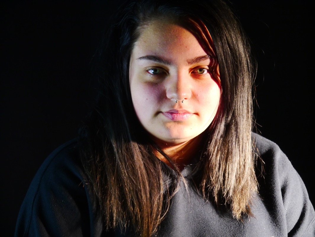
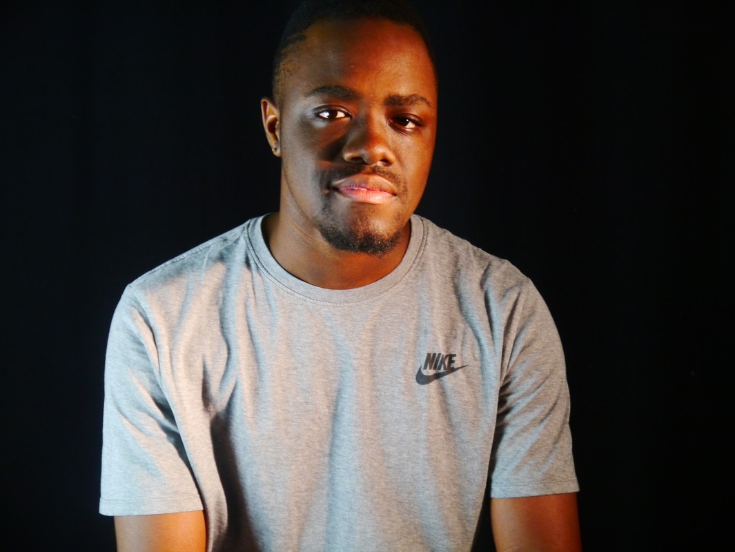
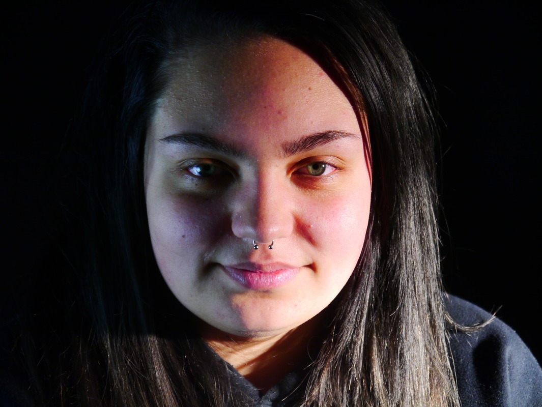
The start of my personal response.
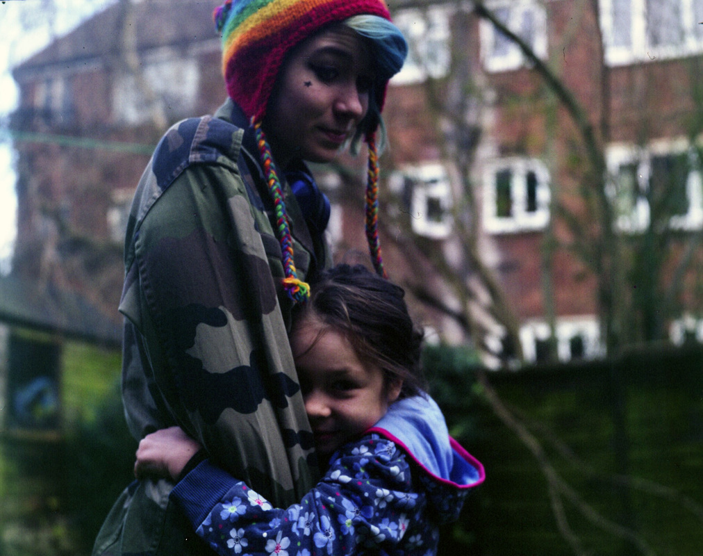
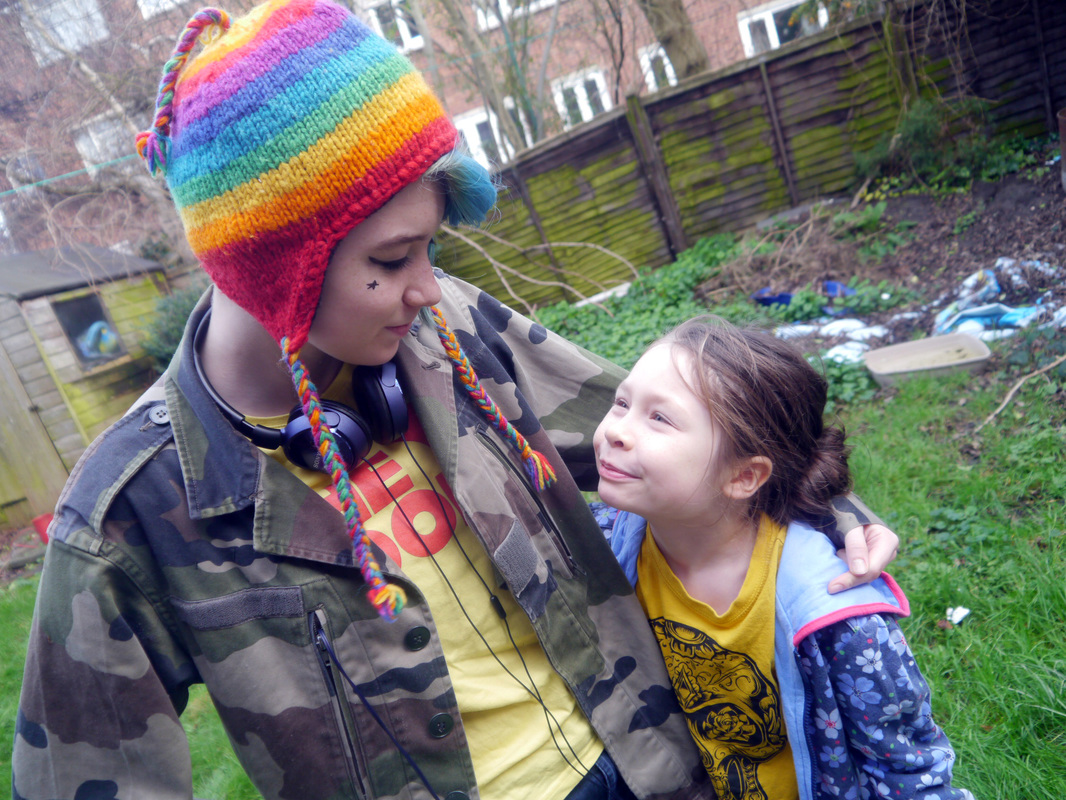
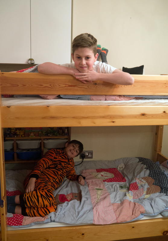
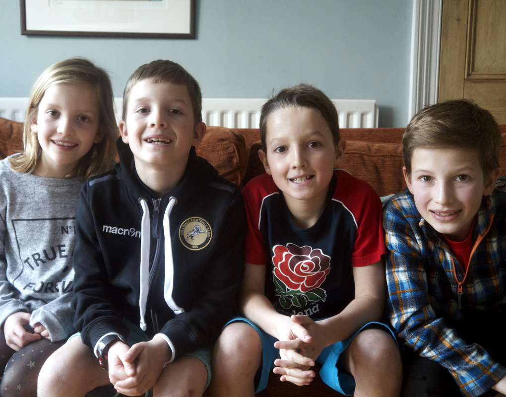
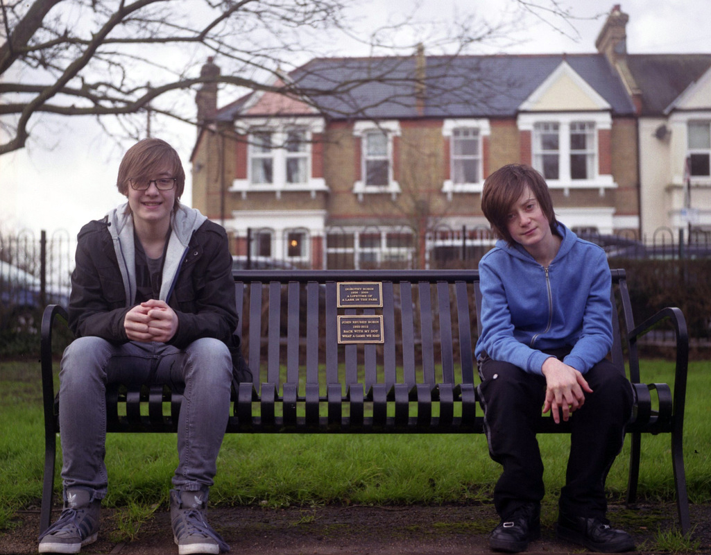
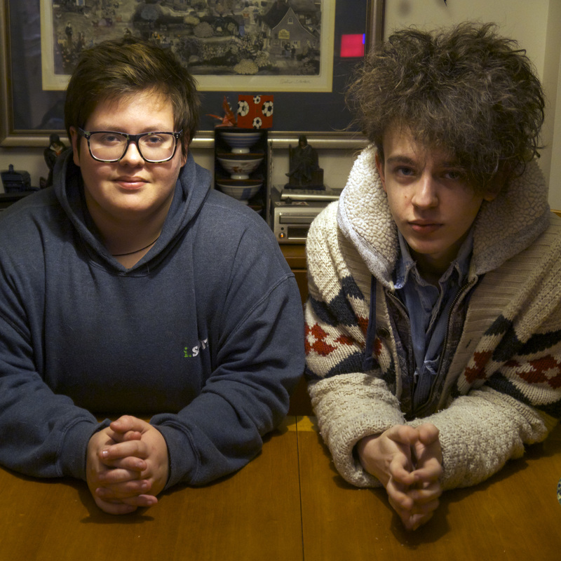
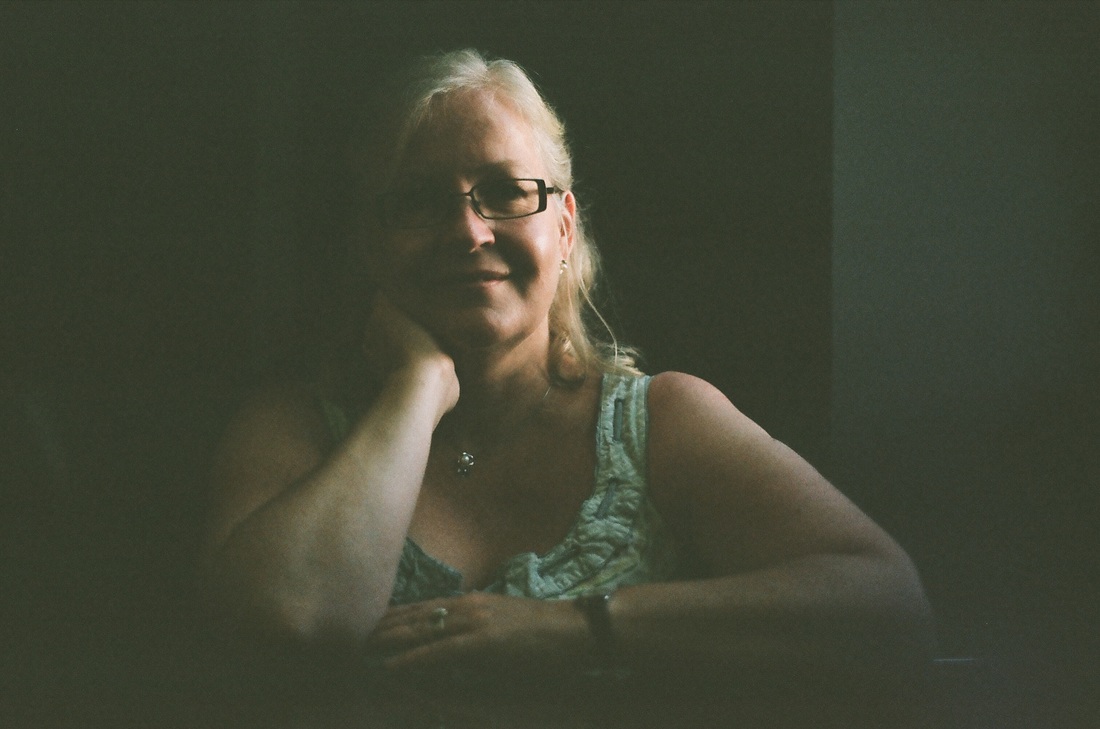
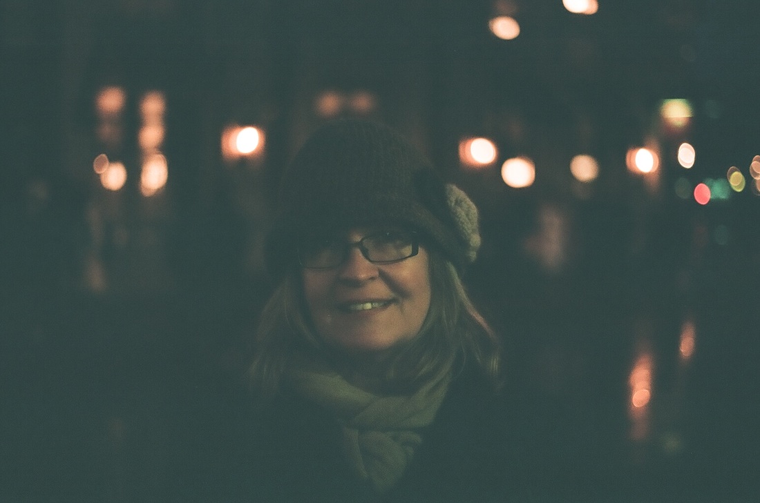
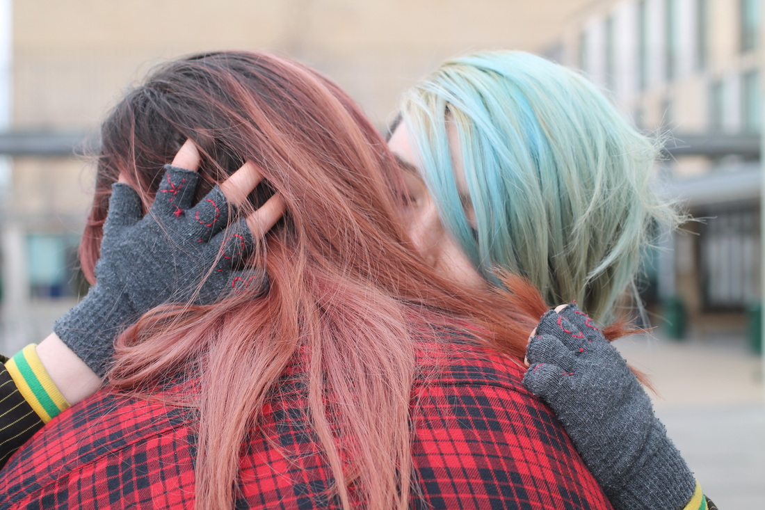
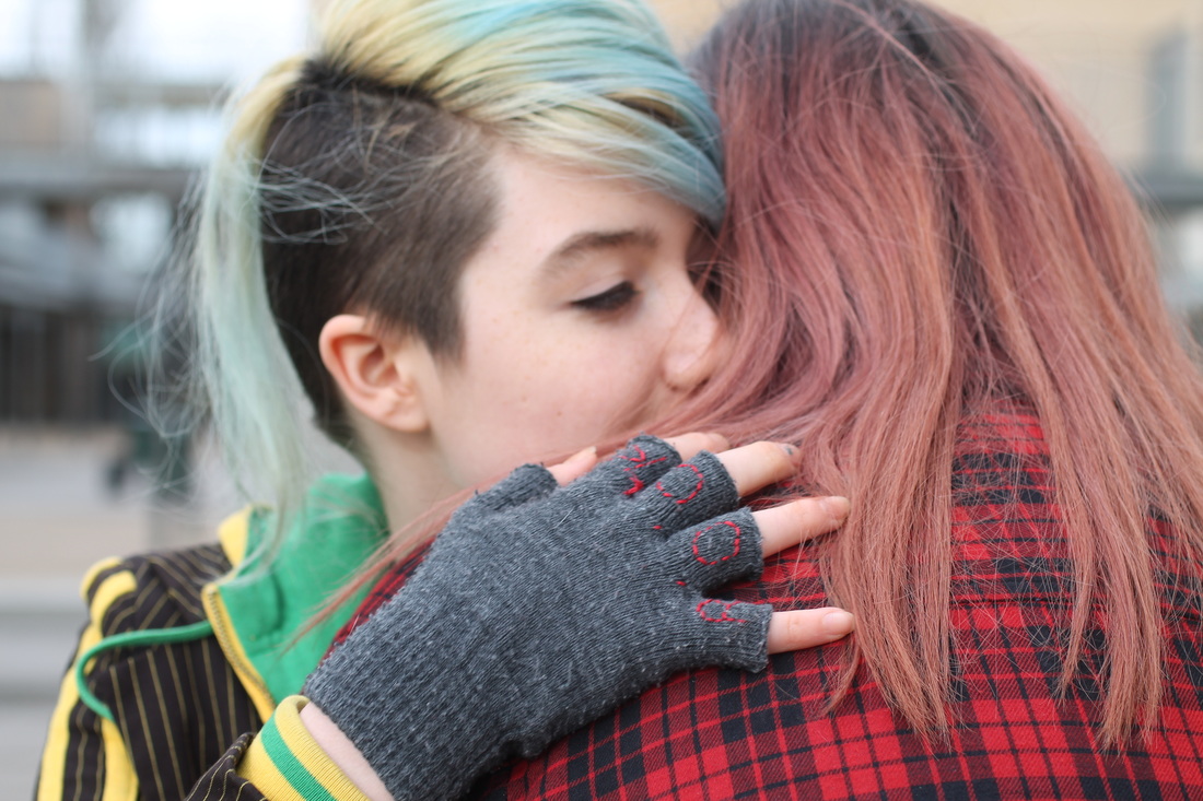
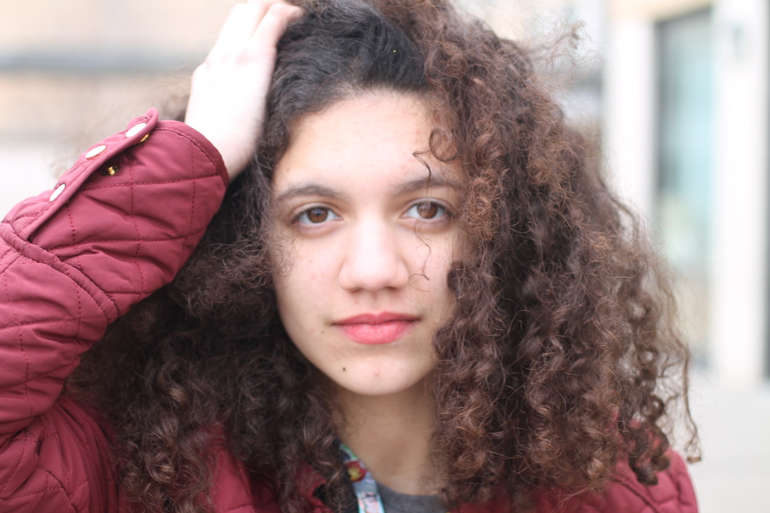
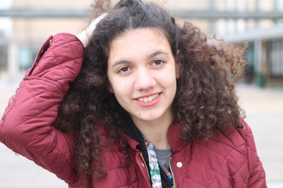
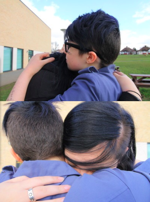
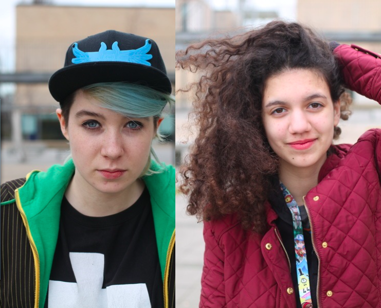
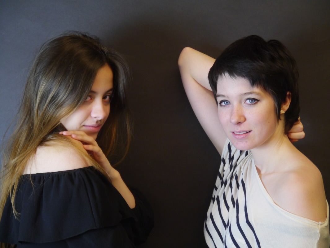
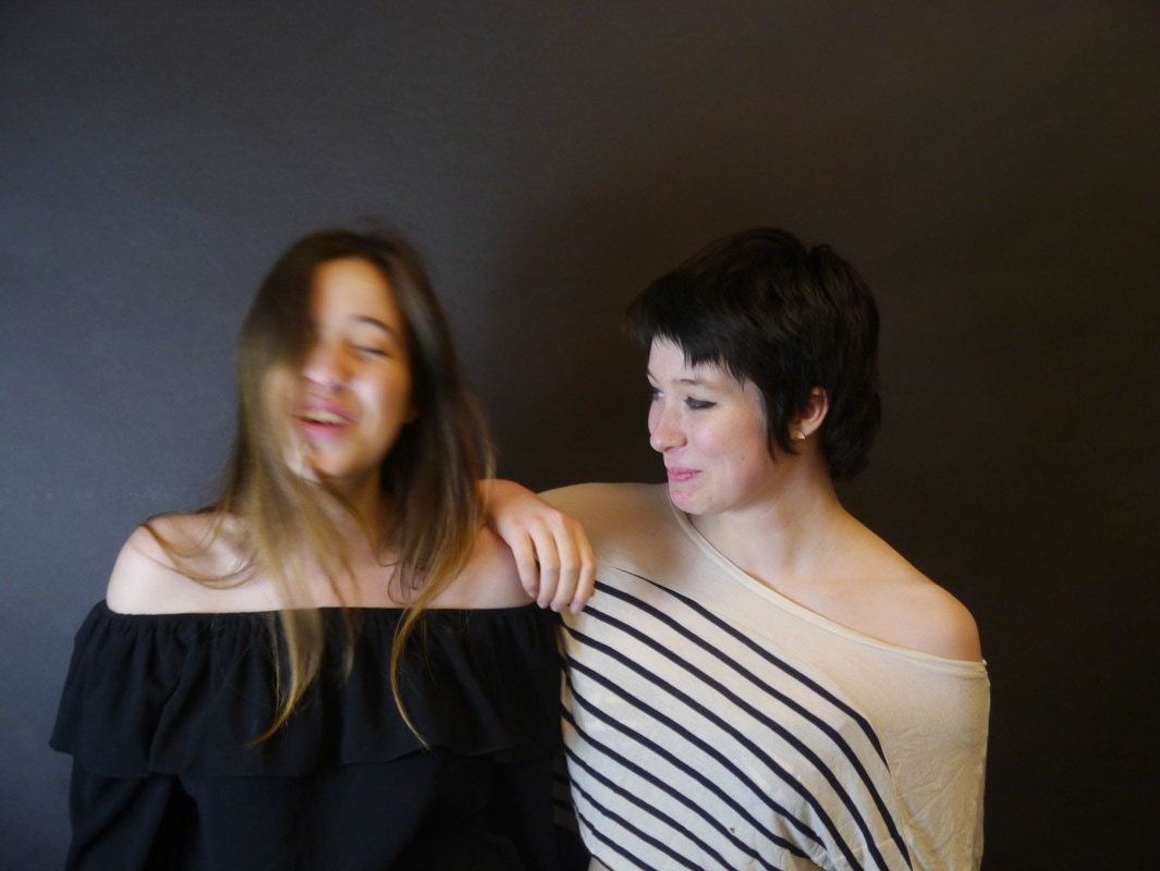
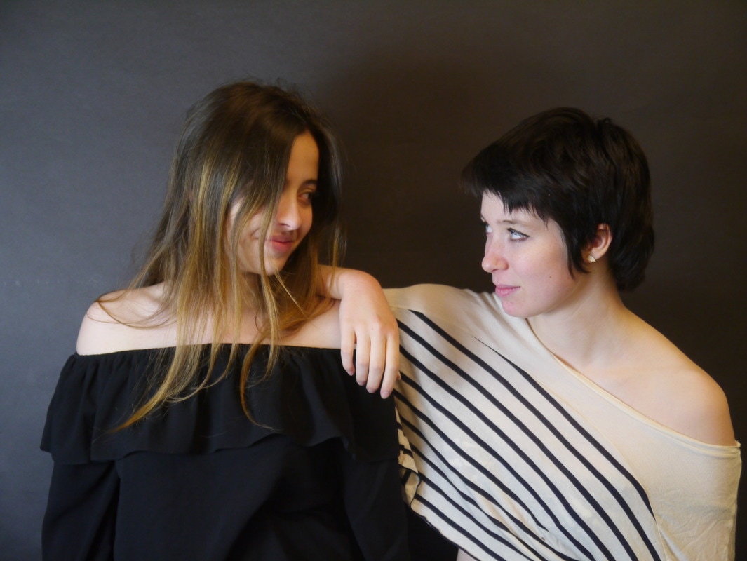
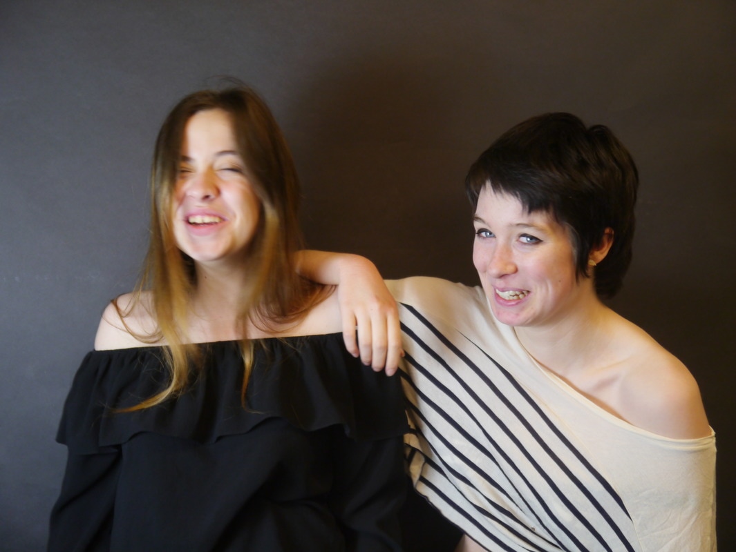
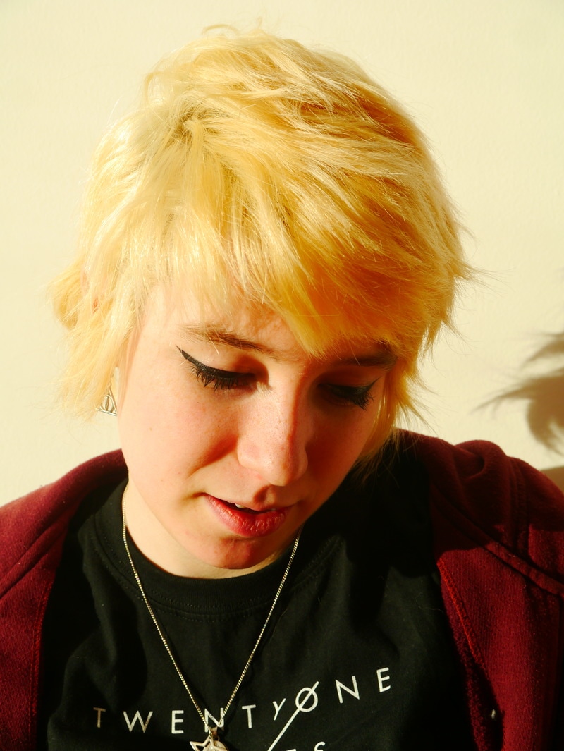
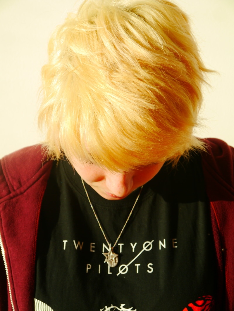
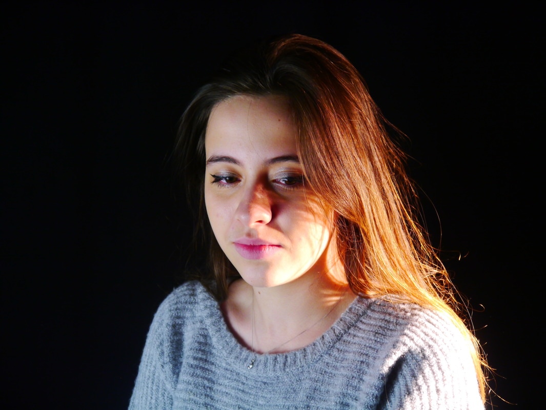
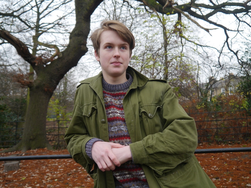
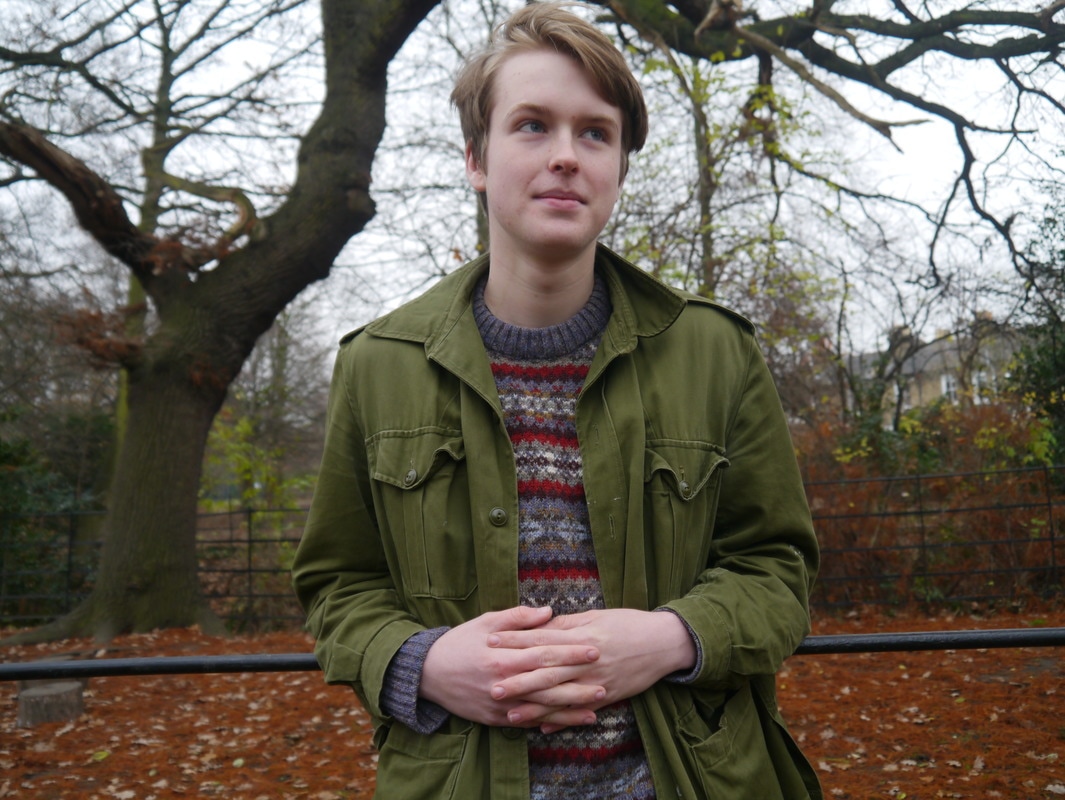
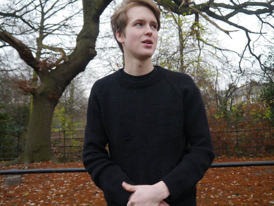
I am really fascinated with people, how they differ, how they chose to express their selves and what makes them, them. For this project there are several sets of siblings and some alone, the siblings were inspired by my relationship with my brother and how I see us as very different people but also have that blood relation. So, I went and talked to some siblings that I know and these are most of the pictures that came out. I was also interested in parents, so there are several pictures of my mum.
|
|
|
|

|
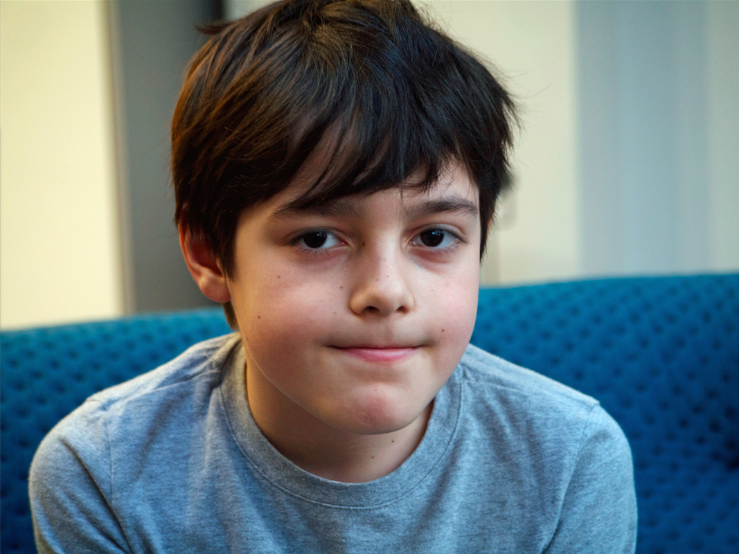
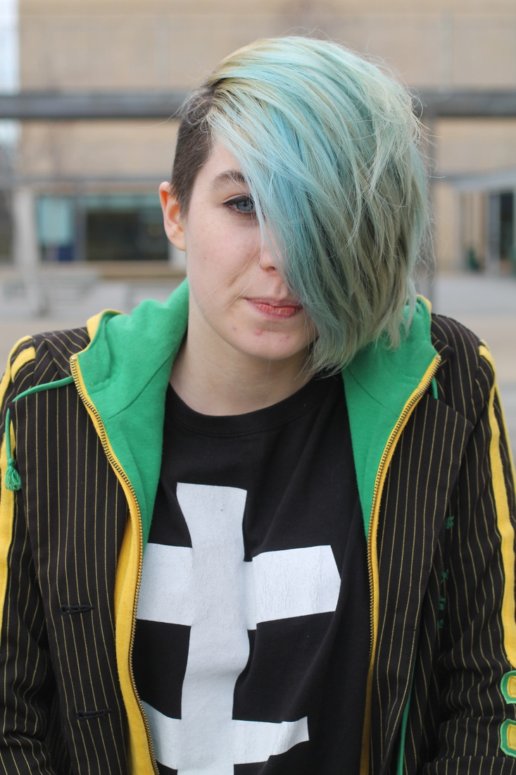
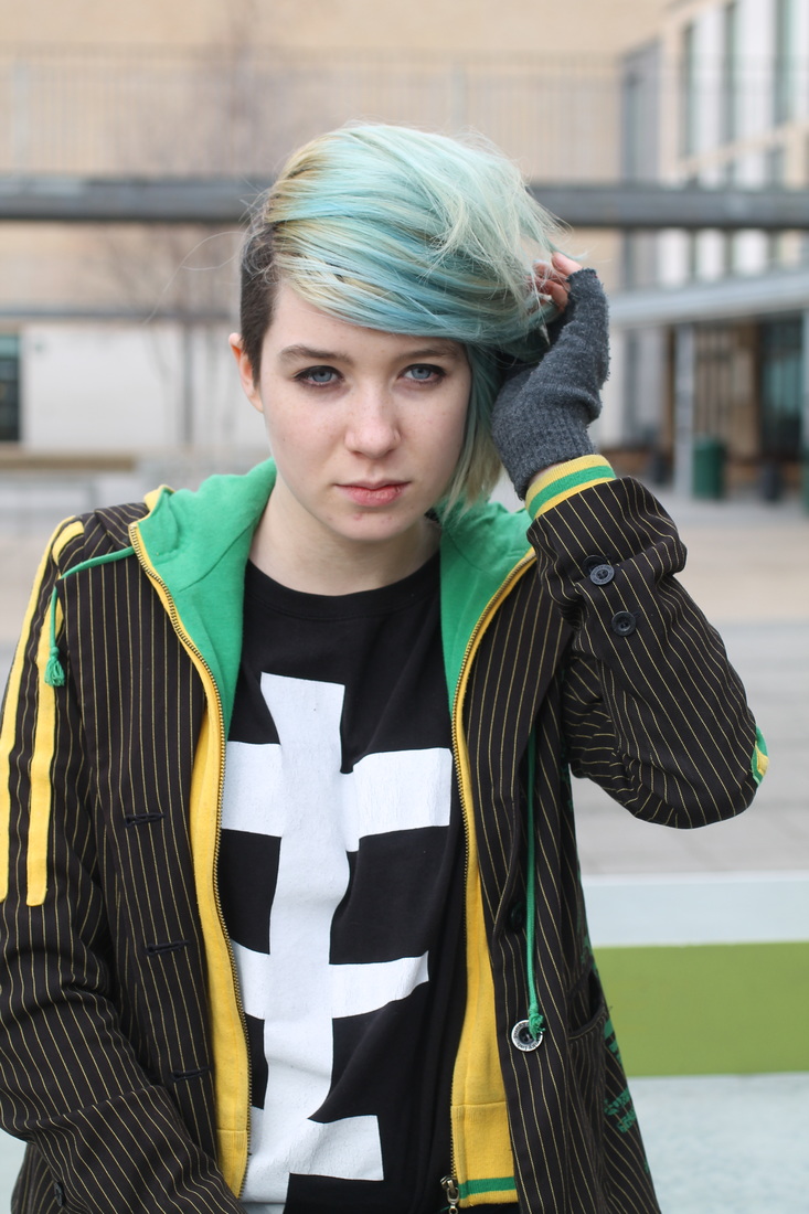
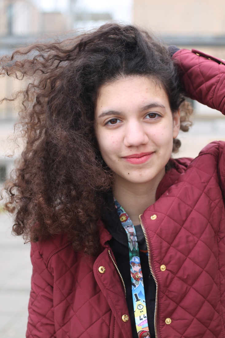
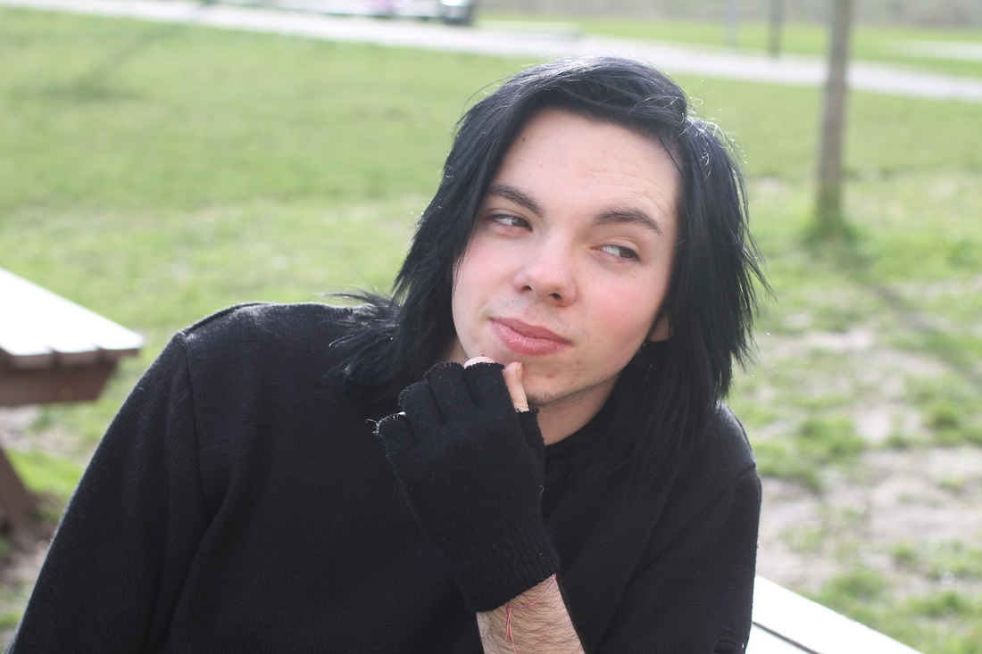
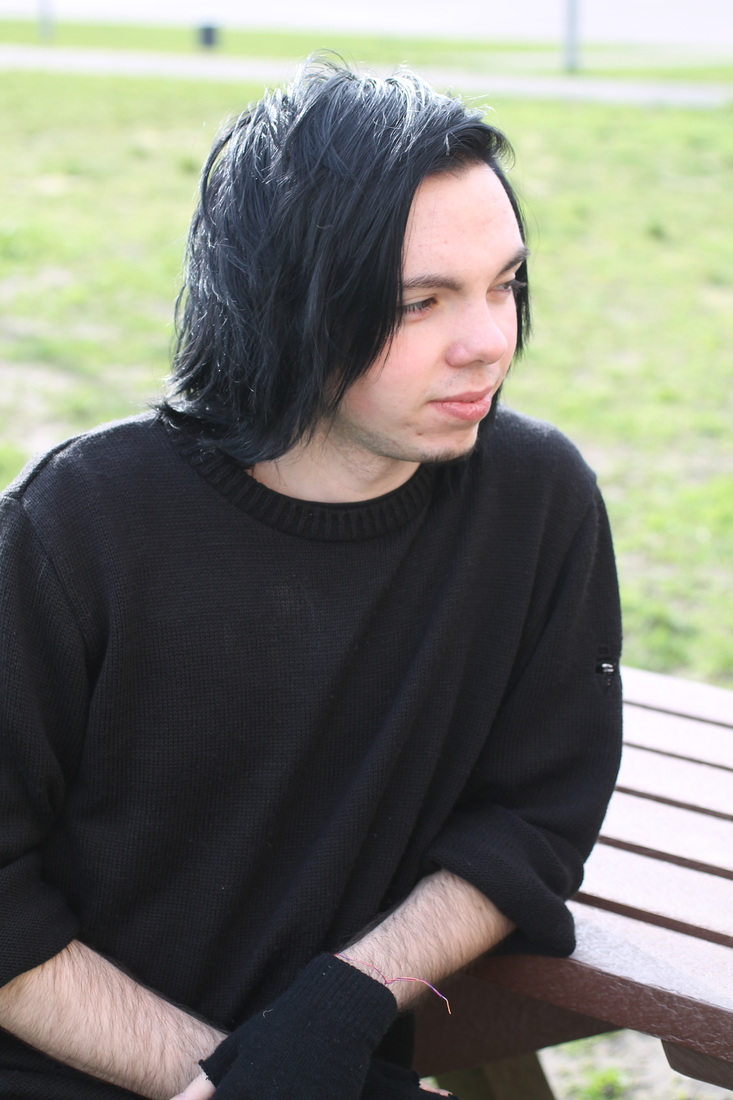
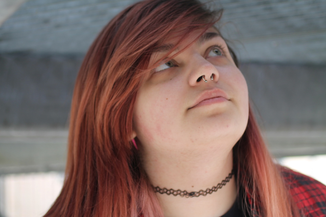
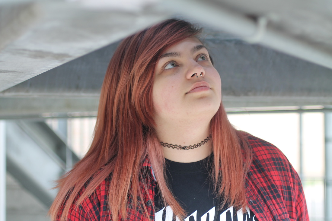
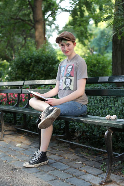
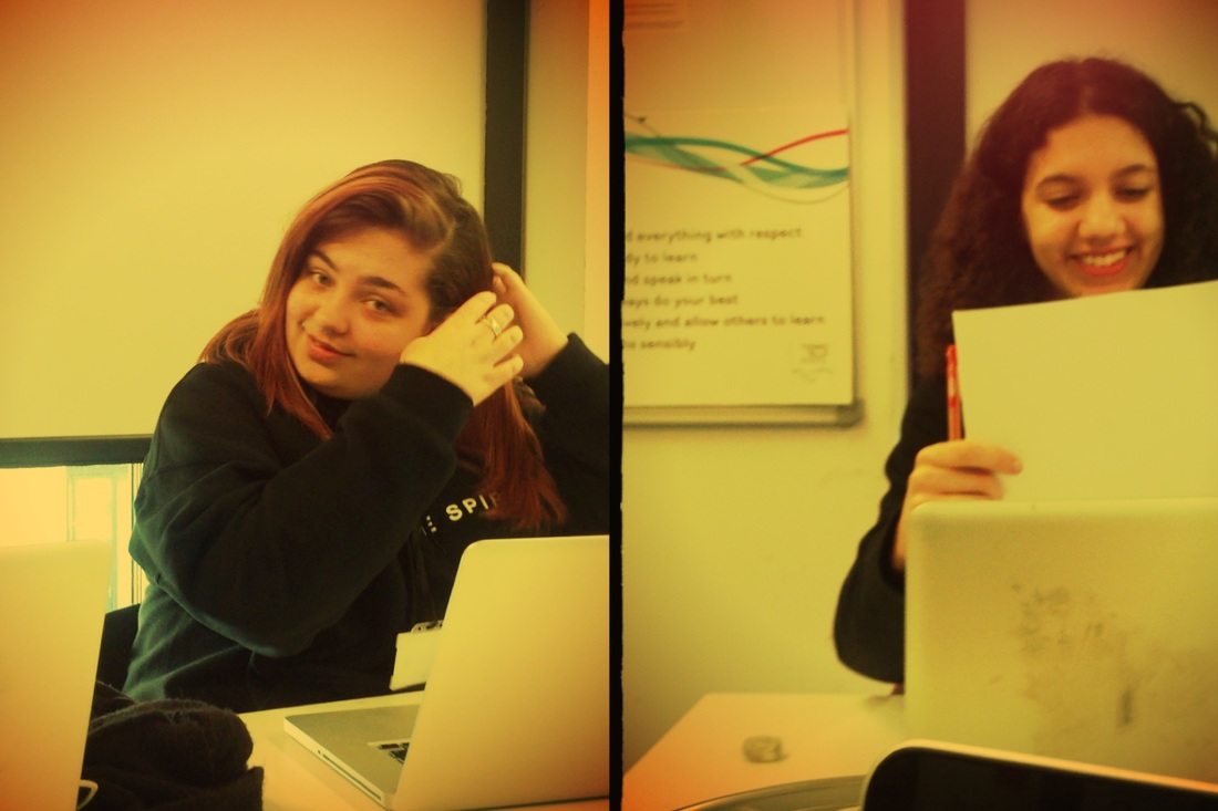
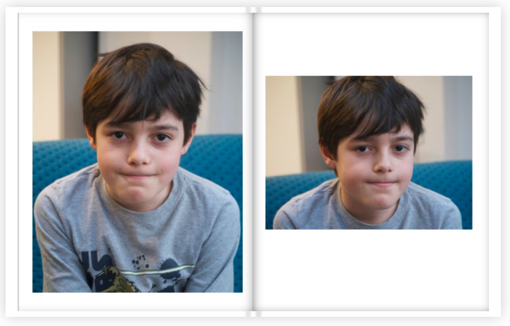
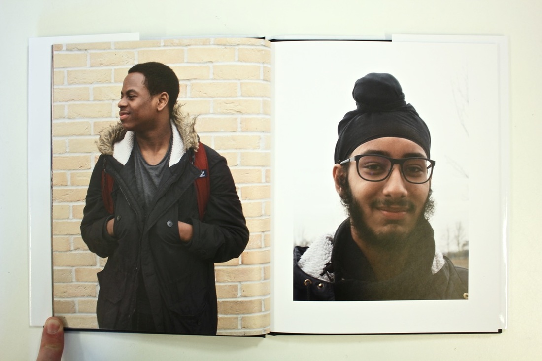
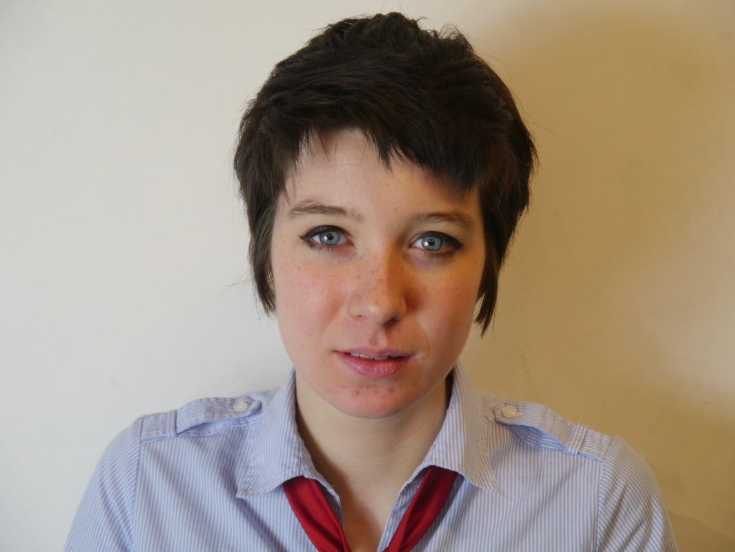
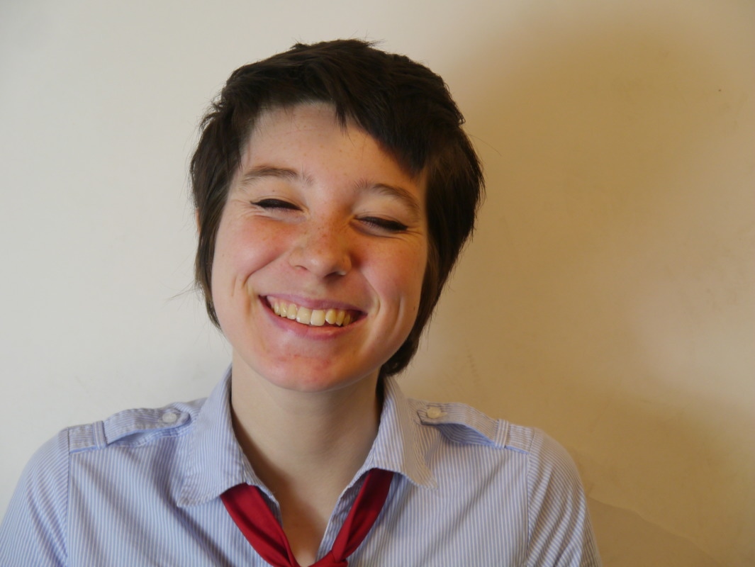
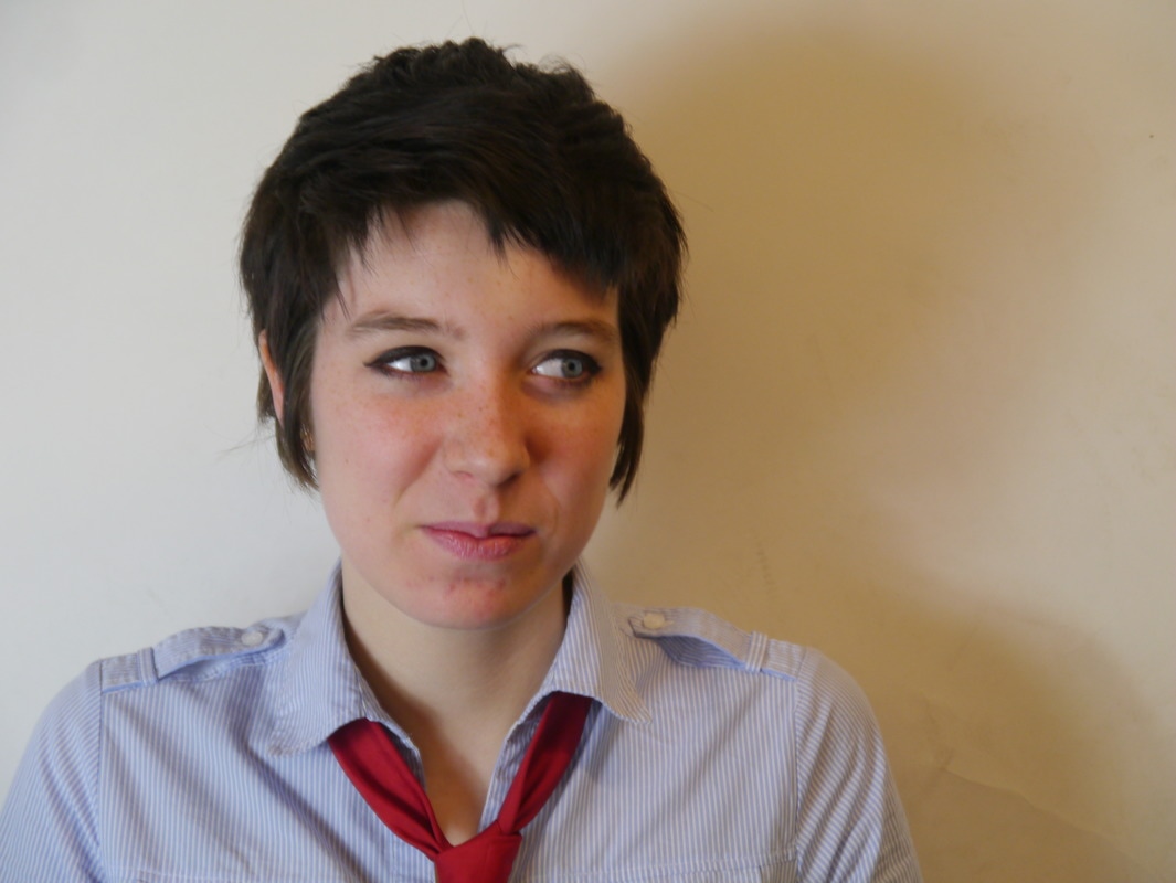
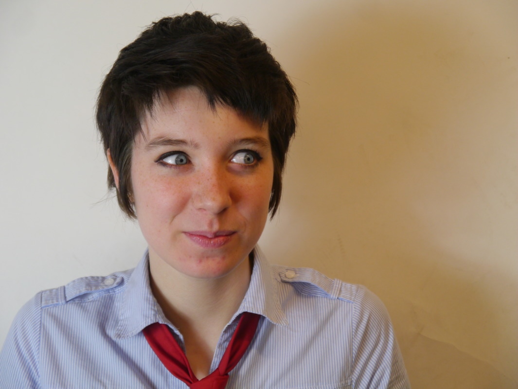
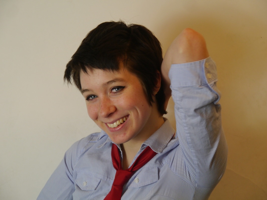
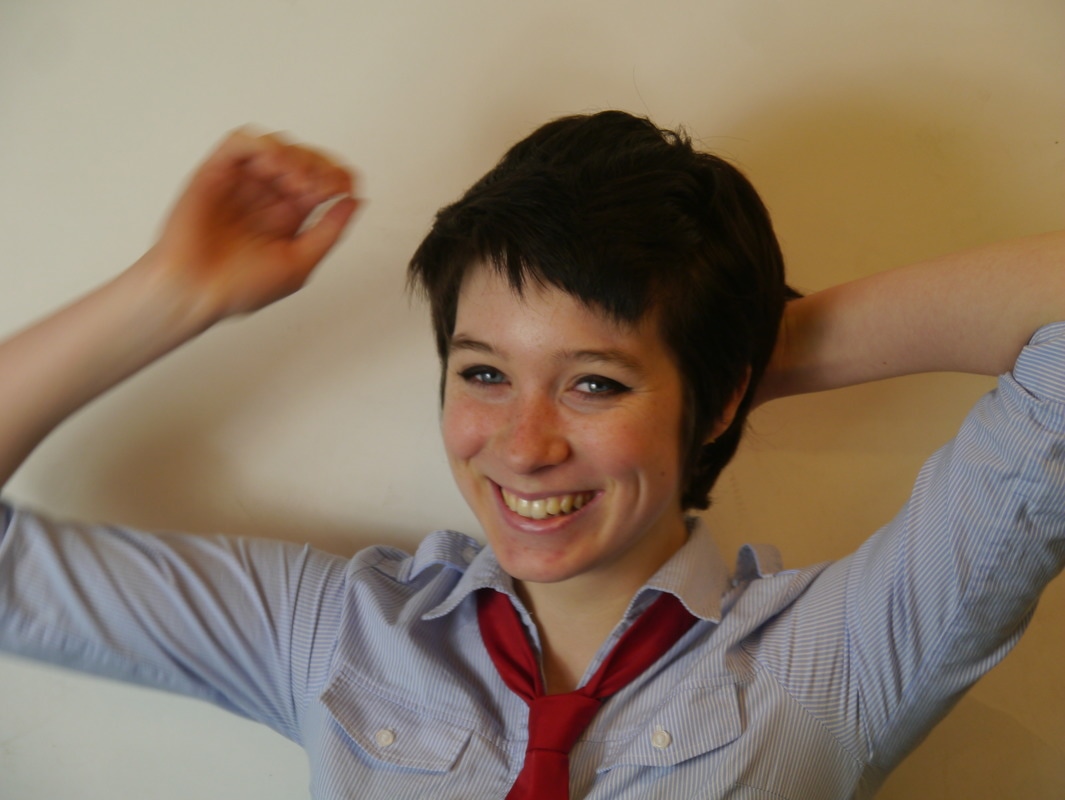
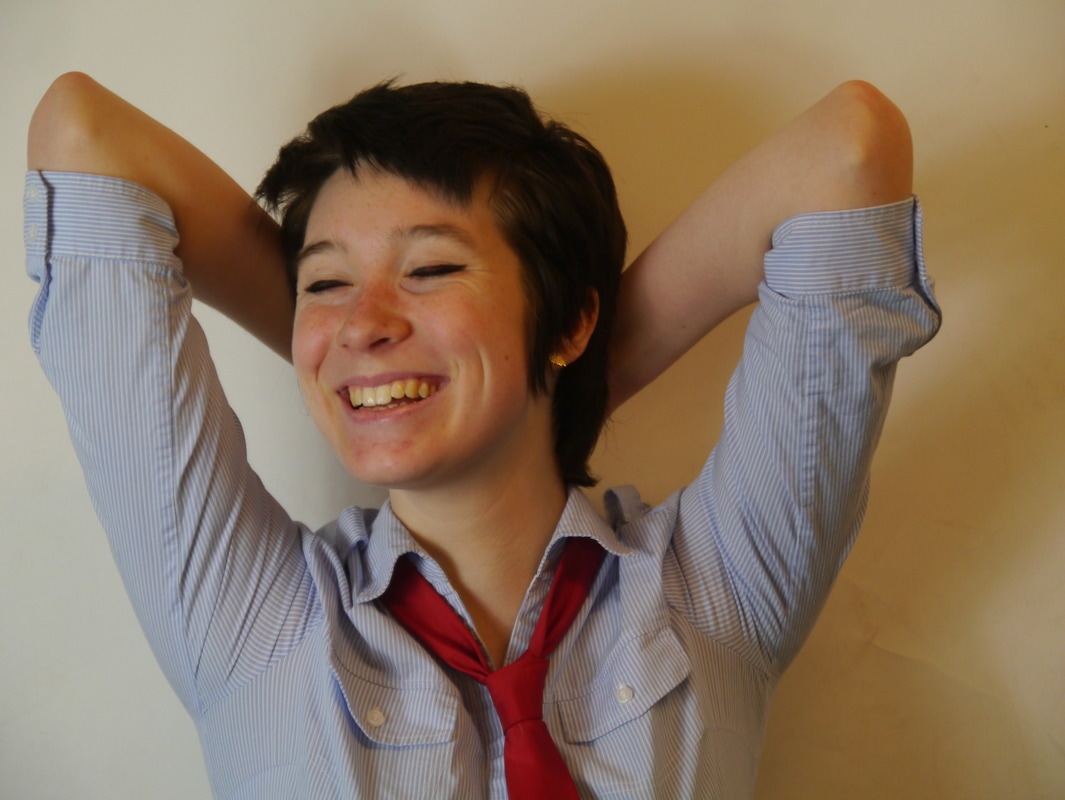
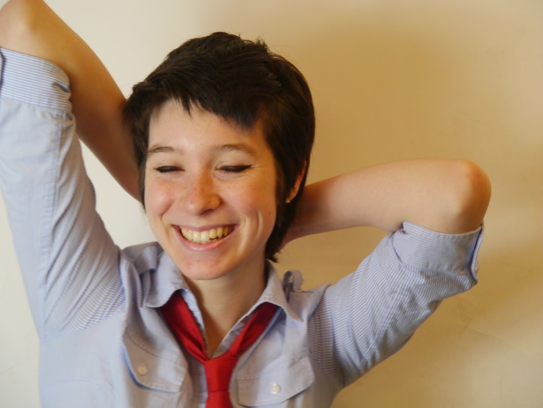
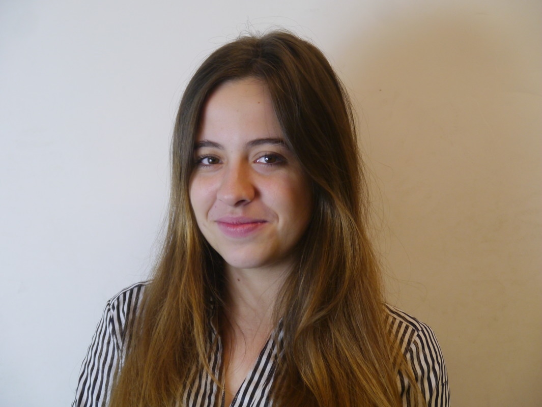
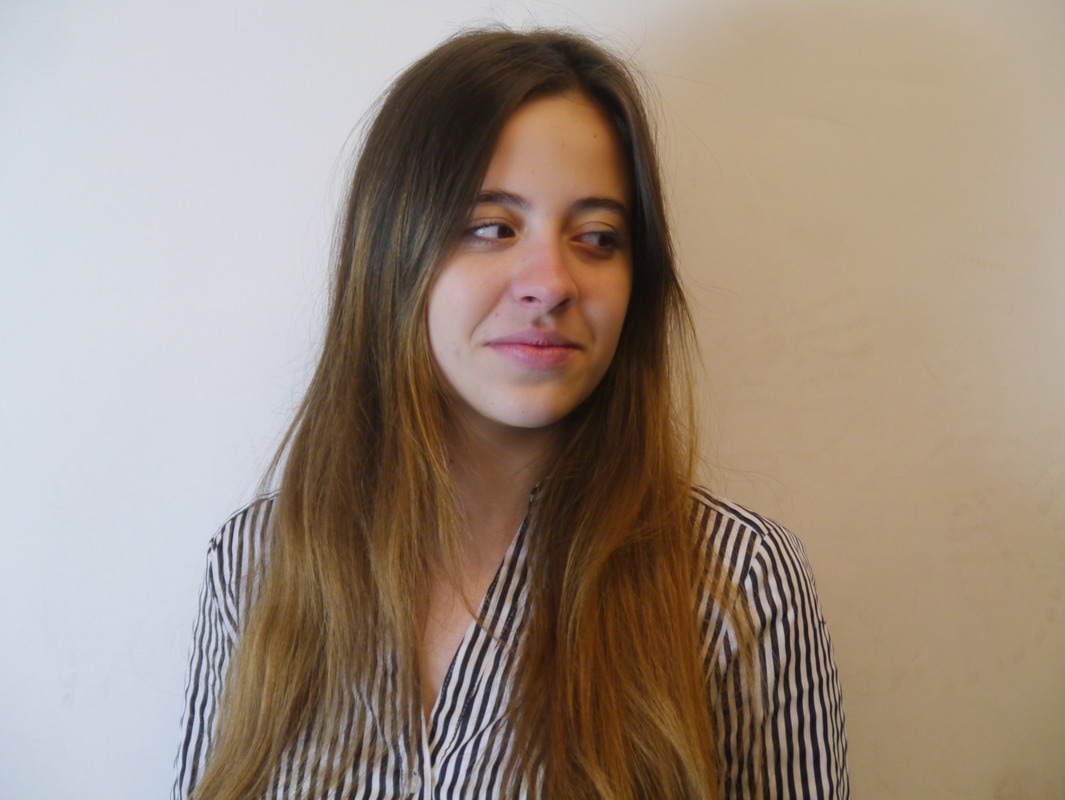
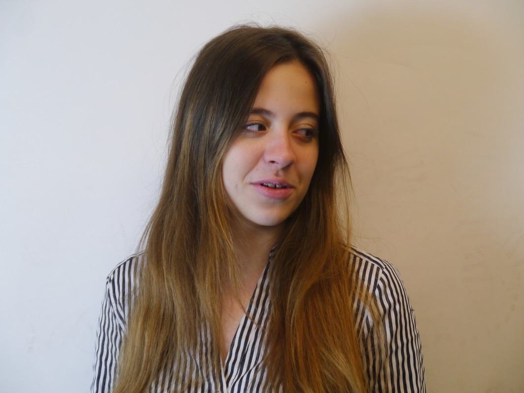
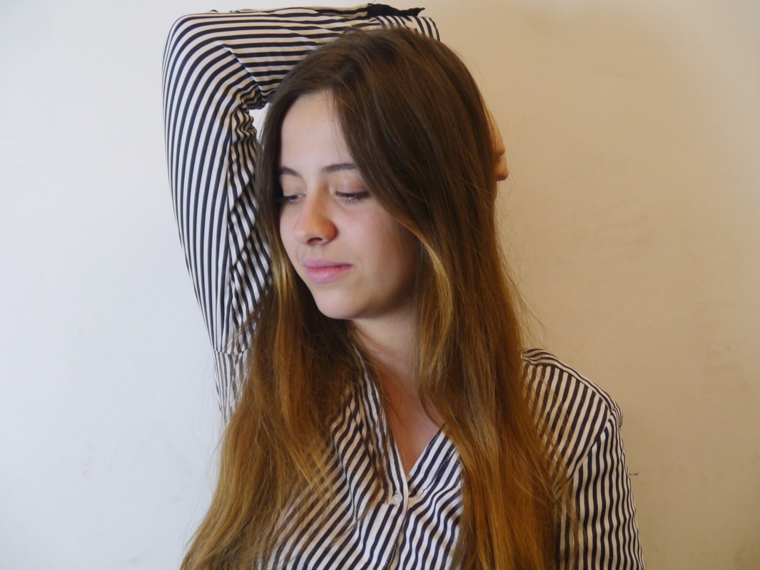
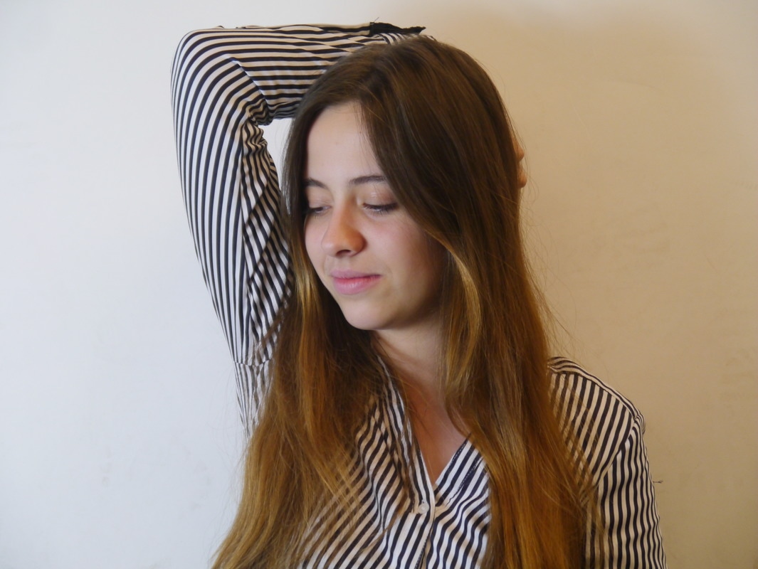
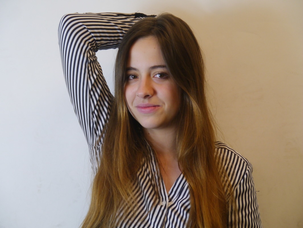
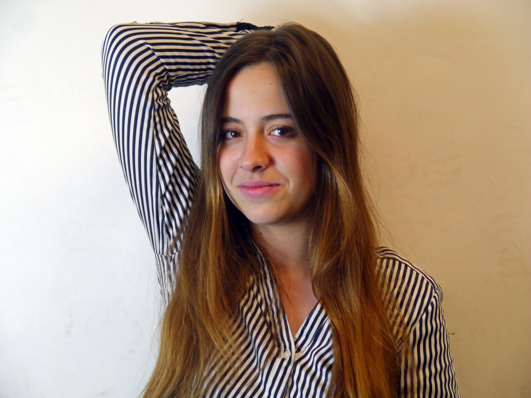
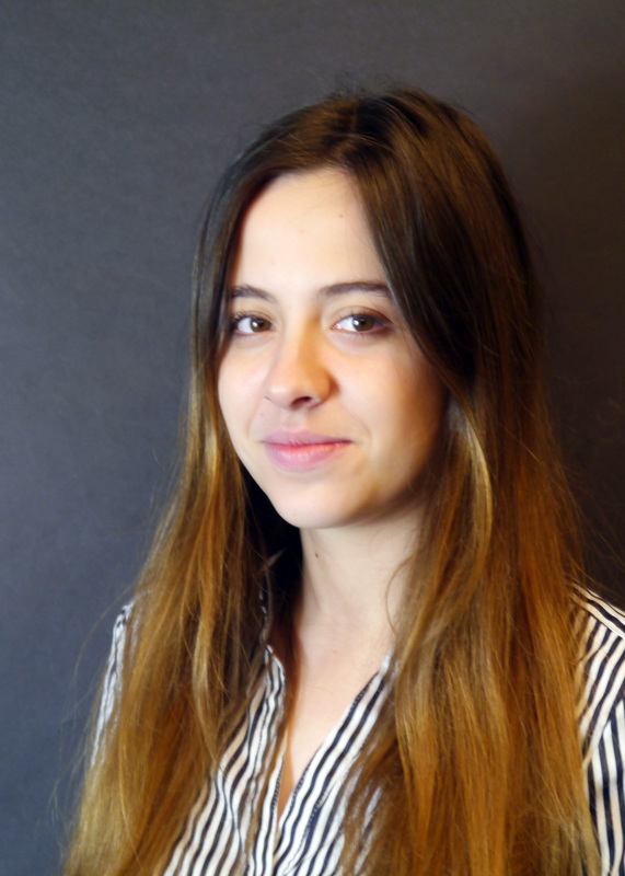
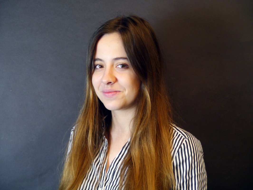
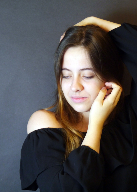
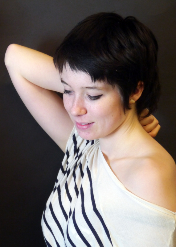
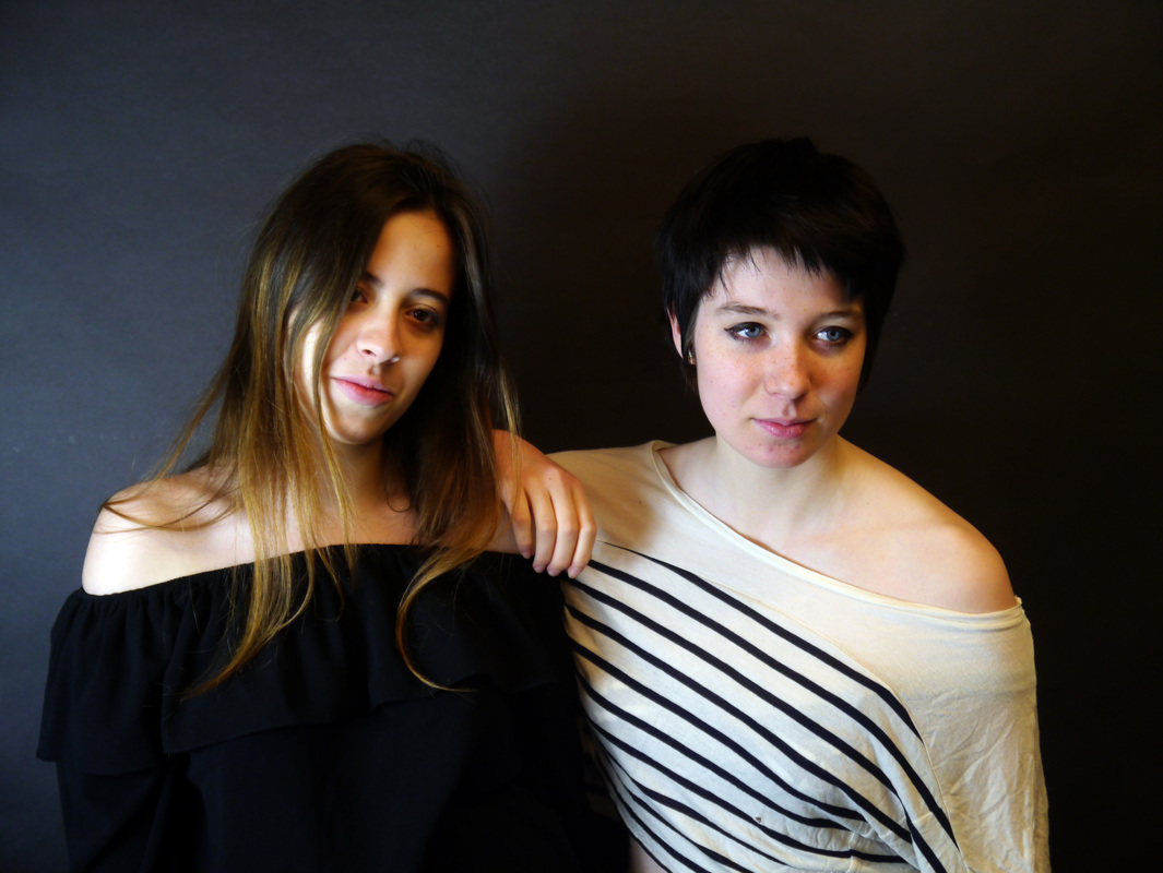
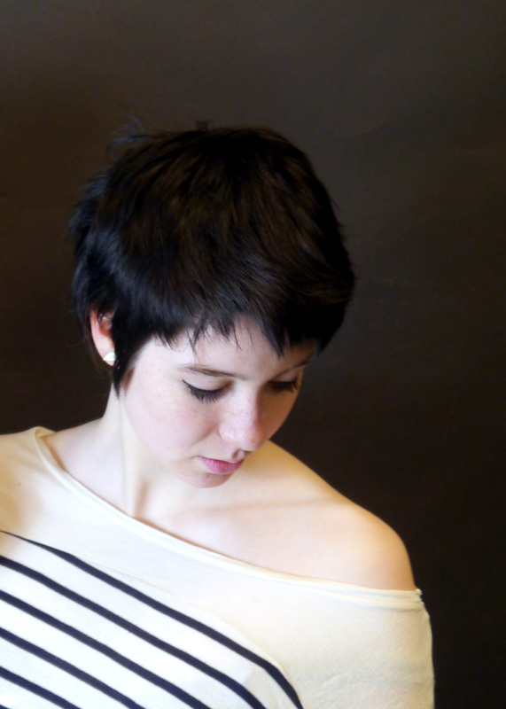
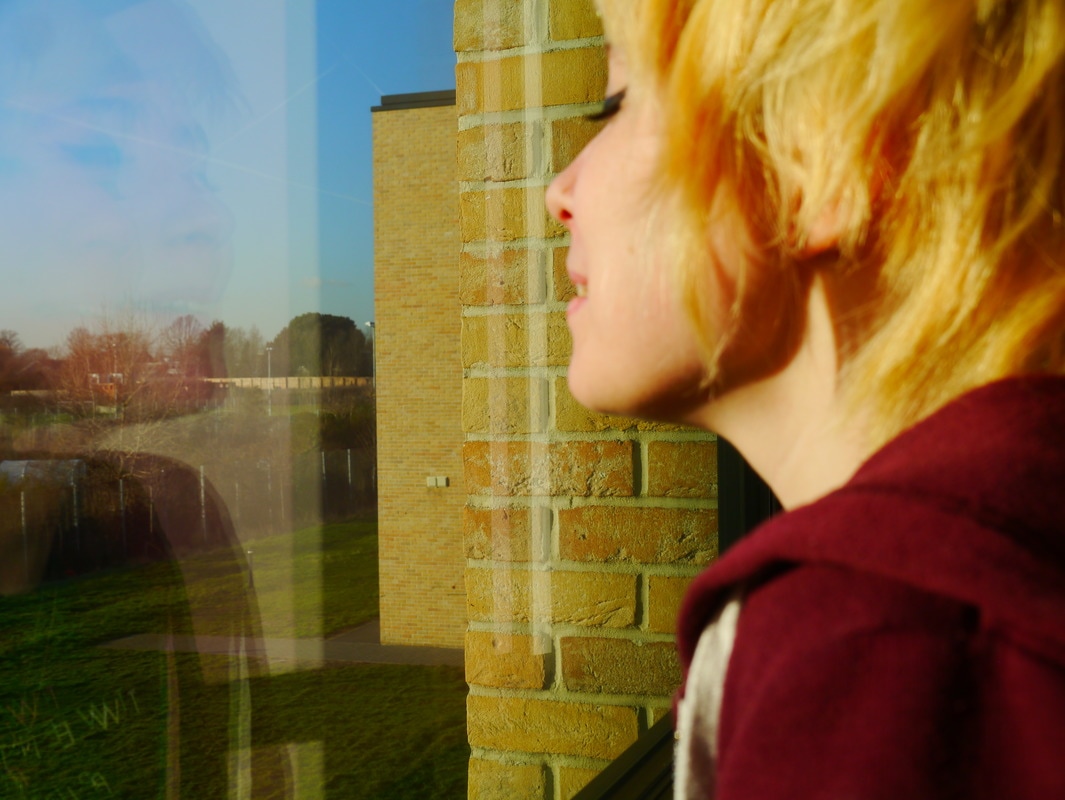
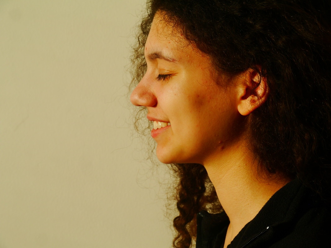
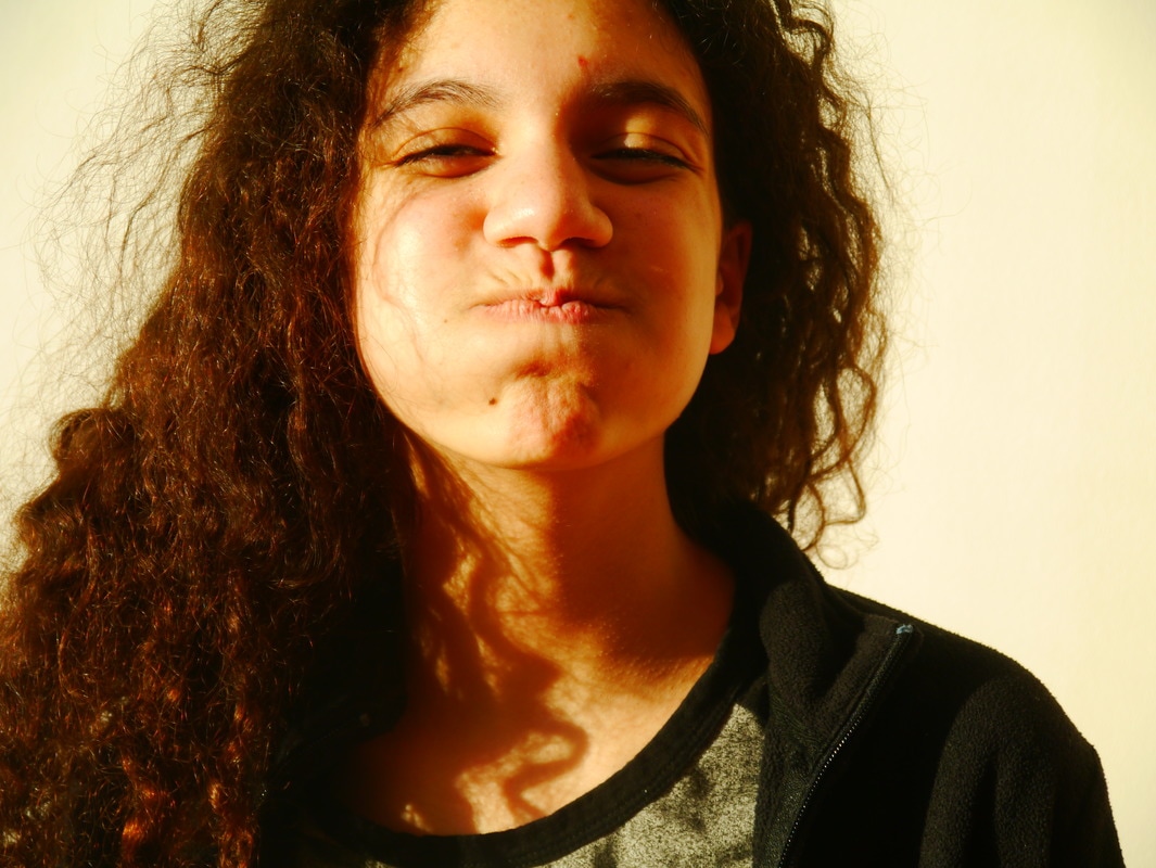
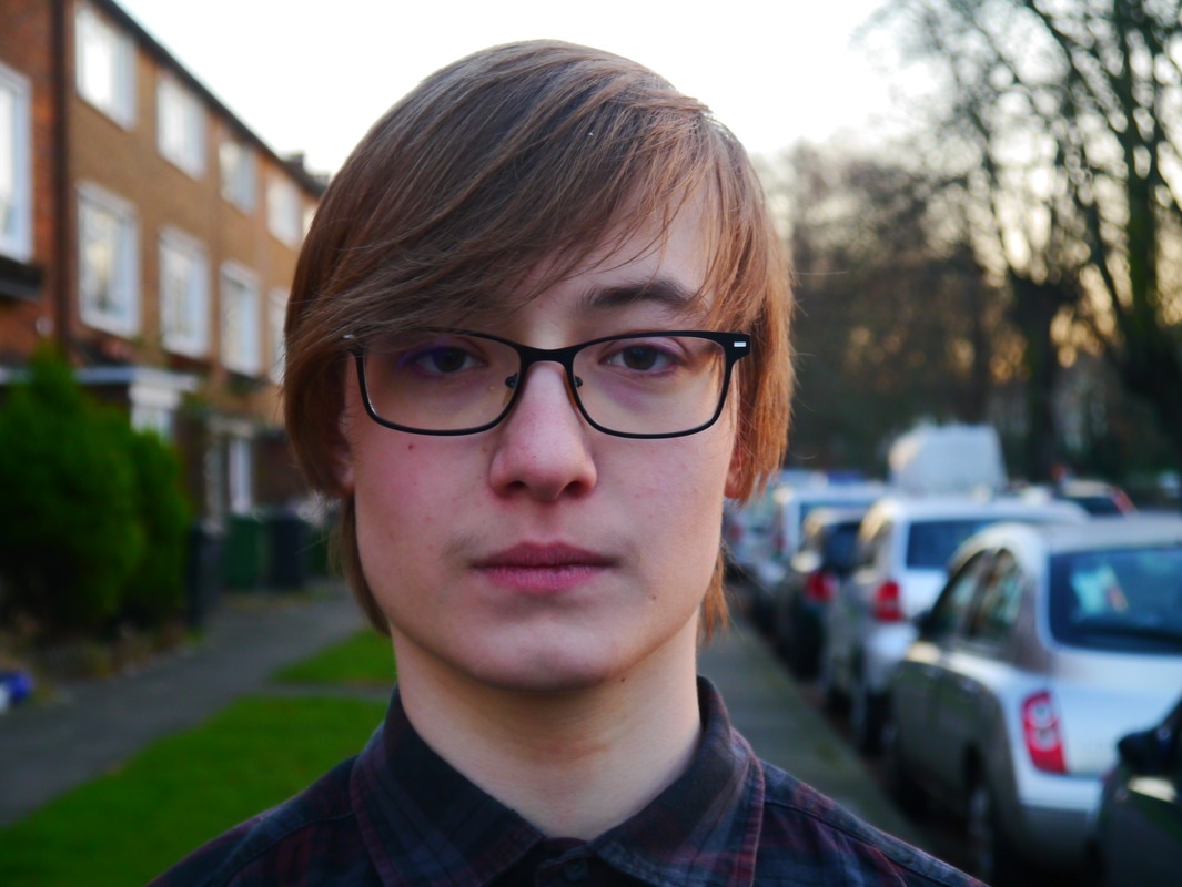
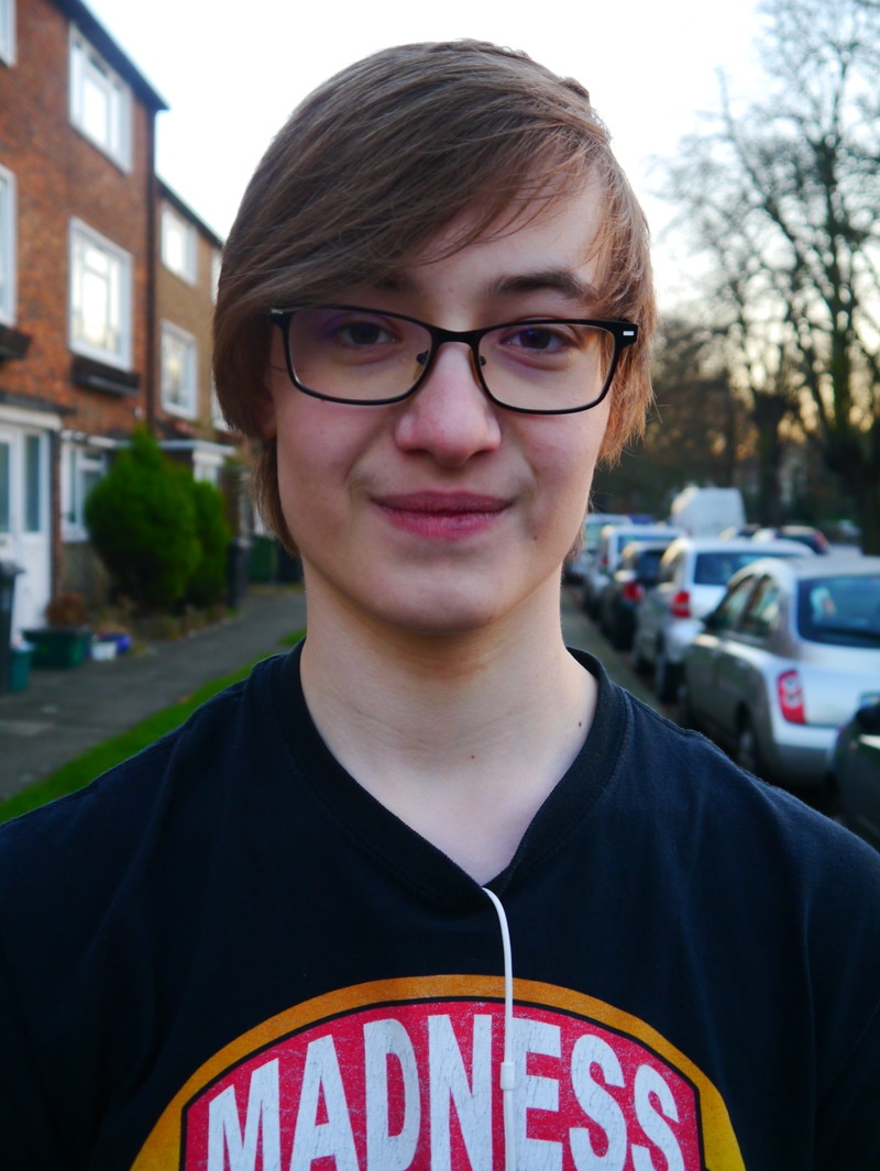
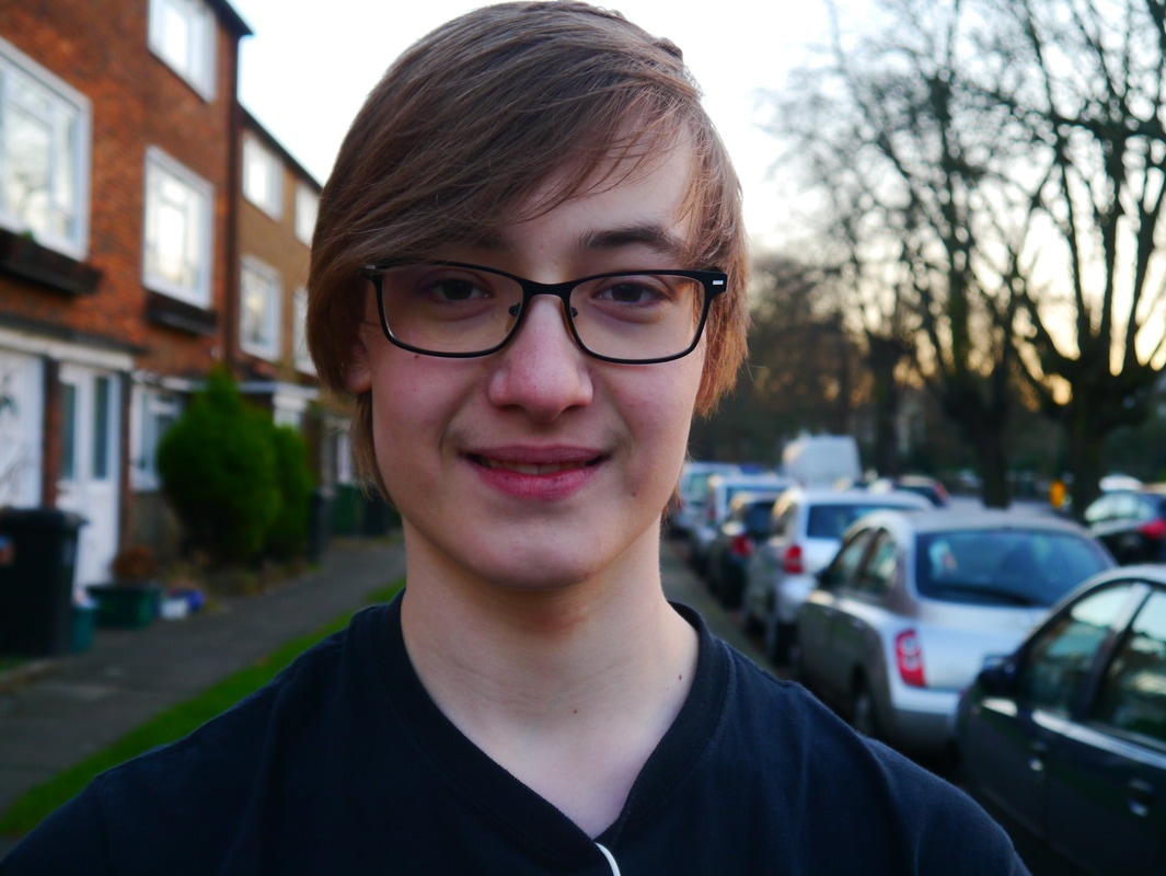
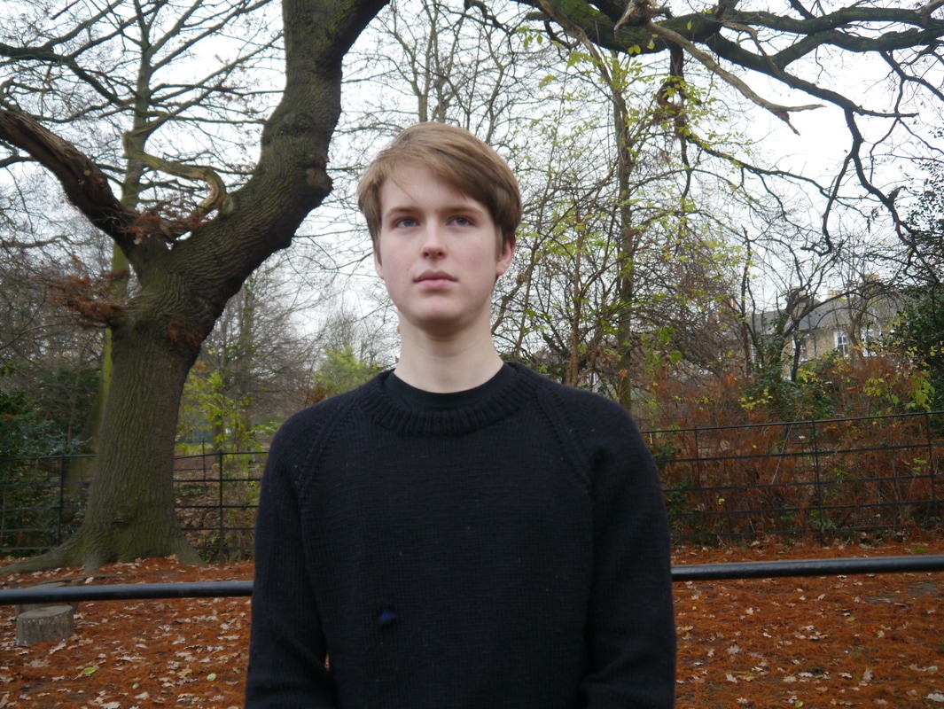
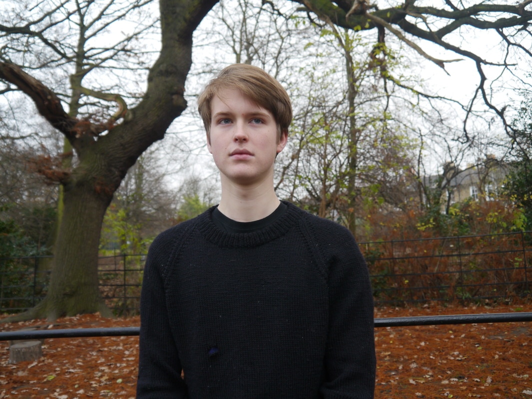
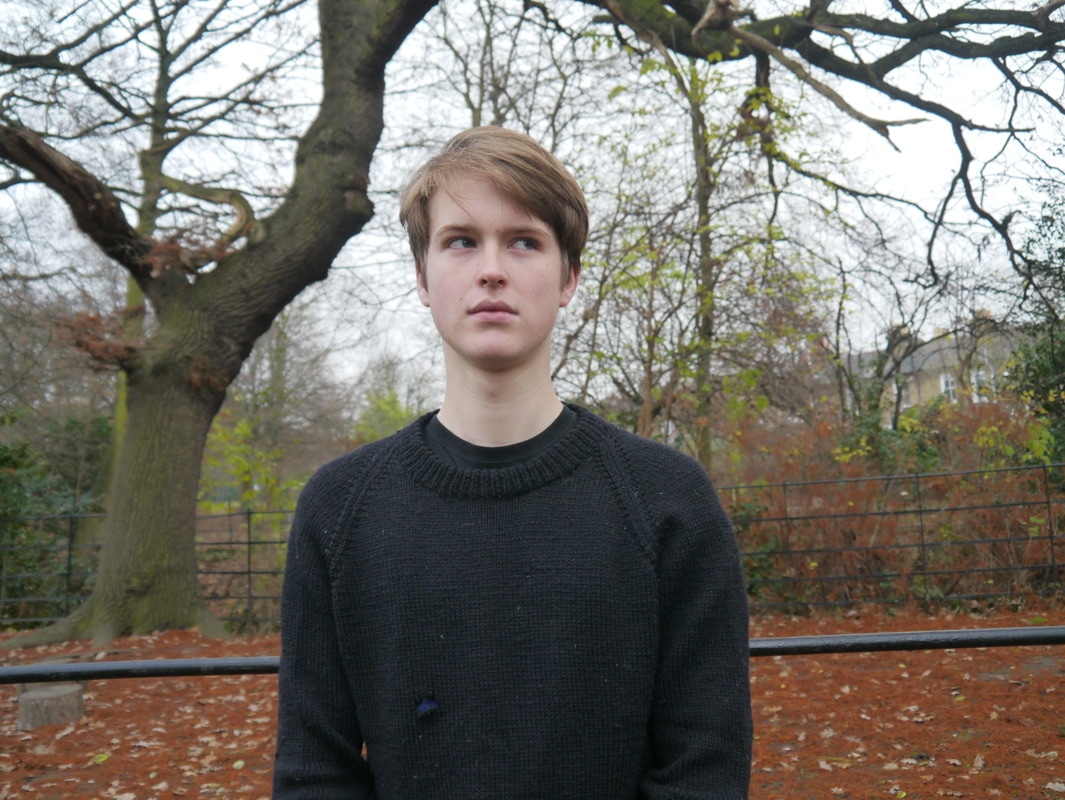
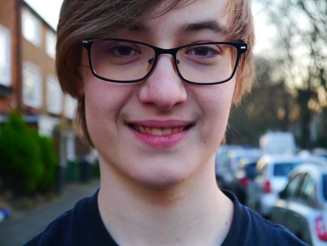
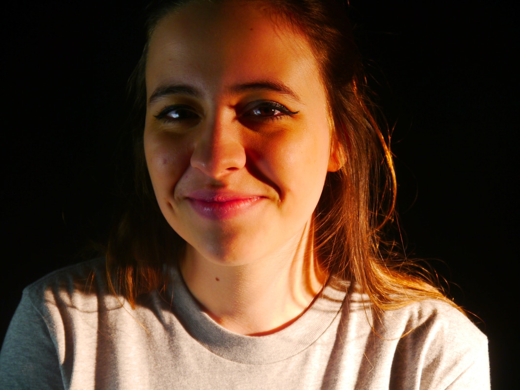
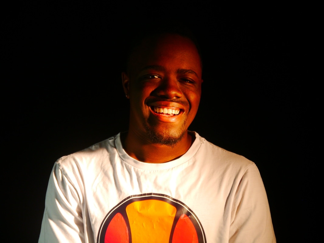
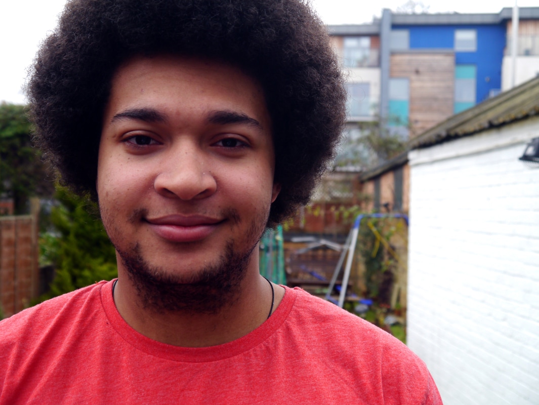
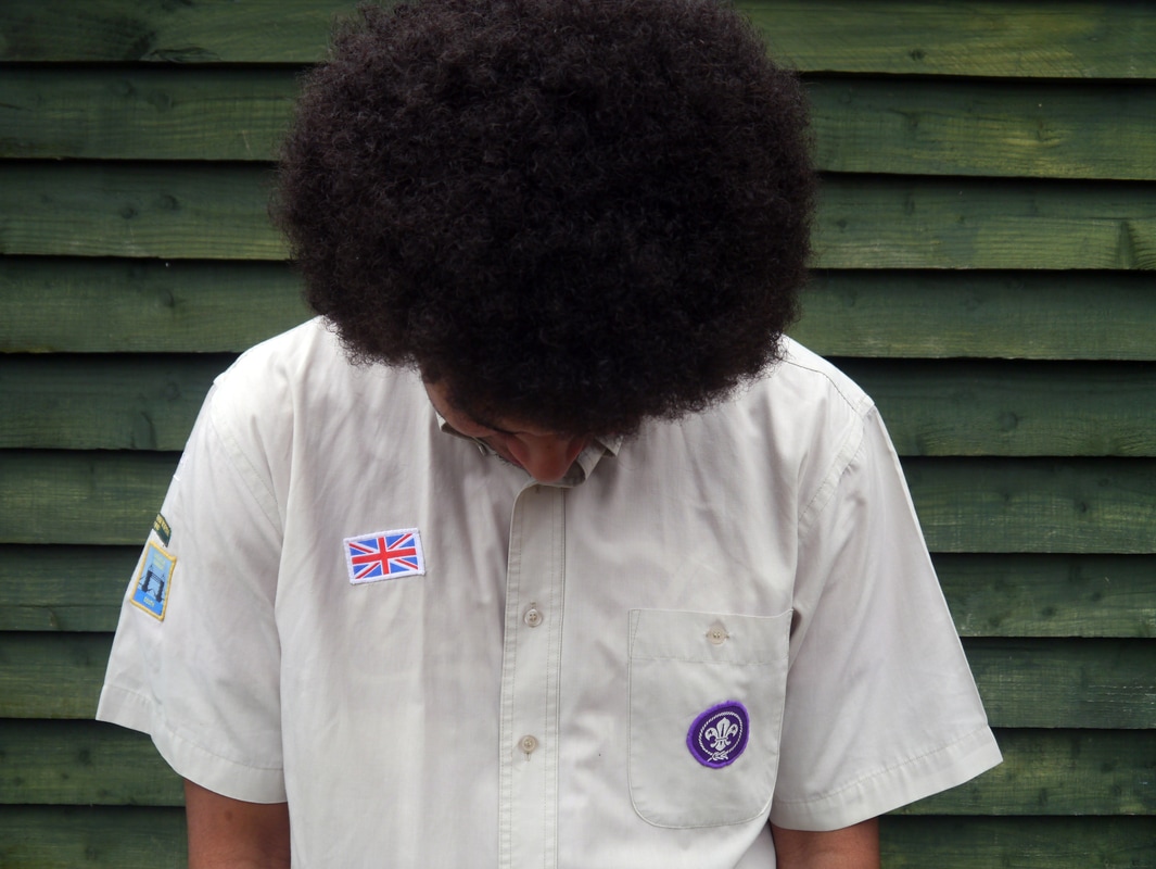
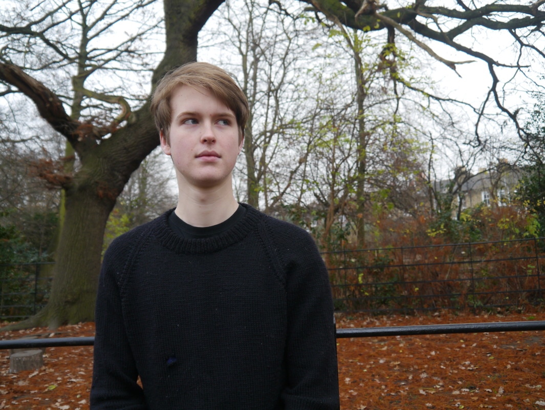
This series of images are a group of my friends with the school as a backdrop. These images are for research: what works, what doesn't, what I like, what I don't, and to help me build a technique that encompasses the things that I think work well. This picture is one of my favourites from the set that I took. I think that what I like is the focus on her and that it makes me think of her personality.
|

|
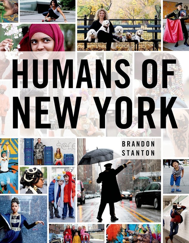
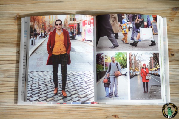
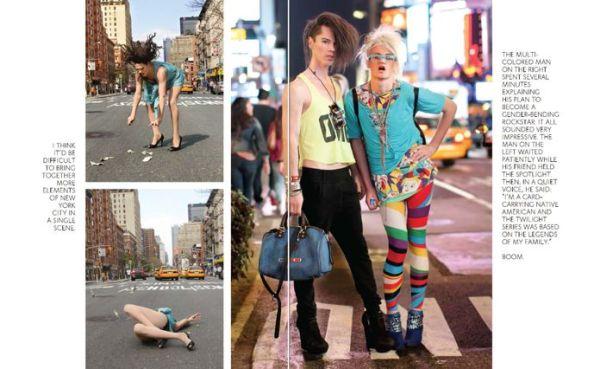
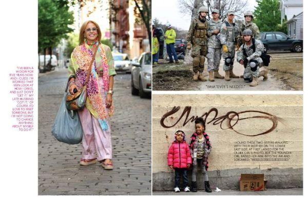
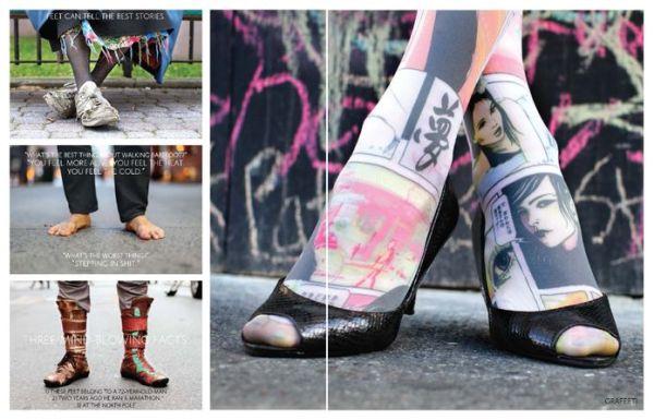
Humans of New YorkHumans of New York is a blog by Brandon Stanton. This book was the first book that he published, it contains 320 pages of images, all with different layouts. Some of the pages have one full bleed image across the double page, some have four or five images across the double page.
This book is about the people that the photographer came across in New York. It shows the diversity of people that he comes across. The front cover of the book is a montage of some of the images from inside the book. The title 'Humans of New York' is written in bold capital font across the top third of the page. I think that these photos stand out because as a whole they are one city depicted in over 300 pictures. I think that the series is important as well as it highlights people that aren't ordinarily highlighted. I think that his intention is to show the actual people who live and go to New York. All the pictures have different styles but all feel very similar. The font on each page is the same but it is all laid out differently so they all look different. |
|
Two frame photography
an idea that DERIVES from the collision between two shots that are independent of one another.
|
Luke Fowler recently published a book "Two Frame Film" it is intended to encourage students to look at the editorial process of photography. The book looks into the relationship between two images, just as two images on opposite pages' exchange with each other. Sometimes the pictures have clear relationships (having been taken in quick succession) some are completely unrelated and some have similarities, making them link like subject or location.
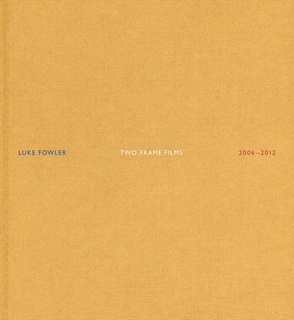
Two-Frame Film - Luke Fowler.
|
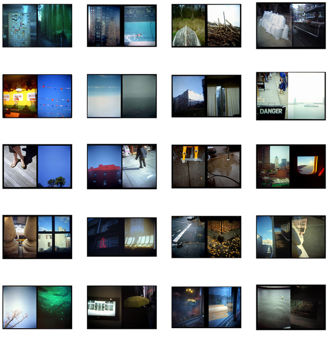
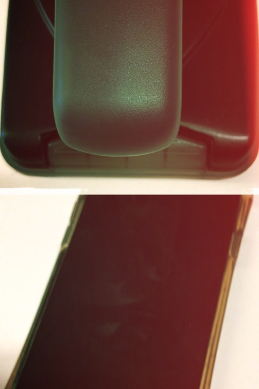
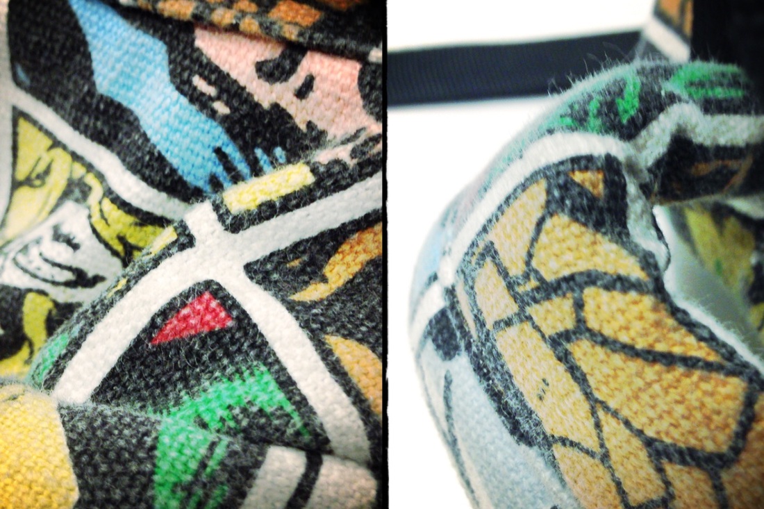
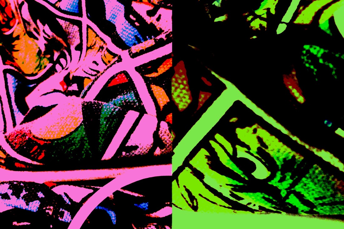
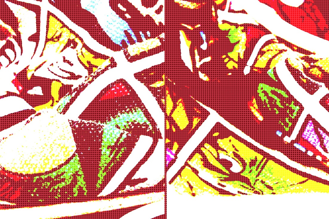
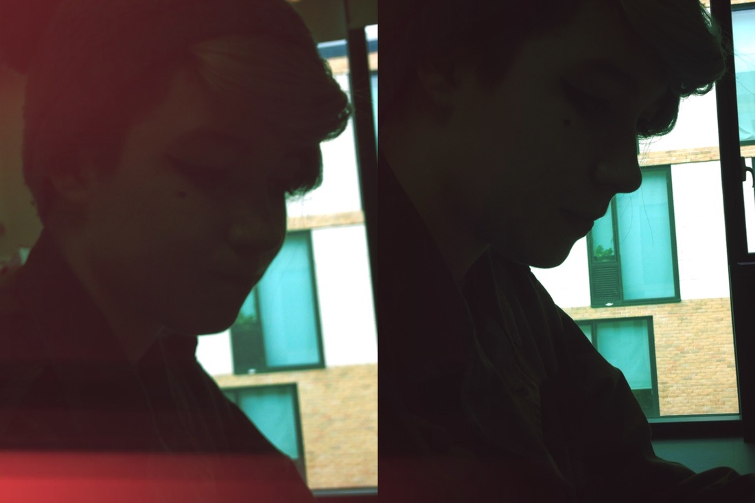
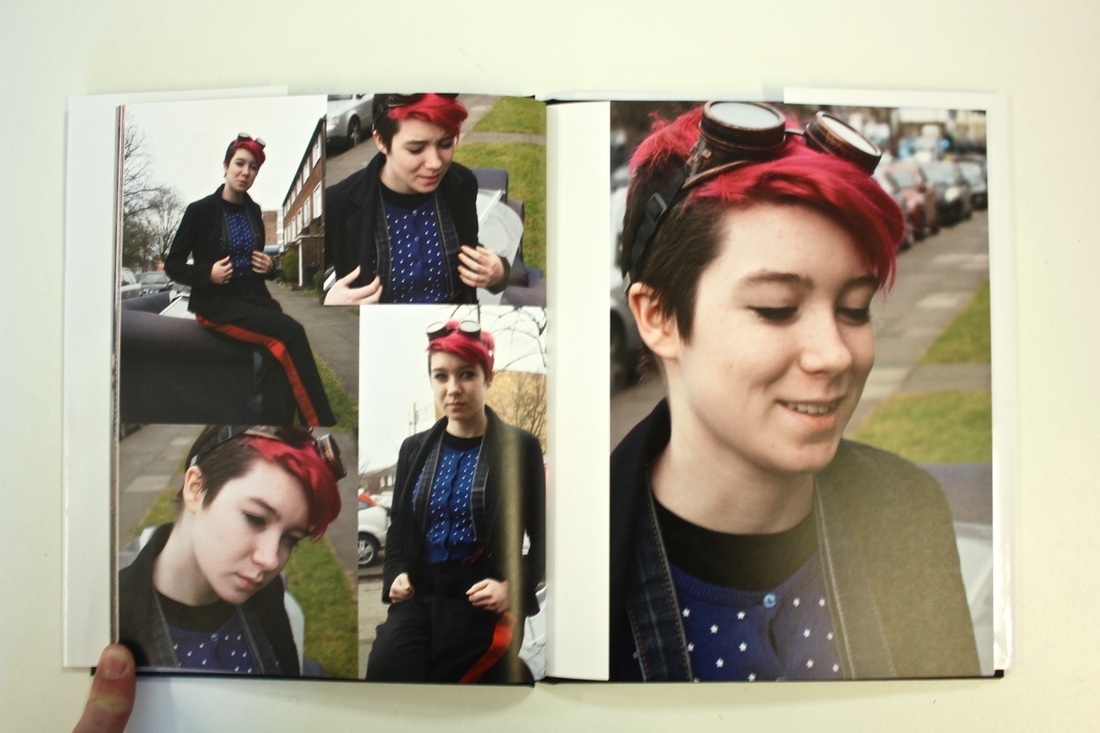
My diptychs
These are a few images that I took with my phone. I used an app called Andigraf, this app lets you imitate using different plastic cameras and different films. For this I used the two frame camera and tried a different variation films. It was really interesting experimenting which pictures looked good next to each other and which ones didn't work so well. I like the first one because at first, I thought that it hadn't worked, but looking at it further the similarities in the colour and the differences in the shape and texture make the contrasting images look good together.
|
|
|
Photobook production
|
|
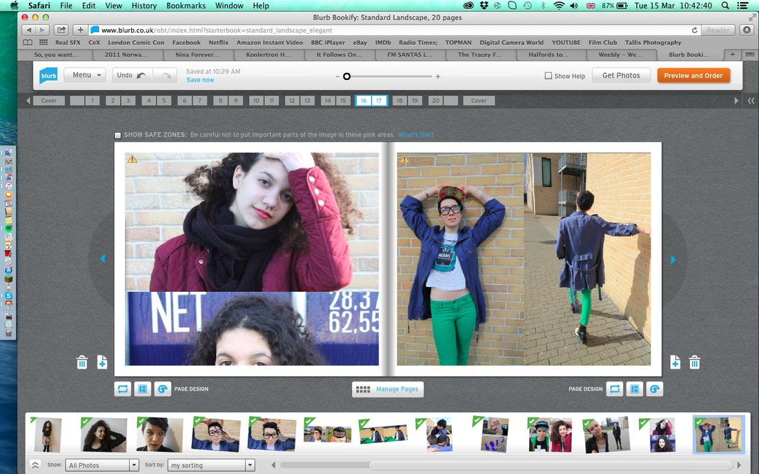
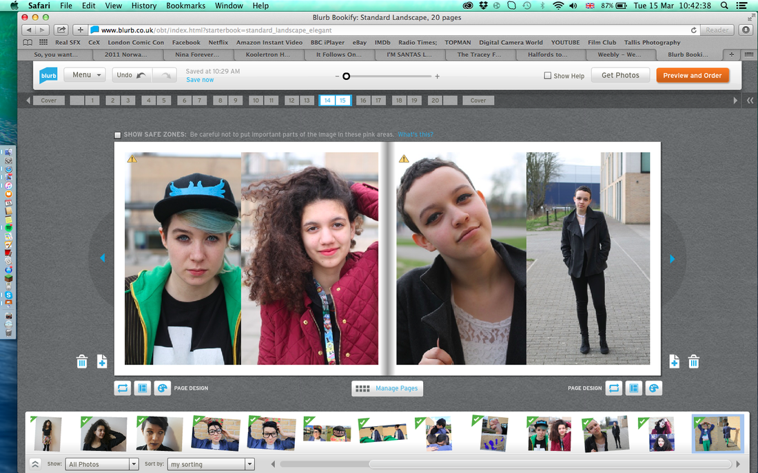
I have started to look into the production of my photobook, for this, I have looked up hand making and professional printing services. I have created a test book on 'blurb' the website that prints photo books, this allowed me to have an idea what their formatting was like but also to see how to use their software and test our which pictures look the best in this layout.
|
Hand making books
|
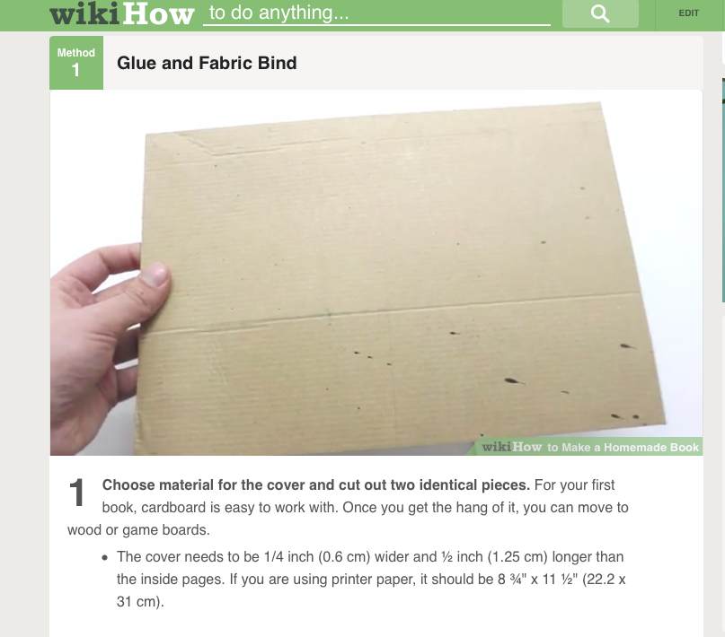
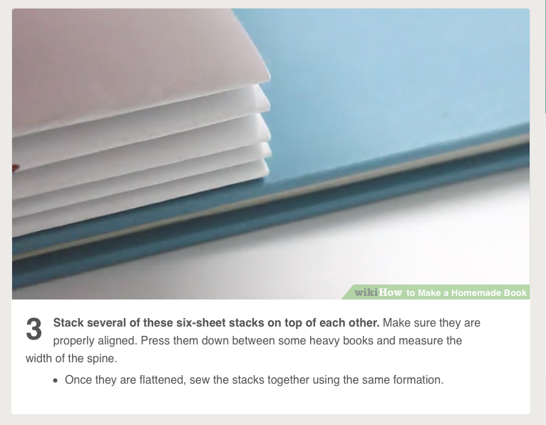
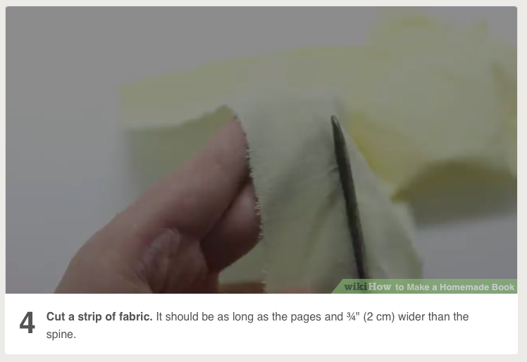
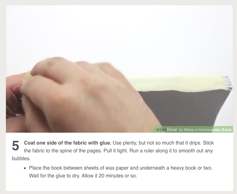
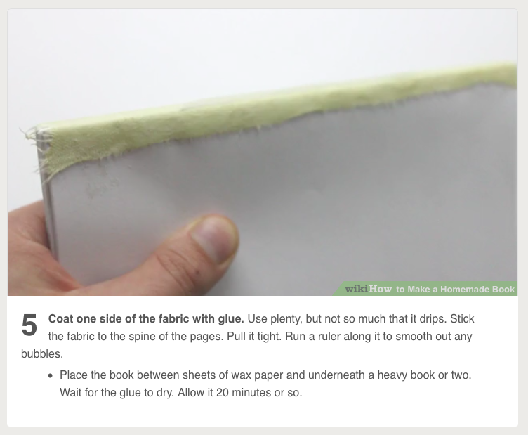
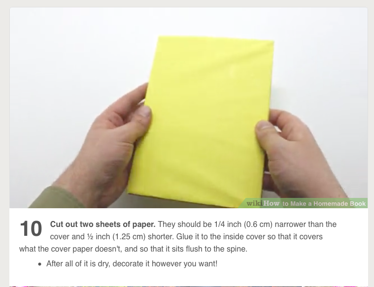
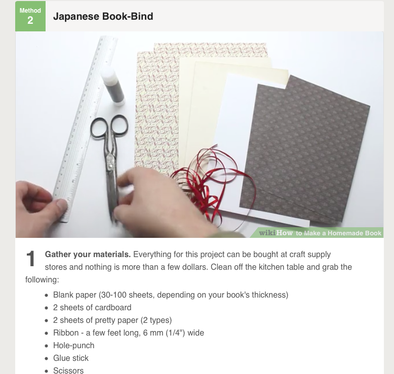
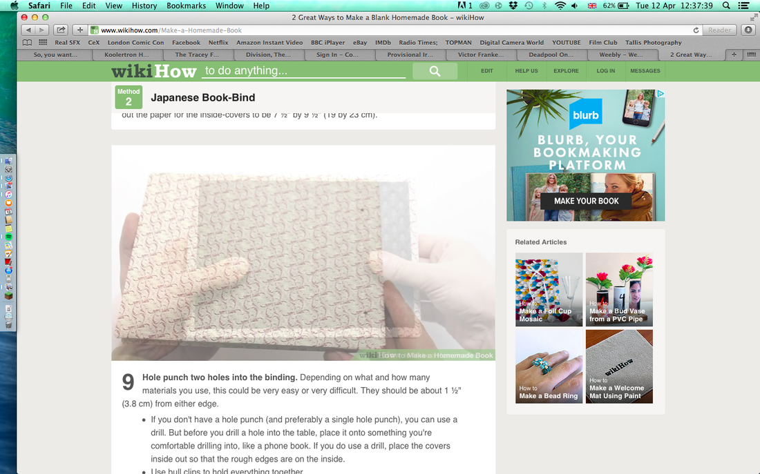
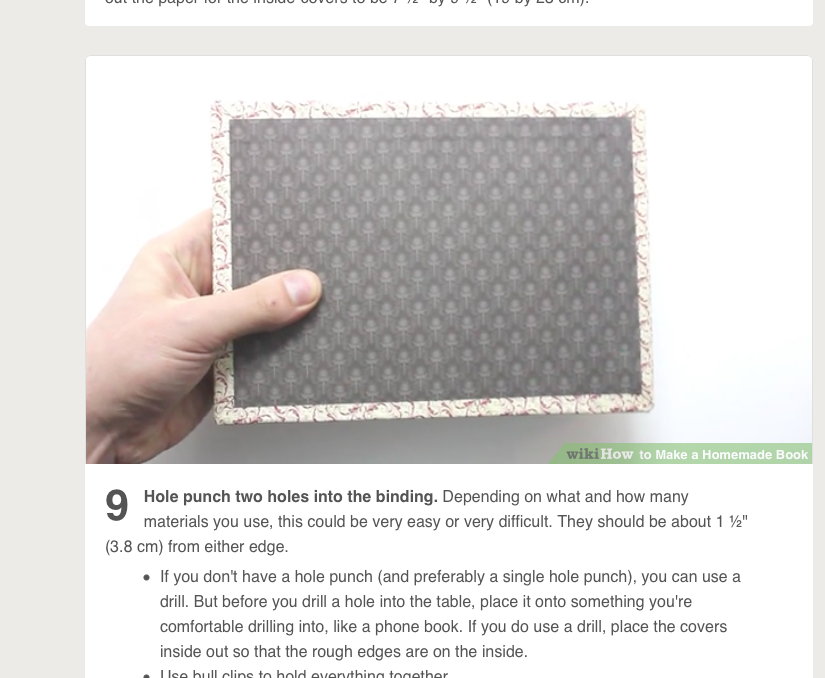
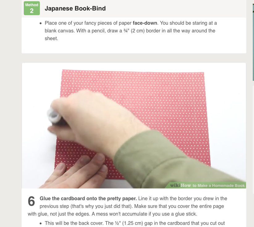
For researching the hand making books I looked at 'WikiHow' I found a detailed step by step guide to 2 different types of making books. The first is a glue and fabric bind. The book created looks really good but looks quite complicated. This involved having two cardboard sheets for the covers and then glueing the pages together with a strip of fabric that is then glued onto the covers. The second type was a Japanese book bind. This created a sort of hinge in the cardboard covers, that was then stitched into the paper. This allowed the covers and the pages to open more freely but ultimately looks more professional.
|
|

|
|
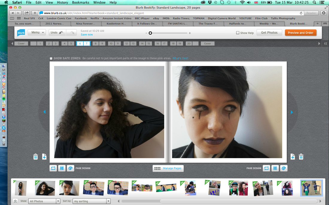
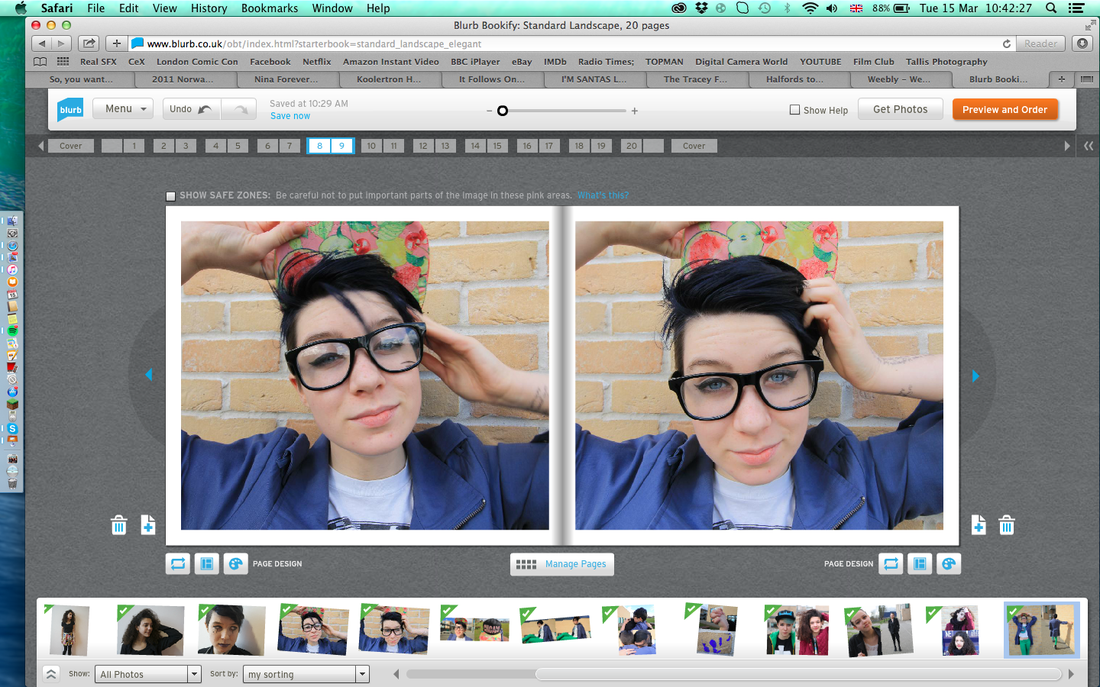
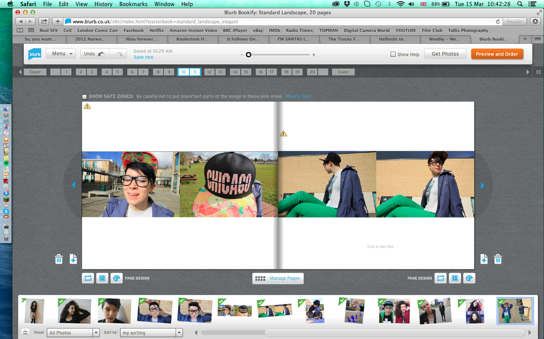
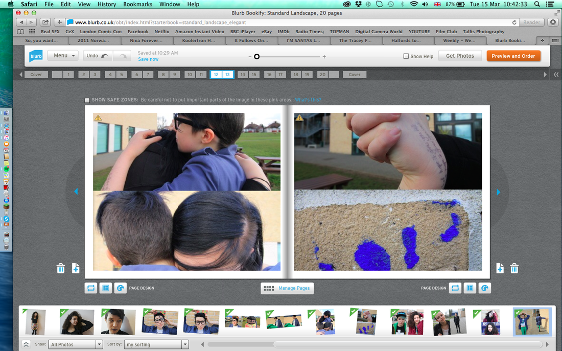
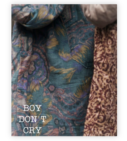
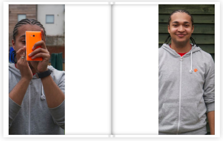
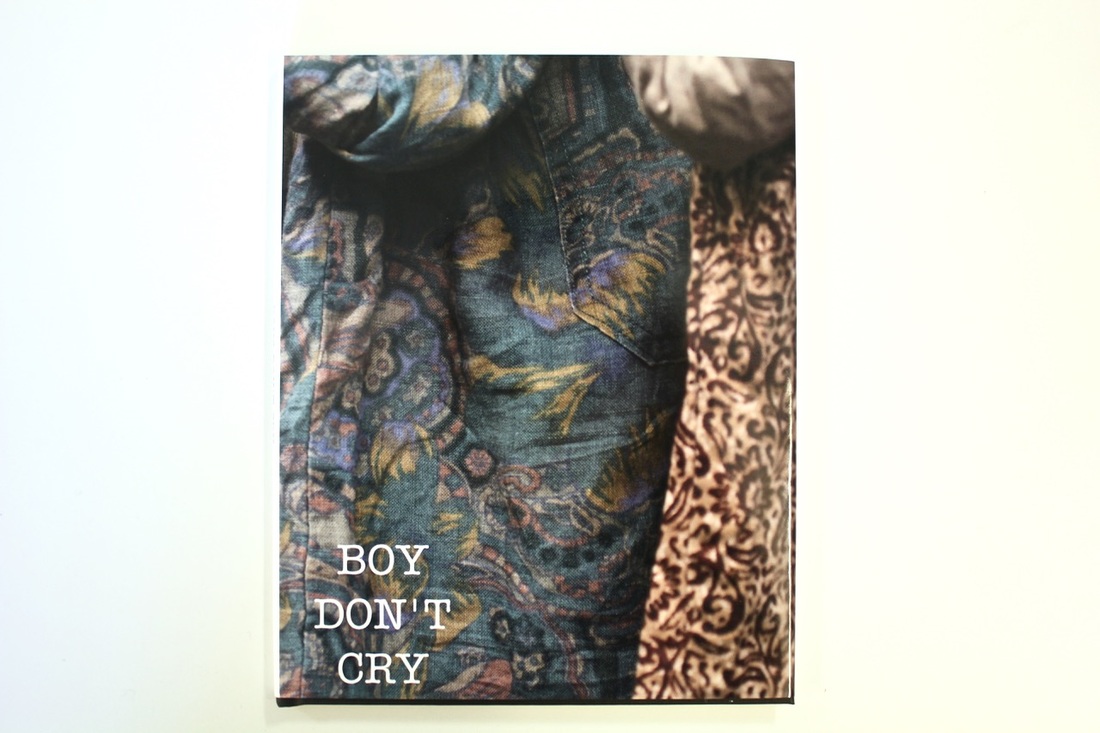
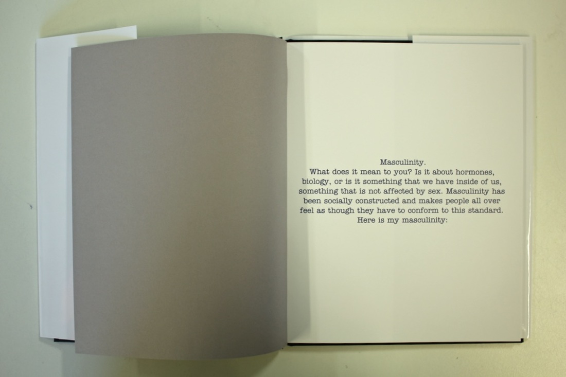
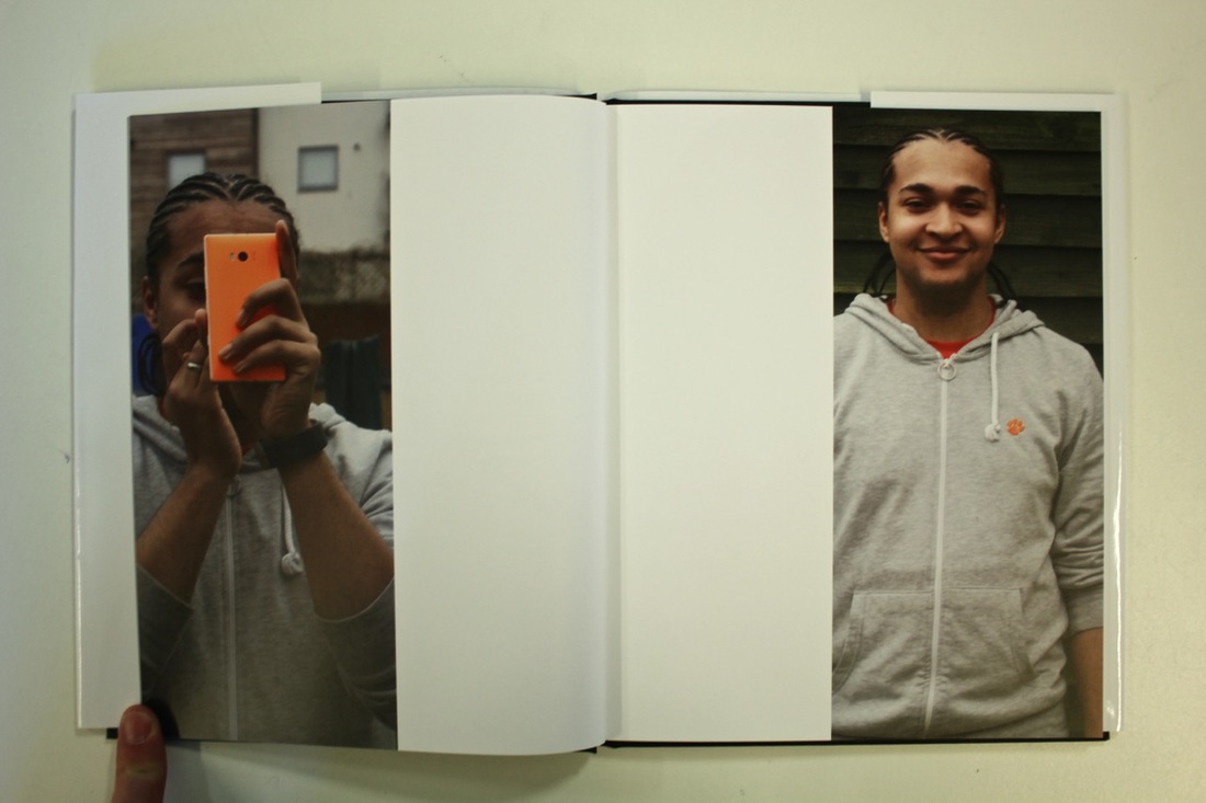
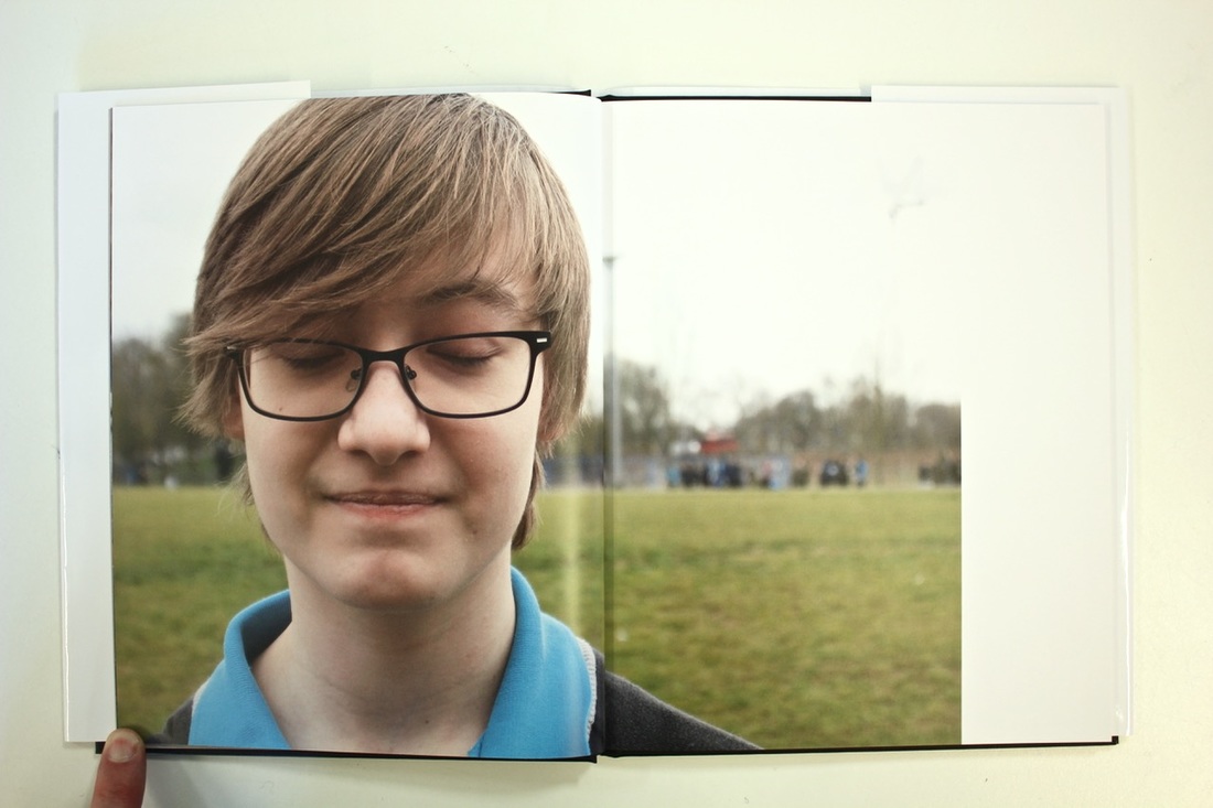
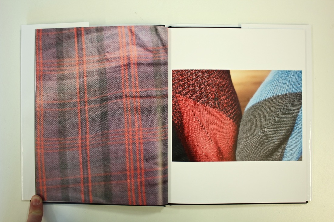
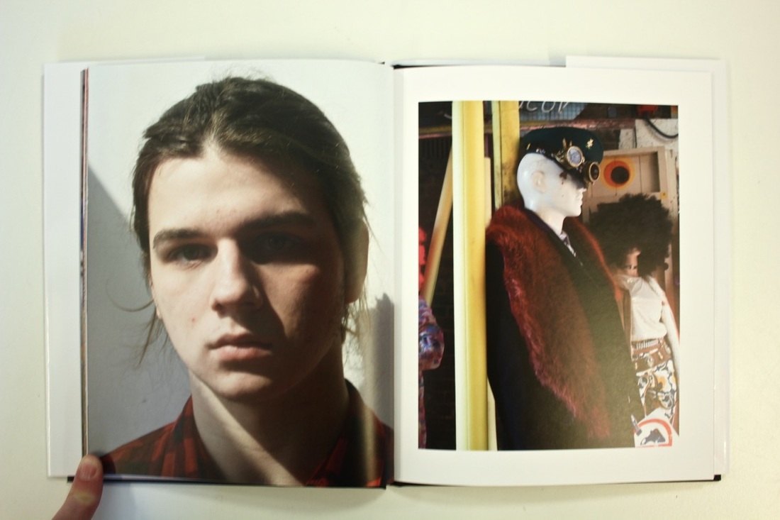
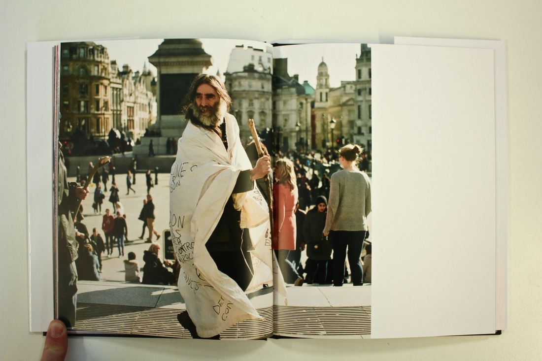
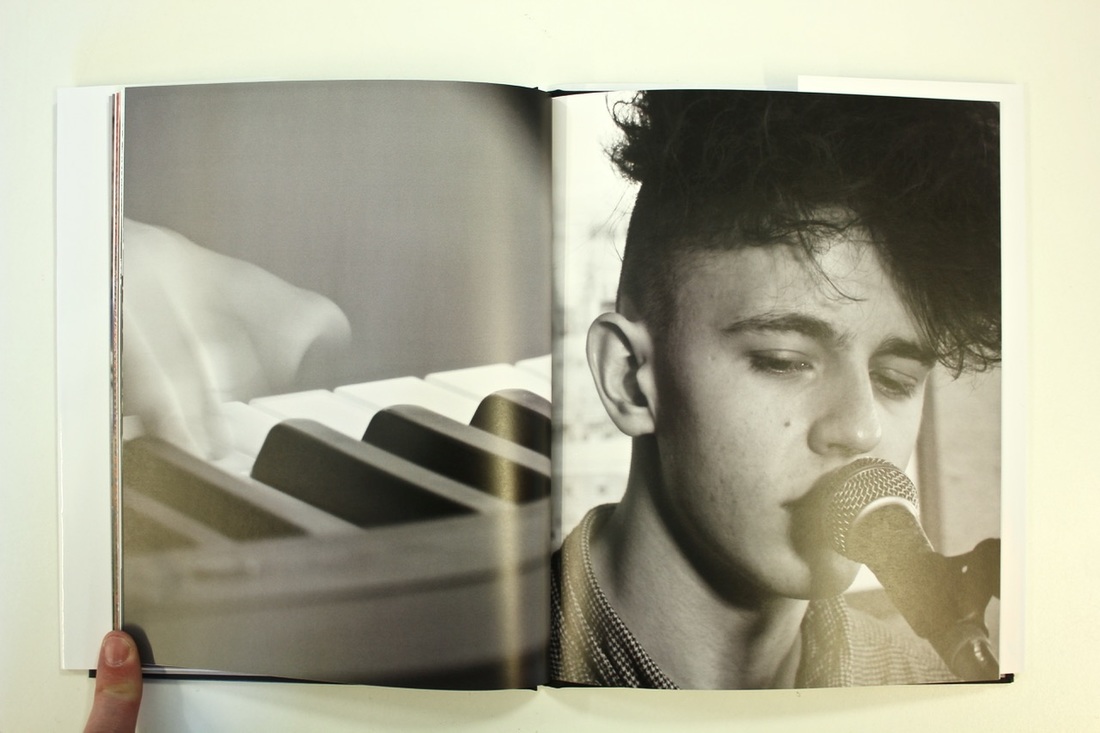
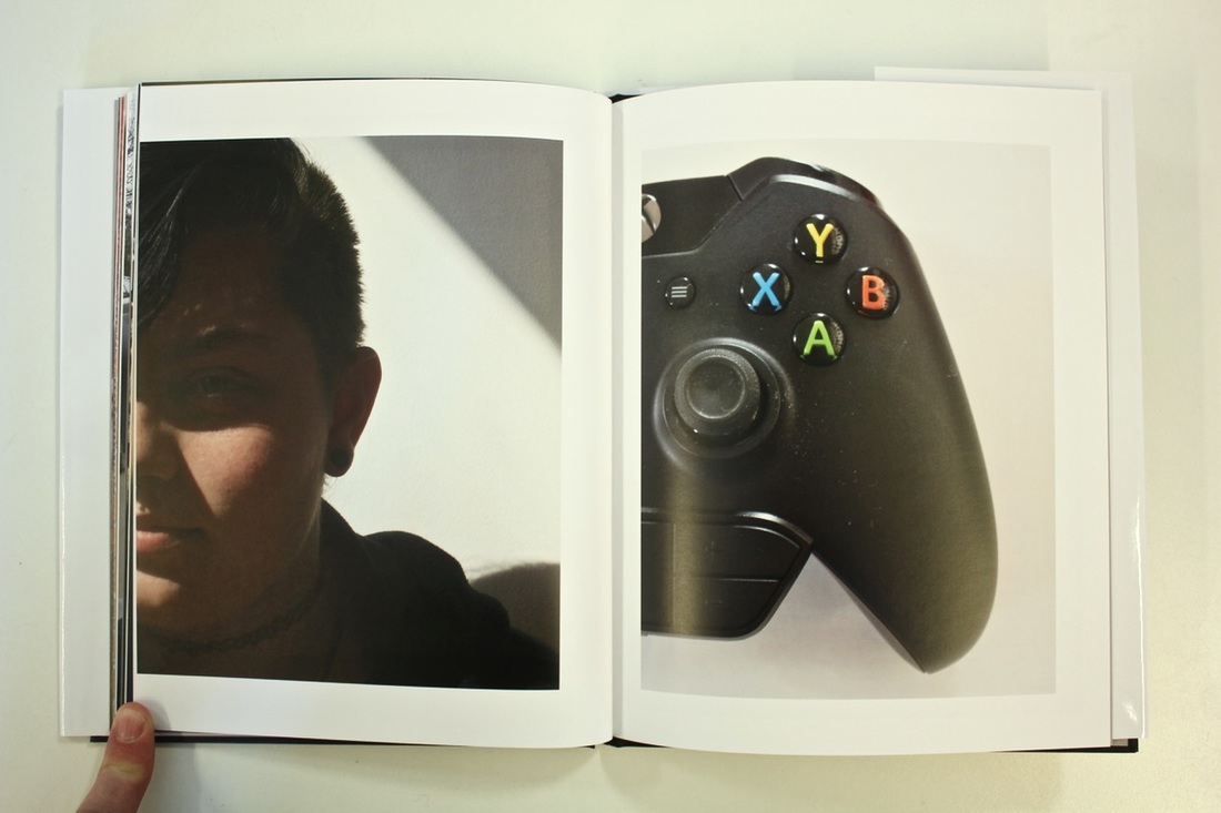
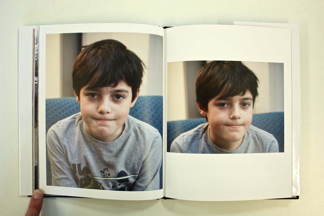
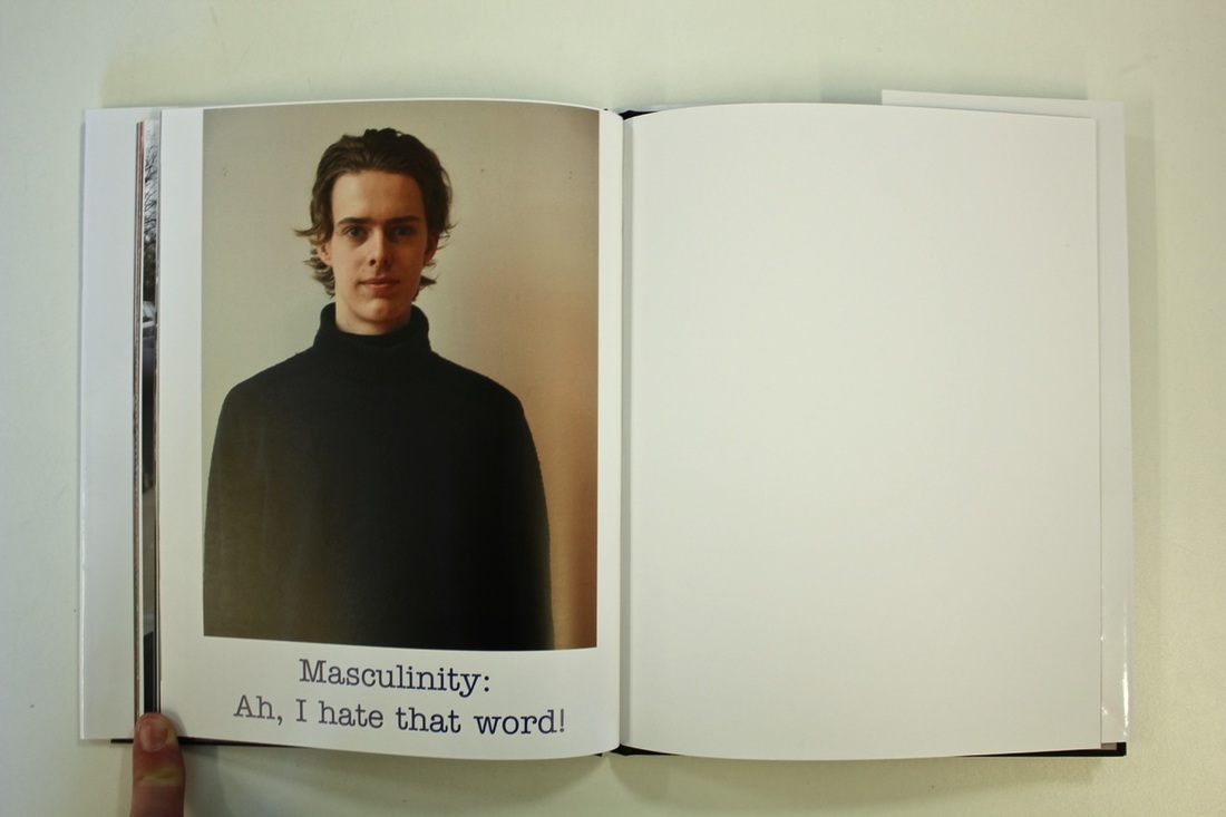
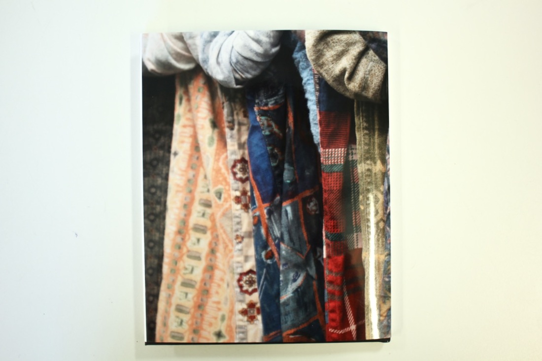
My final bookI decided to use Blurb for my final book, this was partially for ease but also because I really like the results that they come out with. I found that I preferred the professional look, and also I know that I could never produce a good enough quality book. I decided to install the 'book write' app which meant that I had more control and more formats over what it would look like in the end. It also meant that I could have double page spreads, which was important to me as I really like the portraits the cover two pages, or at least have the choice to. My book ended up being 36 pages, which in hindsight was a little bit long, but I think that each page shows something different, which was the original intention. The covers are one image wrapped around the whole cover. I decided to have a dust cover for my book, this was because I wanted the choice of seeing my book with the picture over the covers, but also a plan cover. My favourite page(s) is the 2-3 ones, I like these because the first picture was the set up of the picture, and was more natural than the other one, but then the other one was how he wanted to be seen. I have written the title on the front cover, in white; Boys don't cry, both after the song and the film. The layout of my book was quite different from the other ones that I looked at, the first three books all had the same layout throughout. Whereas mine was individual to each page, I had my picture/s for each page and arranged them how I thought they looked best on the page, rather than following a strict routine throughout the book. The book is split into two categories that are interwoven into each other, portraits and ideas. The ideas came from what people thought masculinity was, or things that were characteristically masculine, for example, odd socks, video games, drumming, comic book, tartan and planes.
|
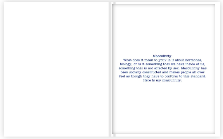
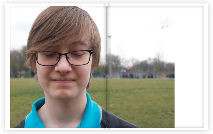
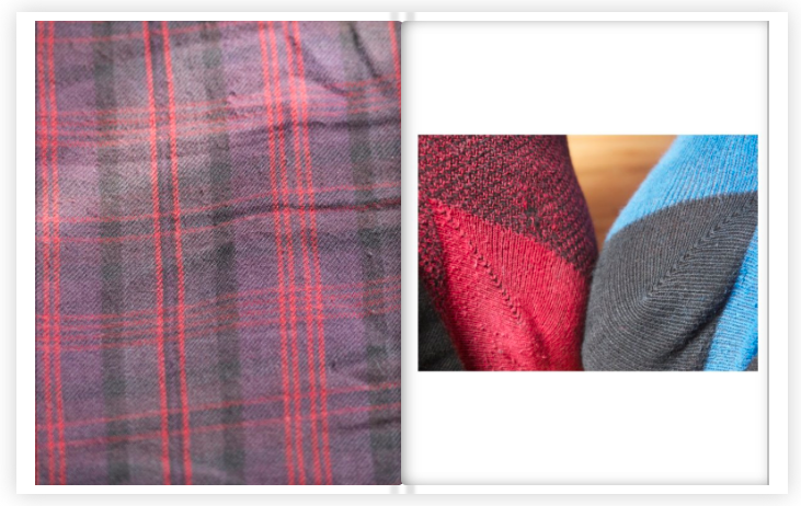
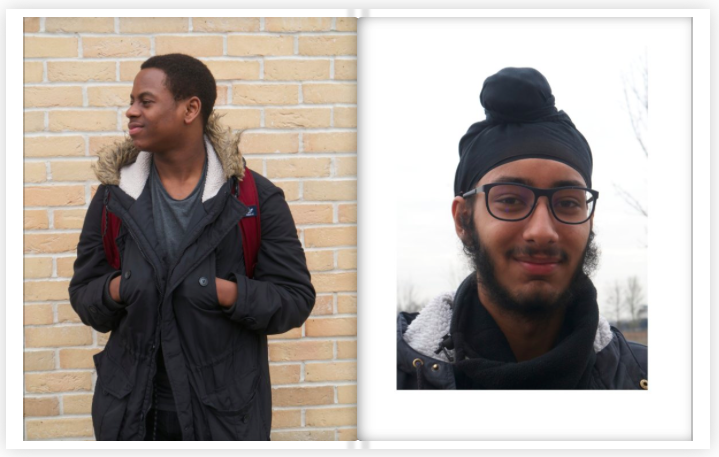
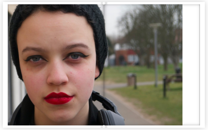
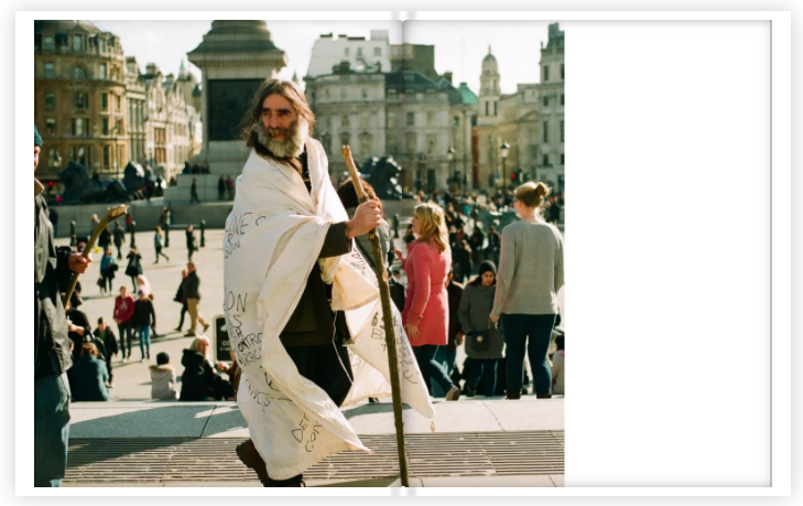
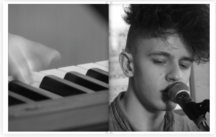
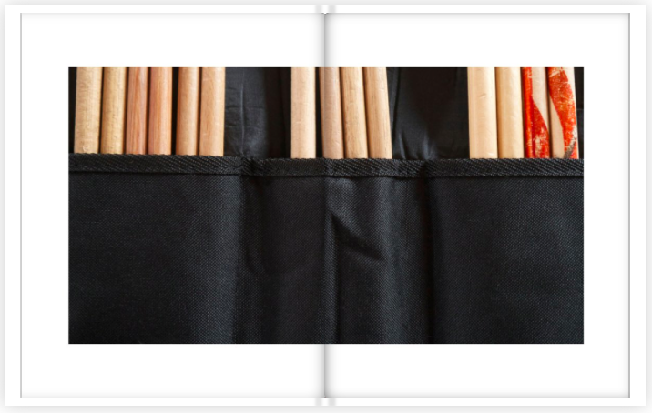
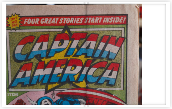
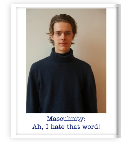
I really didn't have a theme till right at the end and finding the theme really helped me get a clear idea of what pictures I was looking for. My theme was 'masculinity', I thought that I would explore it in an unconventional way, a mix of realism but also staged portraits. As for the object photographs they were all different styles, I wanted a full texture picture for the tartan, but then a wide shot for the drumsticks.
I experimented a lot with my pictures, this meant that I took hundred of portraits of different people, so as I could find what I liked the most and what came out the best. I took some with film and some with digital, although I didn't use them in the end I also experimented with different styles, some landscapes, some abstract. I didn't use any of the pictures that I took during the experimentation process, this meant that they feel like really different stages, and that it was a good practice, and I used the techniques that I picked up before. The one thing that I found really challenging was finding a direction, a specific topic, this really slowed down my process. The thing that I think went well was that I really experimented as much as I could, this meant that I was really ready when I finally found a theme, meaning that I could work better in the end.
I experimented a lot with my pictures, this meant that I took hundred of portraits of different people, so as I could find what I liked the most and what came out the best. I took some with film and some with digital, although I didn't use them in the end I also experimented with different styles, some landscapes, some abstract. I didn't use any of the pictures that I took during the experimentation process, this meant that they feel like really different stages, and that it was a good practice, and I used the techniques that I picked up before. The one thing that I found really challenging was finding a direction, a specific topic, this really slowed down my process. The thing that I think went well was that I really experimented as much as I could, this meant that I was really ready when I finally found a theme, meaning that I could work better in the end.
- Quality of research - Your research is very good and I really enjoyed reading about the whole process of you finding out about photobooks and making your own. I wonder whether a slightly more detailed general introduction to the history of the photobook and some notes about the video might work well at the top of the web page.
- Quality of photographs - It's great that you took so many images for the project and have them (mostly) on your website. I could really see how your practice developed during the project. You are great at describing the creative decisions you took and referring back to your stimuli in the evaluation. The photographs you've chosen for the book are all successful in their own right and work together as a sequence. I really enjoyed the juxtaposition of portraits with street photographs and still life images. I like the variety of angles and proximities too.
- Quality of published book - You've managed to balance the design of the book very successfully, combining full bleed with cropped images. The occasional photo crossing the gutter also really works. There is a great rhythm to the book and it feels well considered and deliberate. I hope you feel very pleased with the outcome and I look forward to seeing how this idea (and others) progresses as your Personal Investigation develops. Well done!
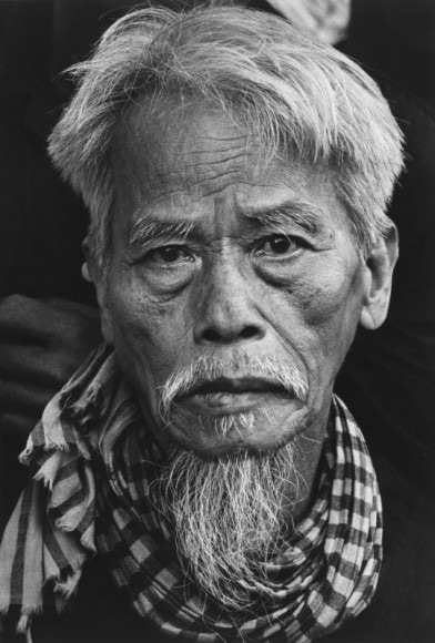
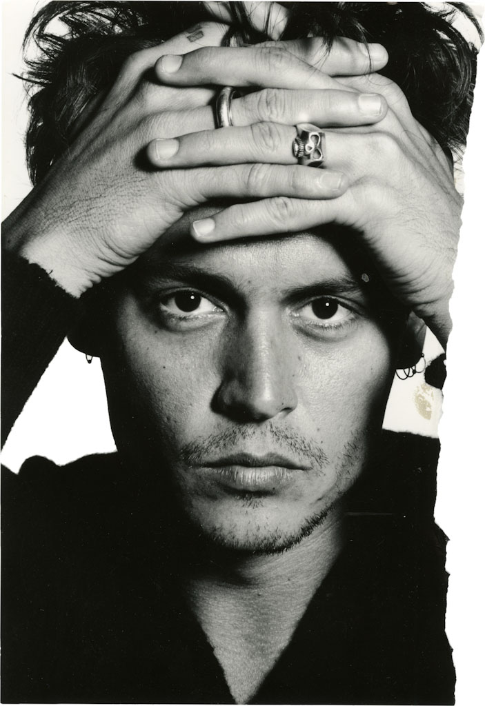
Portraiture
Portrait photography or portraiture is photography of a person or group of people that captures the personality of a subject by using effective lighting, backdrops, and poses. A portrait picture might be artistic, or it might be clinical, as part of a medical study. - Wikipedia ( Portrait Photography ) |
A portrait is a painting, photograph, sculpture, or other artistic representation of a person, in which the face and its expression is predominant. The intent is to display the likeness, personality, and even the mood of the person. - New-York Historical Society |
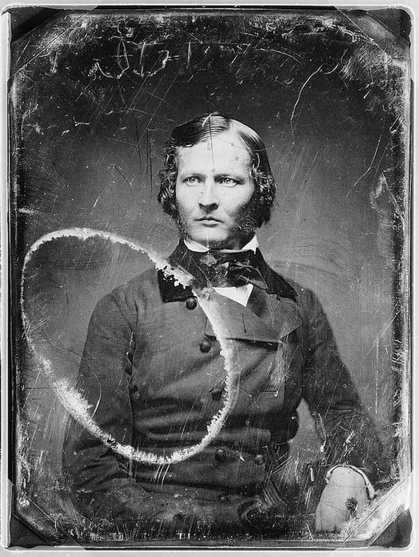
Portraits have been around since the beginning of time, examples span across time back to the Ancient Egyptian wall paintings of Pharaohs. When portraiture was first around the most common subjects were the rich and powerful, Kings and Queens, as well as that the church would regularly commission of religious figures to adorn cathedrals. With the invention of Daguerreotypes by Louis-Jacques-Mandé Daguerre in 1839 photography would become cheaper and easier, as with this and the reduced sitting time portraiture became publicly more popular. However 20 years later it was superseded by a newer form that was even cheaper and produced results quicker. With the advancement of photographic technology, photographers were able to produce better outcomes, easier and cheaper than before. This also allowed photographers to make portraits outside of the studio.
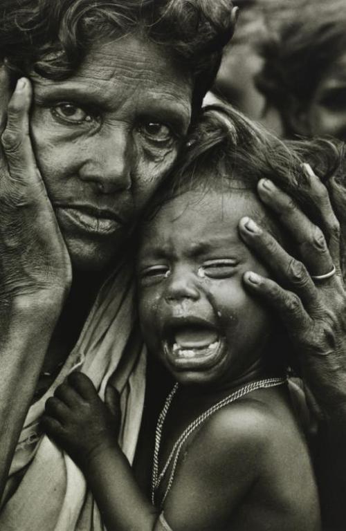
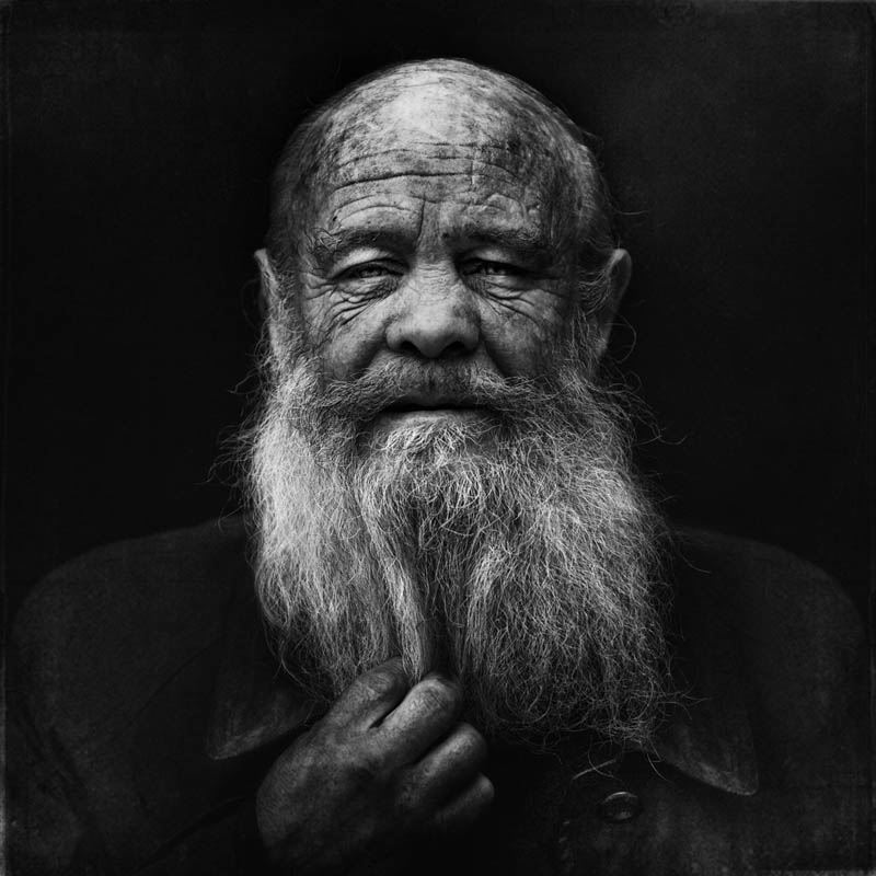
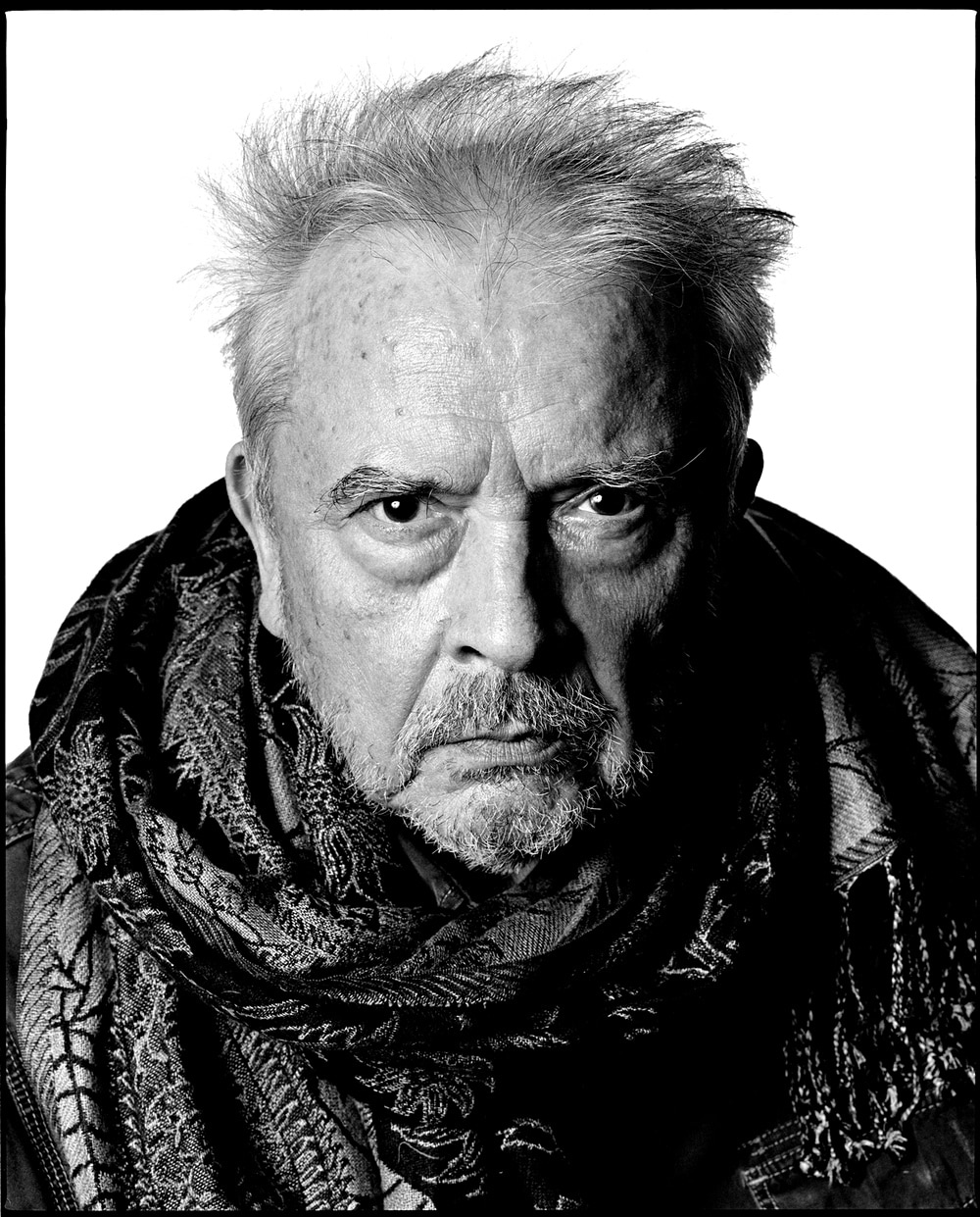
Don McCullin
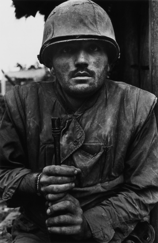
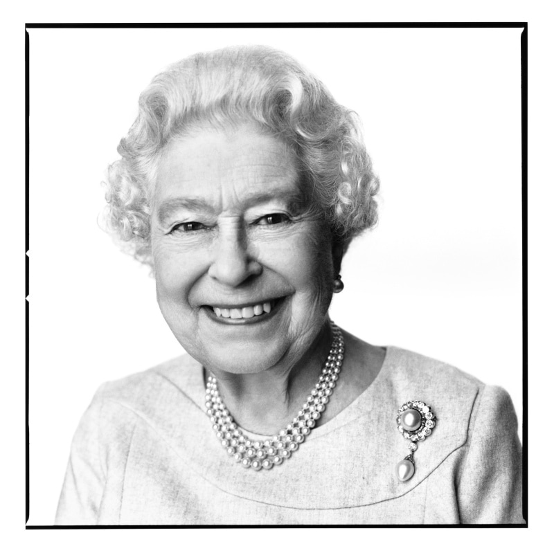
Don McCullin was born in 1935, after being granted a scholarship to Hammersmith School of Arts and Crafts his father died and he left at 15, to become a caterer on the railway. He was then called up for National Service with the RAF. During his service, he worked as a photographer's assistant spending his time in the darkroom as he failed the written test to become a photographer with the RAF. He bought his first camera, a Rolleicord, which he had to pawn due to a shortage of funds. After returning home he took a photograph of a London Gang which was published in the observer. For the next twenty years, he worked as an overseas correspondent for the Sunday Times. Just two years in he was shot at, his Nikon F saving his life. In the same year, he was invited to photograph for the Beatles as they recorded 'The White Album'. He was knighted in the 2017 New Years Honours for services to photography.
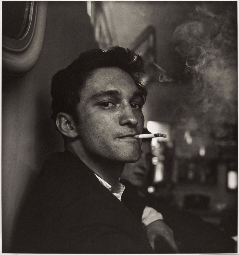

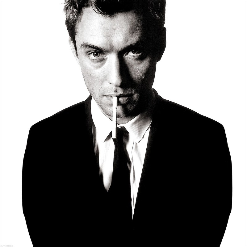
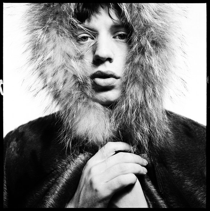
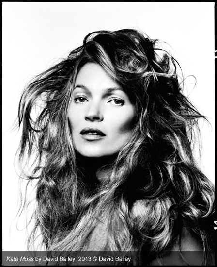
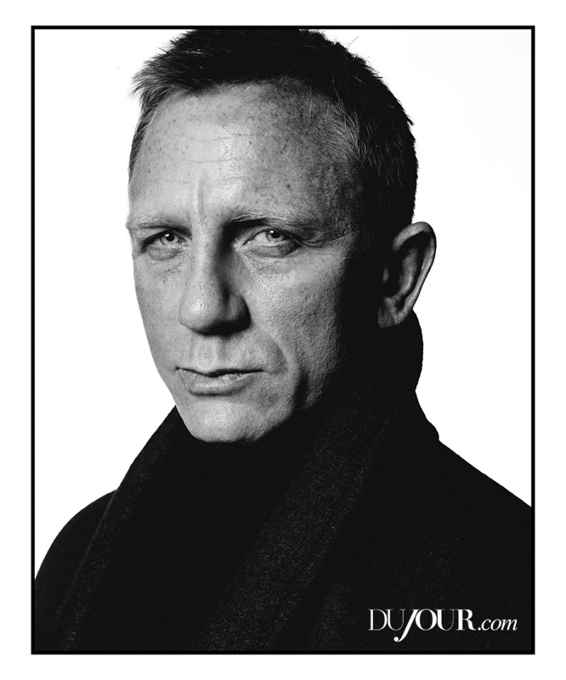
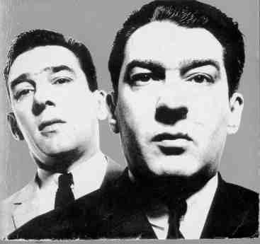
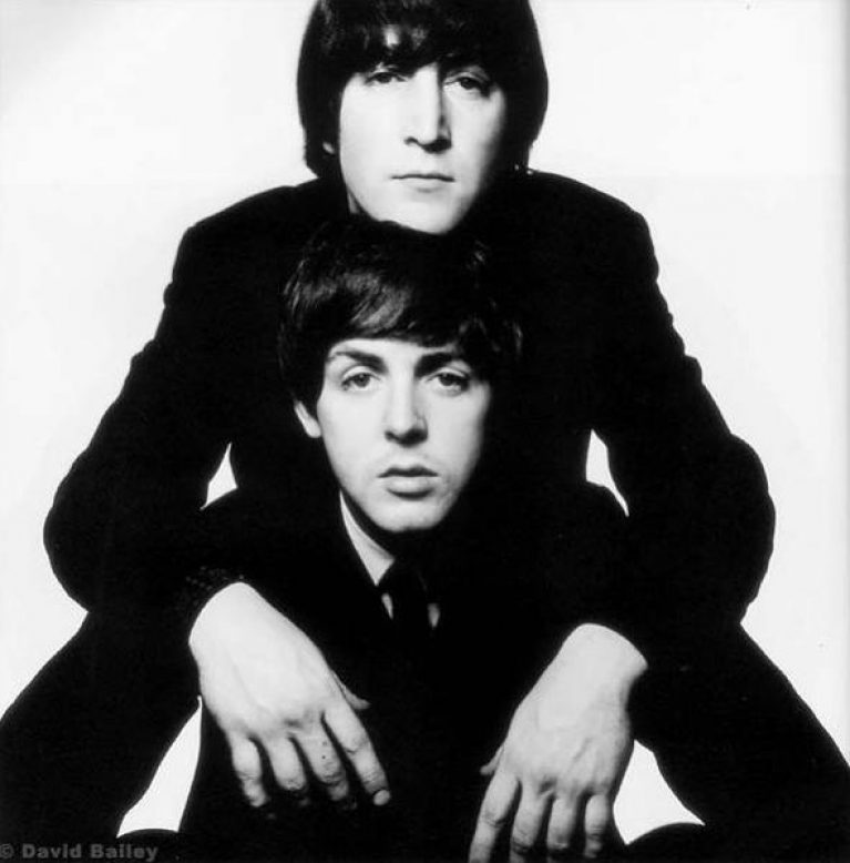
David Bailey
David Bailey, like Don McCullin, discovered photography out of the RAF. While there he realised that he wanted to pursue a different creative avenue and chose photography. Soon after he became a photographer assistant to John French. From there he went on to work at Vogue. Alongside two other photographers, they helped create the 'swinging London' in the 60's. This was reflected in his first collection 'Box of Pin-ups' in '64, a box of poster prints of 1960's celebrities. Very soon after working at vogue he was shooting covers and during his prime there he shot 800 pages in one year.
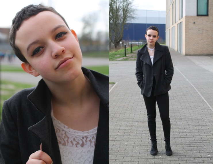
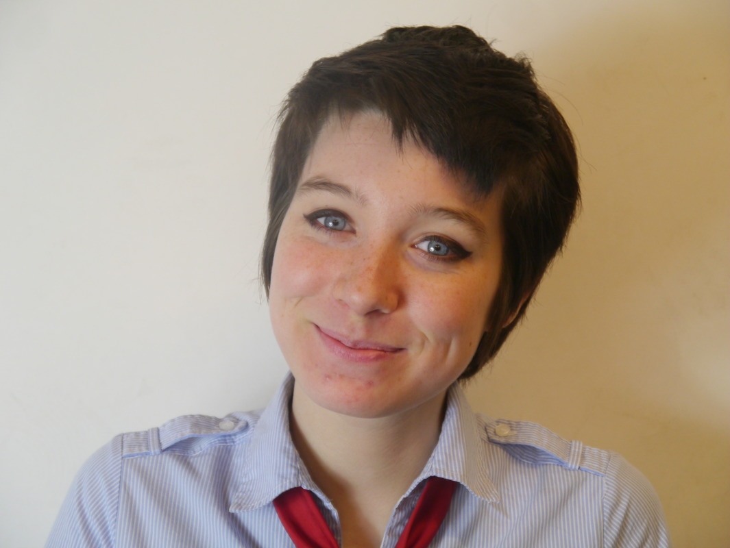
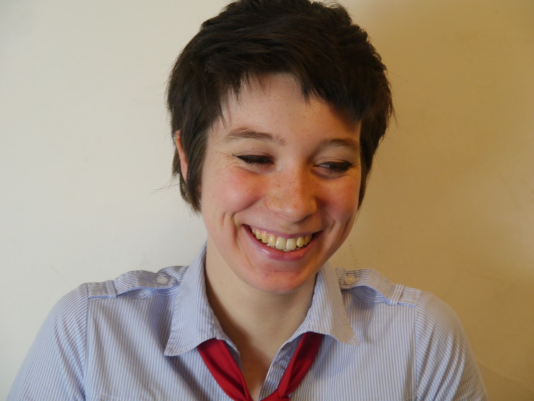
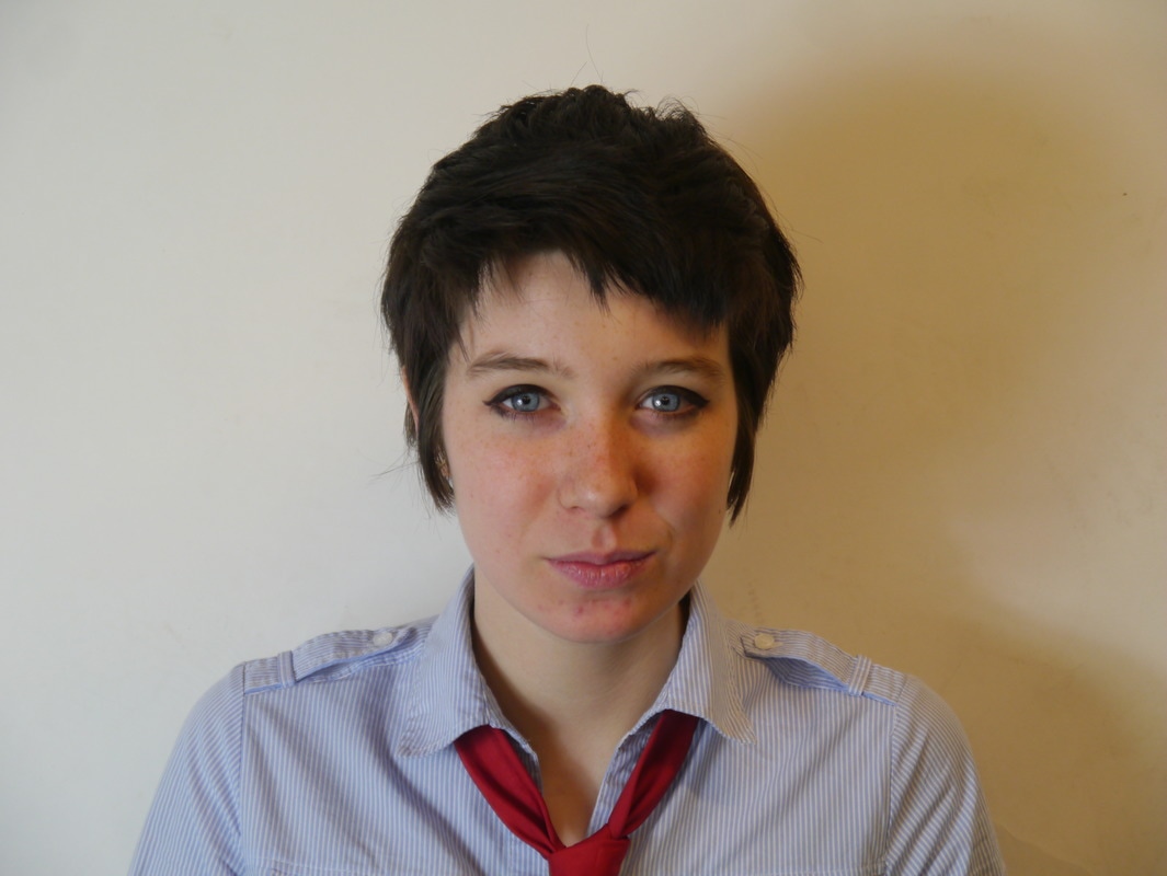
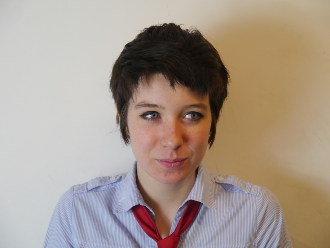
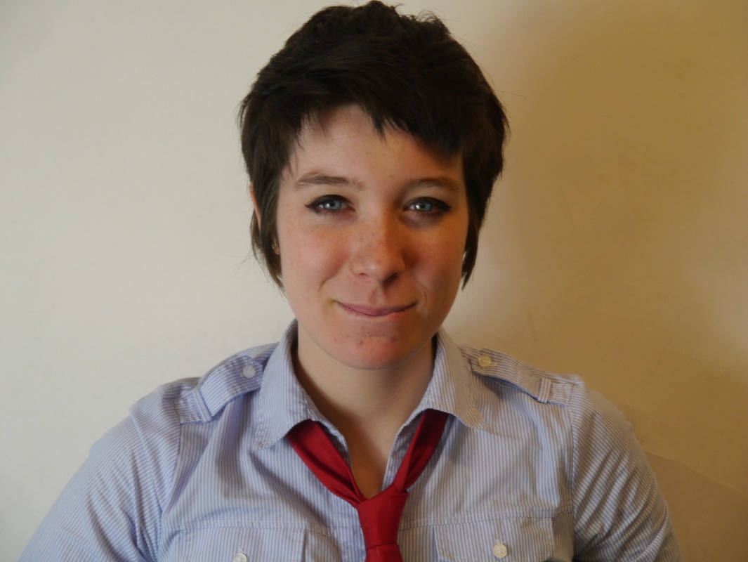
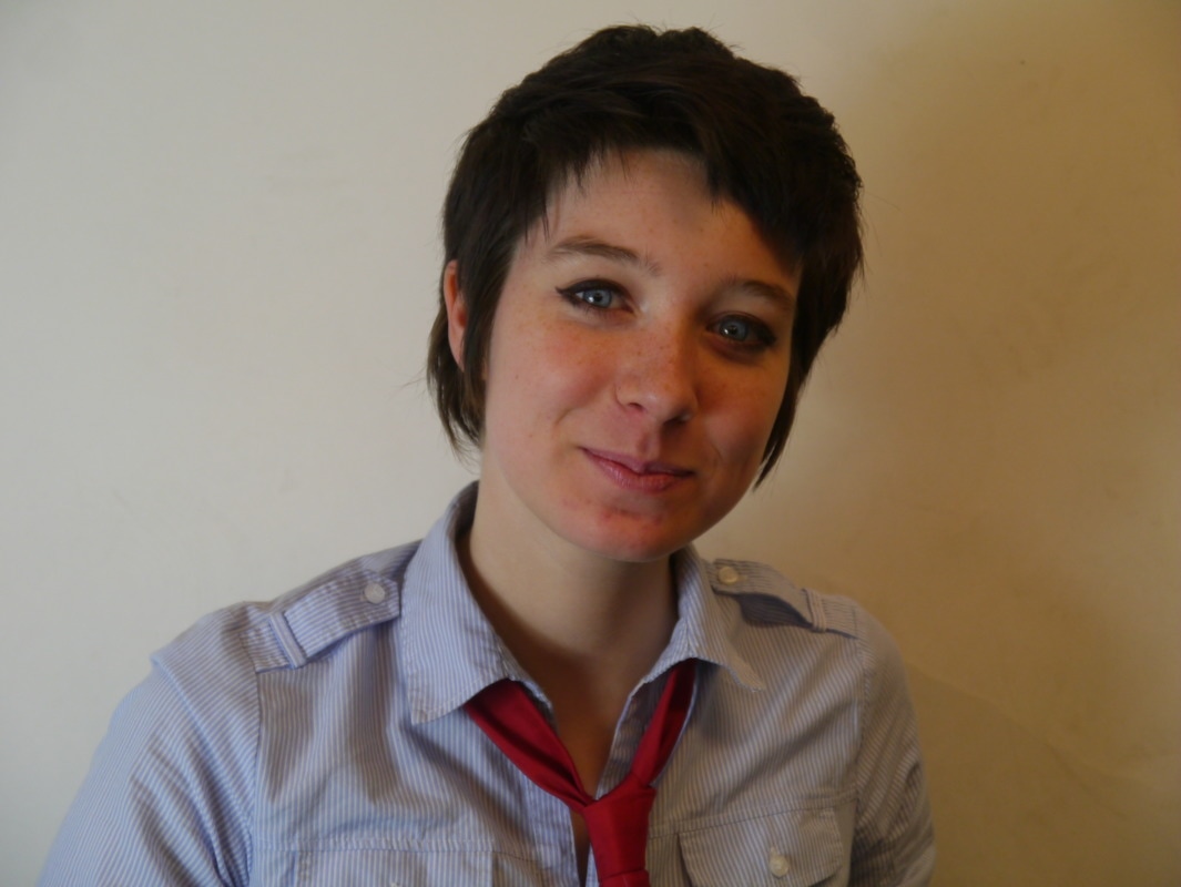
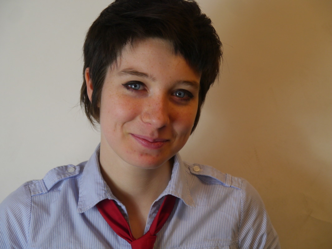
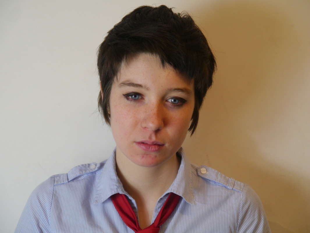
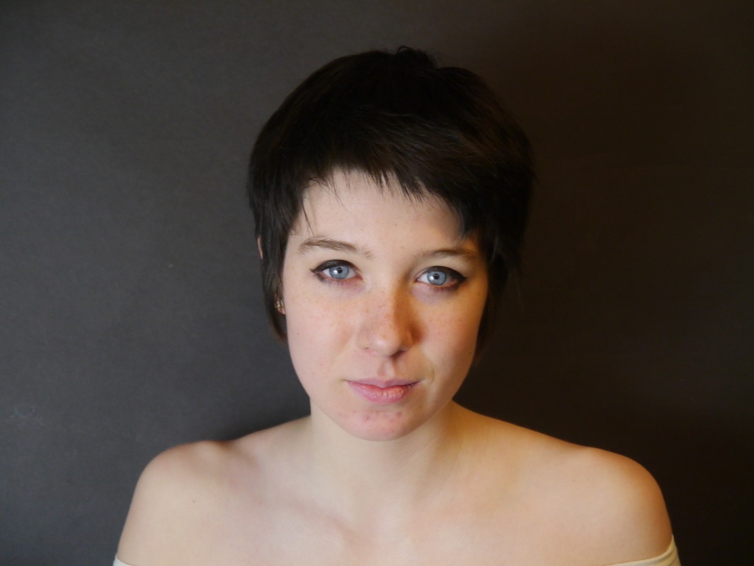
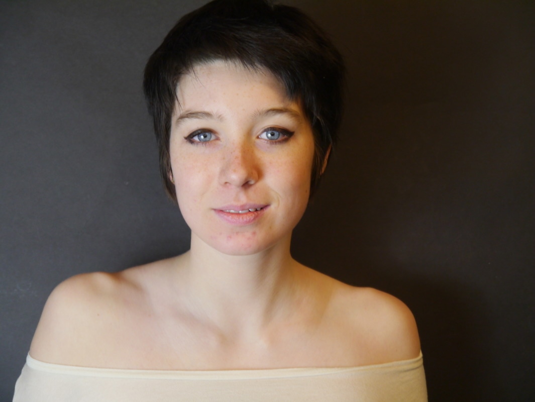
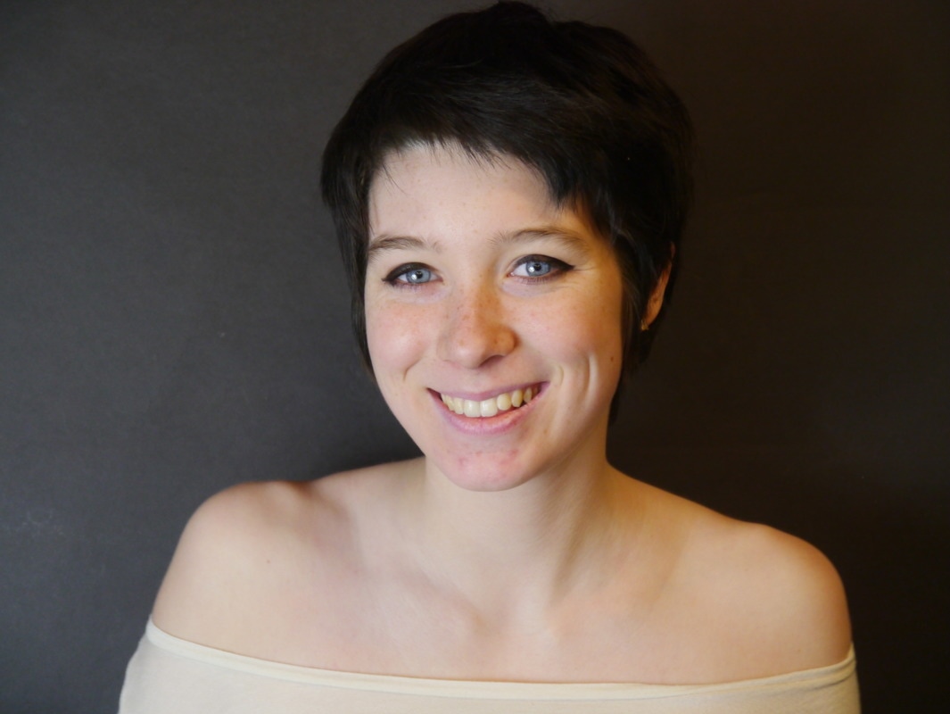
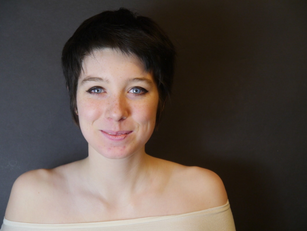
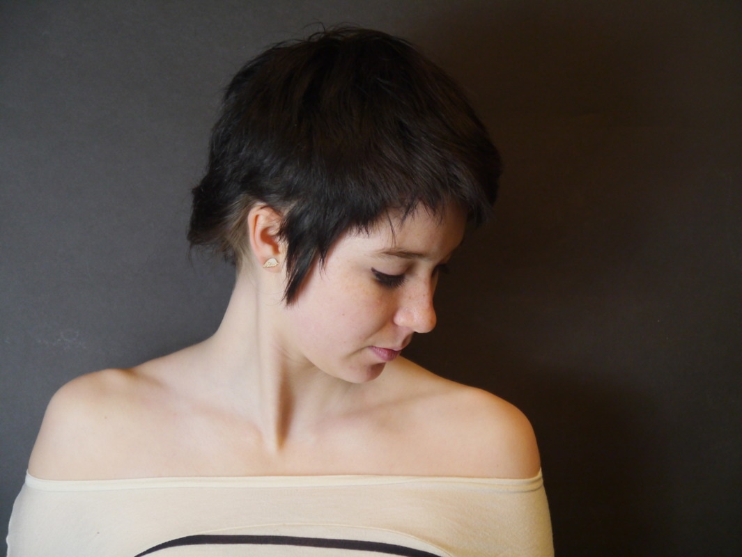
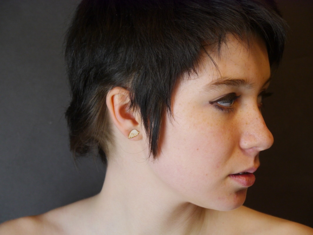
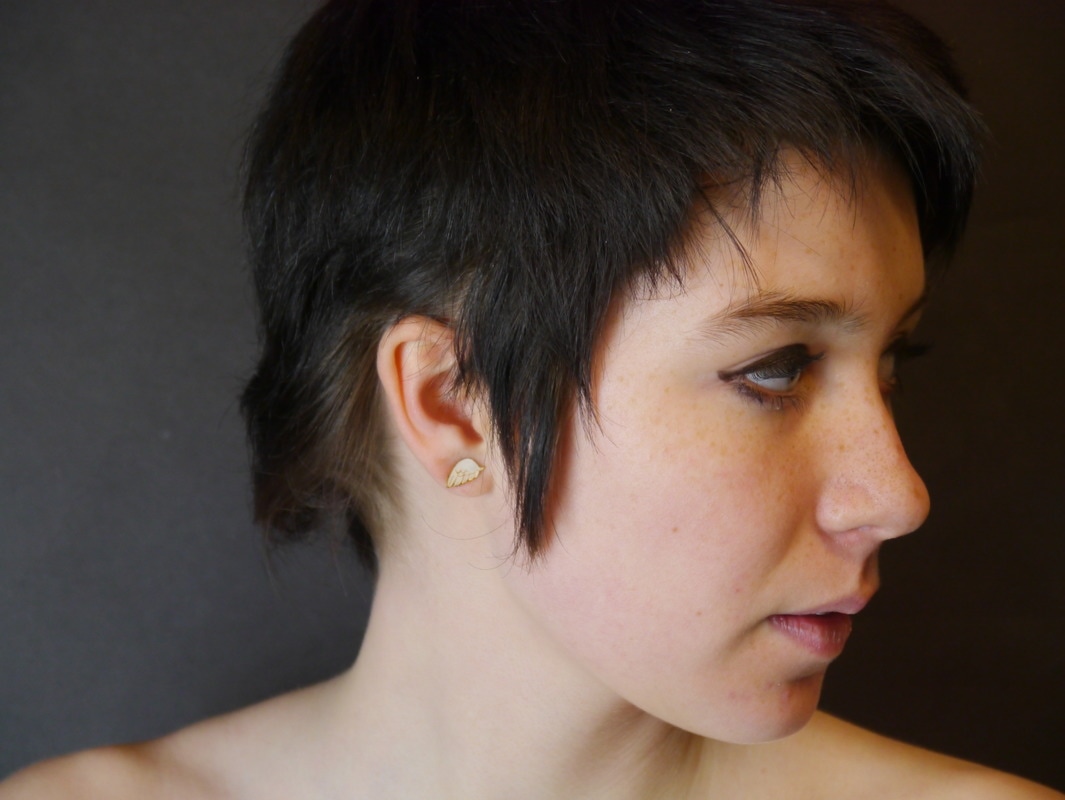
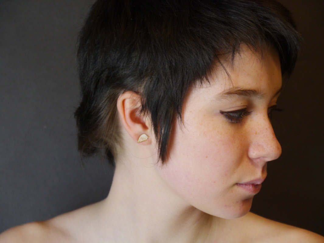
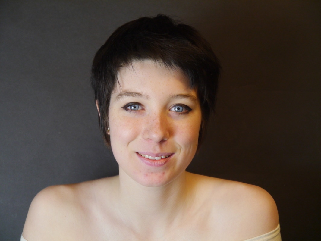
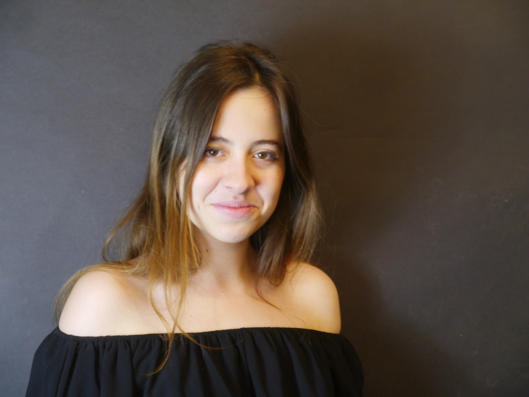
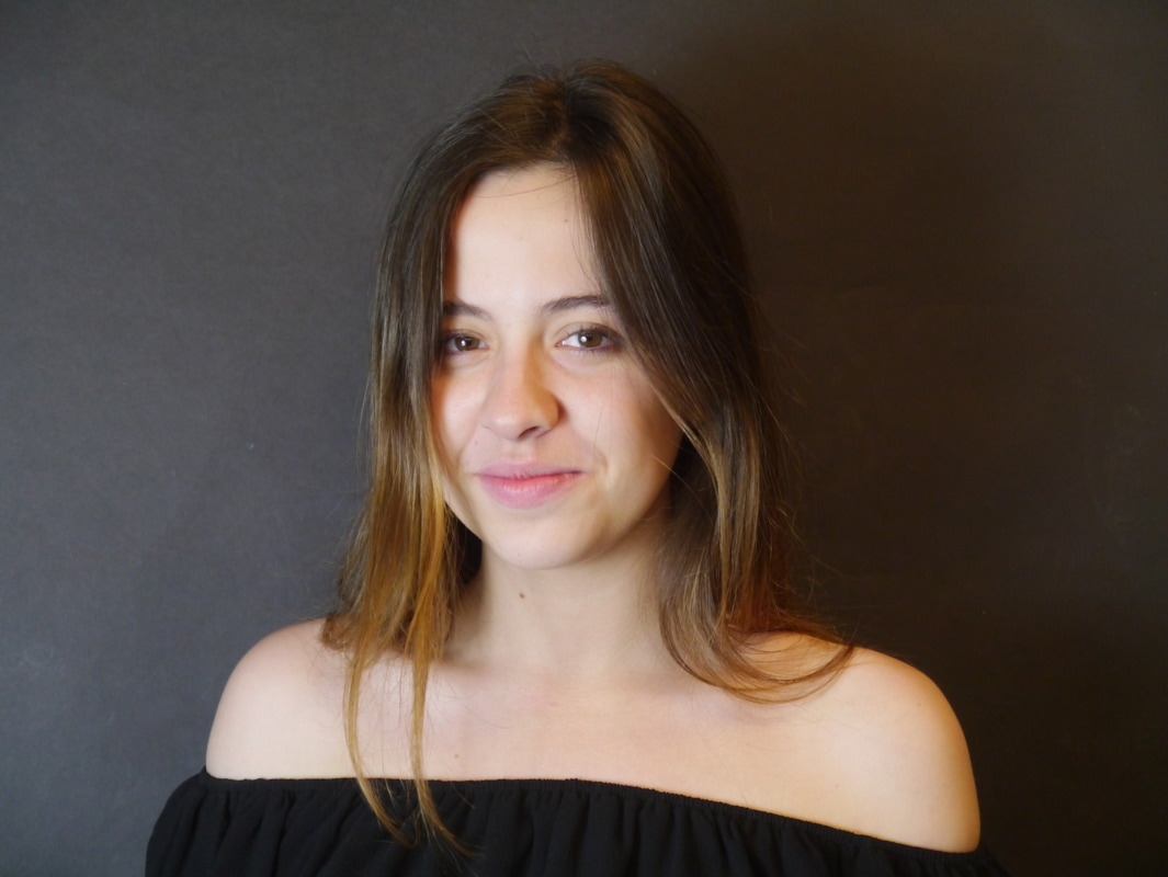
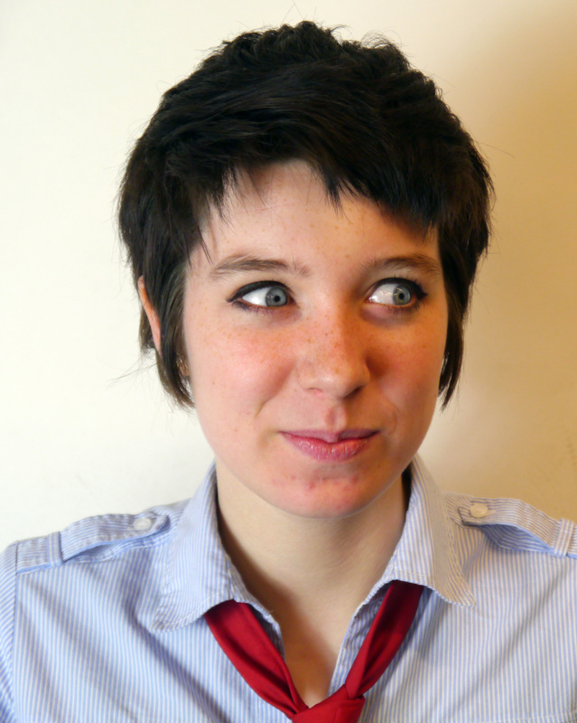
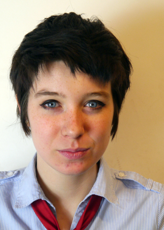
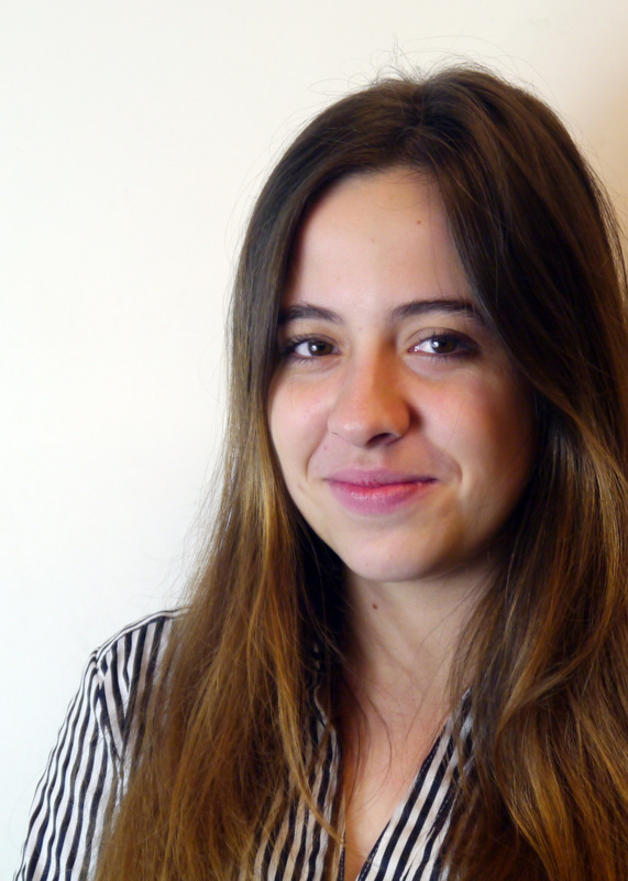
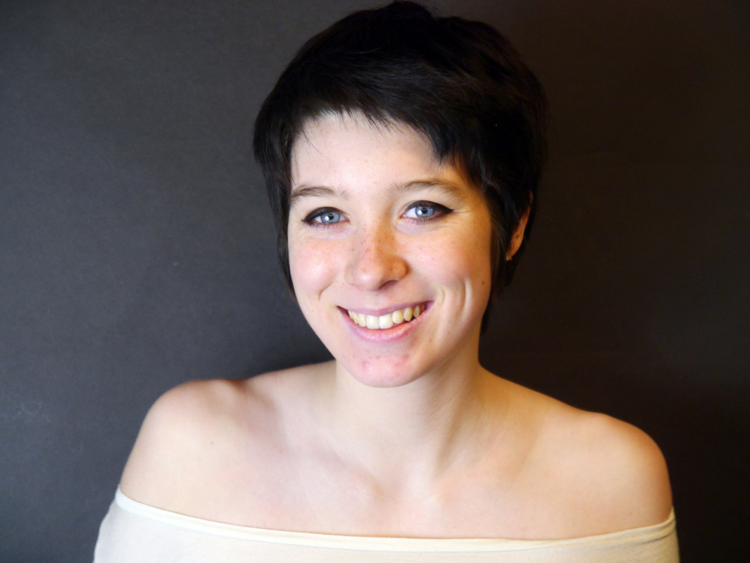
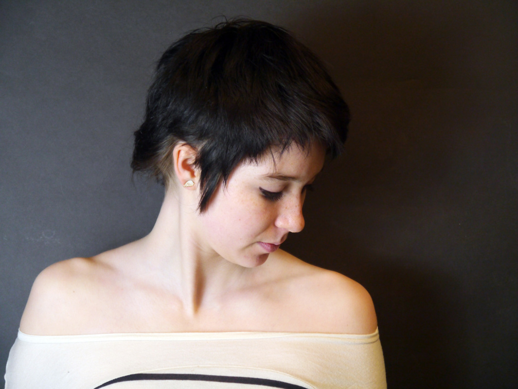
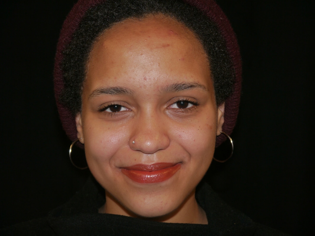
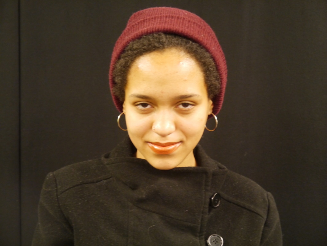
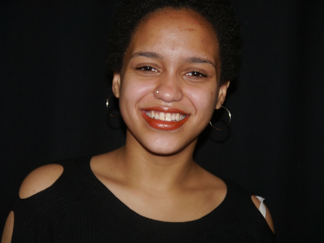
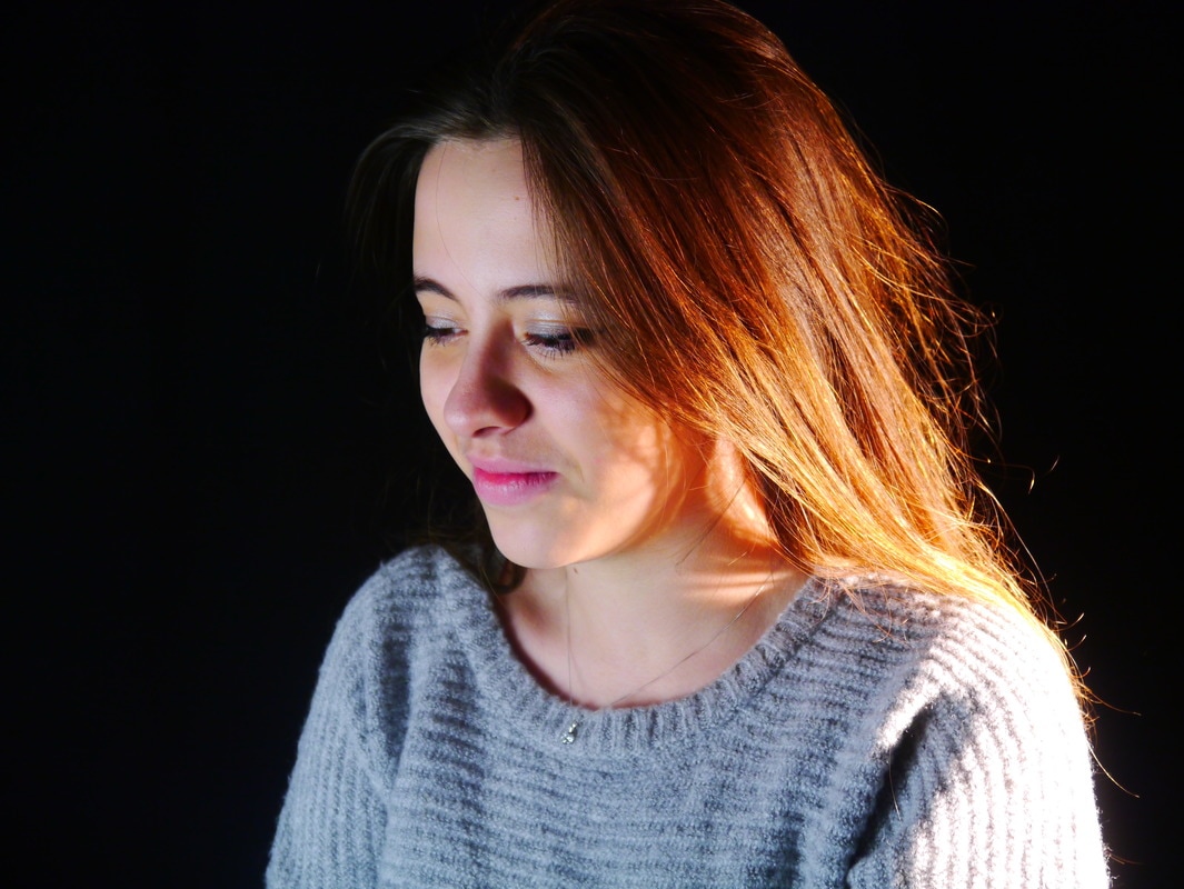
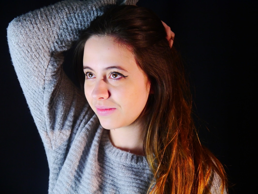
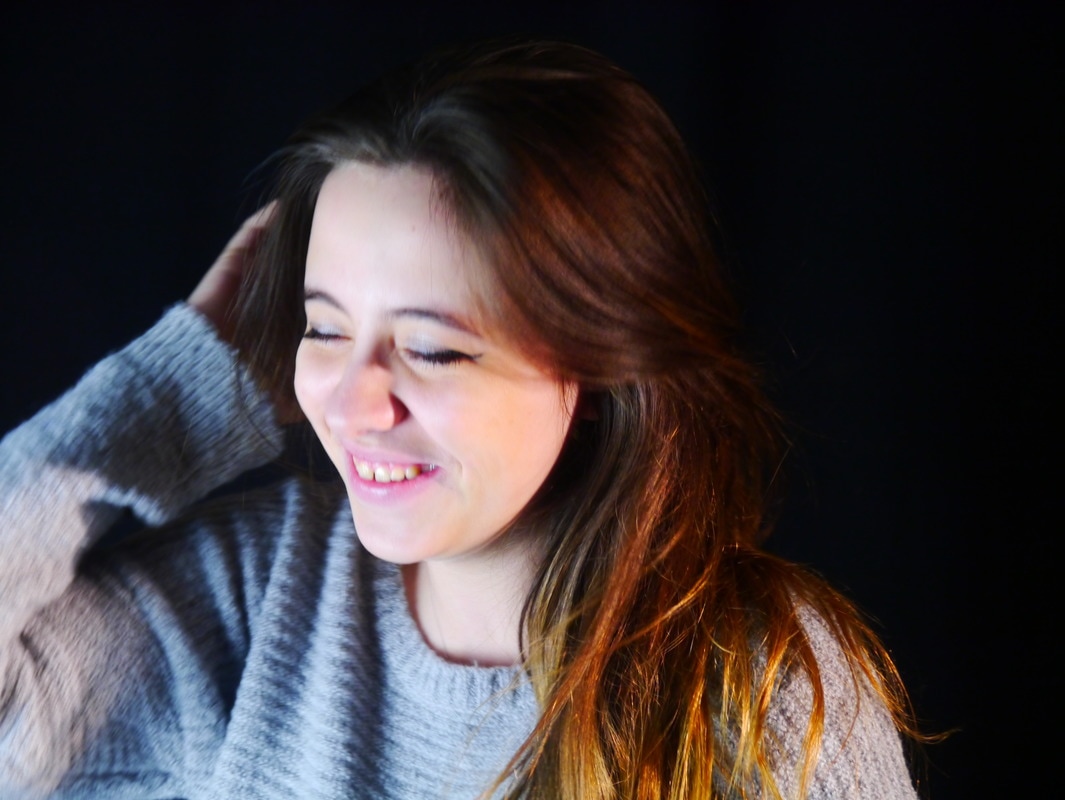
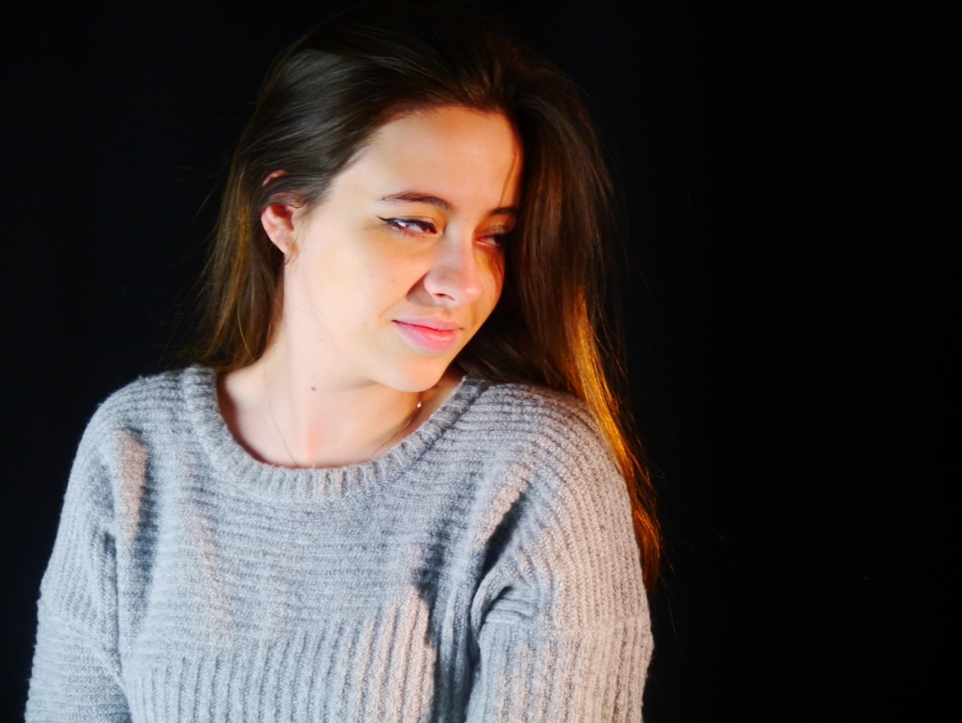
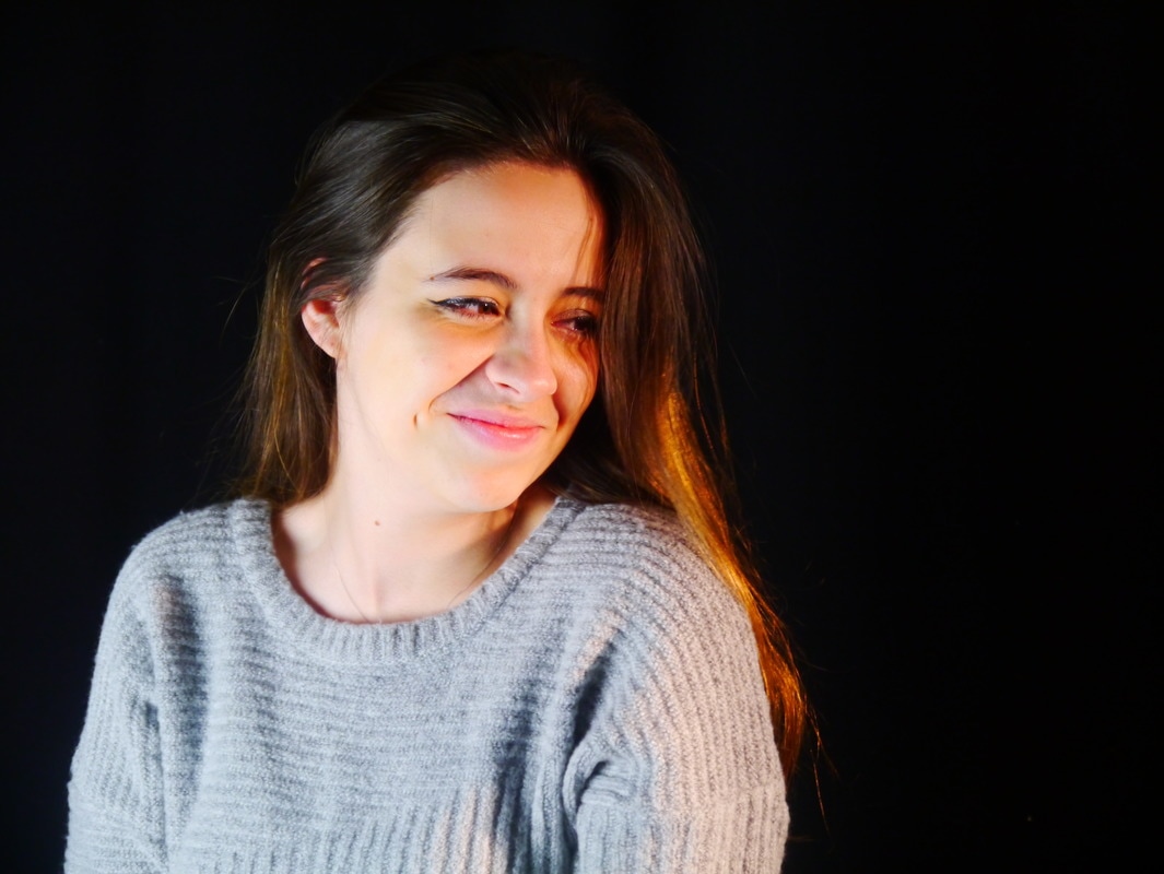
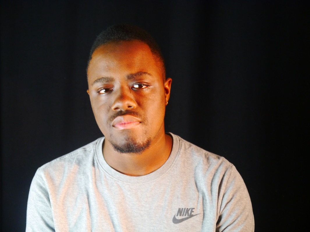
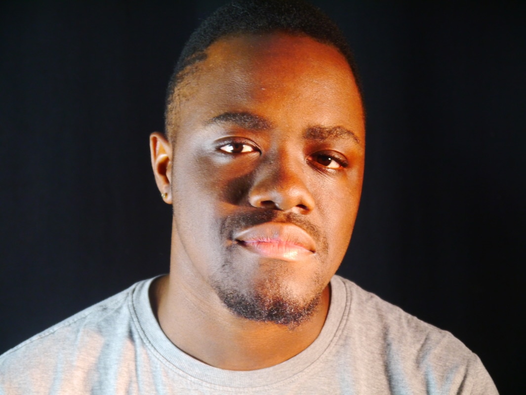
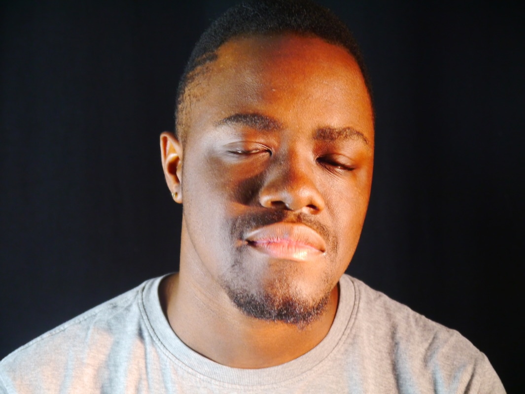
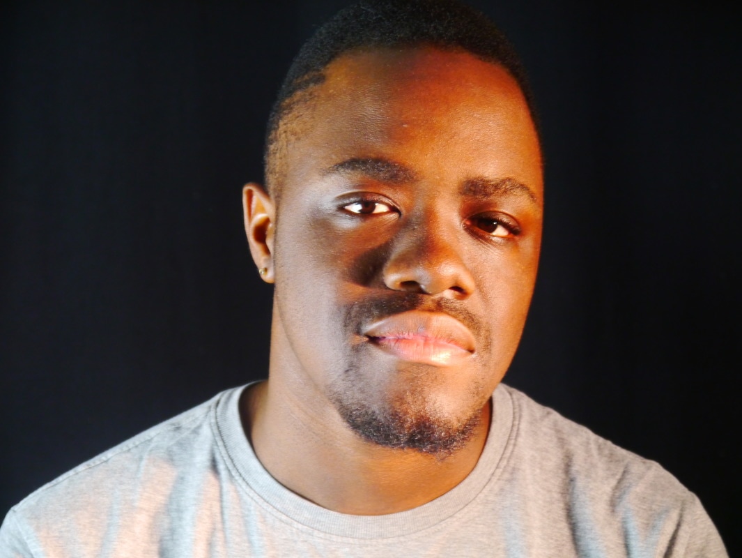
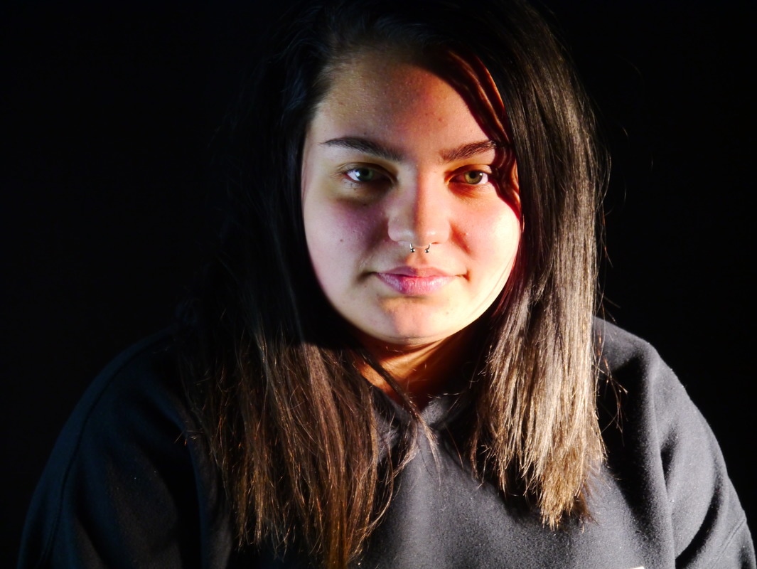
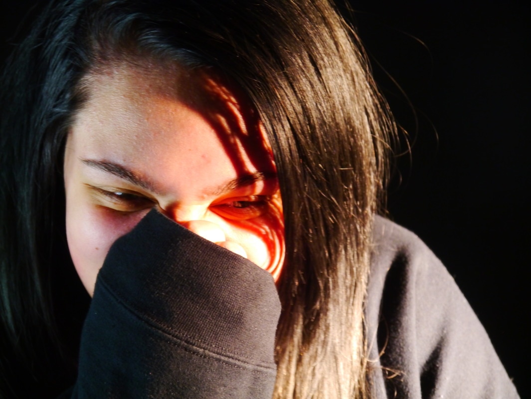
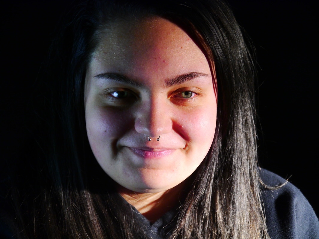
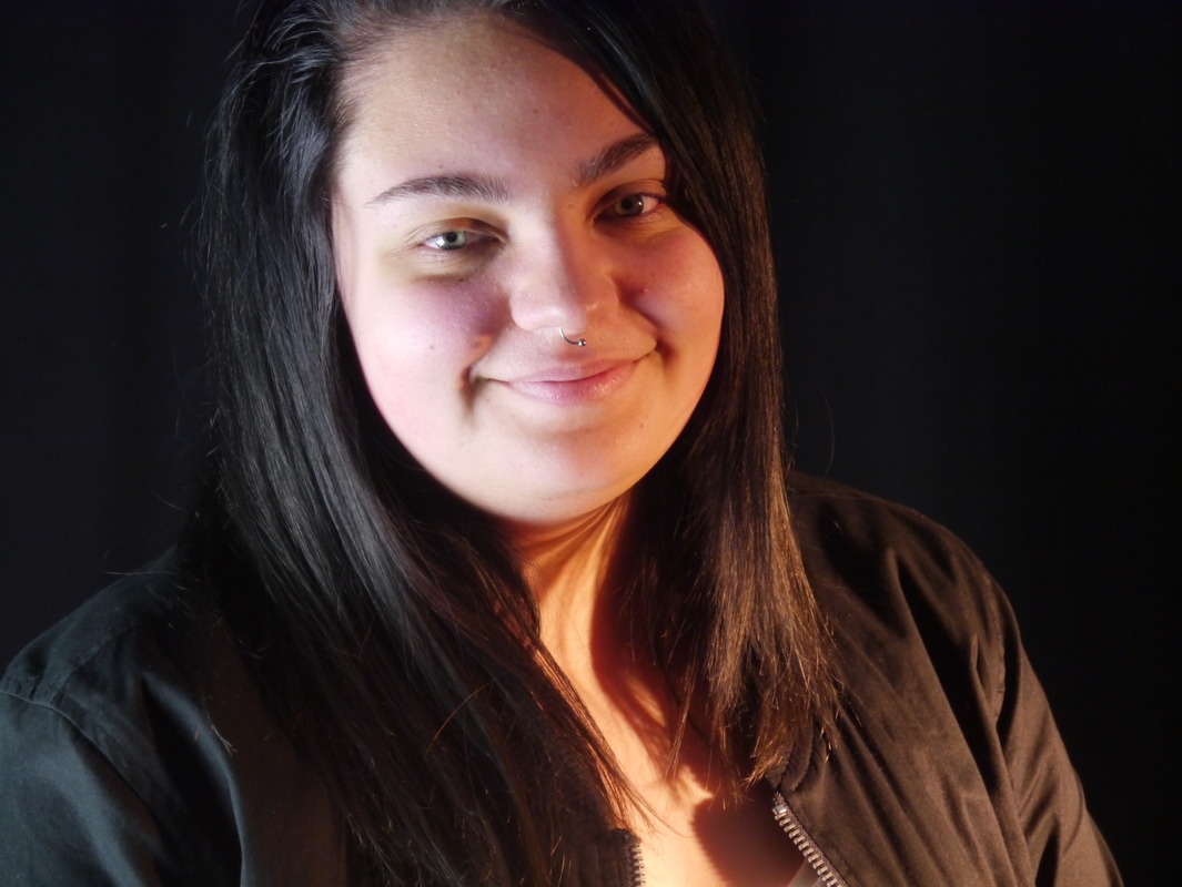
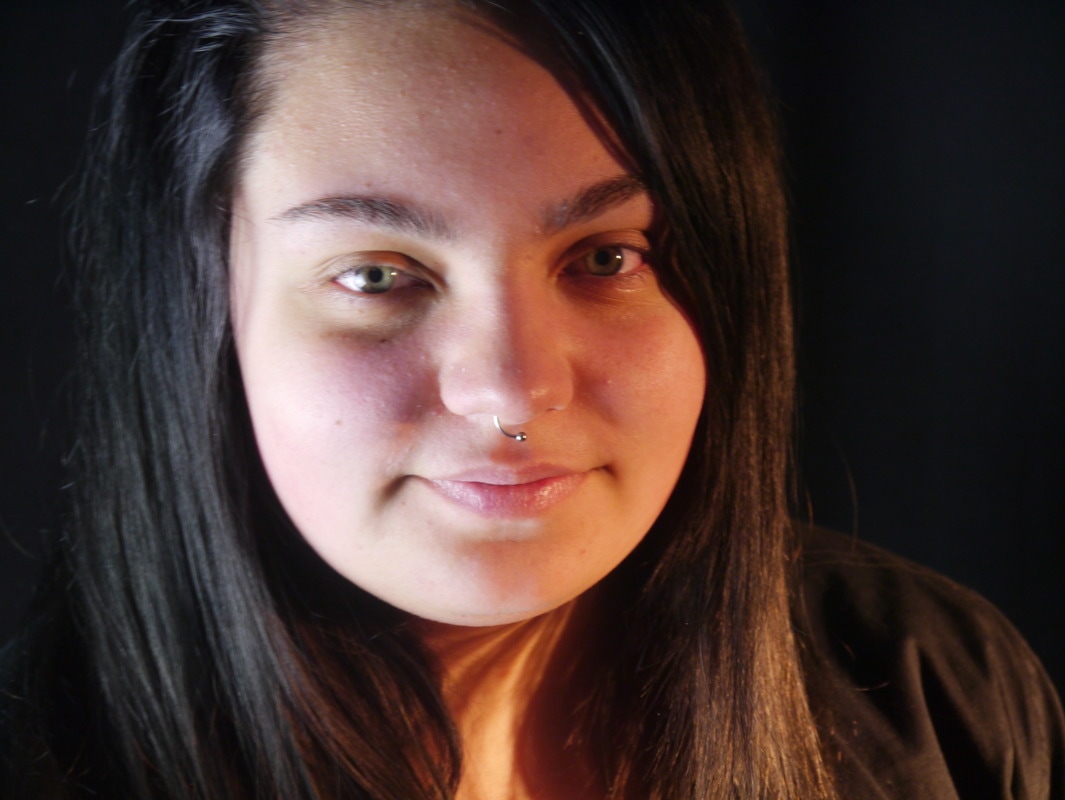
My portraits #1
Pre-edit and trimming down
|
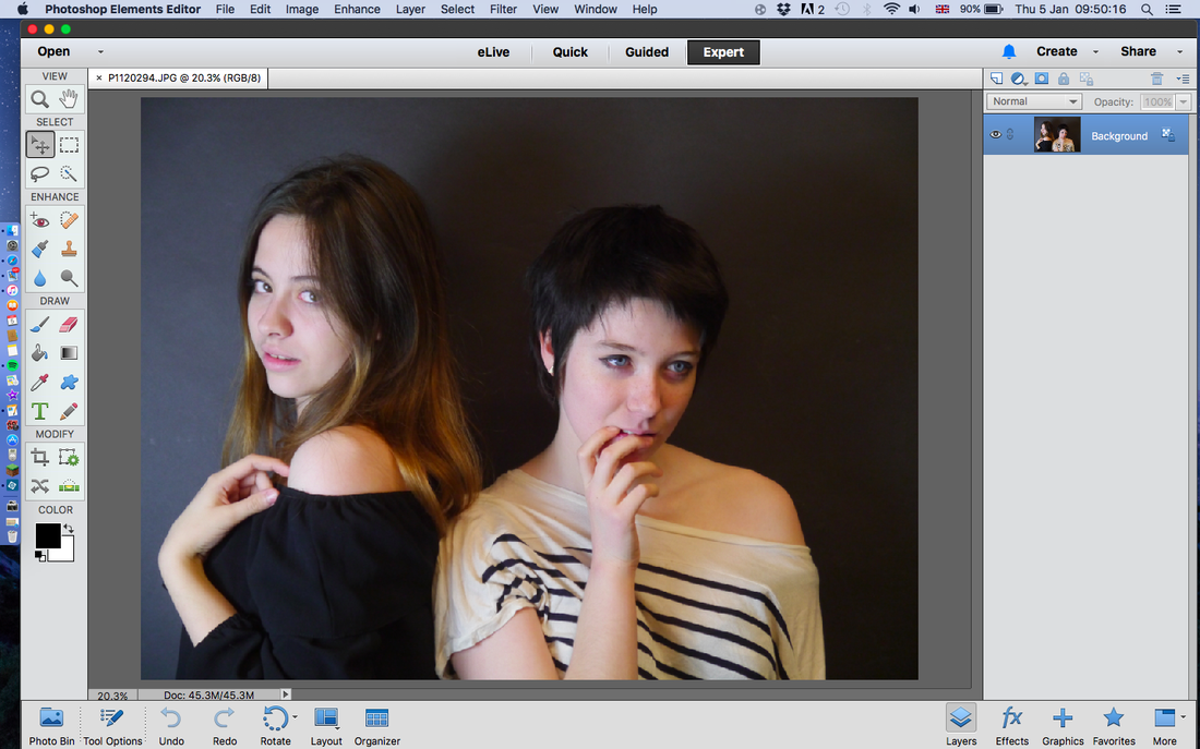
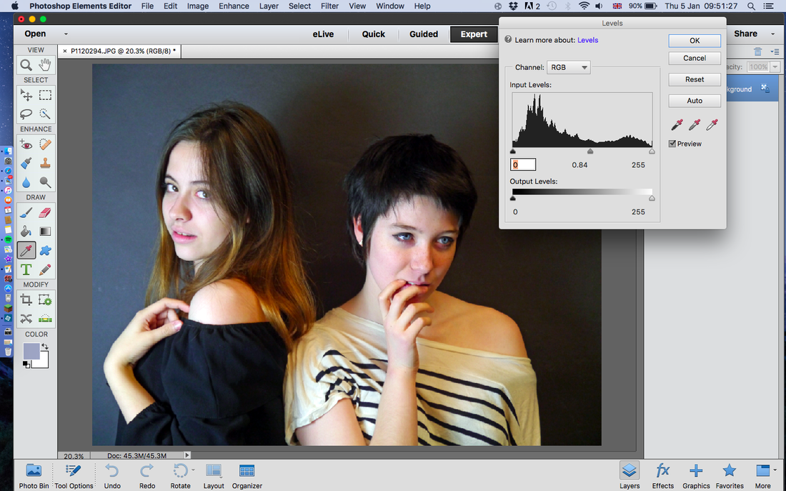
My selection process was mostly just picking out which one of a pair or set I liked the best, deleting all the blurry ones or out of focus ones or ones where the lighting wasn't positioned correctly. As for editing I just adjusted the lighting on somewhere the shadows were too harsh, or where I wanted them harsher. To do this I just played with the levels in photoshop.
|
|
|
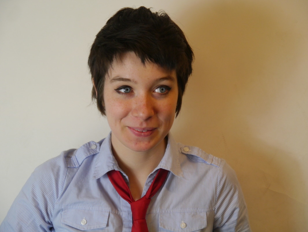
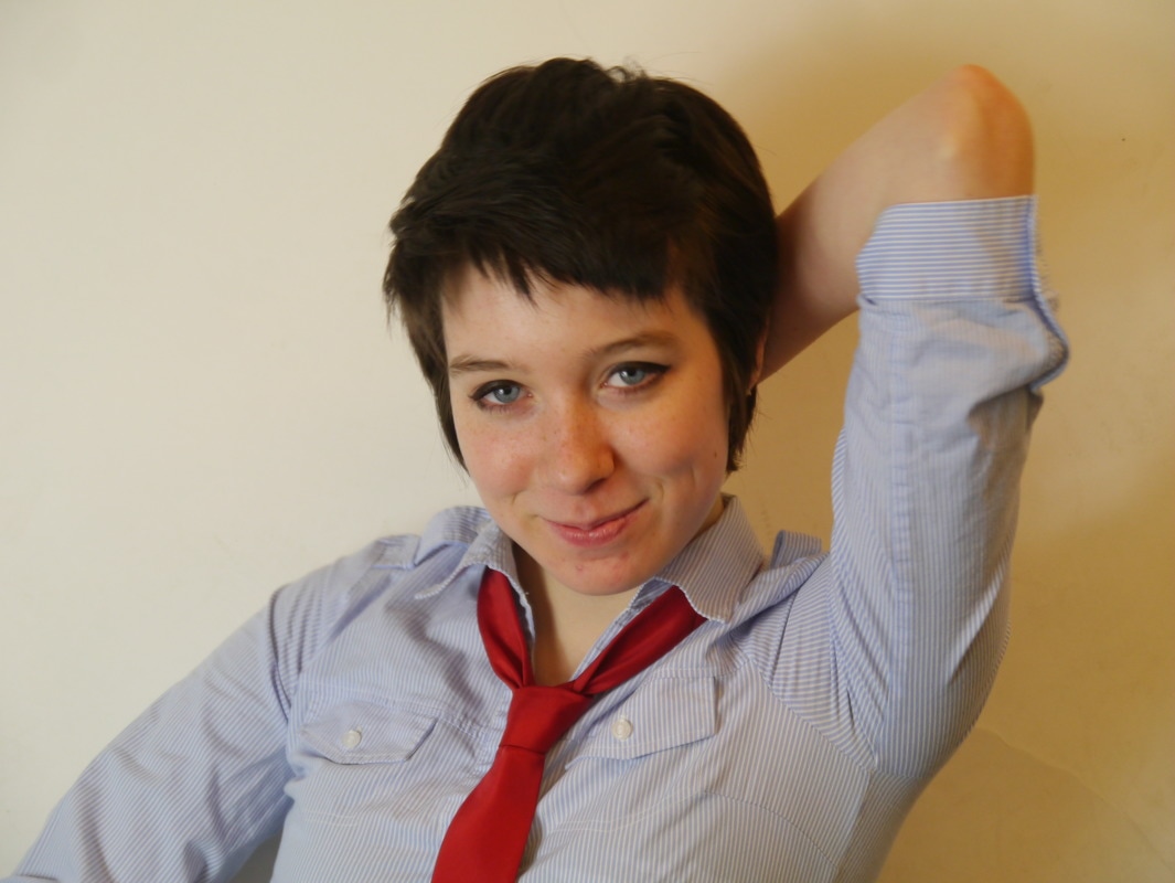
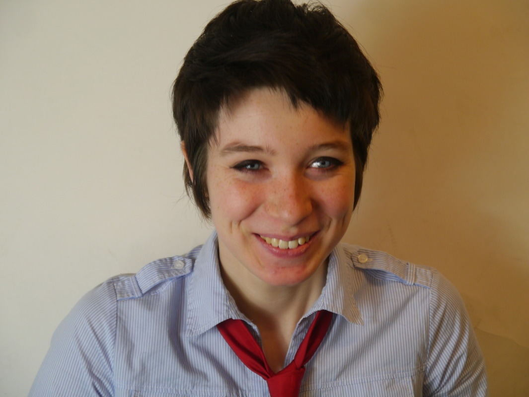
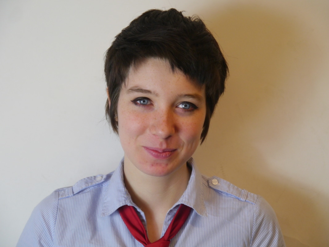


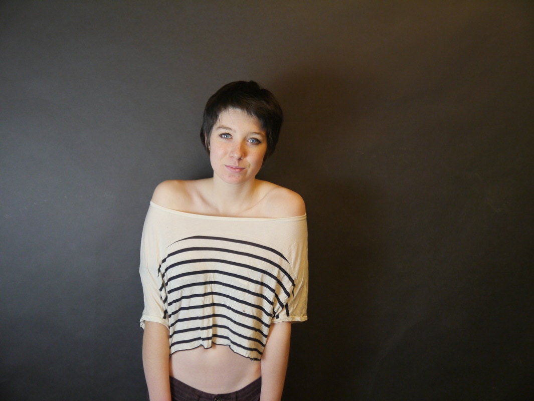
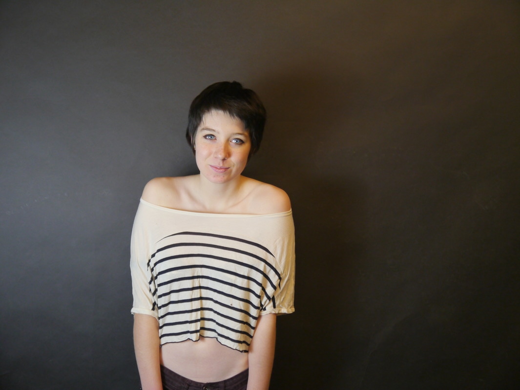
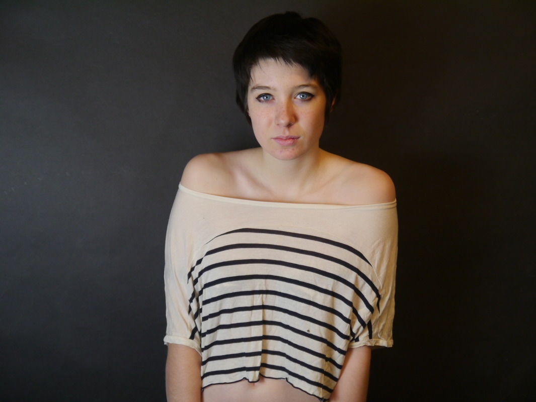
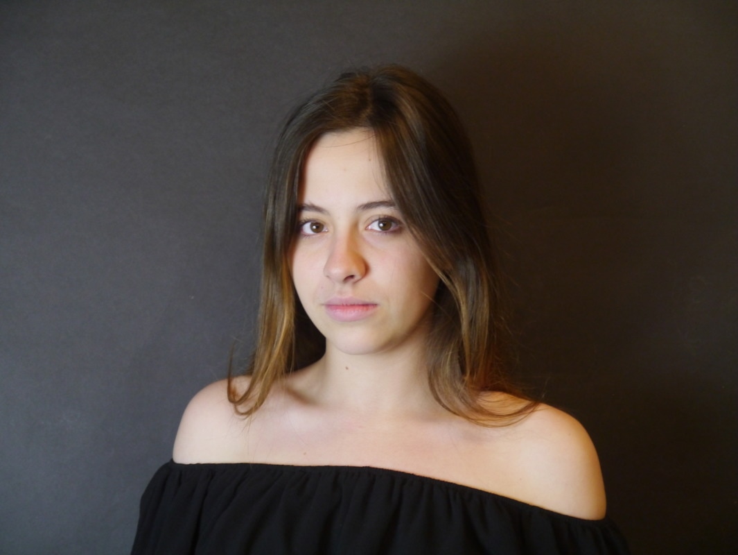
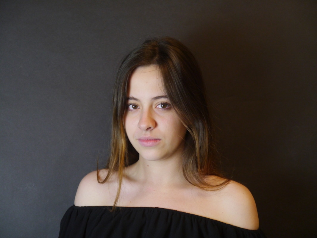
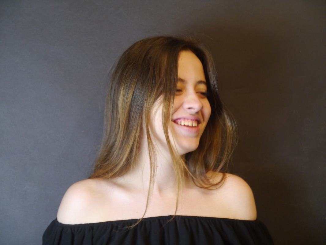
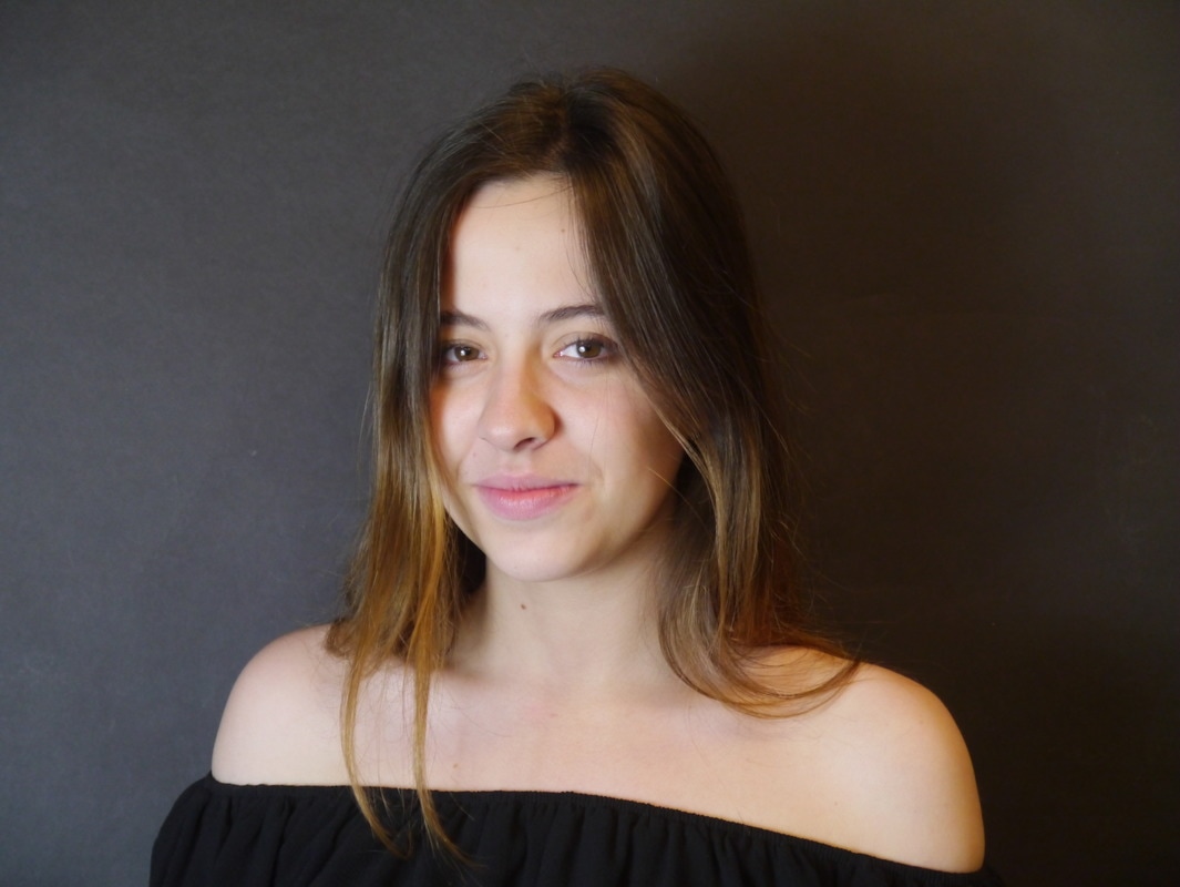
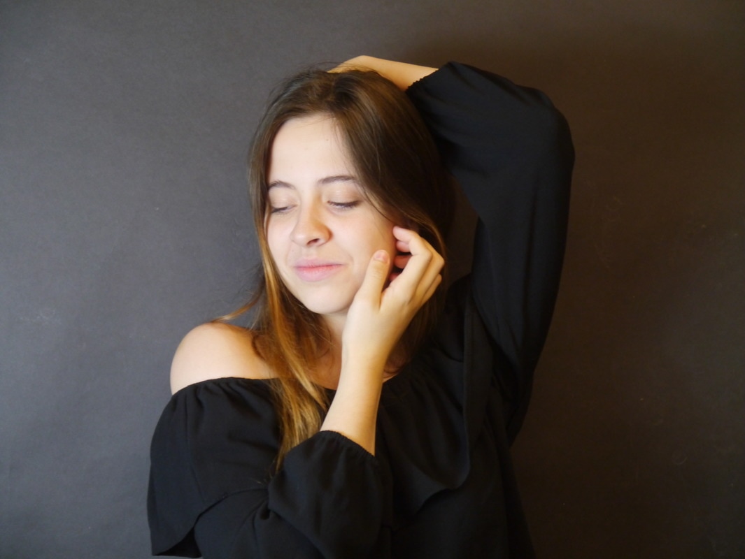
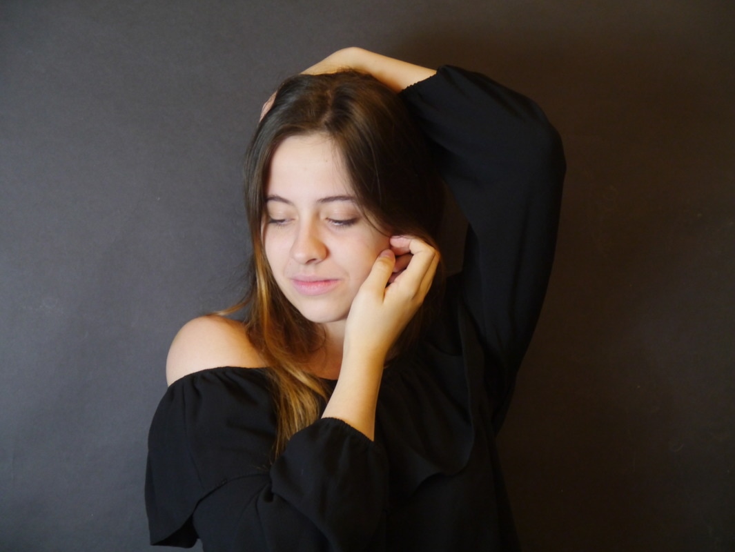
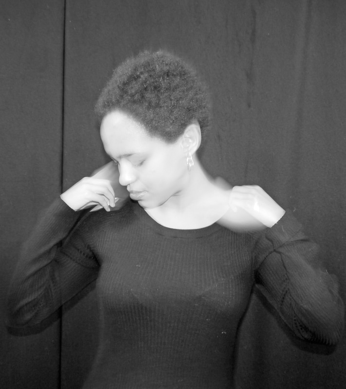
Editing
Finals |
|
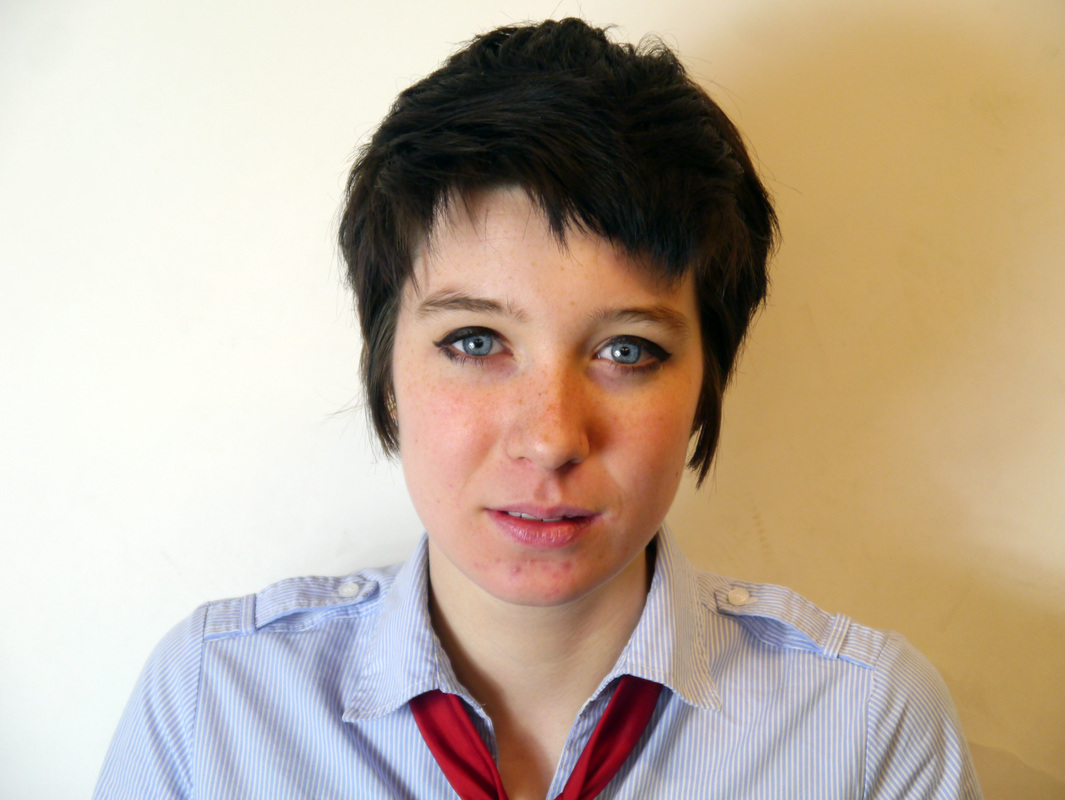
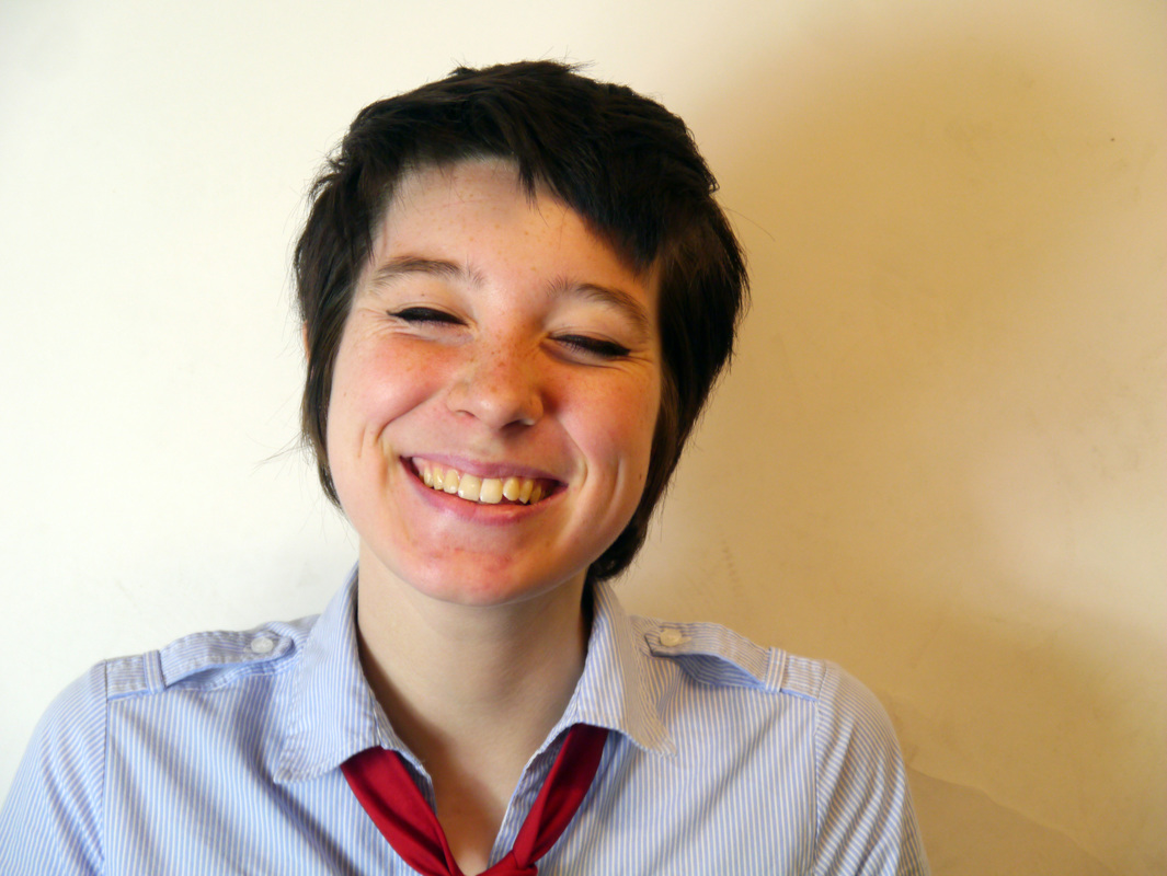
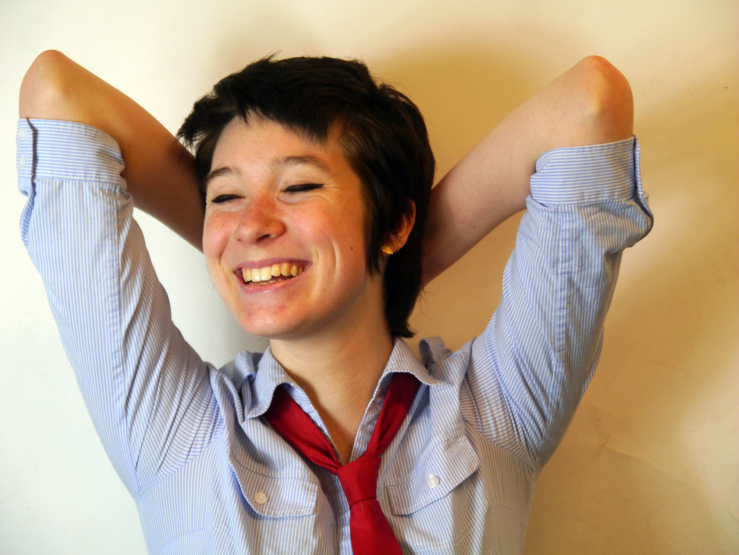
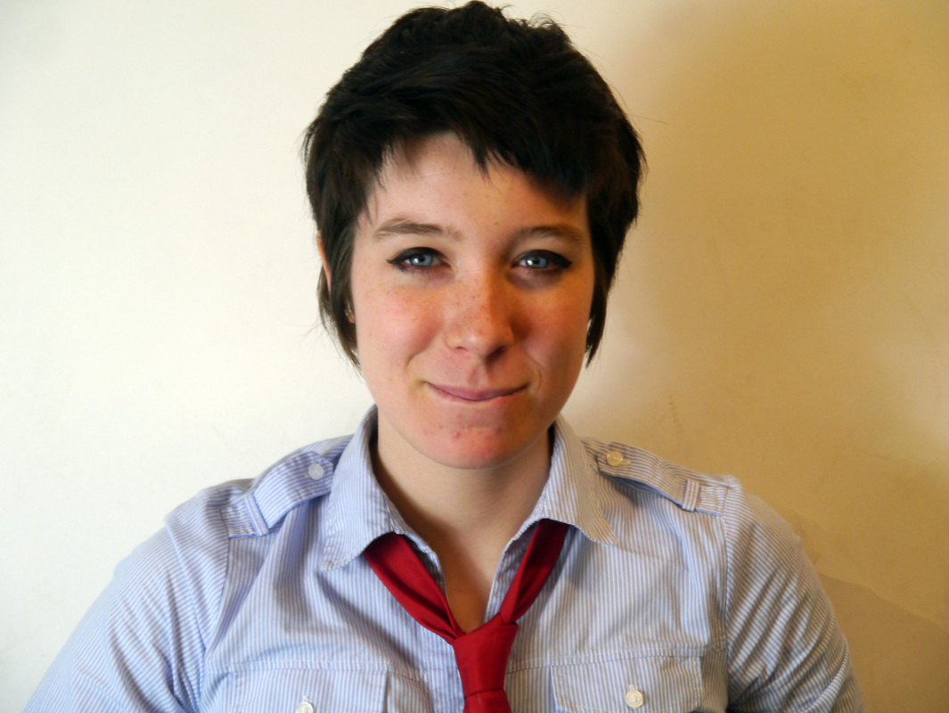
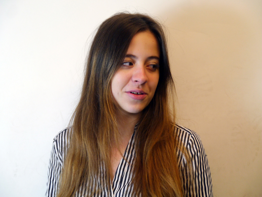
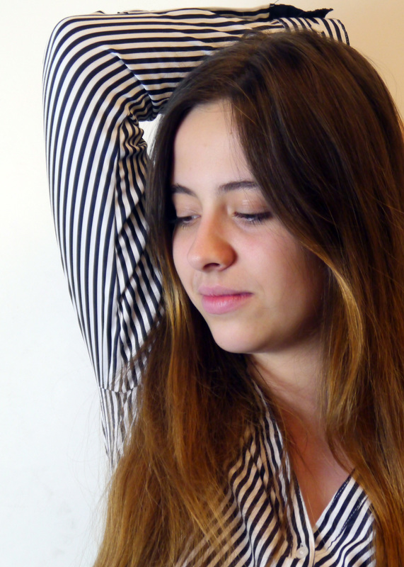
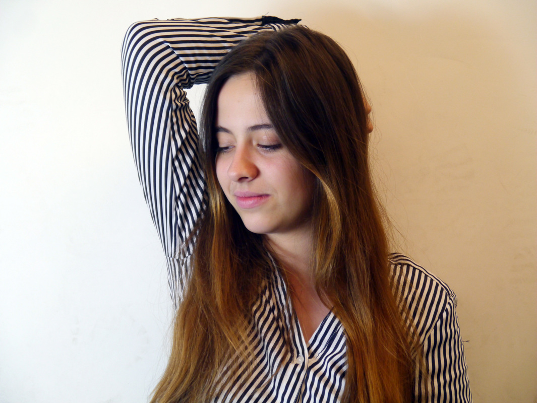
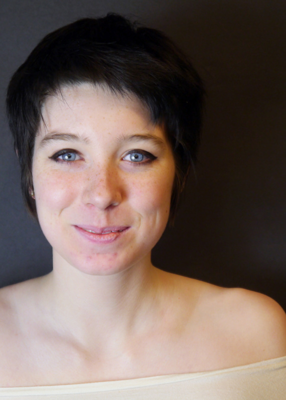
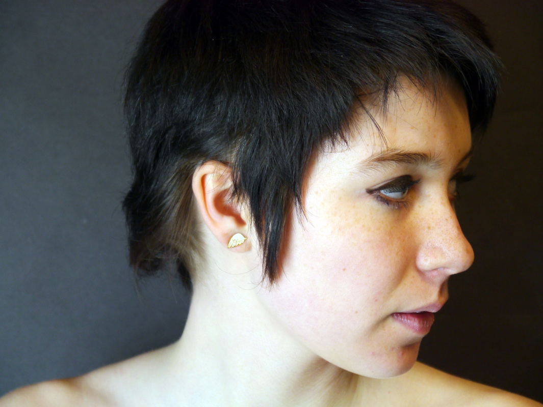
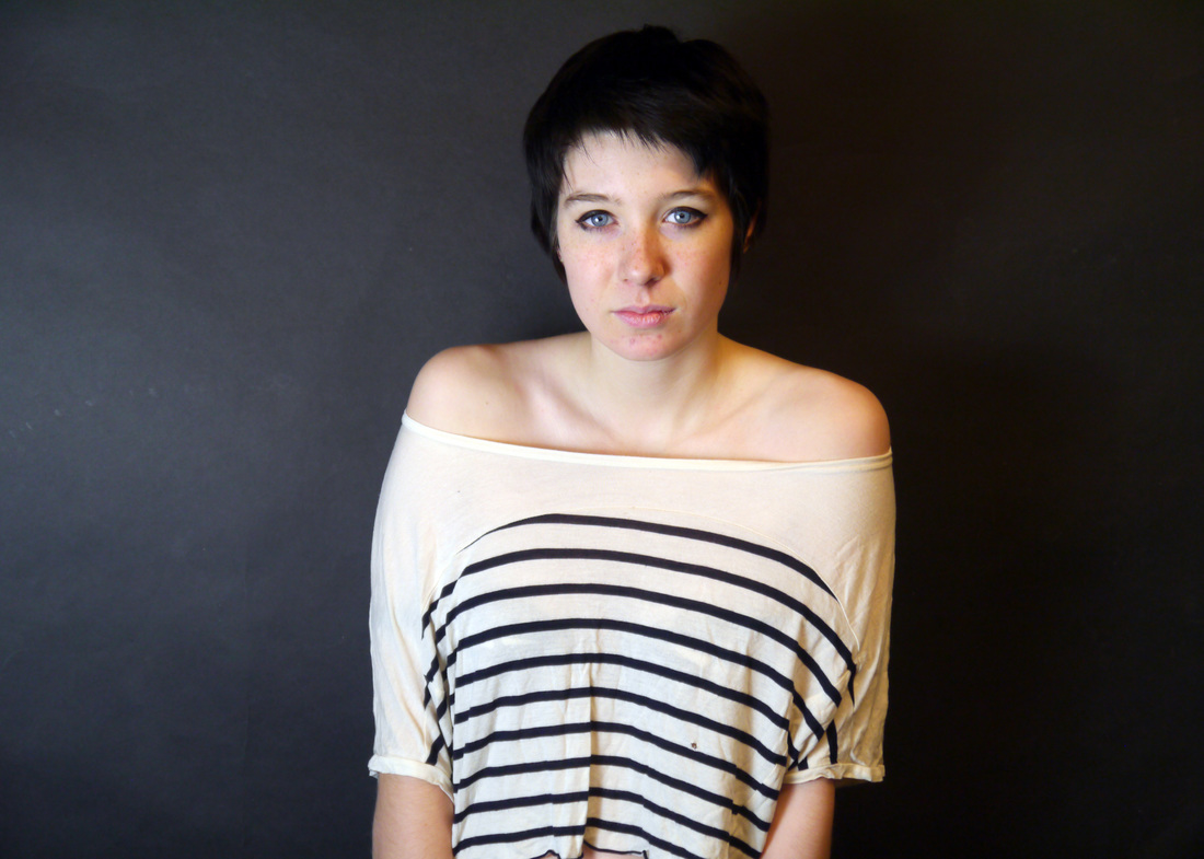
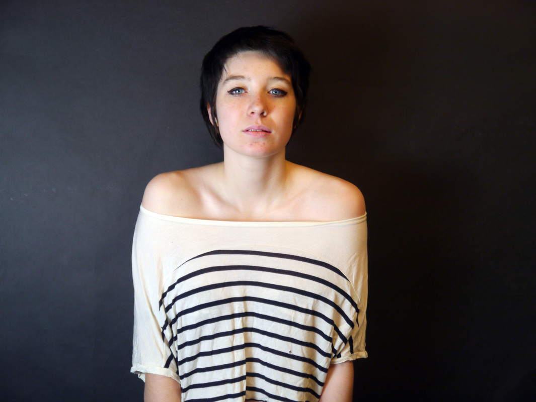
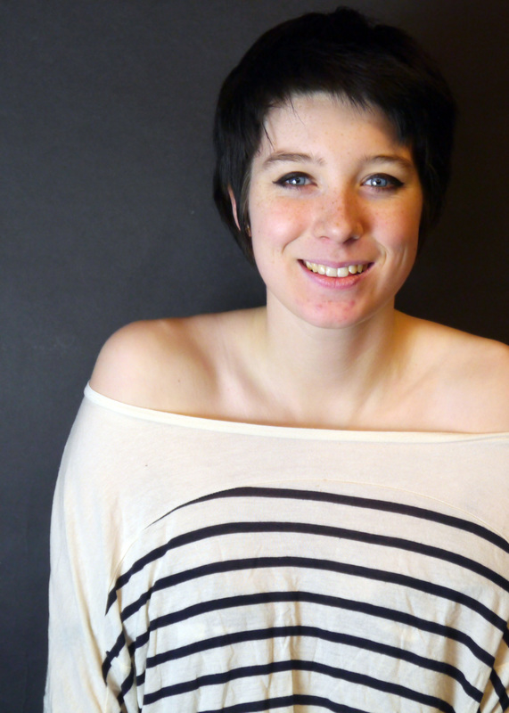
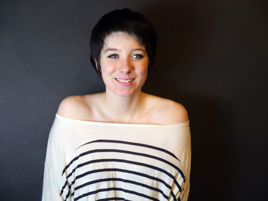
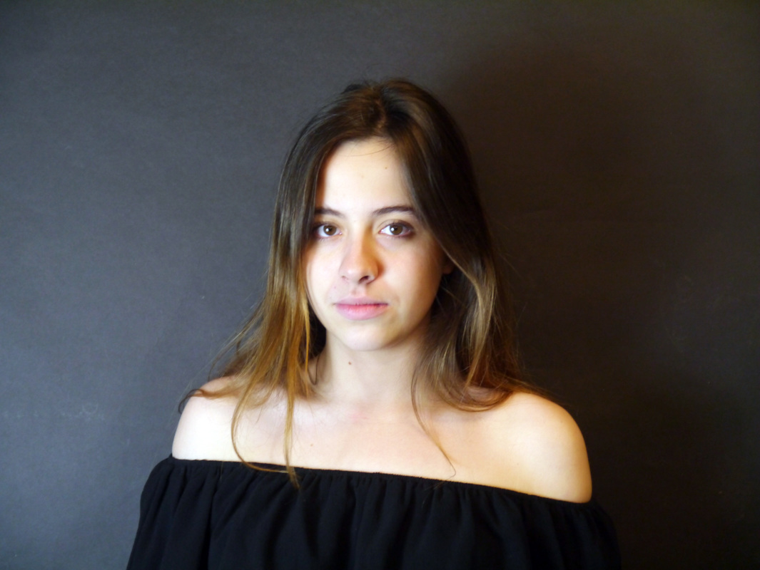
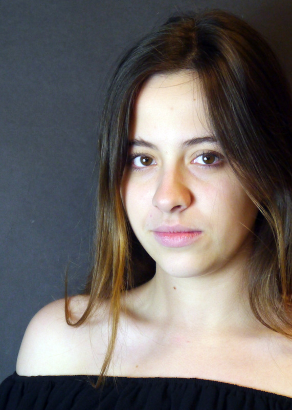
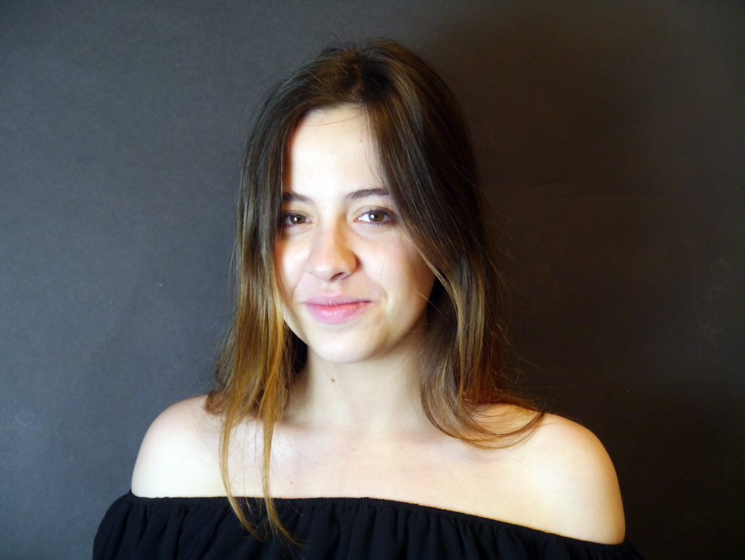
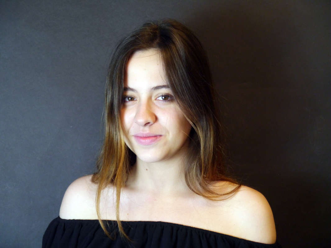
I really enjoyed taking these in a studio style setting. I particularly enjoyed using the black background, highlight all of their features more clearly. I think that experimenting like this was very helpful as I was able to see what I liked and what I didn't. I don't think that these photos will feature in my final piece but I know that trying out different styles of portraiture will help me when creating it. It was also the first time I had massively edited and cut down a large shoot.
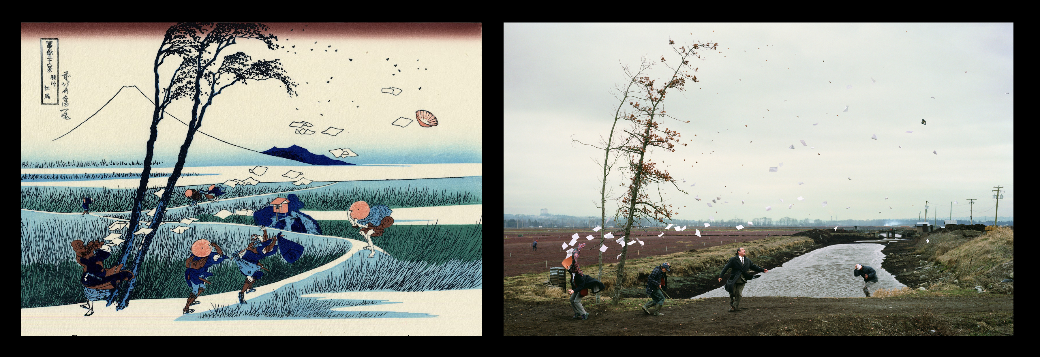
Jeff Wall
|
Jeff Wall takes inspiration from different iconic art platforms. For example the piece on the left, Sudden Gust of Wind, it was inspired by the painting 'A Sudden Gust of Wind at Ejiri (Ejiri Suruga Province)' or '駿州江尻' a Japanese painting by Katsushika Hokusai. It was made in 1830, as part of the series “Hokusai’s Summit: Thirty-six Views of Mount Fuji”. It shows a sudden gust past travellers on a marshy path.
|
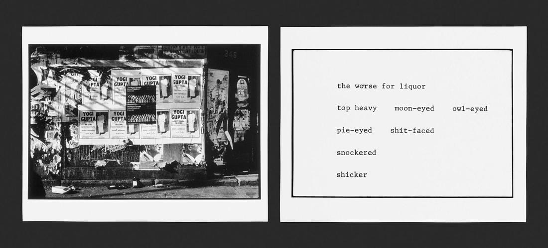
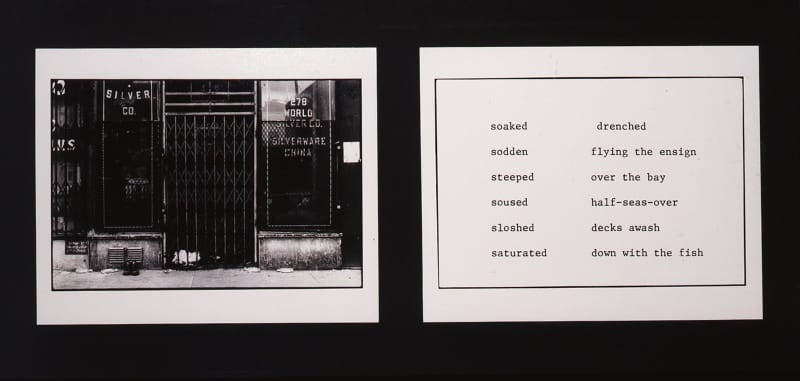
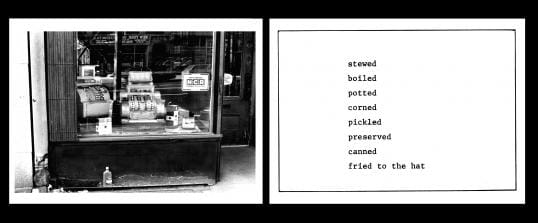
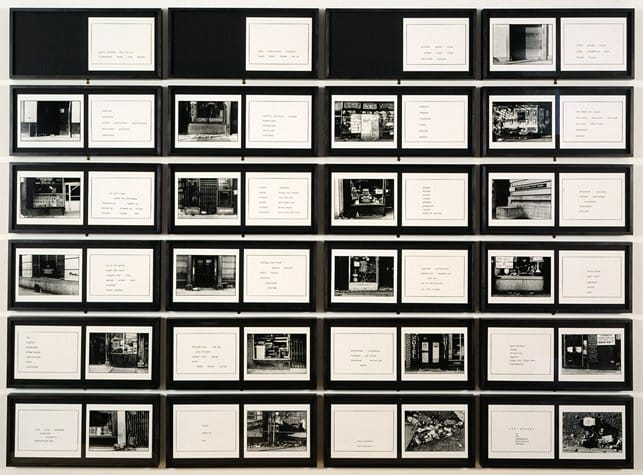
Martha Rosler's The Bowery in two inadequate descriptive systems
|
Martha Rosler was born in 1943 New York attending UCSD. She has lectured at many universities during her career in video art, photo-text, installation and performance. She's mostly interested in highlighting real concerns with society that include the media and war, housing and homelessness. In this project 'The Bowery in two inadequate descriptive systems' she photographs the places where alcoholics were sleeping and then next to it she put slurs for alcoholics. She photographed the places they sleep and not them because she wanted to avoid the ethical concerns surrounding the use of photography when making portraits that the photographer has the power and the subject is powerless, especially at the time(the mid-70's)
|
|
Staged Photography
Staged photography is where everything that is in the picture is controlled. Everything in the photo is a result of a conscious decision and these thing were made for the sole purpose of the photograph.
Staged Photography is a celebration of images that were made consciously.
I am interested in staged photography because it tells a specific story that has been totally constructed by the 'director'. It also has a strong link to film as the photos are essentially a still frame of a film, telling a story, exploiting an issue, creating a provocation.
Roger Ballen
"Shadow is better than dark, because dark for a lot of people connotates evil, and I always say it’s just the opposite. [...] The pictures shouldn’t be seen as dark, and I’m not quite clear what is ‘dark’, anyway."
|
Roger Ballen was born in 1950's America, now living in Johannesburg, South Africa. His work has spanned over four decades, starting with documentary but spreading to visual dialogues between individuals, architectural space, found objects and domesticated animals. Of his publications, we looked at the Asylum of the Birds. This was a project looking at a house in Johannesburg, it was a monograph of photographs that were of the house's inhabitants, being both the humans and animals. All of them were captured in a theatrical way, often being manipulated by Ballen. From the Roger Ballen website "The resulting images are compelling and dynamic, existing somewhere between still life and portrait." He explores areas that are not often explored and ones that artists are not fond of going to. His work has highlighted different areas of the world that aren't seen, showing the vast variety that lives in one place. His photographs are often shocking and make you question what you are looking at.
|
|
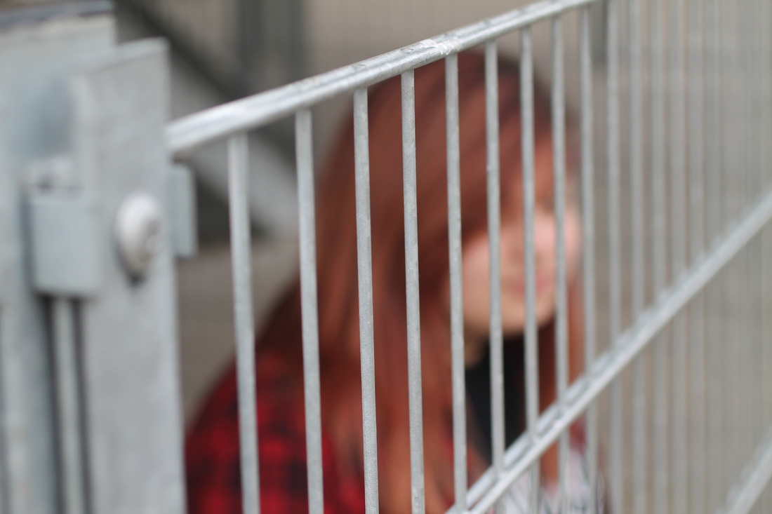
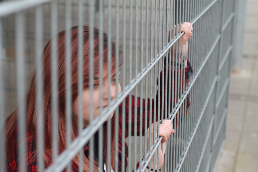
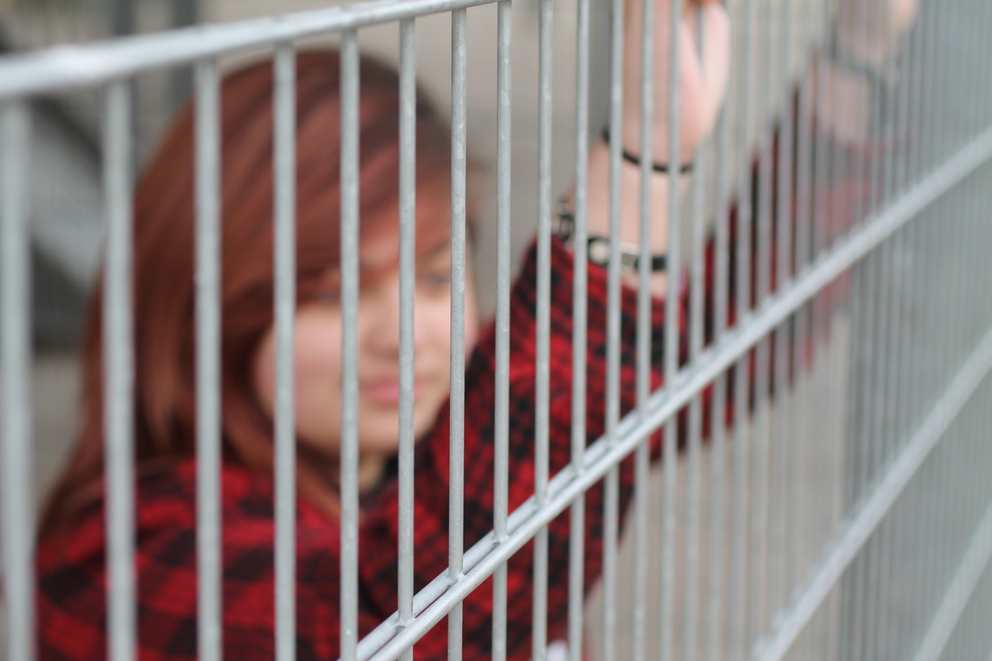
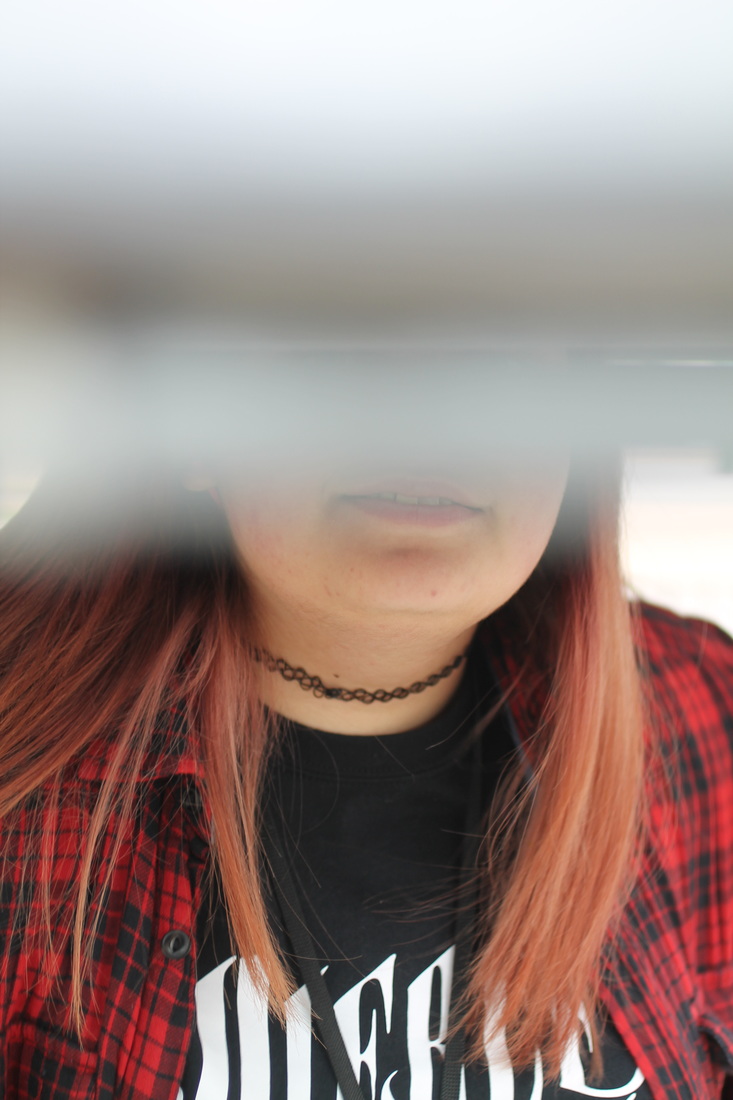
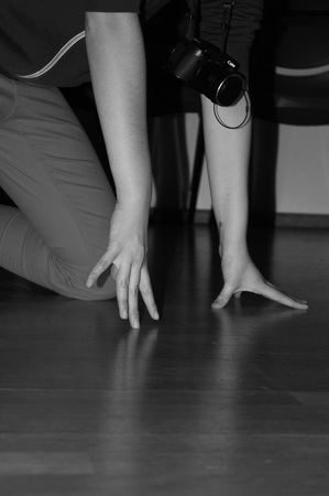
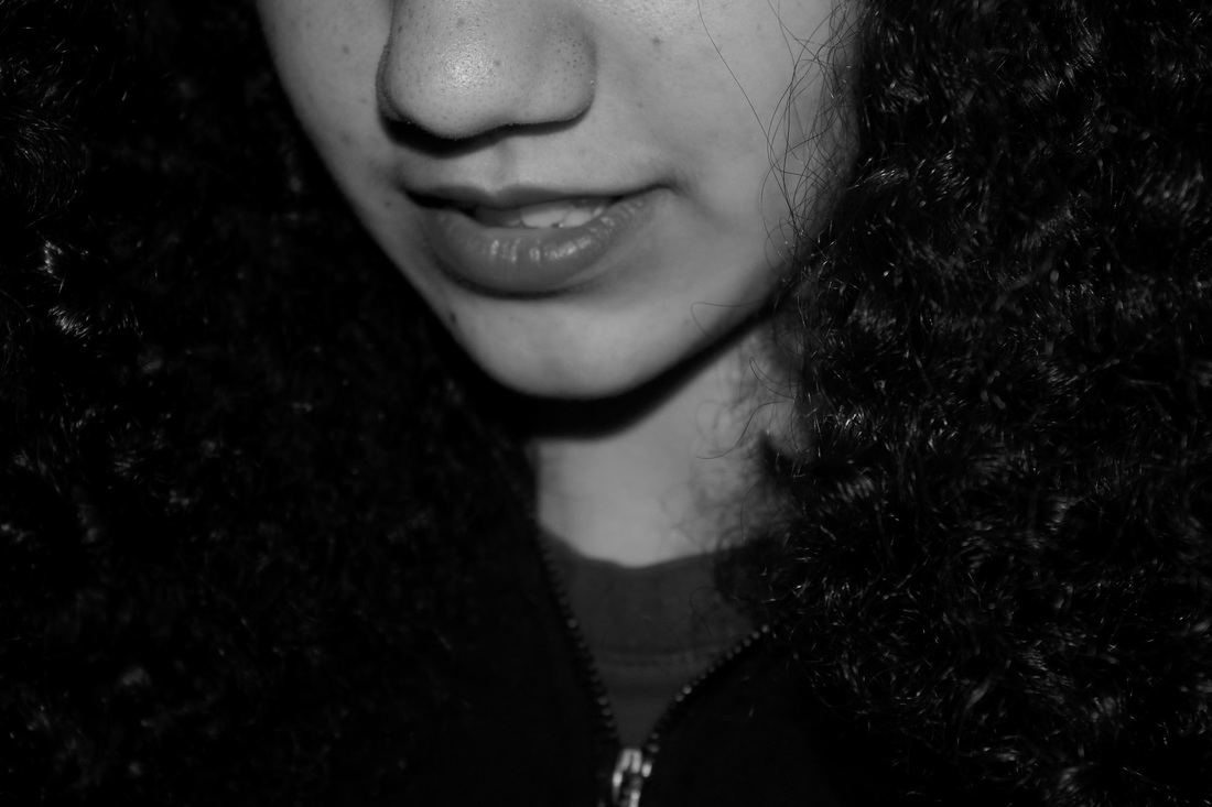
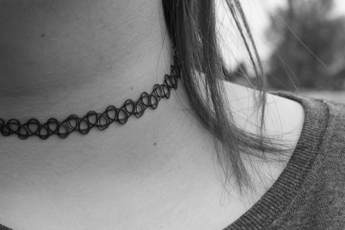
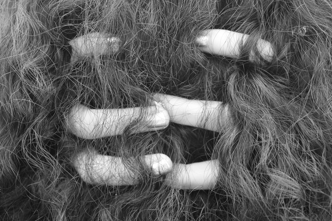
In my series, I looked at different parts of the human body: hands, necks, faces, hair. As in Ballen's photos, they are singled out and distorted somehow. My first image was actually a mistake one that when I looked at it afterwards I like the distortion of the face and the difference that the subject looks now, the photograph was taken in the dark with a flash. The second image has a lot of emotions expressed, I cut it off at her chin as Ballen would frame people cut off by furniture or the edges of the photograph.
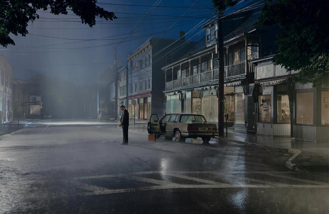
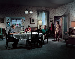
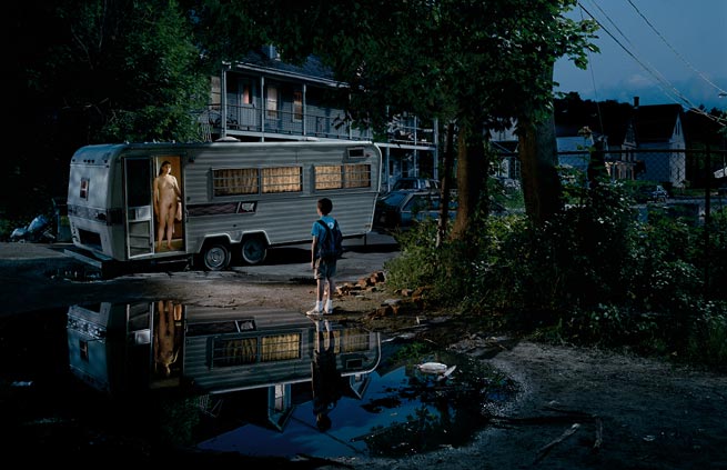
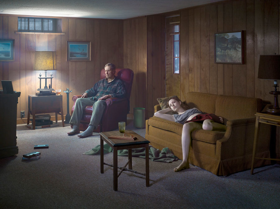
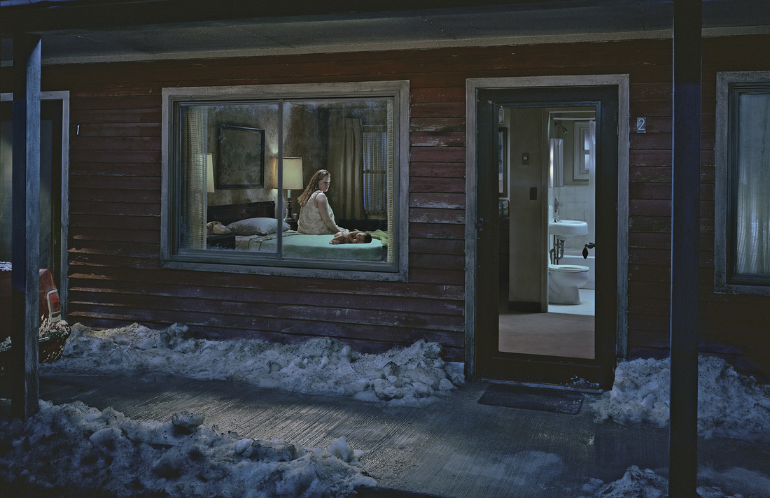
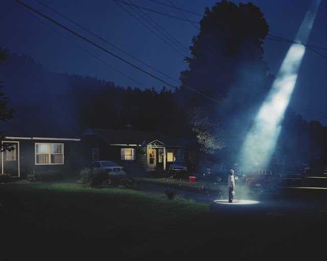
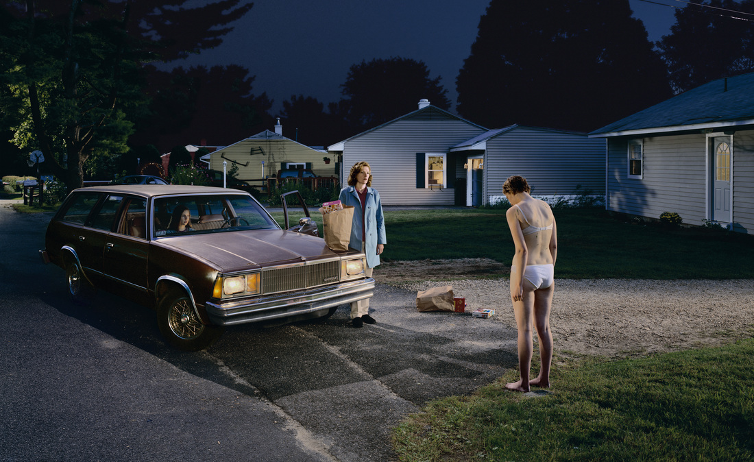
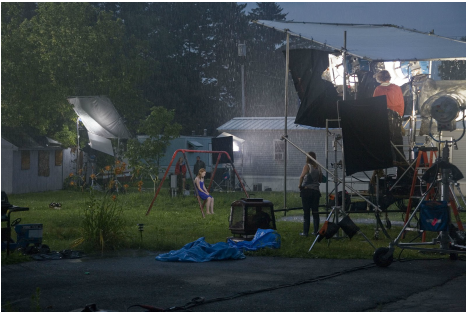
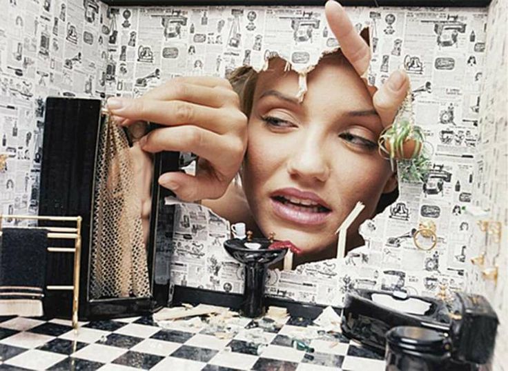
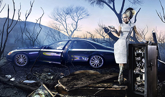
Gregory Crewdson's anthology book of photos from 1985 to 2005
Gregory Crewdson is another example of a photographer that uses staged photography. Crewdson, however, does it on a much larger scale. His photoshoots are often over a large space, hiring many actors, and using huge rigs.

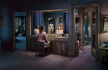
|
His photographs were taken with large crews, film quality lighting and with large budgets. He sometimes uses well-known actors like Tilda Swinton. Each of his photos will often take weeks to make.
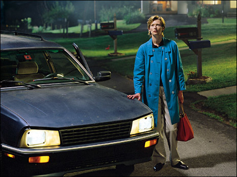
|
His photographs resemble stills from films, filling them with deeper meaning and more questions, as to what has brought these people here and what they are doing, as they are often in shocking or unusual situations, like the boy in the beam of light or the woman standing in her underwear outside at night.
|
|
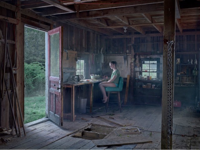
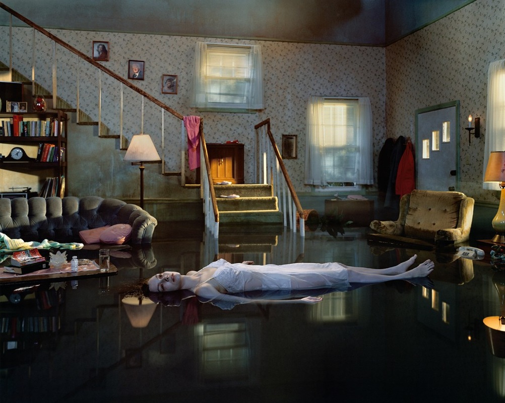
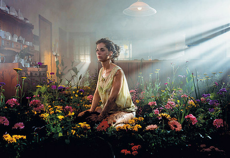
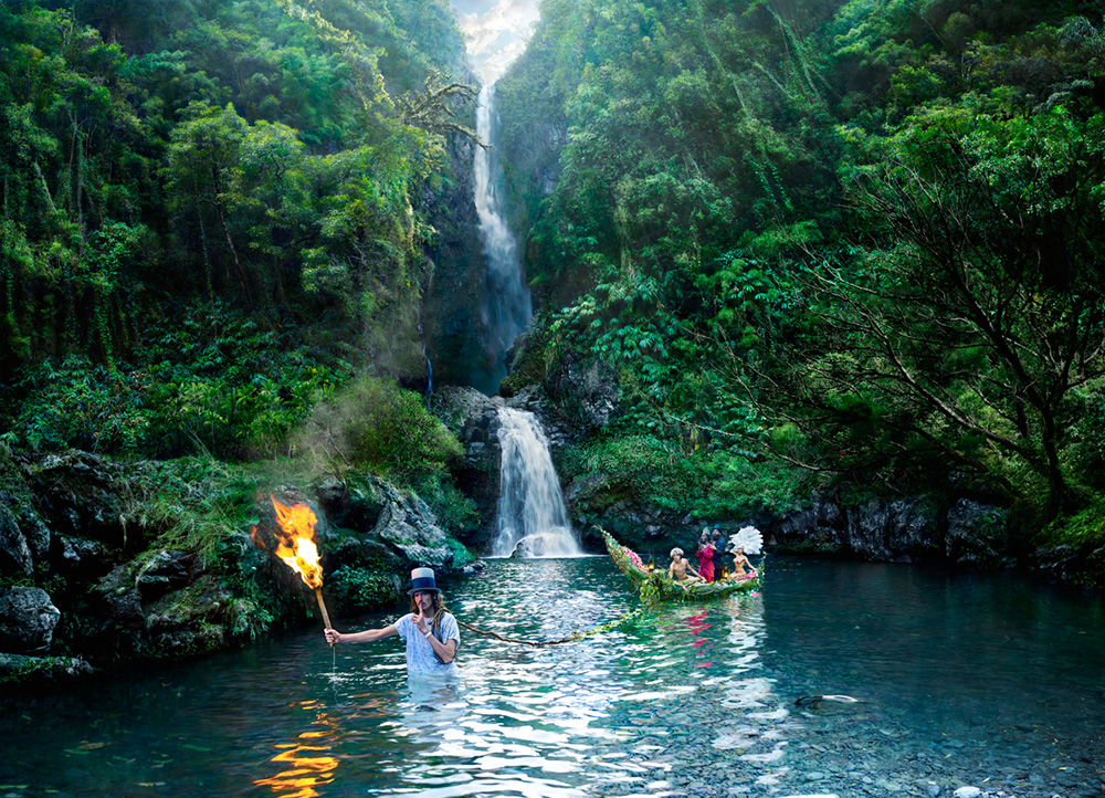
This is my favourite photograph of his collection.
The light distorting the right-hand side of the photograph, coming through the windows in beams, the light on the ceiling doing nothing to light the room, but is visibly on. This is an interesting idea of waste when we look at our lives and think about how many things we have but don't need, I'm not sure if this was his thinking, but I'd like to think that it was a theme. There is also light spilling in through the door at the rear of the photograph. The multidirectional light causes the whole picture to be quite overly lit, yet not over exposed. The woman is framed right in the centre, she is surrounded by flowers, and is covered with dirt. The flowers are all different colours, creating a contrast between the top half and bottom. Where the top half is a quite dull colouring, browns and white. Whereas the bottom has yellows, pinks, purples, greens and black. I like the questions that this picture springs up. I like that we are, and will always be curious about this woman. |
|
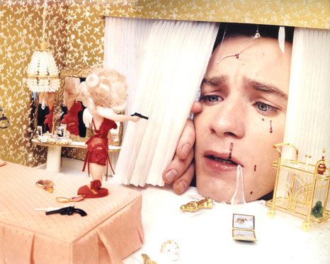
Richard Tuschman’s series, Hopper Meditations - Photographic Meditations on the Paintings of Edward Hopper
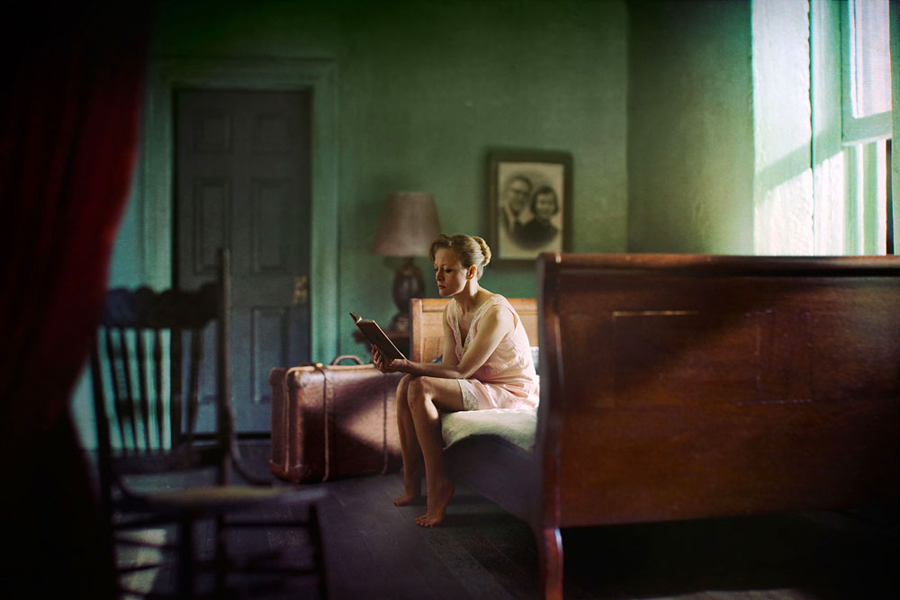
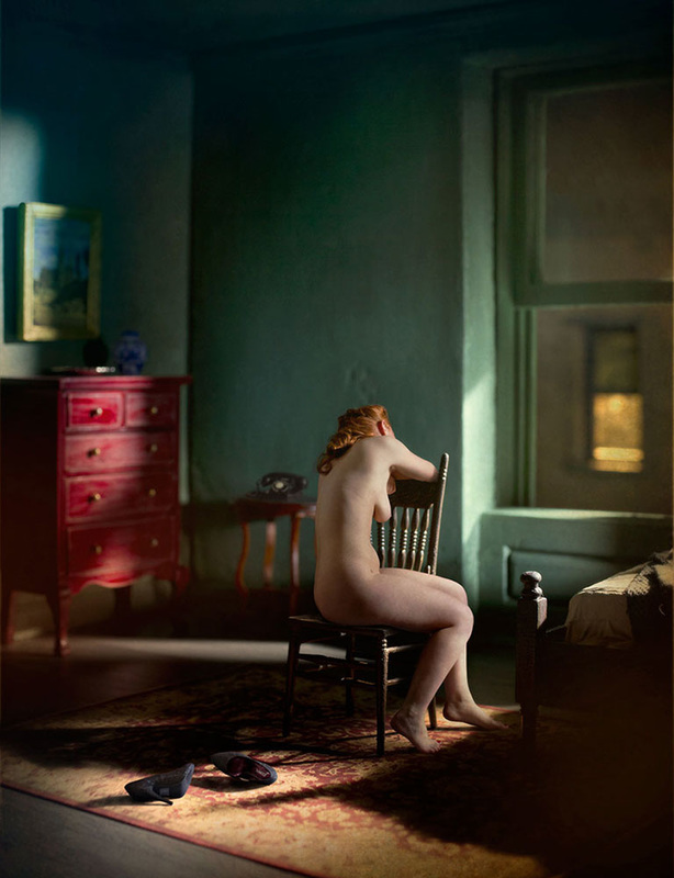
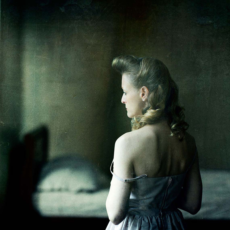
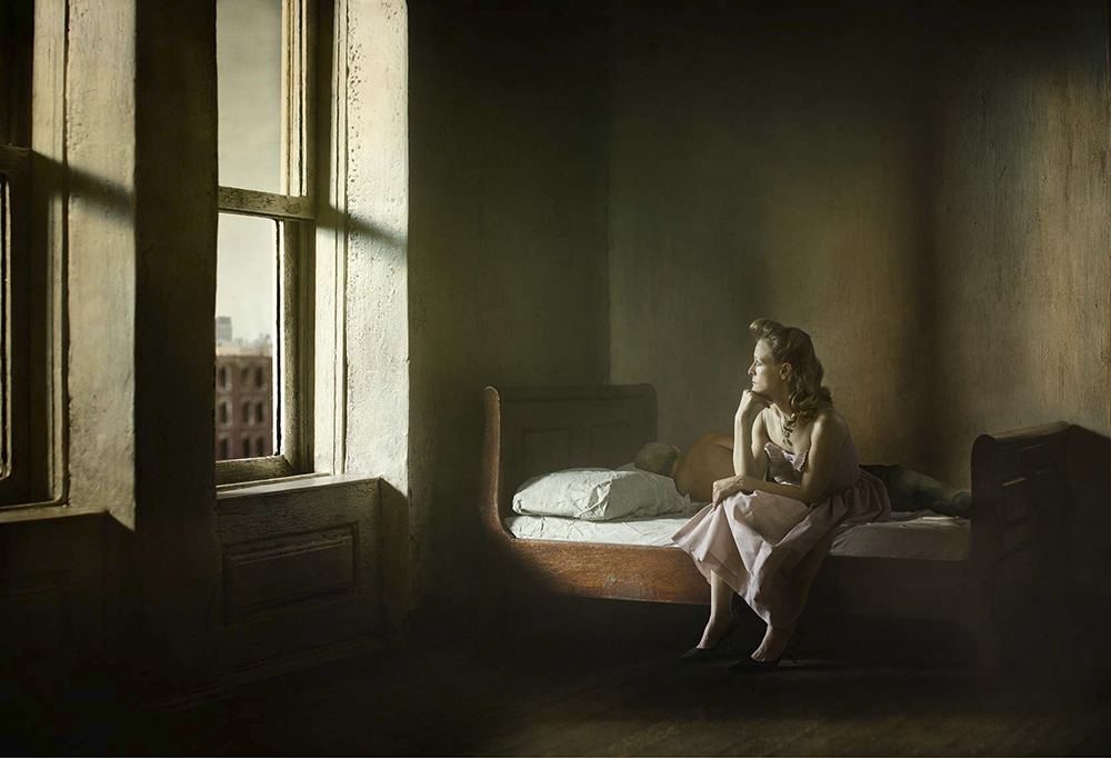
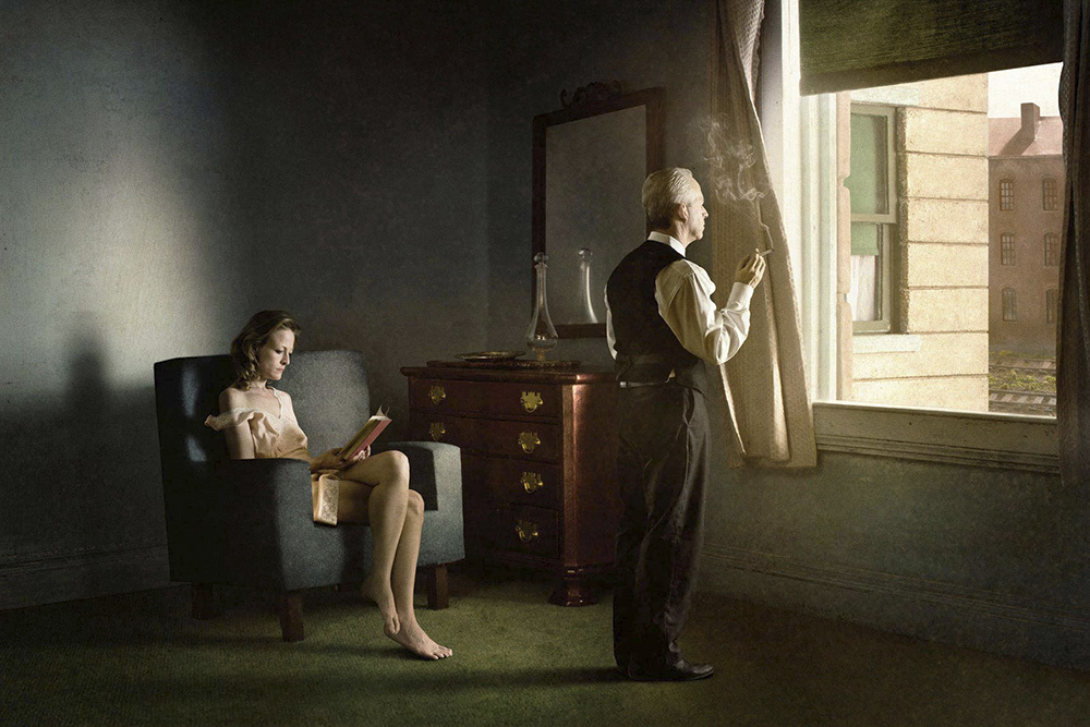
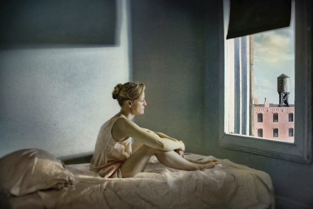
Richard Tuschman created this series of photographs in response to the paintings of Edward Hopper. He has cast his subjects as actors emulating the artist's characters. His photos are naturally lit and the subject is often a woman. His photographs are very softly lit, with a narrow depth of field. I think that his work is very interesting as these women look very similar but are portrayed very differently. The women in these photos are all looking at things, whether out of windows or reading. I think that this mystery as to what they're looking at is very an interesting depth to these photos as we are curious as to what is engaging them so much. I think that the, like Gregory Crewdson, use of actors as subjects is interesting because it allows the photographer to control every variable in the picture. The 'posed-ness' of the photographs is a technique that I like as it creates a more cinematic and deliberate photograph.
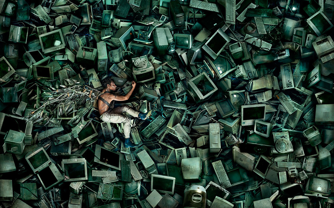
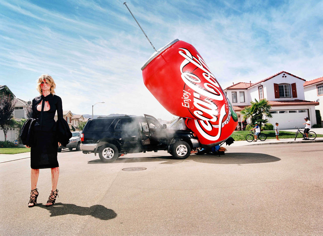
David LaChapelle
|
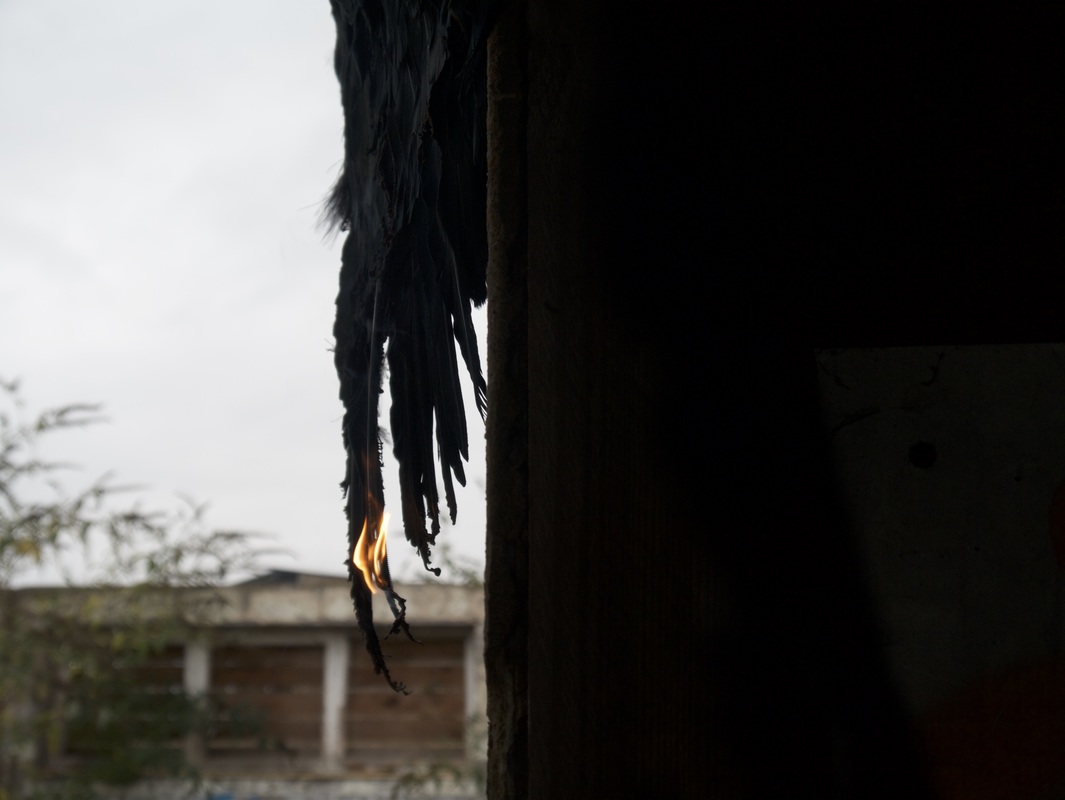
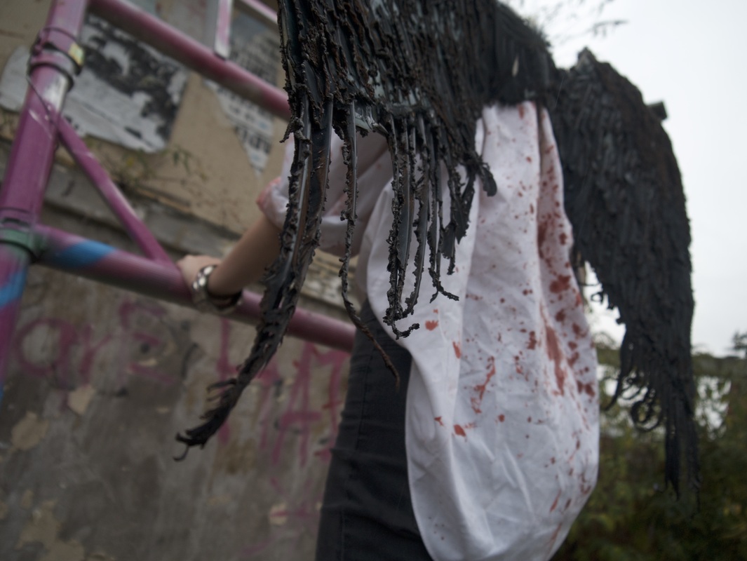
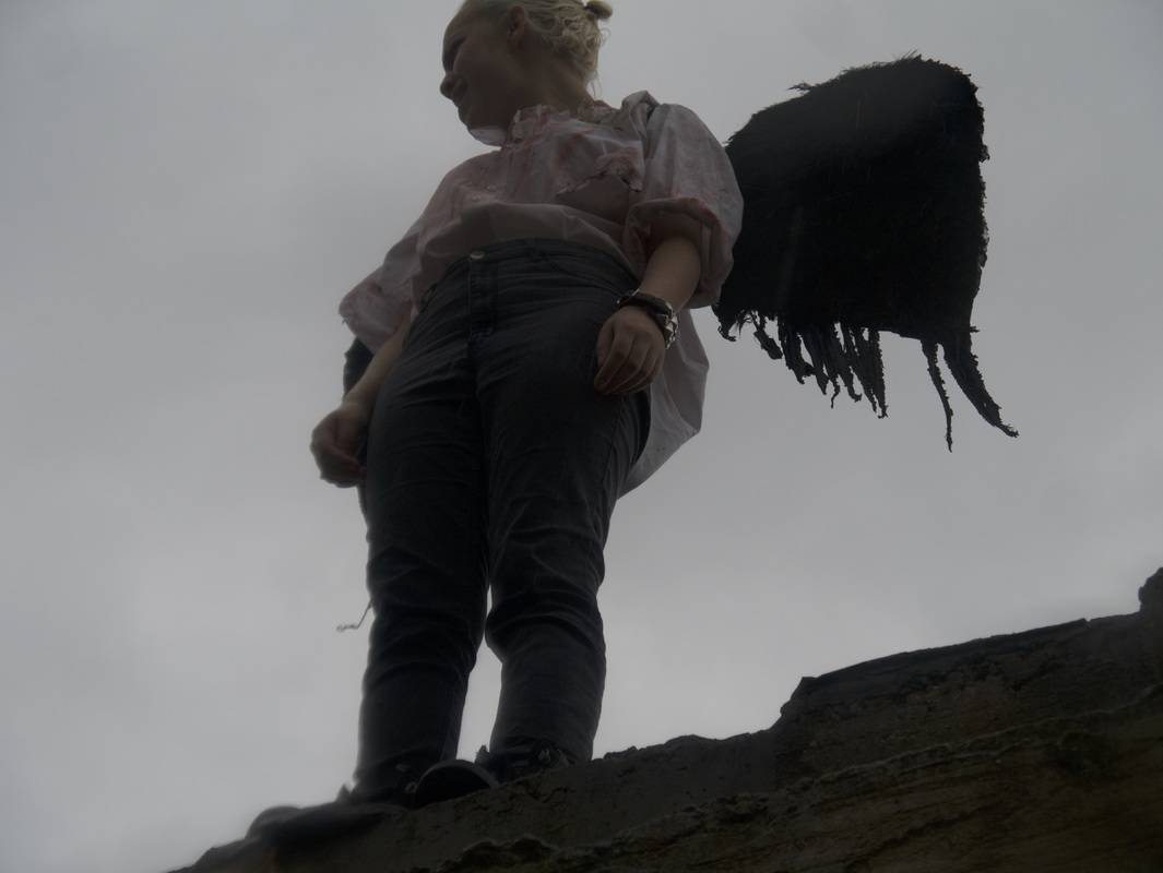
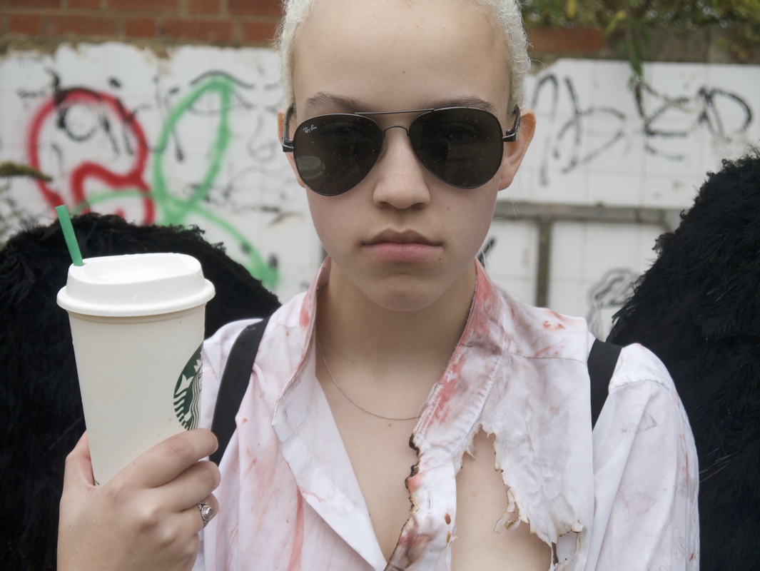
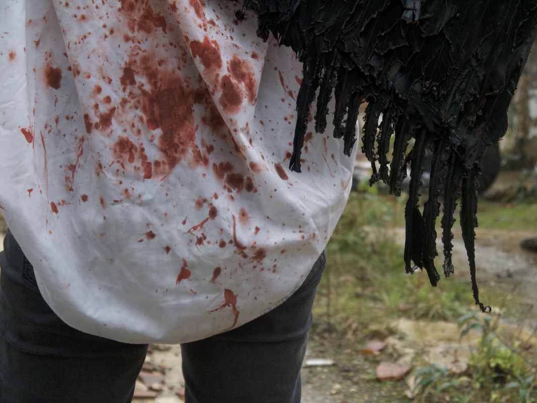
David LaChapelle was born in 1963 in Connecticut. He is best known for his photography, being best described as "hyper-real and slyly subversive". His first commercial photographic experience was when he was 17, Andy Warhol hired him as a photographer for 'Interview'. In 1995, for Diesel, he shot the first public advertisement showing a gay couple kissing, during the height of the Don't ask Don't tell policy in the US Military. He has recently got a Doctorate in Fine Arts (Hon.) from UNCSA, 2015. His photographic work has a huge variety of subjects and styles. His variety of work is very interesting to look at as it shows that all these things are connected. My favourite photograph of his is the one in the centre of the top row. It is entitled 'Icarus' and is inspirational. Icarus' tale is one of my favourites and I think that this interpretation of it is fantastic. Icarus lays dead with his burnt wings on a pile of broken computers. The questions it brings up about society and how we are dependant on our technology. Icarus is placed on the left hand side of the shot, the colouring is white, skin tone and the different blues and greens of the computers. They look as if they are water with the different faded look of each of them.
|
|
My response
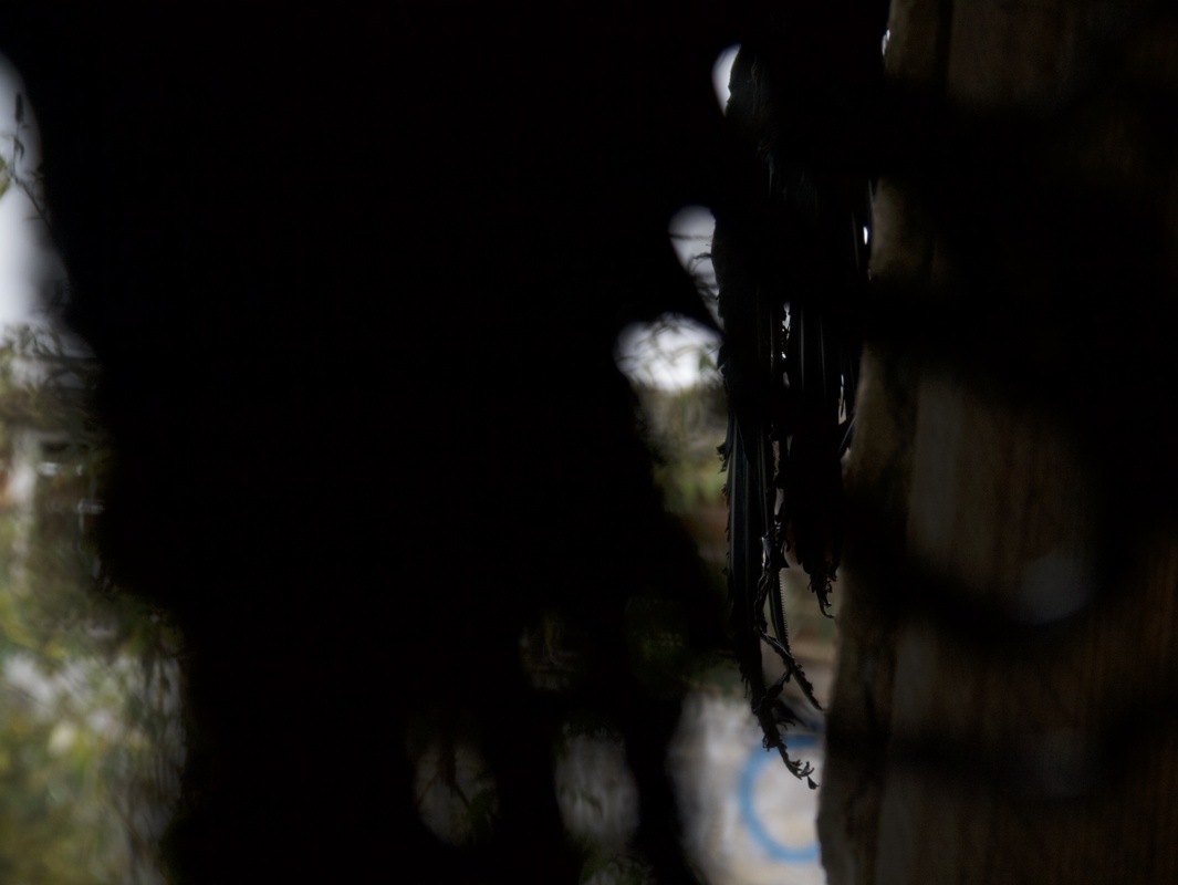
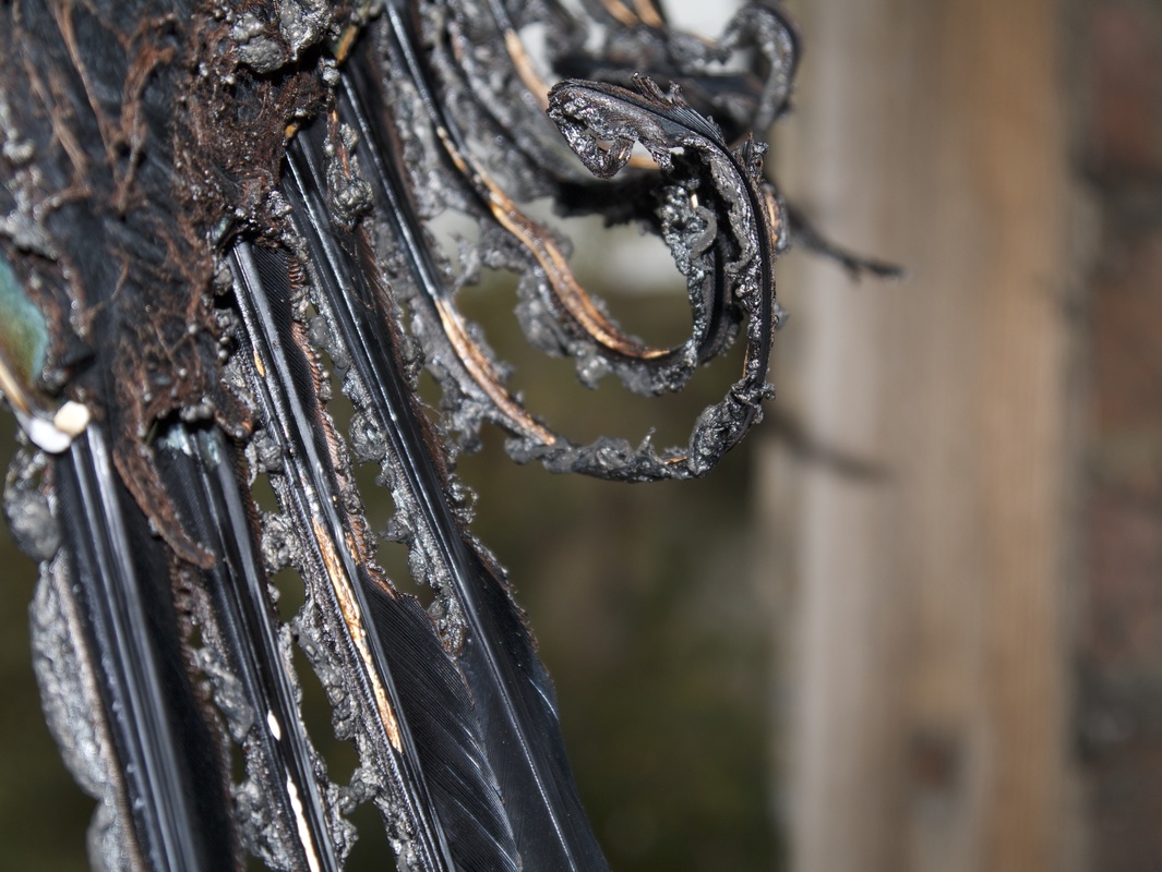
Icarus is my favourite myth, I love the different interpretations that could come from it and the different application of it making it relatable to modern society. I decided to use the idea of consumerism to discuss the Icarus story. In my photographs, Icarus is alive but damaged by their dependency on capitalist consumerism. Icarus is seen climbing the ladder into a new life that will take them into a higher world. However, it does nothing. Their wings are burnt from the pain that they experience from not being able to find themselves in our complex society, never finding Anomie. I think that to make this response better I could have used a variety of techniques including film and 35mm. For my final piece, I will incorporate these into part of a moving image, stopping on each still picture to reflect.
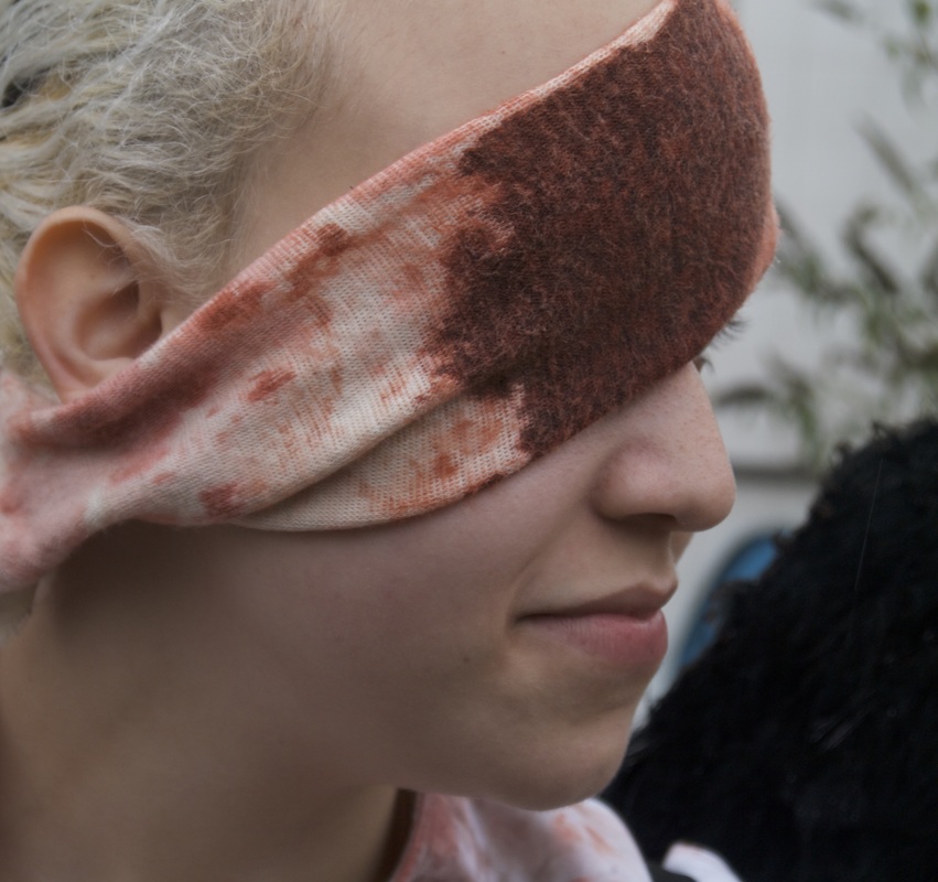
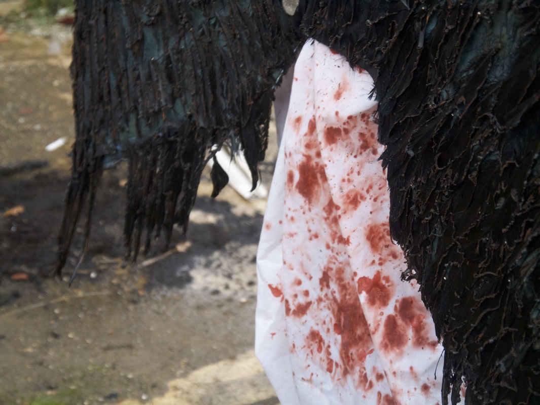
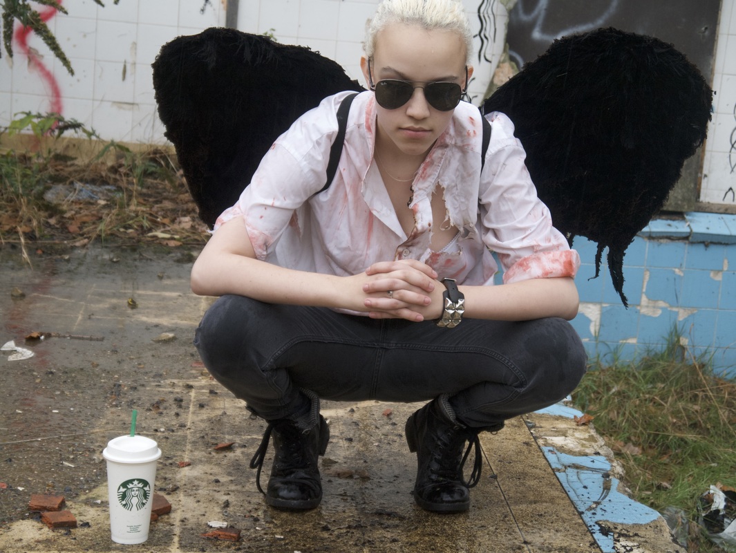
I really enjoyed doing this set, however, I feel like it's quite hollow. In that, I mean that it doesn't mean anything and I would like my final piece to have meaning. Another thing that I think I should have focused doing more on was composition. Using my digital camera allowed me just to snap away and not focus on what the outcome looked like. I like the idea of using a story as your inspiration for a final piece.
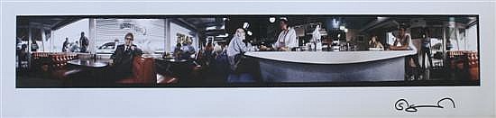
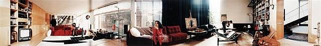
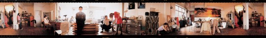
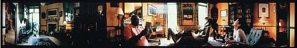
Sam Taylor Wood - Panoramic Photography
Five Revolutionary Seconds XI, These are made with a rotating camera that turns 360° in five seconds. At the exhibition of her photographs at MoMA, she played an ambient sound that was recorded at the time the photograph was taken. She often explores how emotions are expressed, in her 1994 film, she shows a man having a mental breakdown. However he was a method actor, questions are asked as to whether he is playing a role or not. The same kind of emotions are expressed in the series Five
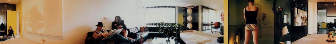
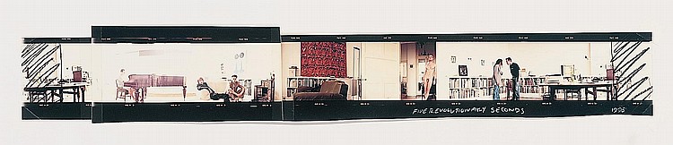
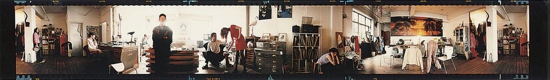
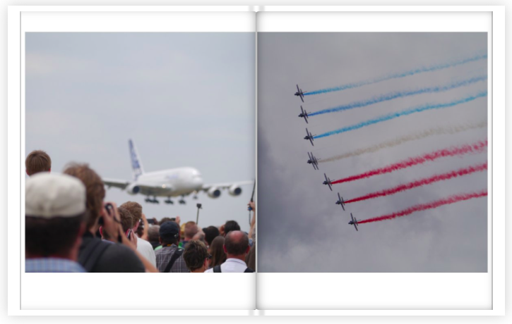
My Panoramas
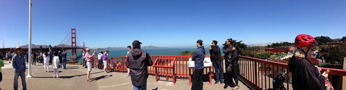
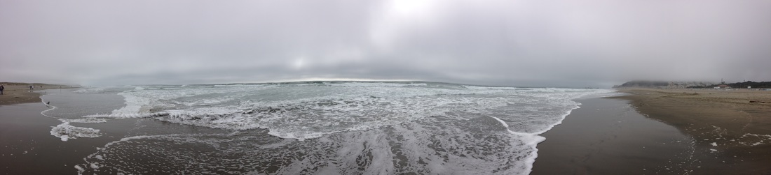
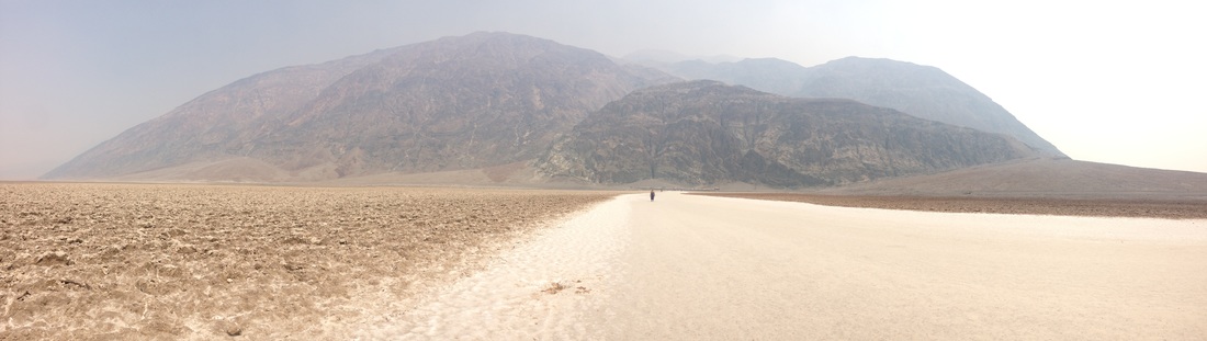
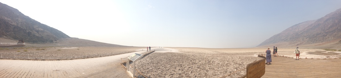
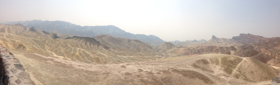
Where I couldn't copy Sam Taylor-Wood's design, where she set up a shot with everything controlled, I attempted to take panoramas with different settings creating different problems. The first one, for example, I needed no one to move otherwise they would either come out distorted or in two places. This is largely impossible due to the vast number of people there, but I picked a time when the crowds had died down and everyone looked as still as I could get. I enjoyed experimenting with phone photography, because it is largely ignored and can produce some really nice outcomes. I decided to not use these photos for my final piece for the same reasons I chose against the 'Icarus' piece. I felt that it had no deeper meaning and I wanted my final piece to.
Final project ideas - Ramblings
'camp'
Definition of Camp: stentatious, exaggerated, affected, theatrical, and/or effeminate behavior, and by the middle of the 1970s, the definition comprised: banality, artifice, mediocrity and ostentation so extreme as to have perversely sophisticated appeal
It is also defined as acting outside a gender norm.
Finding people who would identify as 'camp', photographing a room in their house, preferably their room, without them in it, or have for instance a hand in shot, and then on the other side of the page have different words for camp, or derogatory terms for the LGB community(if there aren't enough for camp, they may also overlap)
The Oxford English Dictionary gives 1909 as the first print citation of camp as
ostentatious, exaggerated, affected, theatrical; effeminate or homosexual; pertaining to, characteristic of, homosexuals. So as a noun, 'camp' behaviour, mannerisms, et cetera. (cf. quot. 1909); a man exhibiting such behaviour.
Later, it evolved into a general description of the aesthetic choices and behaviour of working-class homosexual men
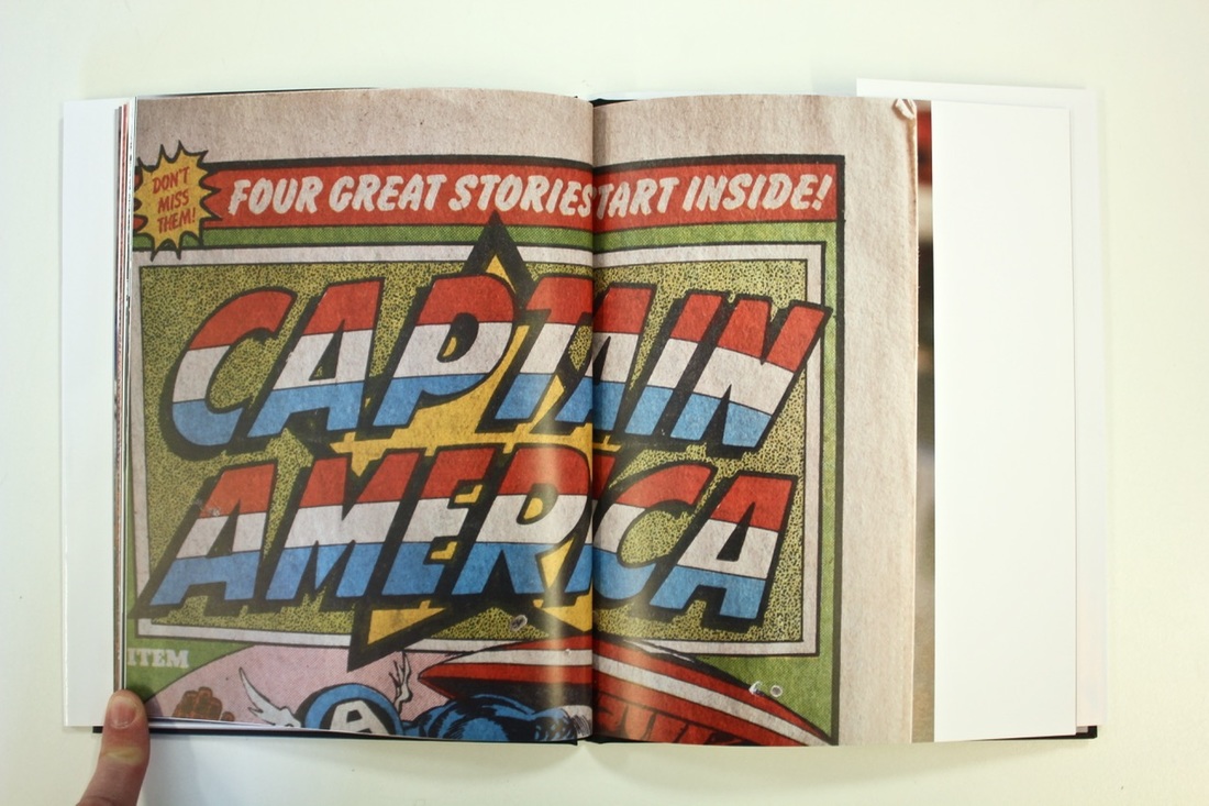
The concept of the comic book superhero (an individual in a highly stylised, outlandish and possibly impractical costume avenging otherwise serious matters such as murder) could be interpreted as camp.
Other thoughts:
Series of four photographs, portrait done in polaroid, room, two personal ones, for example, possessions, interests, pets, etc.
Definition of Camp: stentatious, exaggerated, affected, theatrical, and/or effeminate behavior, and by the middle of the 1970s, the definition comprised: banality, artifice, mediocrity and ostentation so extreme as to have perversely sophisticated appeal
It is also defined as acting outside a gender norm.
Finding people who would identify as 'camp', photographing a room in their house, preferably their room, without them in it, or have for instance a hand in shot, and then on the other side of the page have different words for camp, or derogatory terms for the LGB community(if there aren't enough for camp, they may also overlap)
The Oxford English Dictionary gives 1909 as the first print citation of camp as
ostentatious, exaggerated, affected, theatrical; effeminate or homosexual; pertaining to, characteristic of, homosexuals. So as a noun, 'camp' behaviour, mannerisms, et cetera. (cf. quot. 1909); a man exhibiting such behaviour.
Later, it evolved into a general description of the aesthetic choices and behaviour of working-class homosexual men
The concept of the comic book superhero (an individual in a highly stylised, outlandish and possibly impractical costume avenging otherwise serious matters such as murder) could be interpreted as camp.
Other thoughts:
Series of four photographs, portrait done in polaroid, room, two personal ones, for example, possessions, interests, pets, etc.
Possible final Idea #1
|
I'm inspired to create a piece by Martha Rosler's 'unsatisfactory systems'. I enjoy the idea enhancing a photograph with words that aren't directly related.
|
“What's in a name? that which we call a rose |
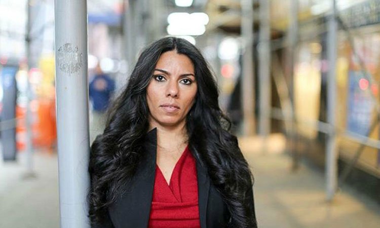
The idea is to discover the labels that people see as ones that they have changed their life to fit in. For example if someone has labelled themselves as 'gay' they may have changed their appearance or personality to fit their label. I think this has become more of an interest due to my sociology studies. The effects of labelling has been 'proven' to be a huge factor in success and life choices and I think that this is hugely important to understand. My idea is to have two photographs of the person, one is them fully comfortable, wearing whatever they like. The second photograph will be them as their label, as they see it. For this, there will be one photo either side of a white photo with the label word on it. The idea of labelling was put forward by sociologist Howard Becker.
Photos for my final idea
|
|
|
|
|


#1 - Twyla
#2 - Roxanne

#3 - Ava
#4 - Joe
#5 - Hannah

#6 - Malik
#7 - Paige
#8 - Ryan
#9 - Nick

I wasn't completely happy with this set of photographs. I think that they are too similar and don't express what I want them too. This has made me rethink my final outcome and create a second set of photos. In this new set I hope to tackle the issues that weren't in this one, like ethics surrounding anonymity. But I was also disappointed that I didn't take these on film. Consistently my best photographs are taken on film and I love the colours and textures that film provides that digital cannot.
Ethics in portraiture. - Final idea #2
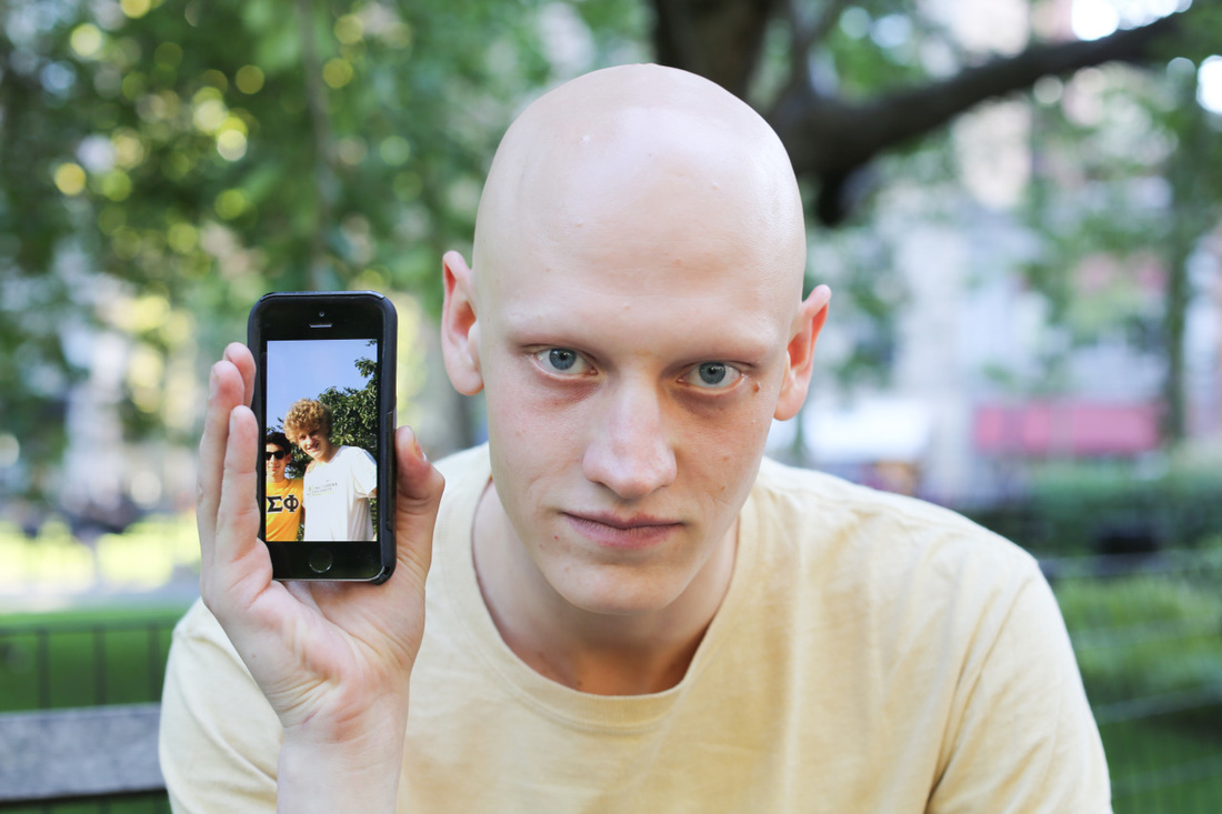
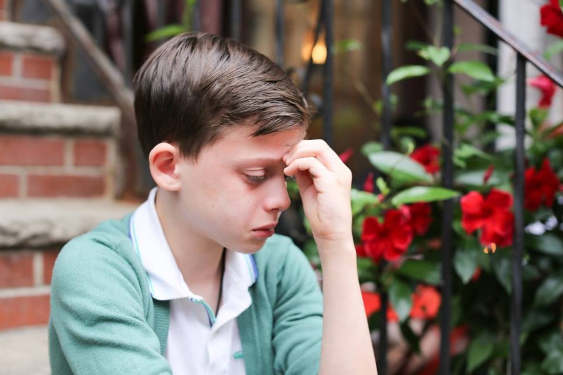
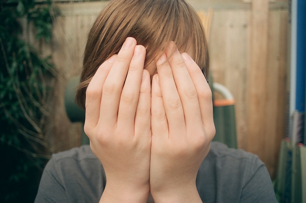
Martha Rosler was interested in the ethics surrounding the taking someone's portrait as in that moment you are deciding how to present that person. As Susan Sontag says in 'On Photography' "to take a photograph is to participate in another person's mortality, vulnerability, mutability" this made me decide to reshoot my final photographs with the ethics in my mind. I only partially agree with not including the person as to persevere their anonymity, so I distorted their faces either with their hands or objects. I went back to my film photographs as seeing that they force me to take a moment before photographing as it's a more complicated process. In this final idea I made my labels simpler and more confined. I used social subcultures to organise my labels.
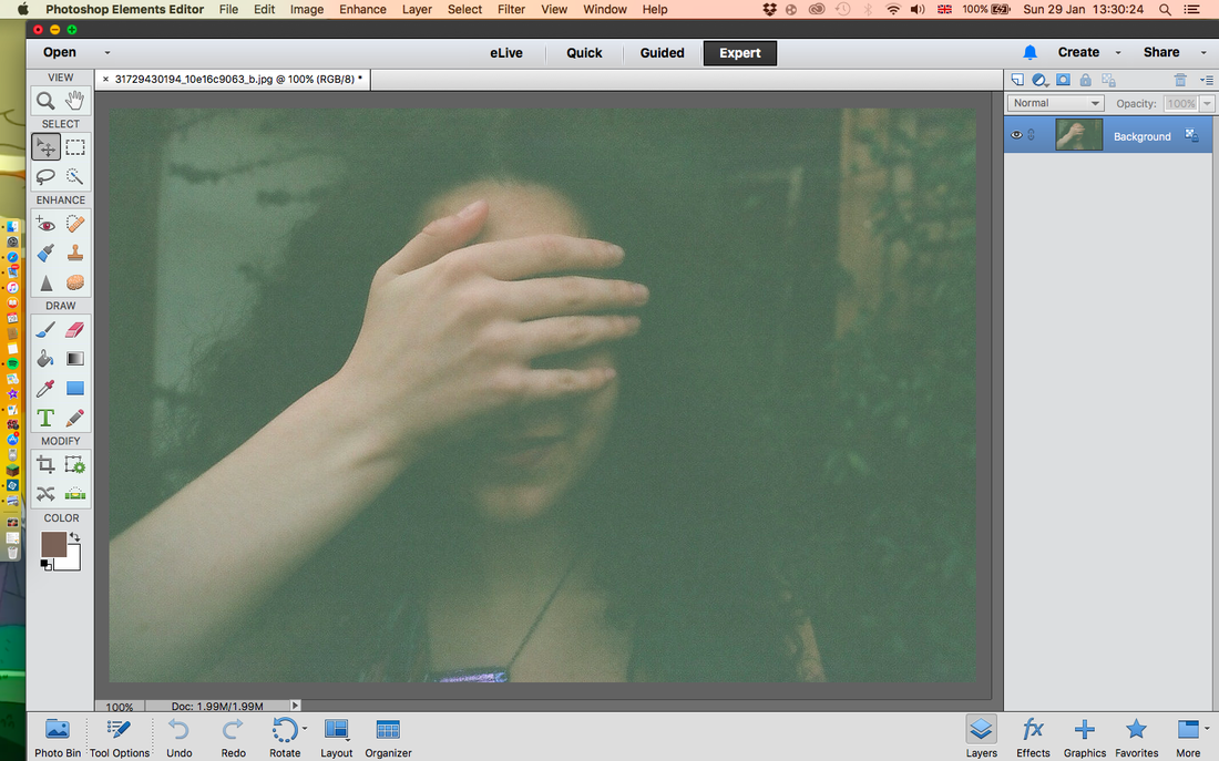
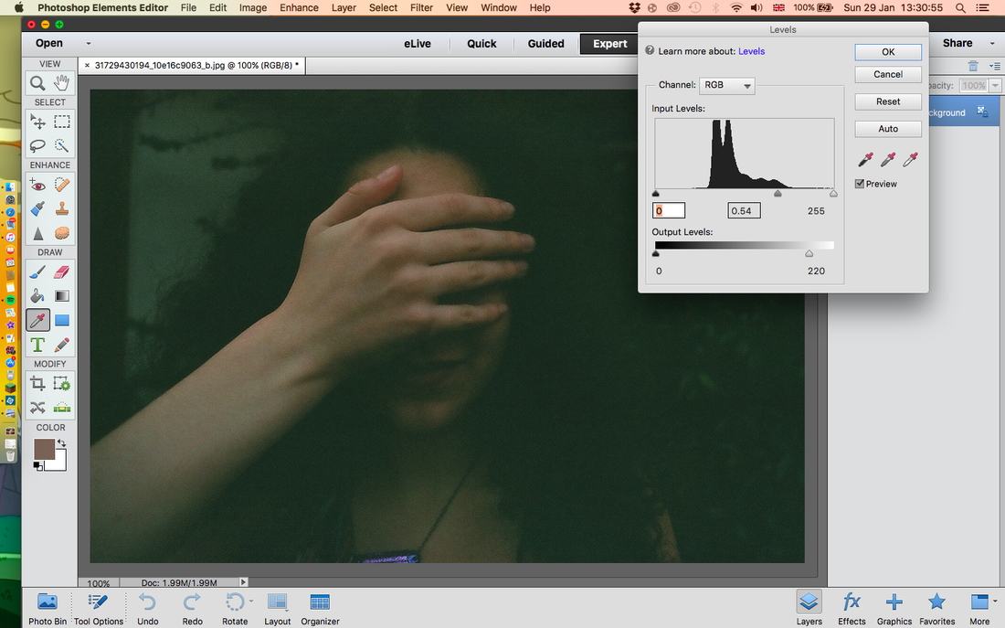
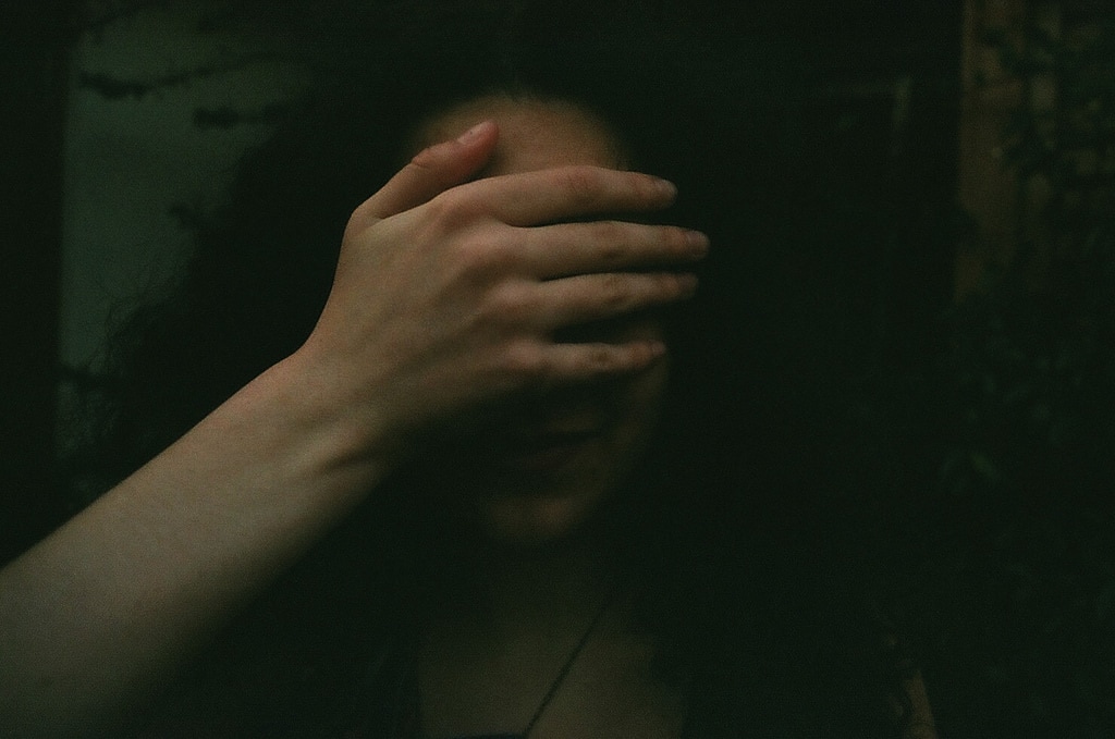
For this set, I had to do a bit of editing, particularly with the levels. I did this on photoshop elements. The photo on the left is how it was before. I noticed that it was too bright all over, so I went into the levels option and lowered the middle tones. This allows the darker areas to not get too dark which would have made the image then too dark. I also took away some of the lighter tones. This made the photo look more balanced as before the range of light and dark tones was too great.
|
|
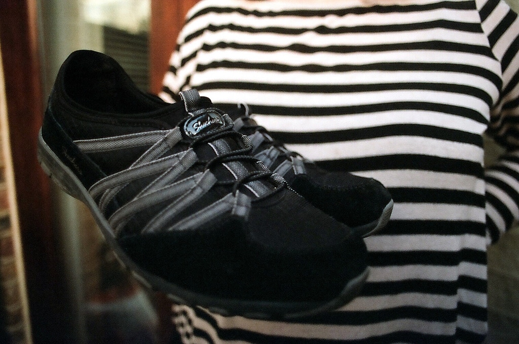
For this series, I was more focused on little details about the label. I decided to use shoes as a common object because our shoes are very personal and they represent something about us. I decided to also enlarge the text so that it was visible from further away.
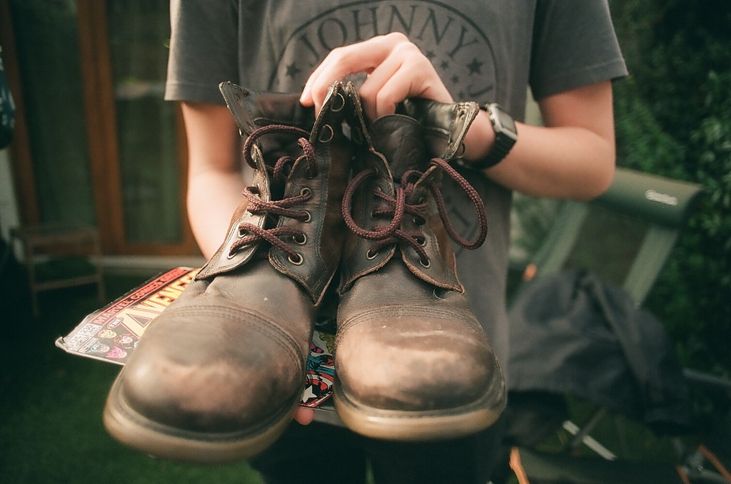
I think that my second set of photographs is a lot more powerful than the first. The first set had two pictures that were very similar and didn't quite show what I wanted. The second set I looked at more carefully and into different ideas. Like the idea of ethical portraiture. The labels I used this time were from one category and are pre-defined labels that are universal. These labels are still ones that people agreed that they changed something about themselves to fit into better. Which I thought was an important part of labelling. Not only societies pressures to fit into these labels but our own. I also decided to less photos, this allowed me to focus more on each one, spending more time doing them.
My Personal Investigation Evaluation
Everyone has a label
“A photograph is a moral decision taken in one-eighth of a second” - Salmon Rushdie
My practice is mostly portraiture photography, with a little in other genres like landscape and panoramas.
I am fascinated by people, how they reveal and express themselves, how they interact with others. Another thing that I find important within portraits is to capture the person as a whole, not just their front or their appearance, but what they are like as a human being. As Susan Sontag says in ‘On Photography’ “to take a photograph is to participate in another person's mortality, vulnerability, mutability. precisely by slicing out this moment and freezing it, all photographs testify to time's relentless melt”.
I have looked at threshold concept number five when doing my project, this is “Cameras ‘see’ the world differently to the way we see the world with our eyes”. I take influence from many different people from war photographer Don McCullin to Empire magazine photographer Debi Berry. These photographers inspire me to capture the person when taking their photograph. They set up their shots to depict something specific or a message or theme they wanted to get across. These are the main things that I take from these people. I like to take photographs with a wide range of equipment, for example, 35mm, digital, 120 and others. Taking photographs on film has allowed me more time when organising the photographs and has meant that I prefer to take staged pictures rather than allowing chance to take lead. I like that when taking a film photograph you have to stop and think about everything for a longer time as it’s an expensive process to waste a shot, compared to digital where you can shoot off a thousand photos in a session.
My favourite cameras to use are the Olympus OM2 and the Lumix G3. These are my favourites because I like having the option of using digital when I shoot, this allows me a safety where I can choose which is better in the end. I like using the OM2 because it has enough controls to let me choose aperture and shutter speed but it also has semi and full auto modes. I also have some really good lenses for it which make the pictures really sharp. In my photographs, I like to both capture the person in a moment, but also issues of conflict with social norms and values that can dictate our behaviour towards one another.
My personal investigation began with my love of portraits and how people's faces are so expressive. This begins with my photobook, stemming from my interest in psychology and the different reactions people have to events in their life. From there I looked into Staged Photography, with artists such as Roger Ballen and Gregory Crewdson. I made this leap because I was feeling that portraiture wasn't really expressing all that I wanted to. As I wanted to put my subjects into settings that reflected them in personality. I found staged photography after having the idea that I wanted to create cinematic stills. This is from my love of film and my intention of going into the film industry. I really like to experiment with different forms, like film and digital, moving and still, panoramas and landscapes. Because this allows me to expand my comfort zone.
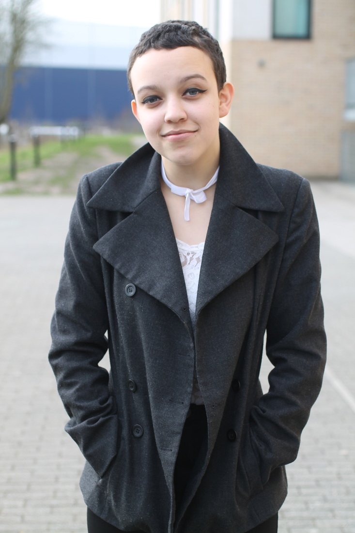
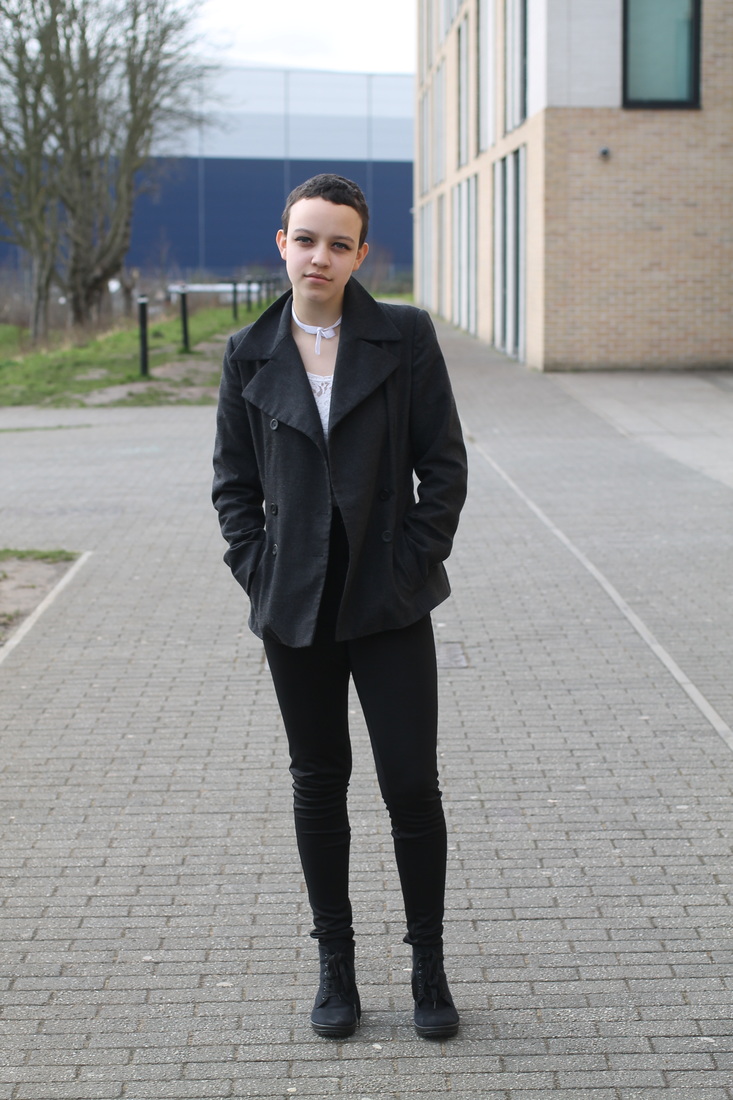
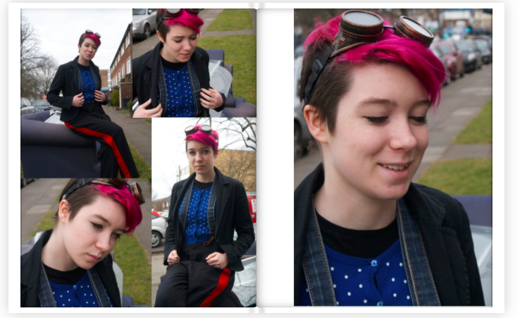
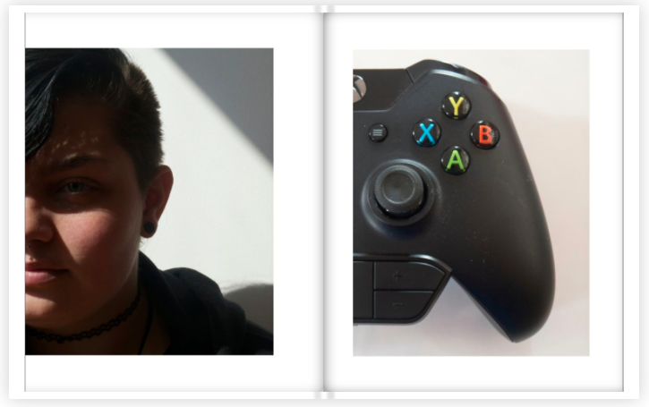
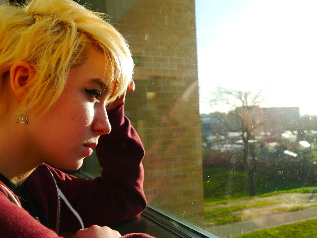
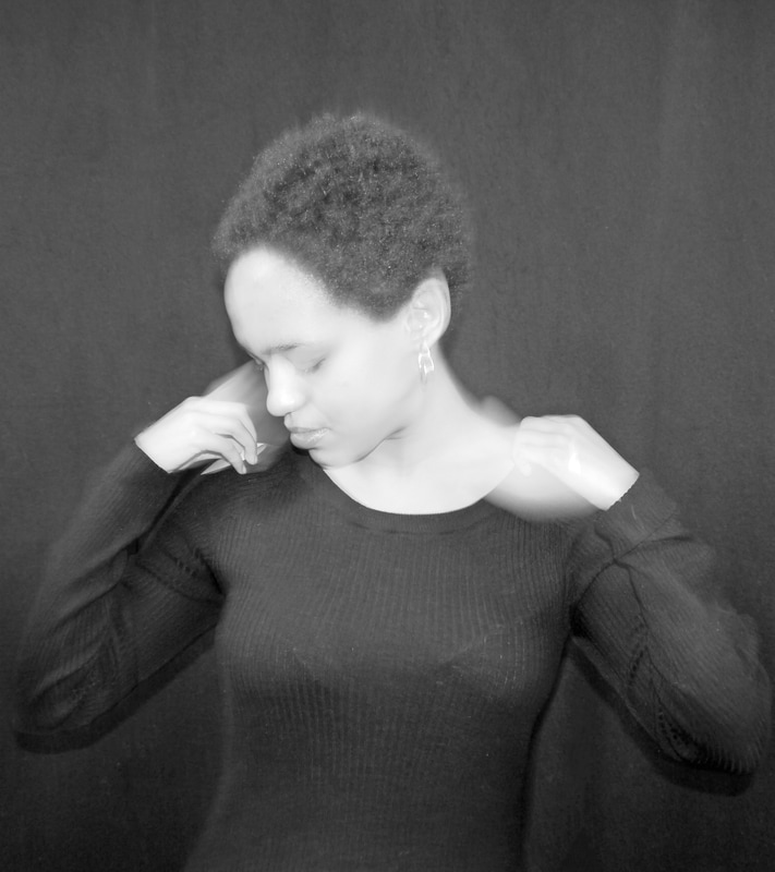
I started my photobook by looking at specific photobooks, including ‘edges’ by Dolorès Marat, where I found that the theme throughout the book, of a hidden Paris, was stronger than the individual's images. I also looked at Brandon Stanton whose blog layout had been transferred into book form when he made a collection of his work. I particularly took from him his style of portraiture, being descriptive and detailed, but also varied. He also has a varied style of layout. I then chose to explore diptychs and two-frame photography. This was to learn about sequencing and this really helped me. Before making my photobook I had to look into the processes, either making it or getting it made. I decided to get it made by Blurb. This I believe was the correct decision as it came out really well. My theme for my photobook was masculinity and I looked into several types of masculinity including female masculinity featuring three natal females who in their own ways displayed masculinity. I was keen to try and find a range of masculine identities which I think that I managed to do.
Inspired by my photobook I continued looking at portraiture. This was the first time that I had researched it in depth looking at different photographers and the beginnings of portraiture as a form of photography. This started with the invention of Daguerreotypes by Louis-Jacques-Mandé Daguerre in 1839. In the beginning, portraiture was expensive and difficult to achieve due to the length of time that the film had to be exposed for. So the only people who would get portraits done would be the wealthy. As photography became more popular and easier to accomplish more and more people were able to get portraits done and soon it was a popular style of photography. One photographer that I looked into was Jeff Wall. His photos were particularly interesting because he used classical art forms as his inspiration. For example, his piece Sudden Gust of Wind was inspired by A Sudden Gust of Wind at Ejiri. I thought that this was an interesting idea. However, although I did not take this style into my final piece. This style being that he takes famous artworks and uses them as inspiration or imitates them in photography. I still appreciate this idea and will use it in future creations. An artist that I have been inspired for this project by is Martha Rosler and her ‘The Bowery in two inadequate descriptive systems’. She was most interested in highlighting concerning parts of the society we live in, such as media and war, homelessness and systems of transport. Which made her create this piece. She photographed the place where some alcoholics slept and on the opposite page displayed different words for drunk. This was an attempt to get past the ethical issues of photography, especially photographing the vulnerable, where the photographer has all the power and the subject has none. She photographed the places where they slept to highlight the problems of alcoholism and homelessness, without taking away their power over the situation.
Here I realised that I wanted to control my pictures more, which led me to look into staged photography. My personal favourite artist is Gregory Crewdson. One thing that he does, which I couldn't to his scale, was to use giant sets which would have high budgets. I think that the thing that I liked most about these photos was the high level of control that staged photographers had over their photographs. I used this idea, of having control over my situation, when creating my final piece. At the time when researching David LaChapelle, I found a photo of his, ‘Icarus’ which I really liked and was inspired to create my own ‘Icarus’. I researched in more depth the story of Icarus which was already one of my favourite myths. I think what interests me most about the story of Icarus is the idea of fragility and ego; that no matter how big we get we are just as easily broken. From this, I created my own Icarus series. I thought that I really liked the idea of creating a series based on different Greek Myths, as their stories are all so rich and detailed but they also depict issues that are still relevant in our society today. I was looking through my photographs when I saw a panorama. I realised that I really liked this presentation, being able to see more. I briefly researched Sam Taylor-Wood to look at her panoramas. I really like the amount of material she got in her photographs. This made me use a wider angled lens for my photographs but I decided to not make panoramas.
However, I was drawn back into portraiture when I had an idea for a final piece when I looked up the definition of ‘camp’. This being as stated in the Oxford Dictionary as ‘ostentatious, exaggerated, affected, theatrical; effeminate or homosexual; pertaining to, characteristic of, homosexuals. So as a noun, 'camp' behaviour, mannerisms, et cetera. (cf. quot. 1909); a man exhibiting such behaviour.’ I thought that it would be interesting to use this as my selection process for a series of personal portraits trying to describe a person. However, I realised that I was more interested in the concept of labels. This is the idea put forward by sociologist Howard Becker that individuals in society will be labelled by others which then affects the way that this person is viewed. For example, in education the way a person acts may get them a label such as ‘disobedient’. This could mean that this person is viewed as less intelligent than others and may be given fewer opportunities. This has mostly come from my sociology work and how it can affect someone's life. So my final piece was inspired by Martha Rosler’s style of having two pictures next to each other. I used this to create my series of two images next to each other. One where the person felt most comfortable and one where they were playing the label that they chose as the one or ones that they feel change them in some way. I will display it as three photographs put one next to each other, printed on A4. The middle one will be the label, with the labelled one on the left and the casual one on the right.
Bibliography:
Books:
Crewdson, Gregory, and Stephan Berg. Gregory Crewdson 1985-2005:. Ostfildern: Hatje Cantz, 2007. Print.
Edwards, Steve. Martha Rosler: The Bowery in Two Inadequate Descriptive Systems. London: Afterall, 2012. Print.
Stanton, Brandon. Humans of New York. London: Macmillan, 2015. Print.
Websites:
Riggs, Terry. "Jeff Wall (born 1946)." Tate. Tate, 1 Oct. 1997. Web. 10 May 2017.
Pantazi, Chloe. "Photographic Meditations on the Paintings of Edward Hopper [NSFW]."
Flavorwire. N.p., 09 Apr. 2013. Web. 10 May 2017.
“A photograph is a moral decision taken in one-eighth of a second” - Salmon Rushdie
My practice is mostly portraiture photography, with a little in other genres like landscape and panoramas.
I am fascinated by people, how they reveal and express themselves, how they interact with others. Another thing that I find important within portraits is to capture the person as a whole, not just their front or their appearance, but what they are like as a human being. As Susan Sontag says in ‘On Photography’ “to take a photograph is to participate in another person's mortality, vulnerability, mutability. precisely by slicing out this moment and freezing it, all photographs testify to time's relentless melt”.
I have looked at threshold concept number five when doing my project, this is “Cameras ‘see’ the world differently to the way we see the world with our eyes”. I take influence from many different people from war photographer Don McCullin to Empire magazine photographer Debi Berry. These photographers inspire me to capture the person when taking their photograph. They set up their shots to depict something specific or a message or theme they wanted to get across. These are the main things that I take from these people. I like to take photographs with a wide range of equipment, for example, 35mm, digital, 120 and others. Taking photographs on film has allowed me more time when organising the photographs and has meant that I prefer to take staged pictures rather than allowing chance to take lead. I like that when taking a film photograph you have to stop and think about everything for a longer time as it’s an expensive process to waste a shot, compared to digital where you can shoot off a thousand photos in a session.
My favourite cameras to use are the Olympus OM2 and the Lumix G3. These are my favourites because I like having the option of using digital when I shoot, this allows me a safety where I can choose which is better in the end. I like using the OM2 because it has enough controls to let me choose aperture and shutter speed but it also has semi and full auto modes. I also have some really good lenses for it which make the pictures really sharp. In my photographs, I like to both capture the person in a moment, but also issues of conflict with social norms and values that can dictate our behaviour towards one another.
My personal investigation began with my love of portraits and how people's faces are so expressive. This begins with my photobook, stemming from my interest in psychology and the different reactions people have to events in their life. From there I looked into Staged Photography, with artists such as Roger Ballen and Gregory Crewdson. I made this leap because I was feeling that portraiture wasn't really expressing all that I wanted to. As I wanted to put my subjects into settings that reflected them in personality. I found staged photography after having the idea that I wanted to create cinematic stills. This is from my love of film and my intention of going into the film industry. I really like to experiment with different forms, like film and digital, moving and still, panoramas and landscapes. Because this allows me to expand my comfort zone.
I started my photobook by looking at specific photobooks, including ‘edges’ by Dolorès Marat, where I found that the theme throughout the book, of a hidden Paris, was stronger than the individual's images. I also looked at Brandon Stanton whose blog layout had been transferred into book form when he made a collection of his work. I particularly took from him his style of portraiture, being descriptive and detailed, but also varied. He also has a varied style of layout. I then chose to explore diptychs and two-frame photography. This was to learn about sequencing and this really helped me. Before making my photobook I had to look into the processes, either making it or getting it made. I decided to get it made by Blurb. This I believe was the correct decision as it came out really well. My theme for my photobook was masculinity and I looked into several types of masculinity including female masculinity featuring three natal females who in their own ways displayed masculinity. I was keen to try and find a range of masculine identities which I think that I managed to do.
Inspired by my photobook I continued looking at portraiture. This was the first time that I had researched it in depth looking at different photographers and the beginnings of portraiture as a form of photography. This started with the invention of Daguerreotypes by Louis-Jacques-Mandé Daguerre in 1839. In the beginning, portraiture was expensive and difficult to achieve due to the length of time that the film had to be exposed for. So the only people who would get portraits done would be the wealthy. As photography became more popular and easier to accomplish more and more people were able to get portraits done and soon it was a popular style of photography. One photographer that I looked into was Jeff Wall. His photos were particularly interesting because he used classical art forms as his inspiration. For example, his piece Sudden Gust of Wind was inspired by A Sudden Gust of Wind at Ejiri. I thought that this was an interesting idea. However, although I did not take this style into my final piece. This style being that he takes famous artworks and uses them as inspiration or imitates them in photography. I still appreciate this idea and will use it in future creations. An artist that I have been inspired for this project by is Martha Rosler and her ‘The Bowery in two inadequate descriptive systems’. She was most interested in highlighting concerning parts of the society we live in, such as media and war, homelessness and systems of transport. Which made her create this piece. She photographed the place where some alcoholics slept and on the opposite page displayed different words for drunk. This was an attempt to get past the ethical issues of photography, especially photographing the vulnerable, where the photographer has all the power and the subject has none. She photographed the places where they slept to highlight the problems of alcoholism and homelessness, without taking away their power over the situation.
Here I realised that I wanted to control my pictures more, which led me to look into staged photography. My personal favourite artist is Gregory Crewdson. One thing that he does, which I couldn't to his scale, was to use giant sets which would have high budgets. I think that the thing that I liked most about these photos was the high level of control that staged photographers had over their photographs. I used this idea, of having control over my situation, when creating my final piece. At the time when researching David LaChapelle, I found a photo of his, ‘Icarus’ which I really liked and was inspired to create my own ‘Icarus’. I researched in more depth the story of Icarus which was already one of my favourite myths. I think what interests me most about the story of Icarus is the idea of fragility and ego; that no matter how big we get we are just as easily broken. From this, I created my own Icarus series. I thought that I really liked the idea of creating a series based on different Greek Myths, as their stories are all so rich and detailed but they also depict issues that are still relevant in our society today. I was looking through my photographs when I saw a panorama. I realised that I really liked this presentation, being able to see more. I briefly researched Sam Taylor-Wood to look at her panoramas. I really like the amount of material she got in her photographs. This made me use a wider angled lens for my photographs but I decided to not make panoramas.
However, I was drawn back into portraiture when I had an idea for a final piece when I looked up the definition of ‘camp’. This being as stated in the Oxford Dictionary as ‘ostentatious, exaggerated, affected, theatrical; effeminate or homosexual; pertaining to, characteristic of, homosexuals. So as a noun, 'camp' behaviour, mannerisms, et cetera. (cf. quot. 1909); a man exhibiting such behaviour.’ I thought that it would be interesting to use this as my selection process for a series of personal portraits trying to describe a person. However, I realised that I was more interested in the concept of labels. This is the idea put forward by sociologist Howard Becker that individuals in society will be labelled by others which then affects the way that this person is viewed. For example, in education the way a person acts may get them a label such as ‘disobedient’. This could mean that this person is viewed as less intelligent than others and may be given fewer opportunities. This has mostly come from my sociology work and how it can affect someone's life. So my final piece was inspired by Martha Rosler’s style of having two pictures next to each other. I used this to create my series of two images next to each other. One where the person felt most comfortable and one where they were playing the label that they chose as the one or ones that they feel change them in some way. I will display it as three photographs put one next to each other, printed on A4. The middle one will be the label, with the labelled one on the left and the casual one on the right.
Bibliography:
Books:
Crewdson, Gregory, and Stephan Berg. Gregory Crewdson 1985-2005:. Ostfildern: Hatje Cantz, 2007. Print.
Edwards, Steve. Martha Rosler: The Bowery in Two Inadequate Descriptive Systems. London: Afterall, 2012. Print.
Stanton, Brandon. Humans of New York. London: Macmillan, 2015. Print.
Websites:
Riggs, Terry. "Jeff Wall (born 1946)." Tate. Tate, 1 Oct. 1997. Web. 10 May 2017.
Pantazi, Chloe. "Photographic Meditations on the Paintings of Edward Hopper [NSFW]."
Flavorwire. N.p., 09 Apr. 2013. Web. 10 May 2017.
